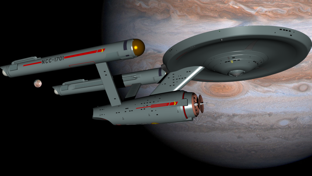
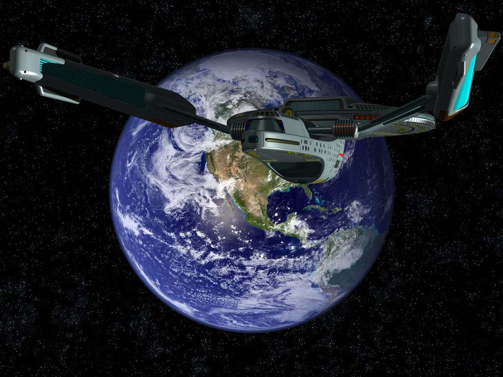
This shot really conveys the ship's size, somewhat like in TMP. Just sweet!

This shot really conveys the ship's size, somewhat like in TMP. Just sweet!
Well, it's like I've always said... it's not the DESIGN that sells the reality. People who want to "demonstrate" that the TOS design "needs updating" always show a shot of a sloppily built AMT model painted with primary colors, after all. But you can do just as crappy of a presentation with ANY design and it'll look... well... crappy.This shot really conveys the ship's size, somewhat like in TMP. Just sweet!
") (at least now that I've gotten all my car issues resolved and can take the time to actually do something I WANT to do again...).
(at least now that I've gotten all my car issues resolved and can take the time to actually do something I WANT to do again...).These are not "movie quality" renders, but are provided to give a general impression of what the shots from the ST-09 trailer would have looked like had the TOS design been used.
I'm assuming that the trailer would have been the same one we saw, except for the specifics of the ship itself. So, the initial "welder" shot would have been the same, as would all of the voiceover clips, music and so forth.
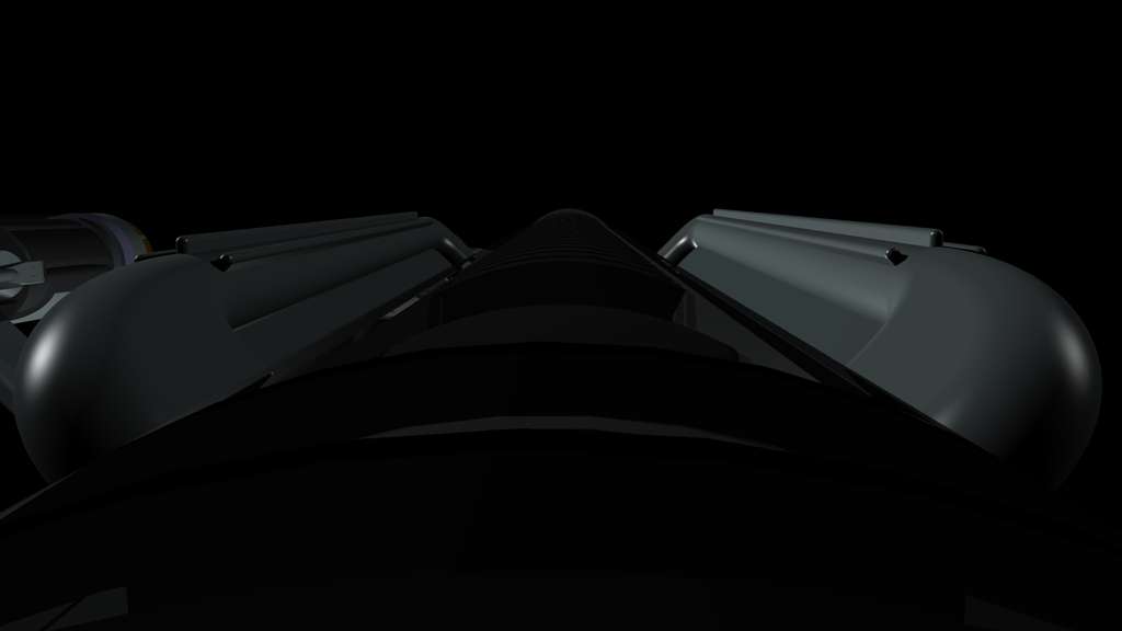
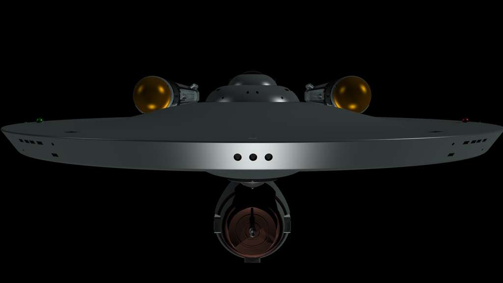
The first shot we saw was of the top of the nacelle. Here's what that would have looked like with a TOS-style nacelle. (Again, I'm still "transparent-skinned" so you can ignore that aspect and assume that you'd see, instead, some areas where the skin wasn't there yet).
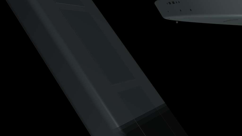
Next, we saw a guy doing welding work, suspended from a harness/scaffold of some sort, on the inside of the port pylon. Here's where that shot would have been with the TOS ship.
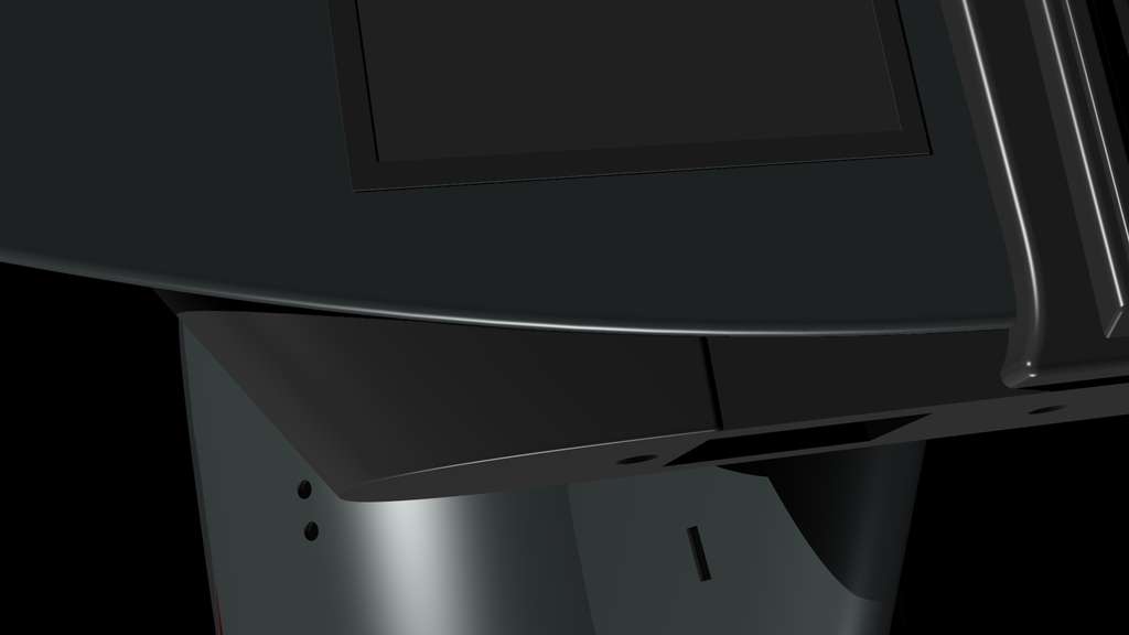
Next, we saw a downwards shot of another guy doing work at the edge of the primary hull. I thought about where that shot would work best with the TOS ship, and I decided that this would've been the best place for that shot... the true fan can tell what's being looked at, but the casual observer would have no idea. Especially if the "L-hatch" was off, revealing the impulse engine workings underneath...
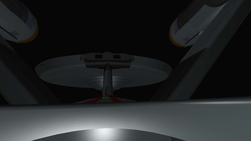
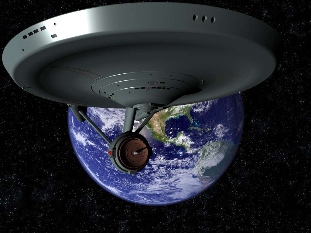
Finally, the final "sweep up" gave us the first reveal of the ship. Here's what that shot would have looked like with the TOS ship.
Now, obviously, you'd have the ship in a partial state of construction... you'd see the slight motion of "fan blades" inside the nacelle domes, etc, just like in the trailer. I'm only trying to show what the "TOS-ish" shots would have looked like in the most general of terms.
 :rolleyes:")
Yeah, that's significant on both versions of the ship (TOS and TMP). Even for the later-era ships, they always implemented SOMETHING in that region to emphasize the shape. In the case of the Sovereign-class, it was with color rather than with a deep inset, but the effect is the same.Looking very nice indeed. It's always surprised me how the saucer undercut doesn't look nearly as severe when viewed in 3d, yet we know from your cutaways that it takes out nearly half the rim!
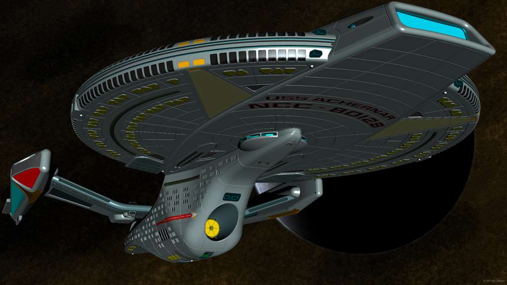
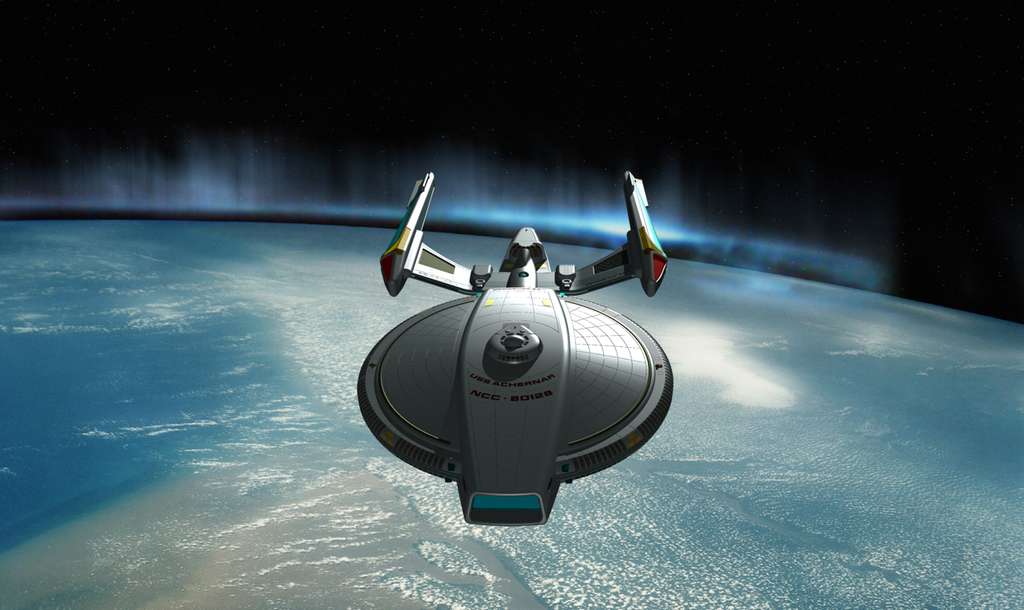
Well, that's the thing about style... what one person hates, another may love. I, personally, love it, and I've heard from quite a few people who share that opinion. But I don't take it personally if someone doesn't agree. Personal taste and all that. (As mentioned in another thread elsewhere on the BBS.)Your modelling skills on both these ships are outstandingly good, but the Achernar's design is still atrociously ugly.
Well, texturing is going to be last. For two reasons... first, I can't really do proper texturing within the tool I'm doing my design work in (at least, not to the same level as you can with Maya)... so I have to have all of my structural/physical stuff in place before I start doing that (and that includes all internal stuff I ever plan to implement as part of the base model... chairs, people, etc, can be separate elements, but the entire ship is going to be one big freakin' model).But the Big E looks superb. Can't wait to see a textured version of her")
Thanks! That was sort of my point when I set out to make her. Basically, I decided that the "Ent-D" design style was specifically a "Utopia Planetia" style, and that the "Ent-E" design style was from some other shipyard... but that the San Francisco Naval Yards design style (which was predominant during the TOS/TMP era) is still the preferred style of ship design for that shipbuilding facility. It's a matter of style, and I really wanted to do a post-TNG-era ship that had the stylistic leanings of the TOS and TMP eras, while not sacrificing any of the functional updates.I love the Achernar. It's a nice change of pace to the Ent-E knockoffs.
Yep, those are self-contained (ie, with integral power generation) nacelles. They allow the saucer to move at a reasonable warp velocity. Notice that both halves of the ship have everything needed to be a full starship. However, the ship is better able to do anything on the list when combined.Are there pop-down nacelles on the bottom of the saucer? Would this be for saucer-sep?
We use essential cookies to make this site work, and optional cookies to enhance your experience.

