-
Welcome! The TrekBBS is the number one place to chat about Star Trek with like-minded fans.
If you are not already a member then please register an account and join in the discussion!
You are using an out of date browser. It may not display this or other websites correctly.
You should upgrade or use an alternative browser.
You should upgrade or use an alternative browser.
Andrew Probert and Rick Sternbach: The New Enterprise
- Thread starter Lowdarzz
- Start date
- Status
- Not open for further replies.
I had to come back just to make this post. I originally joined over eight years ago and was a member of a great many star trek forums and just got burned out. But this, this insult to Star Trek could not go unanswered. I am sorry, but this new ship isn't the Enterprise. It is an insult beyond words. I get the whole time to reset star trek argument and concept, but honestly, why the hell do they have to make the new ship look like its been ran though one of those photo morphing programs. The ones that make you all silly looking and such. Jimmy is rolling in his grave right now. Gene... well poor Gene.
You forgot the part where JJ Abrams raped your childhood.

They didn't try to pretend that it was supposed to be the original, though. That is by far the thing that rubs me the most about how the ship looks.
Actually this is an alternate version, which I'm pretty sure will be mentioned in the movie. The original is never built, and the new original is now built around 15 years later, which explains why it looks so different. But really, why does it matter? I wouldn't mind if they told us this was supposed to be the same ship. It's no different than any other remake in my mind.
But, but ancient... you can't remake Trek! That would violate teh canon!!!11

^^ Even in that case why does it have to be so frigging ugly...
Actually I kinda like it. It's at least as good as the TOS version IMO, but that's just a matter of taste isn't it?
^^ Even in that case why does it have to be so frigging ugly...
Actually I kinda like it. It's at least as good as the TOS version IMO, but that's just a matter of taste isn't it?
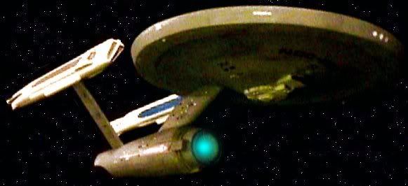
A number of professional artists have pointed out the dissimilarities between the different hull elements. I saw this too and called it the "Starship Platypus" when the first photo came out. The problem is so profound that the finished result is almost unprofessional.
But the curious thing is that the Kelvin shows no such inconsistency. I'm wondering if this is meant to show the Enterprise having been slapped together at its new location in Iowa out of available parts -- the inconsistency is intentional?
Too little data to go, with just the trailer available and a few interviews.
^^ Even in that case why does it have to be so frigging ugly...
Actually I kinda like it. It's at least as good as the TOS version IMO, but that's just a matter of taste isn't it?
A number of professional artists have pointed out the dissimilarities between the different hull elements.
Similarity between hull elements has WHAT to do with aesthetics? Really, the only similarity that counts is all the parts being the same color. Even a kitbash is only recognizable as such when you know where the original parts come from.
Look guys... we all know that the following is true:Actually I kinda like it. It's at least as good as the TOS version IMO, but that's just a matter of taste isn't it?
A number of professional artists have pointed out the dissimilarities between the different hull elements.
Similarity between hull elements has WHAT to do with aesthetics? Really, the only similarity that counts is all the parts being the same color. Even a kitbash is only recognizable as such when you know where the original parts come from.
1) The "new" Enterprise is getting a roughly 50/50 "love-it/hate-it" ratio among fans.
2) The "new" Enterprise isn't going to be noticed, particularly, by anyone but fans. To everyone else, it'll just be a "kewl spaceship."
3) This "new" Enterprise is in an alterative reality from the one we know.
So... ultimately... what makes this acceptable, or unacceptable, is whether or not the film sees a "reset button" event at the end which gives us back our classic Trek, or if it doesn't (which essentially means that, except for in the memory of Spock and Nero, the entire existing Trek universe has been erased).
That's it... that's the only remaining issue. That's the only bit that will make this "acceptable to fans" or not. Everything else is already done.
I'm hopeful, from my own standpoint, that they'll do the "reset" at the end. Even if they happen to use the existing "new" bridge set and model, I'll just mentally retcon those scenes to be what we've always had from that point on (and maybe we'll see someone do a "fan-edit" of that final scene Forrest-Gumpifying it onto the classic bridge, and replacing the final ship shot!)
trevanian
Rear Admiral
Actually I kinda like it. It's at least as good as the TOS version IMO, but that's just a matter of taste isn't it?
A number of professional artists have pointed out the dissimilarities between the different hull elements.
Similarity between hull elements has WHAT to do with aesthetics? Really, the only similarity that counts is all the parts being the same color.
I'm legally colorblind and even so I can see dissimilarities between the hull elements, so it isn't about color (it is probably more about reflectiveness, which is a huge issue given the matte finish in TOS and the shiny one in TMP.) But more specifically to the aesthetics, by incorporating the TMP band lines on the edge of the saucer, you're introducing a deliberate art deco influence that was developed by Richard Taylor for TMP, which is totally at odds with the TOS ship, and as such seems wrong on this universebashing groundbuilt starship (talk about a bunch of words that should never go together!)
Add to that the rather severe lines of the engineering hull, which seems to be a caricature of the EXCELSIOR, a ship 'designed' by ILM folks, who themselves have a totally different take on trek from the designers on TMP, TWOK and TOS. (on TWOK, ILM didn't do creative work on the ships, just executed the designs of others, which was probably the best of both worlds, since you didn't have to StarWarsify the vehicles the way it happened in SFS.)
Here's what you get when you mix and match design eras.
In this case, it was done deliberately, with the incongruity of the design elements being a key part of the backstory of the ship.
What's JJ's excuse?
In this case, it was done deliberately, with the incongruity of the design elements being a key part of the backstory of the ship.
What's JJ's excuse?
Then be specific as to what this IS about, because it sounds like you're just wanking.I'm legally colorblind and even so I can see dissimilarities between the hull elements, so it isn't about color.
Never mind, you ARE just wanking.But more specifically to the aesthetics, by incorporating the TMP band lines on the edge of the saucer, you're introducing a deliberate art deco influence...
 :rolleyes:")
How is this not true of Probert's original Enterprise-C design? For that matter, how is this not true of Sternbach's Enterprise-C design?Add to that the rather severe lines of the engineering hull, which seems to be a caricature of the EXCELSIOR
Look, the fact that parts of the ship RESEMBLE parts of other ships shouldn't be surprising at this point, trek has been doing that for decades. Nobody complained about the fact that Reliant was basically assembled piecemeal from rearranged Constitution parts, so what--other than your newfound hatred of any starship that came after TOS--leads you to establish this precedent?
Actually I kinda like it. It's at least as good as the TOS version IMO, but that's just a matter of taste isn't it?
A number of professional artists have pointed out the dissimilarities between the different hull elements.
Similarity between hull elements has WHAT to do with aesthetics? Really, the only similarity that counts is all the parts being the same color. Even a kitbash is only recognizable as such when you know where the original parts come from.
I should think that'd be self-evident. If I lay out a newsletter such that each article uses a different font, is all forgiven just because I've assigned the same color to all text?

That's essentially what's going on here ... except I'm not even certain all the parts are the same color. The saucer wouldn't be out of place in Star Trek: The Motion Picture -- its lines are clean and euclidian. The detailing, as Trevanian observed, evokes art deco influence, especially with the bands around the circumference of the saucer. Finally, the saucer is distinctly plated. But the secondary hull comes from someone else's mind. It has long, drawn-out curves and overlapping portions and flows into the dorsal. The warp nacelles and pylons take on a third, "droopy" motif that some have characterized as having a 50's automobile influence. And notice the panelling ... it's distinct only on the saucer. It's a lot less visible on the rest of the ship. It's a platypus, designed by committee and thrown together without any effort to make the parts work together.
But all of this, newtype_alpha, completely misses the point of my post which you neatly stepped around and seem to have taken as an attack on the design. It wasn't. It was an observation that the other ship designs we've seen from the movie, particularly the Kelvin, do not share this platypus persona. They're consistent with themselves. Leading me to wonder: is the discombobulated nature of this Enterprise a function of the story? THAT's what I'm proposing here, that there is a reason the ship looks the way it does ... possibly the result of having been thrown together out of spare parts.
It don't think that, when we see this new ship in the film, it will look nearly so mismatched as it does now -- that released photo is really bad. I'm not sure why they'd release an oddly cropped and clearly distorted image as the first one, but they did. The lighting is quite bad too, showing the saucer details quite dramatically, but no any on the secondary hull. But the design looks better in the trailer...
The idea, though, that nacelles are designed and built by different contractors and then simply bought pre-assembled by Starfleet and slapped onto their vessels dates back at least until Shane Johnson's Mr. Scott's Guide to the Enterprise. He chalked up many of the differences between the TOS and TMP Enterprises as well as those between the Enterprise & Reliant and the Excelsior & Grissom as different contractors working on the project.
So even if the design still looks "mismatched" in the final film, I don't have too big of a problem believing that, say, the nacelles and saucer were designed by different contractors.
Sorry, I just don't see it. Mainly because none of the parts used in the NuEnterprise are actually found in any other starship design, nor do they clearly "belong" to a different design lineage.I should think that'd be self-evident. If I lay out a newsletter such that each article uses a different font, is all forgiven just because I've assigned the same color to all text?
That's essentially what's going on here ...
This ship's lines are very different from the TOS version. It's SUPPOSED to be different, at least as different from the TOS ship as the refit version of TMP. You're going to have to be more specific as to which design elements actually "clash" with each other, else you might as well argue that Selma Hayek is ugly because her fingernails are inconsistent with her tits.
In simpler words, you think the engineering section is too smooth and curvy for the otherwise flat and straight-edge saucer section.But the secondary hull comes from someone else's mind. It has long, drawn-out curves and overlapping portions and flows into the dorsal...
I think we can safely file this one as "personal opinion presented as expert analysis."
I'll spare a rehash of the earlier derail, since it would be a waste of time asking you why I should CARE. It's obvious that YOU care a great deal about the "platypus persona," but my Trek Bible does not appear to contain a commandment that says "thou shalt not design a starship whose secondary hull is too curvy for its saucer."It was an observation that the other ship designs we've seen from the movie, particularly the Kelvin, do not share this platypus persona.
How many of us expect the timeline to "reset"?
How many of us expect the timeline to "reset"?
What's that got to do with the new Enterprise design?
How many of us expect the timeline to "reset"?
I thought the latest consensus was that there is some sort of alt. timeline-ness?
I think part of the ship looks different because yes, they wanted it too look better for the modern audience to get more viewers, not just the old fans.
But also, because the ship has to look like its brand new, and shiny, with a new car smell, not the well worn and used TOS one.
I'll spare a rehash of the earlier derail, since it would be a waste of time asking you why I should CARE. It's obvious that YOU care a great deal about the "platypus persona," but my Trek Bible does not appear to contain a commandment that says "thou shalt not design a starship whose secondary hull is too curvy for its saucer."
Besides, some of us like platypai.

- Status
- Not open for further replies.
Similar threads
- Replies
- 4
- Views
- 2K
- Replies
- 482
- Views
- 59K
If you are not already a member then please register an account and join in the discussion!