• Welcome! The TrekBBS is the number one place to chat about Star Trek with like-minded fans.
    If you are not already a member then please register an account and join in the discussion!

Andrew Probert and Rick Sternbach: The New Enterprise

Status
Not open for further replies.
For TVH it's actually a rebuilt set, built from the exact same plans as TWOK. (And, TWOK, of course, used 'dark' lighting for the damage and military feel...) You may not believe it, but all the hardware is in nearly the exact same places.

Yes, of course, I know that the TVH is mostly comprised of components from the TMP bridge.

But you cannot say that those sets are lit the same. The TVH floor lighting, for instance, which wasn't present in any prior incarnation, flies in the face of your assertion.

No you're not. Don't try lying to me.

I'm lying now? Does calling someone a liar count as trolling?

You were saying that the NuTrek bridge is within the same design criteria as those of the movies, and even of the TV series. Your 3:59 post tried to claim that the NuTrek bridge looked the same as the bridges past.

Let's look at what I said:

I guess the bridge is more consistent with past designs than many people care to admit.

How do you get that I "tried to claim that the NuTrek bridge looked the same as the bridges past"? Exaggerate much, Vance, or are you just in a foul mood?

I'm saying what I said:

I'm just saying that there is a precedent for white, brightly lit bridges.
 
But you cannot say that those sets are lit the same. The TVH floor lighting, for instance, which wasn't present in any prior incarnation, flies in the face of your assertion.

It was lit differently, but that's neither what you actually said, nor was TVH's lighting similar to the lighting used in NuTrek. I never made the assertion that 'all the bridges of the past were exactly the same', I simply said that you couldn't say that the NuTrek bridge had the same design aesthetic as the others, which was the basis of your point.

I'm lying now? Does calling someone a liar count as trolling?

You were lying at that moment, and I called you for it. I do not know you well enough to say that you lie as a matter of course, and are therefore a 'liar' in that sense.

But since you seem to be more interested in laying traps for 'getting people who disagree with me banned', a game in which I have no desire to play, I think we're done.
 
You were lying at that moment, and I called you for it... But since you seem to be more interested in laying traps for 'getting people who disagree with me banned', a game in which I have no desire to play, I think we're done.

:wtf:

What on Earth?

This has to be the most bizarre exchange I've had here in over seven years.

Yeah, I have no interest in a simple spirited debate for a few minutes of fun as a break... I just want to use my evil intellect for the devious purpose of setting clever logic traps all day in the hopes of catching you and getting you banned! Muah-ha-ha-ha!

Your stance, Vance, is all over the place. What are we supposed to make of this?

Vance said:
The lighting on the Trek IV bridge is the same as the other movies (except for TMP).

Vance said:
TWOK, of course, used 'dark' lighting for the damage and military feel.

Vance said:
You may not believe it, but all the hardware is in nearly the exact same places.

Vance said:
It was lit differently, but that's neither what you actually said, nor was TVH's lighting similar to the lighting used in NuTrek.

So the lighting is the same... except in the ways it is different.

Vance said:
I simply said that you couldn't say that the NuTrek bridge had the same design aesthetic as the others, which was the basis of your point.

How can I say this more clearly so you can understand?

One of the common objections is that STXI bridge is white and brightly lit. Some people think that white and brightly lit equals the Apple Store, a Revlon commercial, or a makeup store. The Phase II and THV bridges, though, are white and brightly lit. That is my point. Nothing about design aesthetics or criteria.
 
Last edited:
kelvin_tos.jpg
Wow. I've never seen these images for the Kelvin. Is the one at the bottom fan produced or released from the studio? It reminds me a bit of Matt's early color sketches for various TOS Enterprise options. For me personally it would've been a preferable direction to go in.

Mark
 
There was a 3D rotation video of the Kelvin put out.. last week, was it? That's where a lot of images came from.

And, yes, I'll get to a 'schematic drawing' of her eventually. :)
 
.....bright lights shining up from the floor into everyone's eyes (a hold-over from TMP).....

You know, those floor lights might be practical afterall. I think about that everytime I have to crawl under my cubicle to plug a black cable into a dark input located in a shadowed recess labeled with black slightly-raised letters in the dark. :rolleyes:

I think they were Spock's first recommendation after accidentally sending out that signal in "Balance Of Terror" while working under his station. "No more working in the dark! I want lights down there, lotsa lights so even my Vulcan eyes can see what the hell I'm doing." :vulcan:

Mark
 
There was a 3D rotation video of the Kelvin put out.. last week, was it? That's where a lot of images came from.

And, yes, I'll get to a 'schematic drawing' of her eventually. :)
It's worth noting that there's a problem with the Quicktime 3D image of the Kelvin, though. And it's causing a lot of problems for people...

Look closely at the image of the ship when viewed from directly above or below. The saucer does not look circular, but rather oval (long direction front-to-rear) in the Quicktime. However, the real ship has a perfectly circular saucer.

This is because the guy who did the renders for the Quicktime evidently rendered them at a "cinematic" aspect ratio," rather than a "computer display" aspect ratio (I learned the difference playing with cameras within Maya).

So, take a single frame of the Kelvin from above, and overlay a circle on top of the saucer, matching the front and back edges. Then stretch the image vertically until the saucer is actually circular. I believe that's about an 8% increase which will be required, but I'm eyeballing it right now (and have no desire or time to spend doing this actual task at the moment!)

Now, note how much you had to increase the saucer aspect ratio in order to get that "round saucer" shape. Apply the same vertical "stretch' to every other frame... you'll find that the ship isn't quite as "short and squat" as it seems in the side view and front view... and is a much closer match to what we've seen in the posters which were put out on the Intel site.

This is obvious if you really look closely. Don't just assume that the guys putting this website together did the job correctly. They were given a set of images rendered by someone at ILM and assembled them into a *.MOV file, but failed to correct the rendering ratio, so the whole thing is screwed up!
 
Thirded. Like JNG, I'm in their target demographic, and would have been enthusiastic to pay money to see a big-budget-film quality version of the classic E (or the classic Godzilla for that matter).

I'll see your 'disturbingly close' and raise you an 'I have a bad feeling about this...' :rommie:
So you guys are saying that with the original Godzilla design you would have liked the remake? Or maybe you would have like the new Godzilla a bit if the movie hadn't been as bad? I'm going to guess no on the first, maybe on the second. I'm not a huge fan of the new Enterprise, but that may change if the movie turns out as cool as I'm hoping it will.

I wouldn't have enjoyed the new 'Godzilla' movie in its entirety no matter what they did because it was a bad movie, but at least seeing the CGI monster would be a good reason to watch it... like watching a movie for a particular actor/actress.

And I'll agree, if the new movie is good, then my opinion of the ship may warm as well, because of association with the film.


And Shaw, thank you for doing this, I've been wanting to but was too lazy.

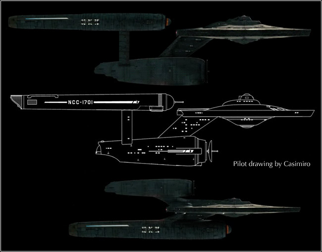
I agree that this design would flow much better into TOS, and actually, I kinda like it, and would definitely have preferred it. It has a nice WWII feel to it and with a few tweaks to 'modernize' it a bit more into a 2245 era, I think it would have been fine to be used in the film. I also agree with the idea that they should have taken the basic bridge design from TOS and just gone from there.

Less is more, after all.

:rommie:
 
Last edited:
On the Bridge-slash-Revlon commercial set...

Yeah, that bridge looks nothing like a bridge on the Enterprise! :scream:

Oh, wait...

http://movies.trekcore.com/gallery/albums/tvh/ch17/tvh1073.jpg

Well, that movie was a box-office bomb just like Nemesis! :scream:

Oh, wait...

It sold the second most tickets, was the second most profitable Trek movie, and earned four Academy Award nominations.

Well, that's the films -- the original Enterprise would never look like that on TV! :scream:

Oh, wait....

http://www.trekmania.net/conference/behind_scenes/bridge1.jpg (cut 'n' paste the link in your browser)

I guess the bridge is more consistent with past designs than many people care to admit. :bolian:
Of course both of those are set after TOS, as opposed to before it like this movie is supposed to be. I also notice a distinct lack of eye-level lighting...
 
True, but it was the same set design. :)
Correction: It's the same SET, just repainted and redressed.

I've heard conflicting things on this. From what I've gathered, the ST:II - III set was largley destroyed by fire while filming the San Fransisco scenes for Trek IV, and they had to largely rebuild the sets from the blueprints. That's why we actually see so little of the bridge in Trek IV. (And why Trek V reuses so much TNG stuff.)
I thought that we saw so little of the bridge in IV because that was all that they repainted of the original bridge, and there were still scorch marks on it. And the reason why V uses so much TNG stuff was because the sets had been converted over to use for TNG.
 
I thought that we saw so little of the bridge in IV because that was all that they repainted of the original bridge, and there were still scorch marks on it. And the reason why V uses so much TNG stuff was because the sets had been converted over to use for TNG.

That would also explain why the Saratoga bridge was so dark even before the spotted the probe...although that would mean the Grissom scenes were shot first in the movie before and then the sets redressed as the Enterprise.

It would be interesting to find that out actually, when were the Enterprise/Reliant and the Enterprise/Grissom scenes filmed in relation to each other.

Ive read about the IV bridge being a partial and only what is scene, the damage occured after that (remember alot of what was left was also reused for the E-D battle bridge and other bridges)
 
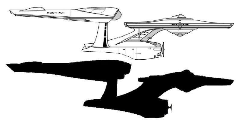
I think we're getting closer, if that silhouette we got over on hobbytalk is at all accurate...

GettingCloser.jpg

The hobbytalk image doesn't look right to me at all. I'm not saying my version is correct or anything, but I think it's more correct than that thing. Though the nacelles may indeed be longer, it's really hard to tell.
 
Status
Not open for further replies.
If you are not already a member then please register an account and join in the discussion!

Sign up / Register


Back
Top