-
Welcome! The TrekBBS is the number one place to chat about Star Trek with like-minded fans.
If you are not already a member then please register an account and join in the discussion!
You are using an out of date browser. It may not display this or other websites correctly.
You should upgrade or use an alternative browser.
You should upgrade or use an alternative browser.
A parade of spaceships...
- Thread starter Warped9
- Start date
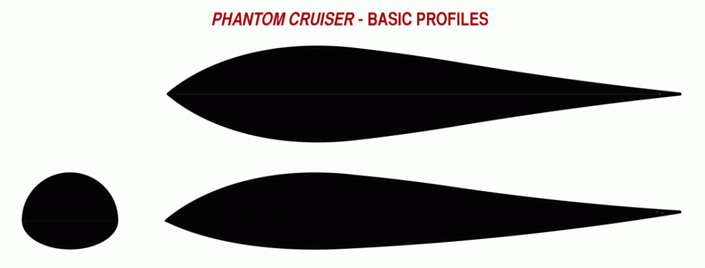
I'm beginning to have a kernel of an idea about this. Basically take the side elevation profile of the ship (when I draw it) and use that as the essential cross-section of everything as it flows back into the shape of the wings. Note, too, that there appears to be a bit of upsweep in the wings from about midway out from the fuselage. While sketching I'm pretty convinced that you wouldn't see much of the fuselage as distinct. It will look very much like a wing all the way across with the thickest part in the middle as the main body. There will be something organic about the final result. Add in the fact that there are no discernible exhaust ports on this thing. Extrapolating from that the ship incorporates all its drive systems within its smooth hull and the drive systems must include some form of antigrav system as well as something very advanced for FTL propulsion.I am mentally wrapping cross-section lines around that thing and it just doesn't add up.Looking ahead I'm thinking of skipping the Rocketship Galileo and going right to one I've been thinking about for a very long time...
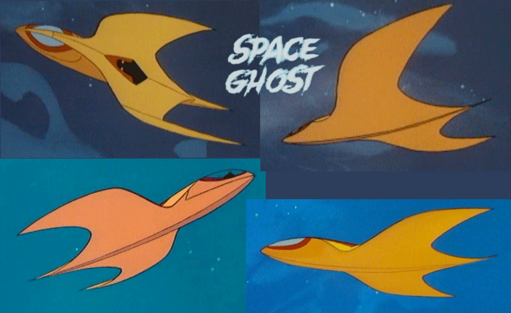
It's going to be a challenge to reconcile some of the shapes and lines into something coherent that really looks like the onscreen craft yet also works in 3D. There are also a fair number of interior shots regarding the cockpit and quite a few of them are generally consistent with each other.
Studying these images and sketching last night I can see contradictions. The most familiar view of the ship (as seen from above) leads one to think that the wings flow back from the nose and flare out yet fixed above the main body. But seen from below that's not how the ship is drawn. Seen from below we don't see a discernible fuselage separate from the wings. As drawn it looks like the wings are much thicker and merged with the protruding forward section. The ship is more manta ray like than bird or airplane like. I don't have a problem with that, but it makes reconciling the top view a challenge. Granted annimated ships are stylized and simplified, but a simple extra line easily added to the bottom view would have made a big difference and yet it's not there. It could be that what we're seeing from above is more of a painting scheme rather than hard lines or shapes. Also the bottom and top surfaces each appear to have a subtle crest or ridge to them as evidenced by a continuous line from bow to stern.
Of course, that's beside the point. The main objective is to get a 3D shape that looks as close as possible to the 2D images we're familiar with. And note, too, that onscreen we get essentially only two views of the ship---from above and from below. Once we get a 3D shape we'll be able to see some interesting angles to it. I say this because I've been trying to sketch those views while trying to wrap my head around the wings flow into the fuselage.
It's going to be interesting.
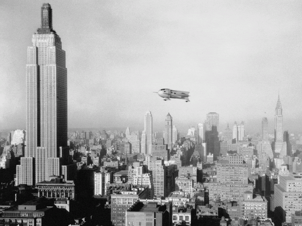
Wow, they sure complete to top of the Empire State Building fast...unfinished as Flash approached, finished after he passes.

Wow, they sure complete to top of the Empire State Building fast...unfinished as Flash approached, finished after he passes.
it was built by daleks, they're fast.

Re: the Phantom Cruiser.
I'm presently on my first attempt modelling this. I can see basically two ways of realizing this in 3D and either way isn't going to look completely consistent with what we see onscreen. It's just one way will look a lot more right than the other.
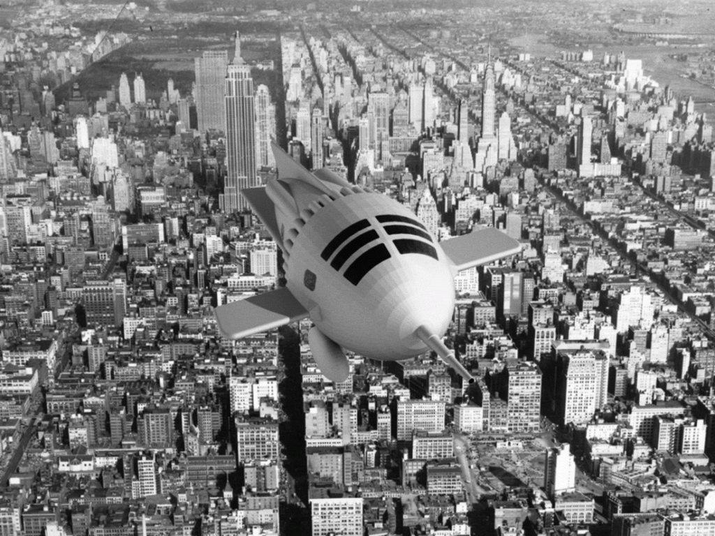
The most familiar shot of the ship is at an angle as viewed from above. If I were to follow what the image seems to be saying then that's the only angle where the 3D model would look consistent with the onscreen image. That's because as seen from above it looks like the wings flow from the nose and back then out from the top of the fuselage. From any other angle it just wouldn't look right anymore.
However if I take into account the few other views of the ship we've seen onscreen then a credible three dimensional shape does become possible that will look consistent with the onscreen version...except when viewed from the familiar angle from above then it will deviate somewhat. That said the latter approach makes for a better result all around and will result in a model that will be instantly recognizable.
I'm looking at this from the perspective of what is the shape suggesting rather than taking every single visible line drawn literally?
I'm presently quite far along with my first attempt, but I'm convinced I can do it better (and why I'm holding off posting pics). That said I've got a lot of the essentials right, but it needs to be tweaked to get a better final result.
Okay, I've tweaked the shapes a bit to get closer to how I think it should look. There is an ever so small roundness to the tip of the nose, the tail and finally the wingtips, but from a distance they will look pointed. You can't really tell from the front view but the wings are meant to flow into the body so the end result shouldn't have any hard angles---every surface should (hopefully) flow into the next but for one small and subtle exception: there is a crest or subtle angle meant to run from nose to tail along the top and bottom of the craft. You can just see it in the front elevation.
I haven't any idea of scale yet, but this is supposed to be more aircraft sized rather than multi-level ship sized.
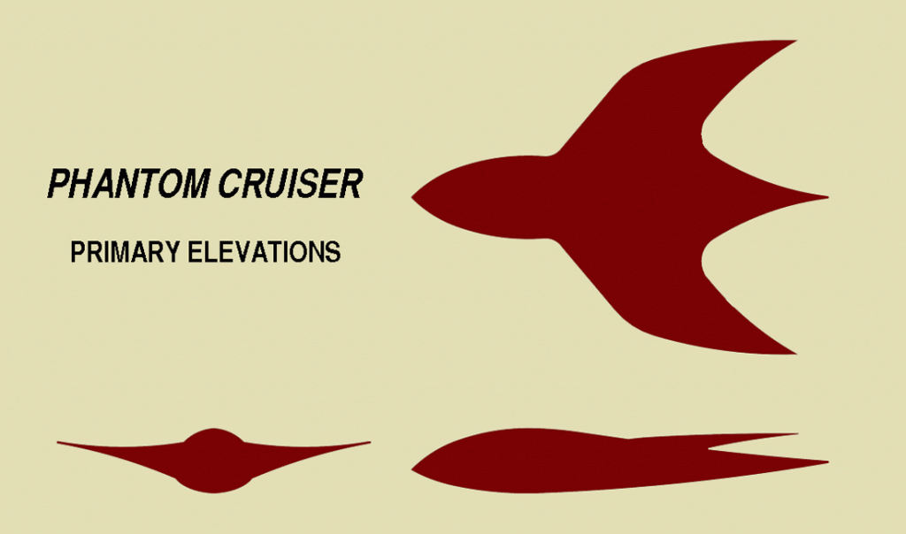
I haven't any idea of scale yet, but this is supposed to be more aircraft sized rather than multi-level ship sized.

Well I worked right off (on top of actually) screencaps to get the shape and proportions right. Also in the elevations you're not seeing the curvatures of the shape or any perspective so that can distort how it appears to some degree. Still if eventually necessary it can always be stretched a bit.looks like it needs to be longer.

Here's something to consider. This appears to be the only side elevation model used for the Phantom Cruiser and it shows something pretty interesting regarding the wing angle and their attachment to the fuselage.
EDIT: I initially thought that there wasn't much of Toth's work on animation to be found online, and then I stumbled onto this gem, courtesy of the late Alex Toth's official site:

Space Ghost himself wasn't finalized then (the model sheets of the final design for the show are dated in May 1966), so it's clear that either Toth himself later altered the design or it was changed due to time constraints.
Regardless, it does seem to corroborate a few design concepts that we've been questioning (the nature of the attachment between wings and body, the relationship between the paint pattern and ship outline, etc.) Although Toth himself included a section of Space Ghost art in "Alex Toth: By Design!", this page is the only one with images of the (same) Phantom Cruiser, albeit cleaned up.
CartoonConceptDesign has a great collection of Toth's model sheet and concept work, and I do recommend checking it out.
Last edited:
Awesome find!
Here's something to consider. This appears to be the only side elevation model used for the Phanton Cruiser and it shows something pretty interesting regarding the wing angle and their attachment to the fuselage.

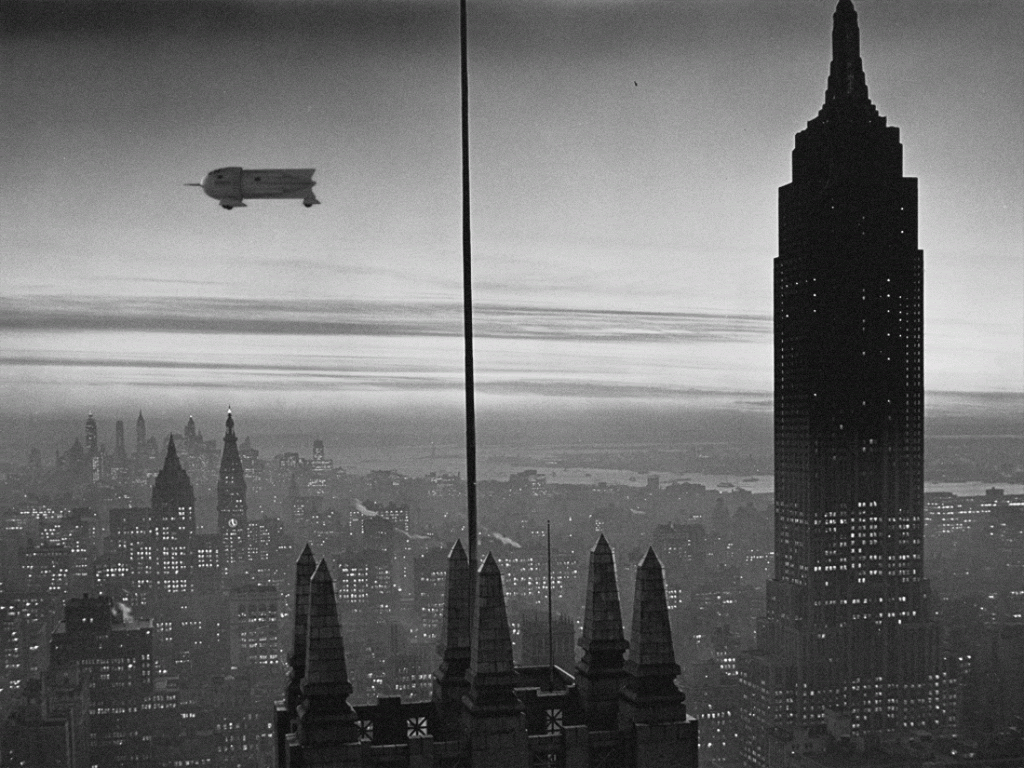
And it appears my conclusion was right. It isn't that the view from above (of my model) won't be wholly consistent with what we saw onscreen but that how that view was drawn and shown onscreen wasn't truly accurate.
Hmm, not even any landing gear of any sort. But then I was pretty sure I'd never seen any before. From the drawings it does look like there could be an aft compartment to this (certainly looks to be room enough), but I don't recall them ever showing even an access hatch at the back of the forward cabin.
Wow, I loved that show as a kid. Looking at it now you get the idea the opening credits suggest something more dramatic overall in tone than what you actually get in the episodes. I know there was something of a reboot (in the '80s I think) which I never saw, but it's interesting to ponder what a more contemporary reboot could be like with some smarter writing. Hell, it's amusing to ponder if something like this could even be done live-action. We follow the adventures of one Space Ghost wherein he's really one of many throughout the universe (or galaxy). He could be one of a number of interstellar or intergalactic sentinels much along the lines of the Green Lantern concept.
A 3D interpretation of the Phantom Crusier by John Picha
http://www.youtube.com/watch?v=Y95PMrHZObY
He also has a 3D model of the Flash Gordon Rocketship
http://www.youtube.com/watch?v=dGA3m0UmbZA
http://www.youtube.com/watch?v=Y95PMrHZObY
He also has a 3D model of the Flash Gordon Rocketship
http://www.youtube.com/watch?v=dGA3m0UmbZA
Yep, I've seen those. The Flash Gordon ship really departs from what we see particularly as there is no exhaust port right at the tail or a ridge along the forward section or any detail on the wings. The nose of his PC looks a bit too rounded but the rest looks all right. I admit my interpretation will vary some from his.A 3D interpretation of the Phantom Crusier by John Picha
http://www.youtube.com/watch?v=Y95PMrHZObY
He also has a 3D model of the Flash Gordon Rocketship
http://www.youtube.com/watch?v=dGA3m0UmbZA
Be glad you didn't see the 80s interpretation. The characters looked the same and Gary Owens once again voiced SG, but in the wake of greeblie festooned ships as depicted in Star Wars, the Phantom Cruiser was a brick shaped "mess". Only the "nose" resembled Toth's original sleek design. The aft looked more like the stern of an Imperial Star Destroyer. The Bernard Herrman "Day the Earth Stood Still" inspired scores of the 66 series were replaced with post John Williams fanfare using a far too small band. And the "violence" and implied deaths of villains in the original were still whitewashed by rulings put into effect because of cartoons like "Space Ghost", "The Herculoids" (my favorite) and "Jonny Quest". Certainly the animation was no smoother and the color palette just seemed paler...if that makes any sense.
Sincerely,
Bill
Sincerely,
Bill
Similar threads
- Replies
- 87
- Views
- 20K
- Replies
- 1
- Views
- 2K
- Replies
- 103
- Views
- 15K
- Replies
- 40
- Views
- 1K
If you are not already a member then please register an account and join in the discussion!

