I like the color scheme, but yeah, the asymmetry isn't working.
-
Welcome! The TrekBBS is the number one place to chat about Star Trek with like-minded fans.
If you are not already a member then please register an account and join in the discussion!
You are using an out of date browser. It may not display this or other websites correctly.
You should upgrade or use an alternative browser.
You should upgrade or use an alternative browser.
3D interiors in Blender
- Thread starter Rekkert
- Start date
I like the colors and I think the asymmetry does work. But from this perspective the asymmetrical part don't look centered. It looks like the captain's chair is too far in the center. It might be becasue that console has too much visual presence so it ruins the asymmetrical symmetry.
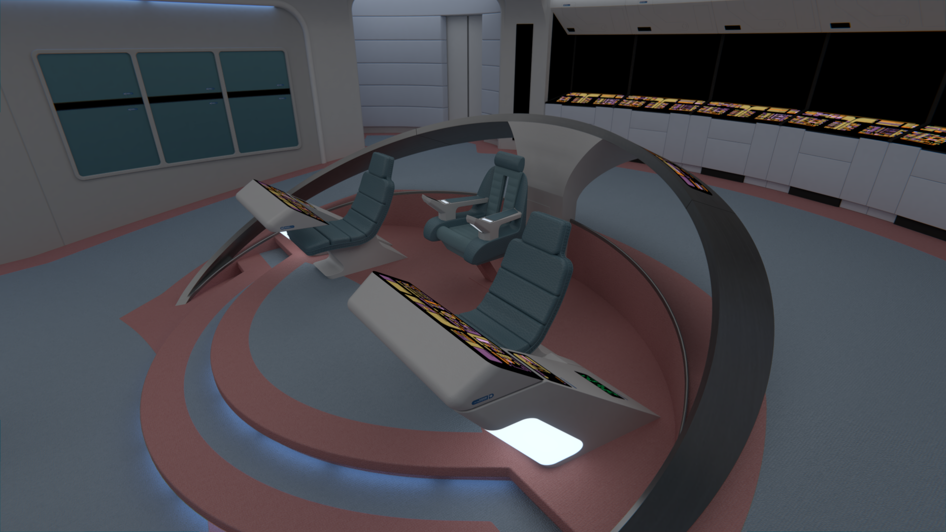
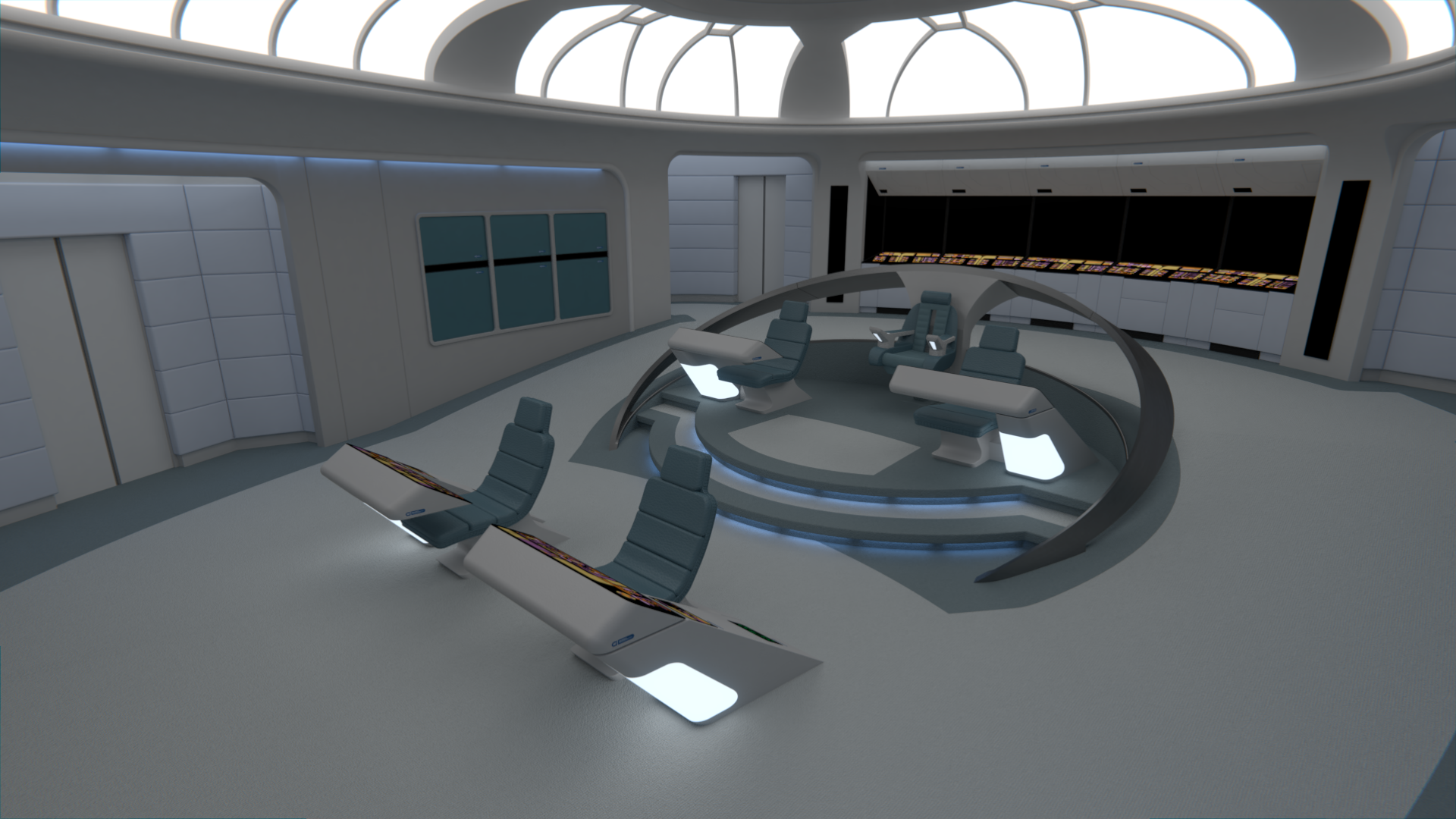
I've UV mapped the new platform and modified the aft stations, which now use the late TNG version of the chairs rather than the original on-rails ones. I'm also adding back the LCARS bits that won't have to be modified for this bridge.
I'm mostly researching and looking for the best references I can find for the new Captain's chair right now, so there's not much visible progress.
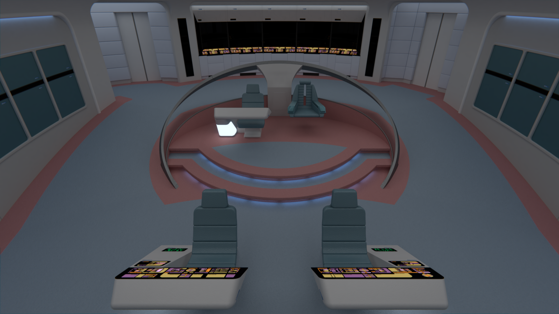
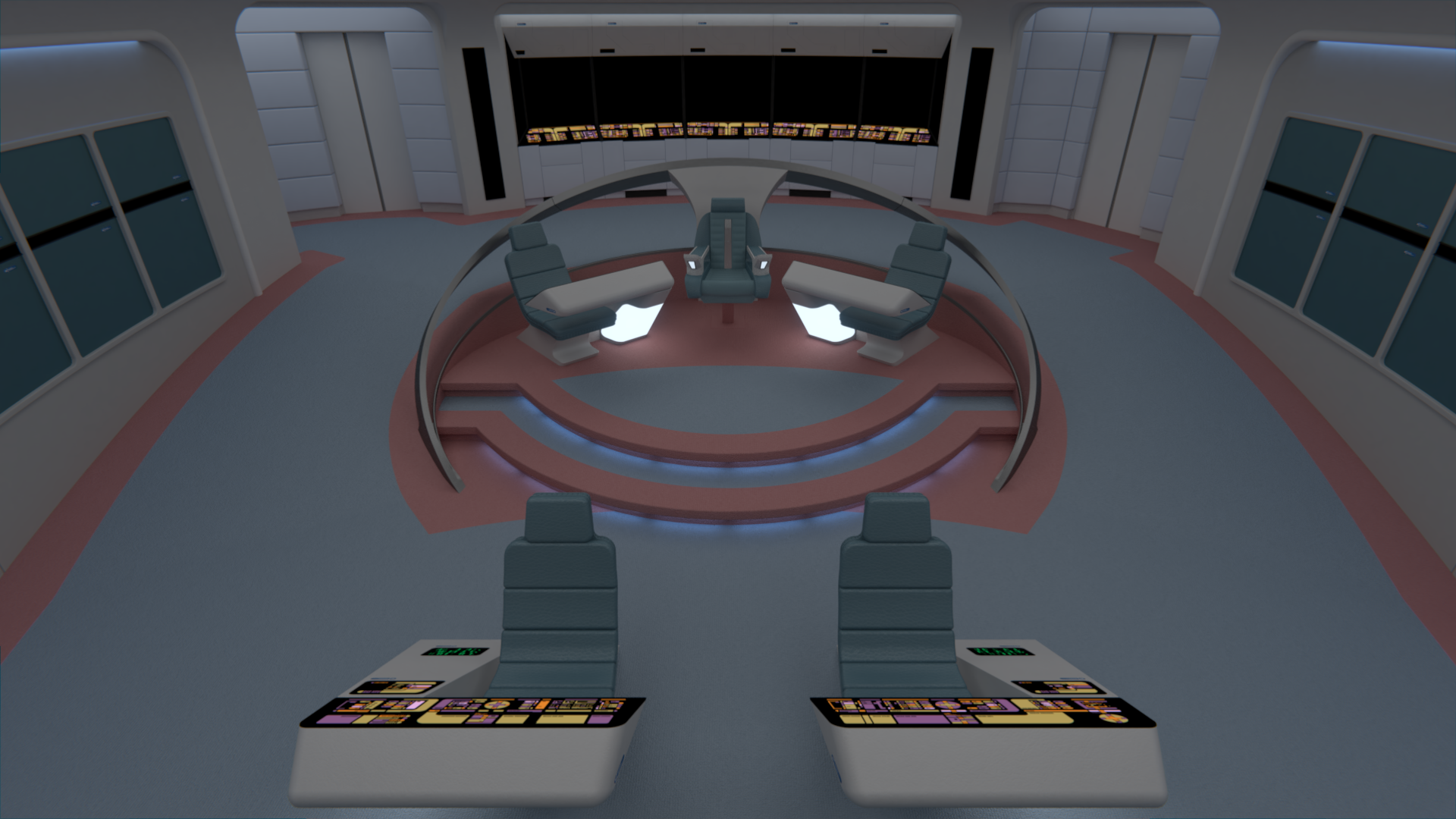
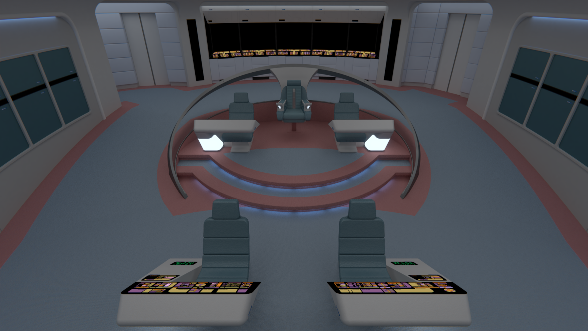
Here's a render showing the symmetry of the command area. Both chairs are symetrically aligned, but that does mean that the Captain's chair looks to be more centered as it's wider.
I'm mostly researching and looking for the best references I can find for the new Captain's chair right now, so there's not much visible progress.
Here's a render showing the symmetry of the command area. Both chairs are symetrically aligned, but that does mean that the Captain's chair looks to be more centered as it's wider.
I've UV mapped the new platform and modified the aft stations, which now use the late TNG version of the chairs rather than the original on-rails ones. I'm also adding back the LCARS bits that won't have to be modified for this bridge.
I'm mostly researching and looking for the best references I can find for the new Captain's chair right now, so there's not much visible progress.
Here's a render showing the symmetry of the command area. Both chairs are symetrically aligned, but that does mean that the Captain's chair looks to be more centered as it's wider.
Personally, I think it's the width of the console that's the issue, not the wider captain's chair. You (or the commissioner) might consider something for that blank space on the right side. Not necessarily a third chair, but maybe some sort of display.
@The Librarian: Once the new chair is finished, we'll have a better picture about how much space is actually there.
Speaking of which, progress is coming along nicely on the new chair, only the armrests and some minor details left.
Speaking of which, progress is coming along nicely on the new chair, only the armrests and some minor details left.
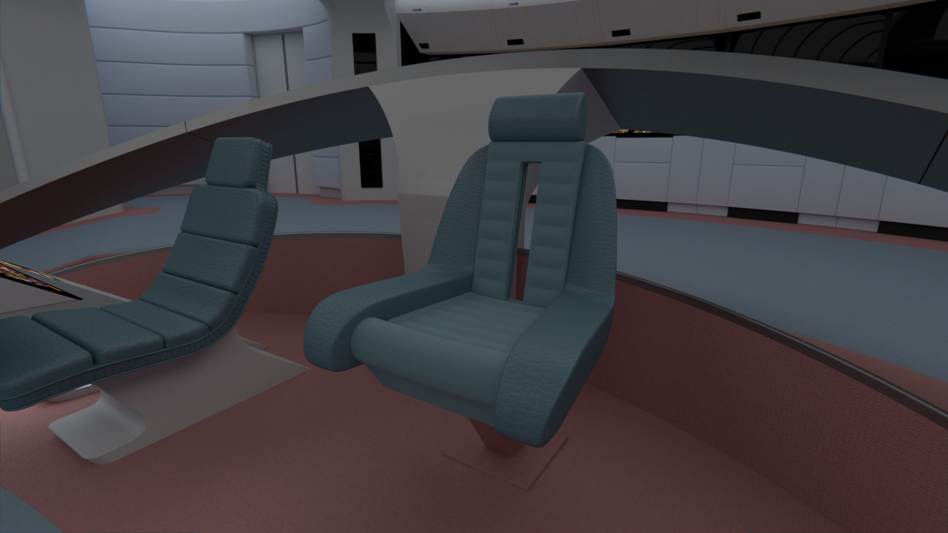
I always forget how low and long those early season chairs are. The captain's going to need a poking stick to keep his XO awake.
@The Librarian: Hahaha, yeah, if I were an officer on one of those I would fall sleep every last hour of my shift. ")
I've finished the chair. For the armrests I reused the one from the Charybdis/Anchorage version of this chair, as it was fairly accurate; however I did some heavy modifications to it to make it as accurate as I could.
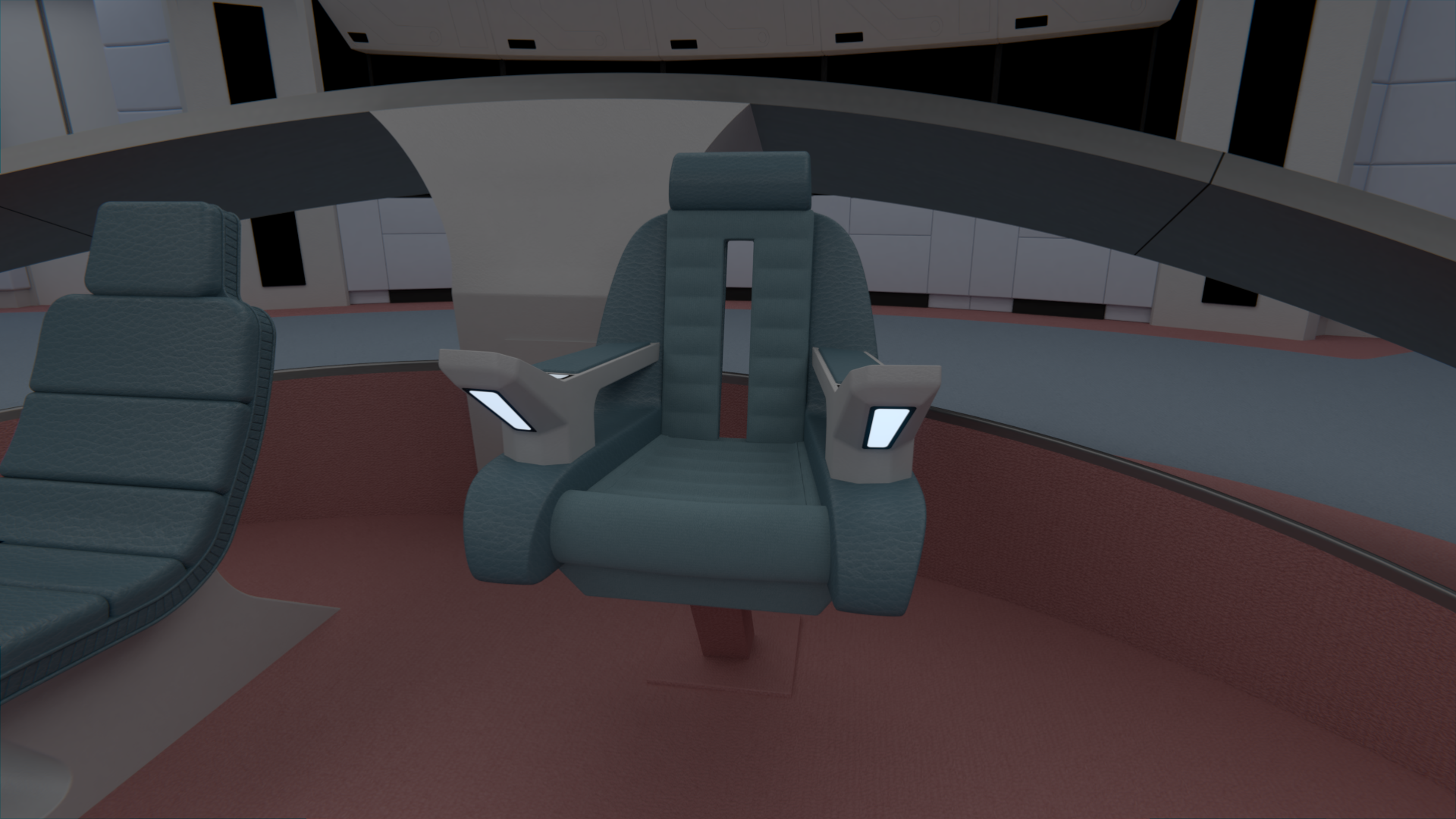
I've finished the chair. For the armrests I reused the one from the Charybdis/Anchorage version of this chair, as it was fairly accurate; however I did some heavy modifications to it to make it as accurate as I could.
I've been wondering the same thing about the console configuration. I don't have a problem with it but if many do, I'm willing to go with two full-length secondary command consoles. Heck that configuration was originally my idea to begin with way back when. Furthermore, I'm working on a fanfic series called "Star Trek: The Next Generation - The Galaxy Chroncles" which starts in 2360, four years prior to TNG, when the Galaxy is finally allowed out of her "nest" in the Sol System to go out on proper missions. I have a rough draft of the first story - "The Sound of the Shiant." E-mail me at rusty0918@comcast.net if you want a copy of it. And feel free to criticize/piss over it/whatnot. Why? Because as Chuck Sonnenberg aka sfdebris says and I quote - "because it shows you're thinking!"
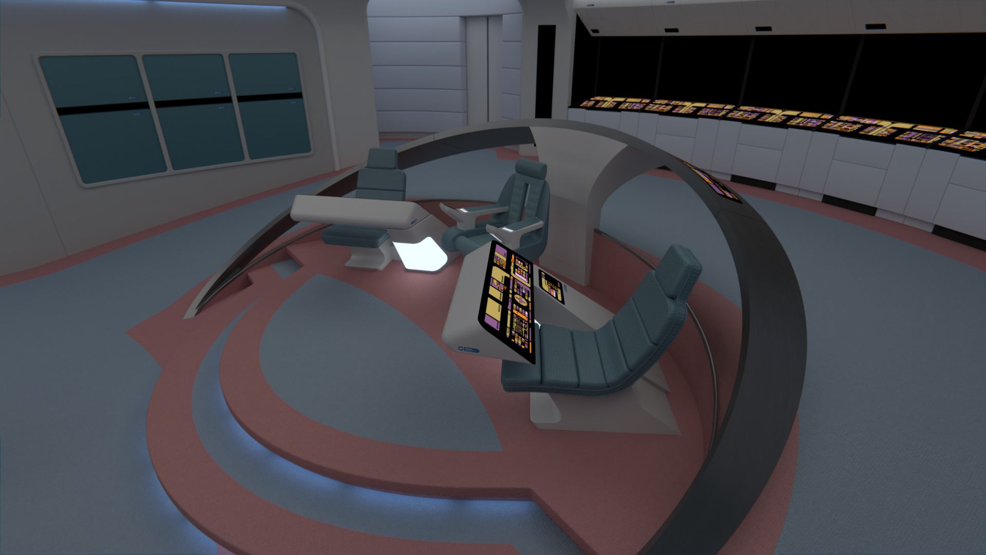
I don't like having full consoles two inches from the captain's face. He needs to be able to get up and walk around, or be able to see what's happening. I'd either go back to TNG's small terminals, so the officers sitting next to the CO can get some data while not getting in the way, or moving them off the center platform altogether.
Here's a thought: shorten the central horseshoe rail and move the consoles next to the tac-officers position.
Here's a thought: shorten the central horseshoe rail and move the consoles next to the tac-officers position.
I like the new layout. I agree that having the console tilted makes it fit in better. I could easily see the top section being easily removed and replaced with the smaller version depending on the preferences and specialties of the officers.
I think it looks better with the symmetrical layout, but I see Jedman's point about the size of the consoles maybe cramping the captain's style... what if you flipped them (so the bases are on the outside rather than right next to the command chair) and shortened the console... somewhere between its current length and the smaller version we saw on TNG?
I'd like to keep the console length the same. Especially in my stories the first officer since she doubles as science officer uses it as her personal science station (as opposed to Sciences I and II).
Rekkert did give me two other alternative ideas. This one might actually work better:
Rekkert did give me two other alternative ideas. This one might actually work better:
Last edited:
@Rusty0918, I have to admit that this second design does give the Captain more room and makes it much easier for the captain to see what people are actually doing on those consoles.
I'd put the captain up a bit like captain Kirk's chair did.
I've modified the carpet a bit to accommodate for the larger consoles, and changed the colors to better accommodate the changed materials. What do you think of the combination?
That one looks amazing. The colors are just right. While at first glance it may look too busy, I think that's just becasue we are used to the Enterprise-D bridge.
Though, I still think the asymmetrical look could be pulled off. If you arranged the chairs not by distance from the center line but by distance from the edge, then I think it could work.

Similar threads
- Replies
- 482
- Views
- 58K
- Replies
- 7
- Views
- 565
- Replies
- 1
- Views
- 149
If you are not already a member then please register an account and join in the discussion!