3D interiors in Blender

@Rekkert, colors are good, but it feels like there's a color missing. It's slightly too monochromatic. Perhaps a metal finish on the walls somewhere? I don't know...
Since its galaxy you can't get rid of the magenta; that'd be like taking away Spock's ears. Use it more as a trim/finish to give it a more subdued approach.

Also, for the First/2nd Officer consoles - split the inside of the horseshoe to build the console stations into the side of the horseshoe rail, and put in a low wall underneath the railing on the sides.
Kinda like moving the Generations side consoles to the front of the horseshoe.
 
Jedman - I'd like to keep the secondary command consoles they way they are. Though that might be an idea for a sister ship.
 
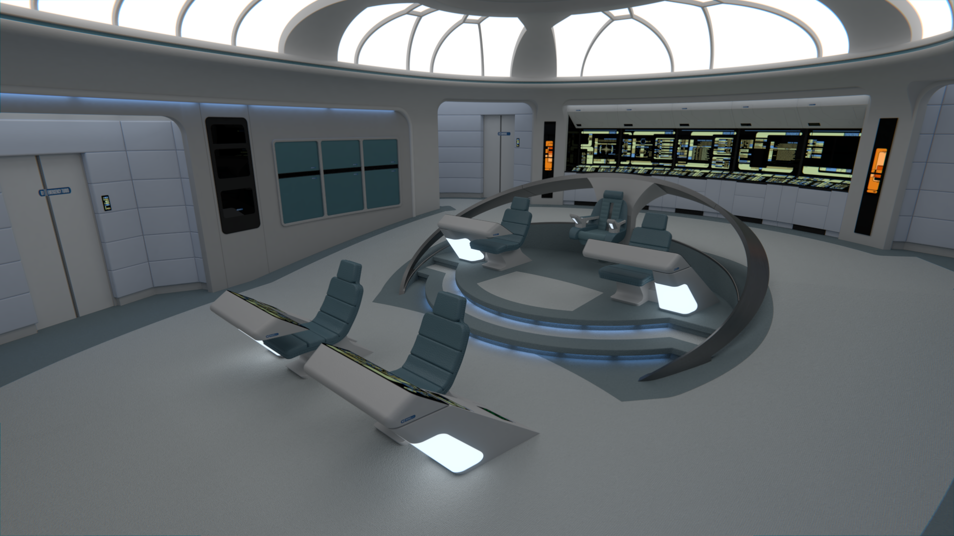
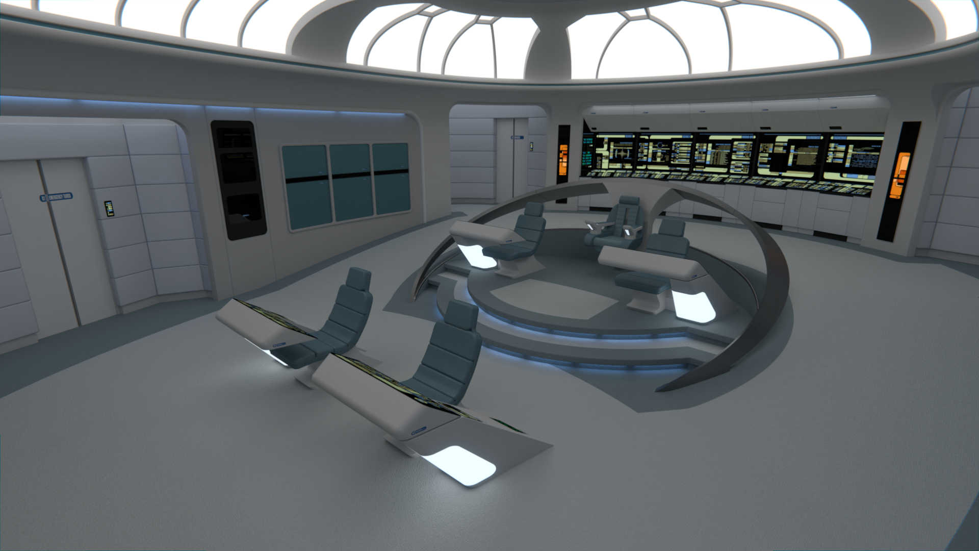
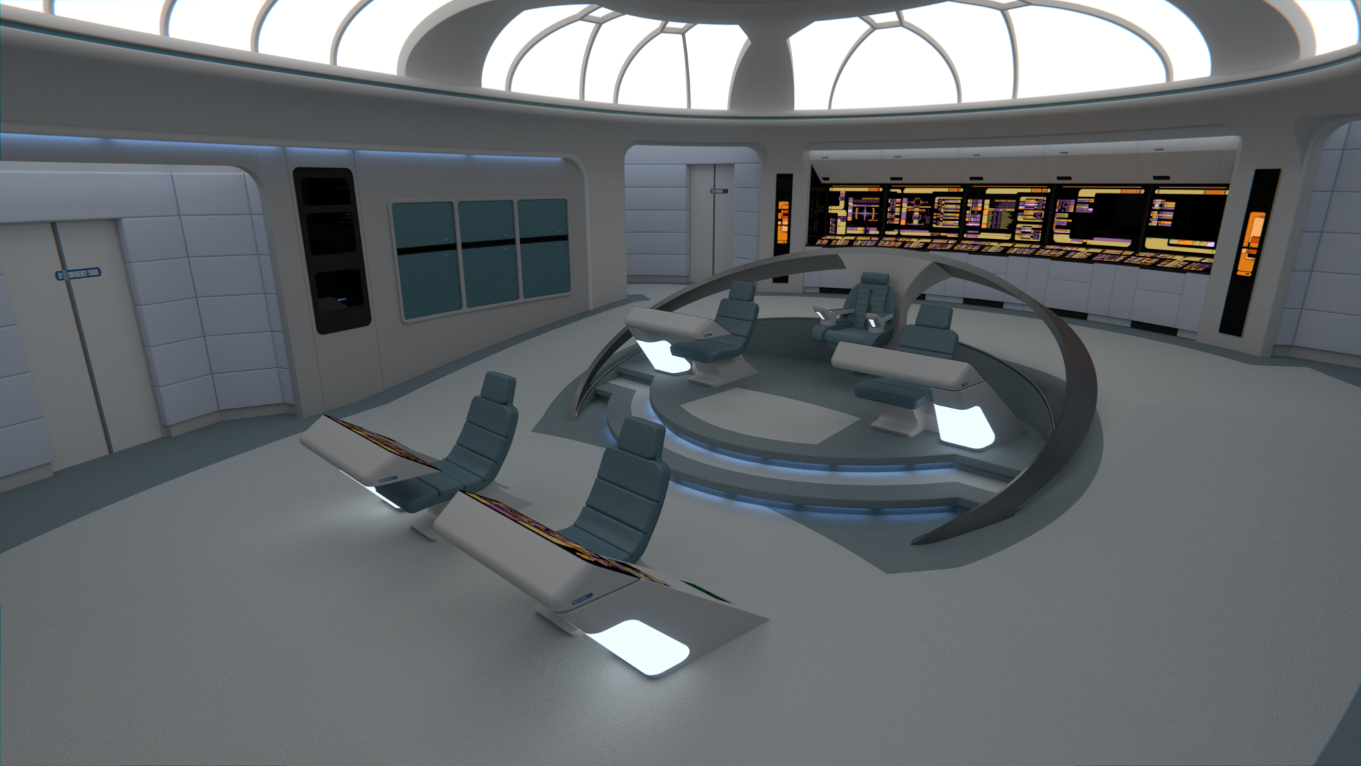
@M: I usually prefer the Captain to be in the middle, but I didn't particularly dislike the Hathaway style command area myself. In the end of the day, it's @Rusty0918 's decision as this is his ship. I do like the current version even though it's not the usual way these consoles are arranged, and it doesn't look as streamlined as the Enterprise, but that does make sense given that this was the prototype ship, maybe the bigger consoles were indeed useful to handle all the new systems initially.

@uniderth: I'm glad you like it, regarding the original version indeed that's a way in which it might have look better, but it leaves the XO's chair closer to the center than the Captain's, which doesn't look very good in my opinion.

@Matthew Raymond and 
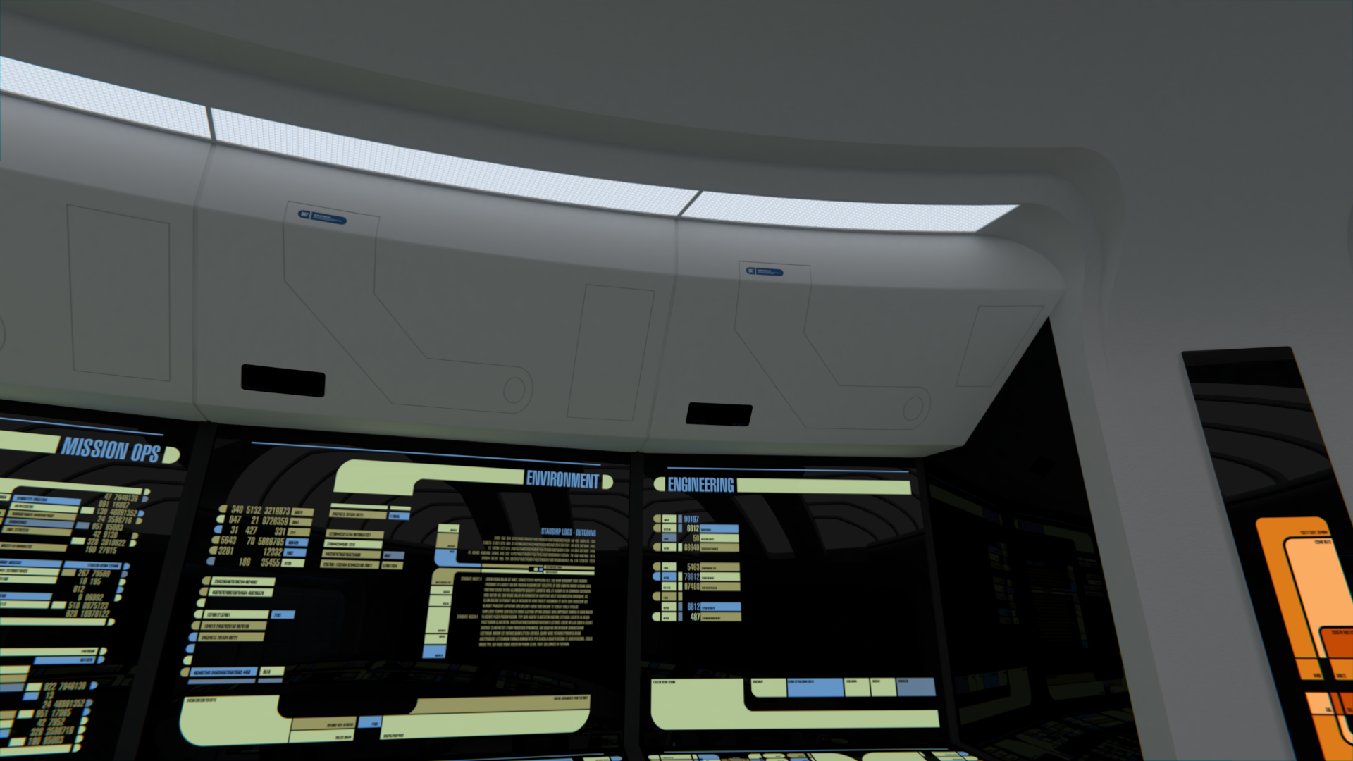
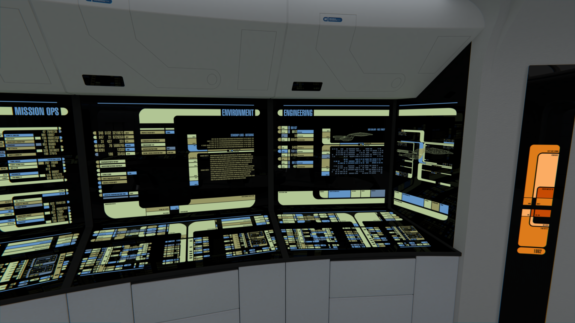
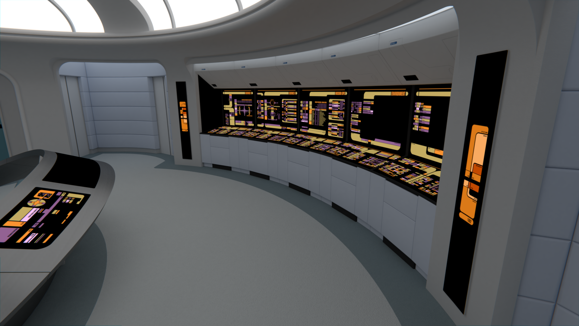
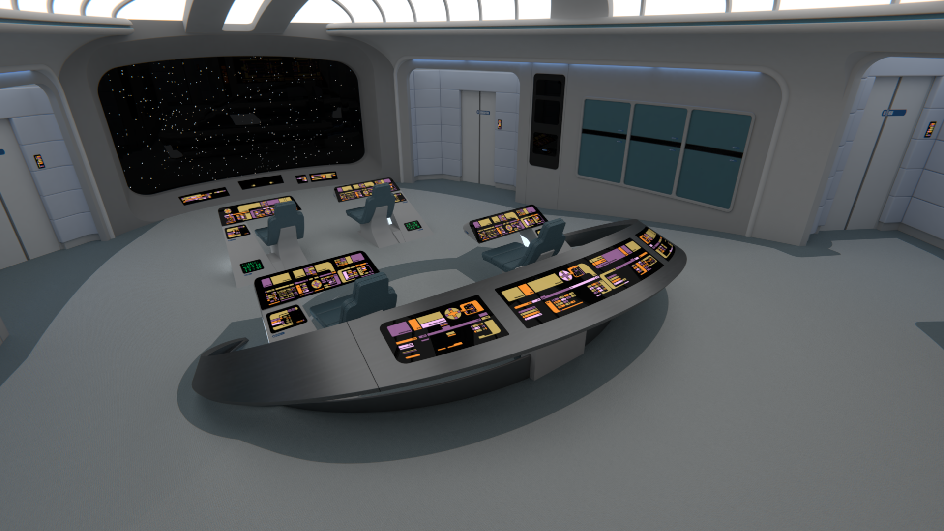
@Jedman67: I am doing some further experiments with color details in a few areas, but the whole color combination for this design is a lot colder and darker than on the more colorful Enterprise.

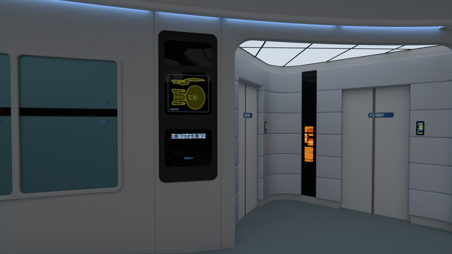
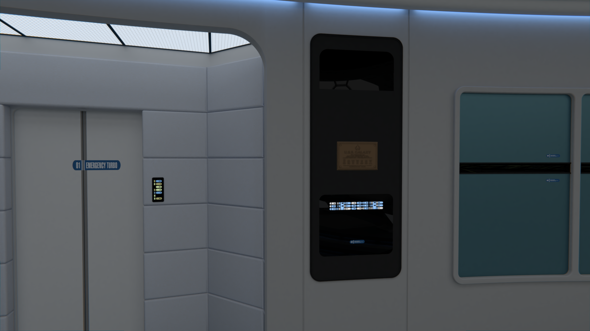
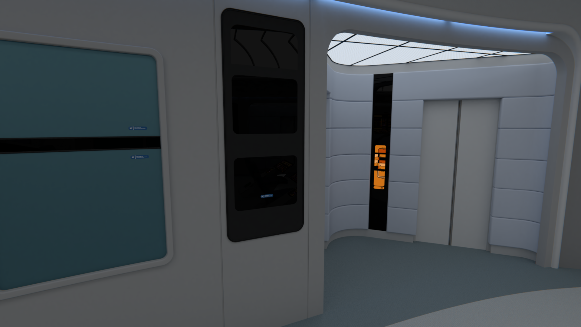
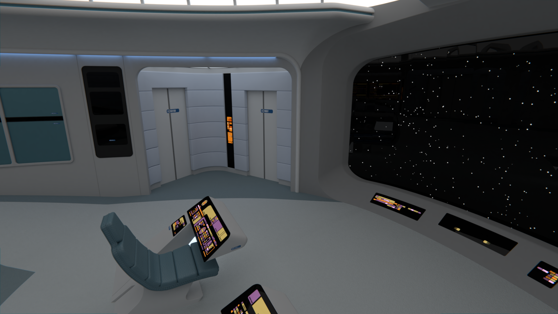
I've been adding back some more LCARS (changing things a bit from the Quasar, as the second to last console here is Environment as in the Ent-D), as well as working on the side panels.

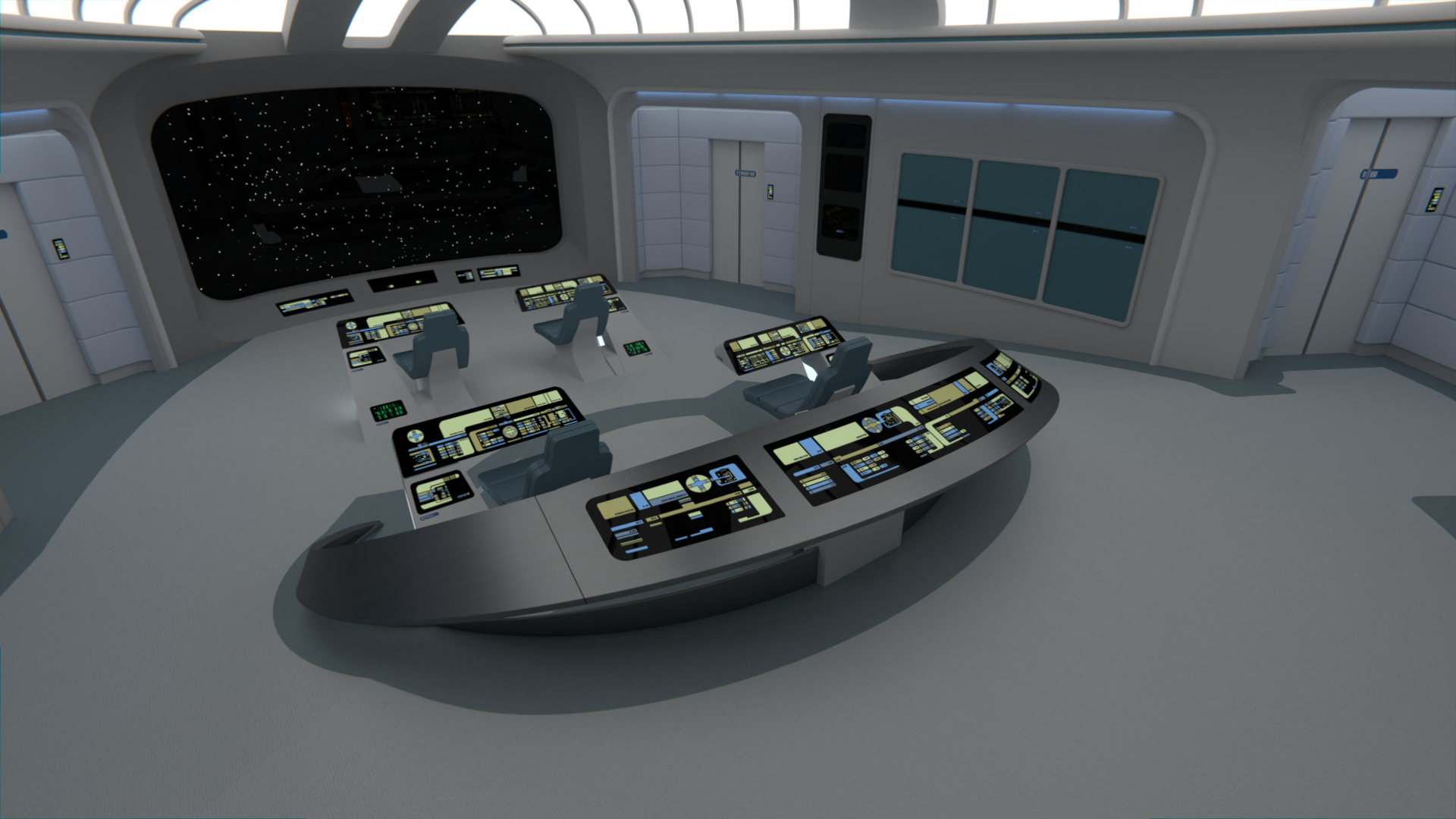
It's barely noticeable, but the aft consoles have a different front section right above the chairs, as it's based on the late TNG version. I still have to change the light above the aft area to the late version.

c5_08_by_rekkert-dbmpqrb.png

c5_09_by_rekkert-dbmpqrj.png
 
I like the full-length consoles primarily since they can be used for a multitude of functions - if Conn and/or Ops blow out. One of the reasons for the full-length consoles is that the first officer of the USS Galaxy in "Star Trek: The Next Generation - The Galaxy Chronicles" doubles as the chief science officer, and those full-length consoles can duplicate most of the science functions so she can be sitting near the captain and communicating to her (both the captain and first officer are women BTW!) much easier than her having to turn her back to Science I and II (though the first officer does use those stations when necessary).
 
@Rekkert, I think what bugs me about the coloring is the ceiling. The upper walls, ceiling and turbolift inset areas lack any significant shade or color variations. They all sorta read as light gray. Could you do something like making the ceiling around the lights metallic, or perhaps put a different color on the walls near the turbolifts? Or perhaps it could be as simple as tinting the lights in different places to accentuate the existing difference in color...
 
@Matthew Raymond: Some of the things you describe are already happening. The walls near the turbolifts are a light blue fabric, while the lights in the door alcoves are darker and bluer than the general lighting.

@M and @137th Gebirg: Thanks, I'm glad the colors are liked!

I've done the new LCARS for the tactical console, and added access keypads to all doors.

c5_11_by_rekkert-dbmtowx.png
 
I've changed the upper section of the aft consoles to use the more rounded light fixture featured in TNG since season 2. I've also started modifying the LCARS for the Engineering station as to integrate the side panel, notice that the title ENGINEERING is moved to the left side of the console.

c5_13_by_rekkert-dbmycz0.png
 
@Rekkert, the new LCARS colors are very soothing to me. From the back, looking toward the view screen, it looks like an LCARS waterfall. Feels very stress free and serene.
 
"Romulan Warbird decloaking directly ahead sir! Oh my god they're charging weapons!"
"Okey Ensign, keep it together, look at your console, look at the relaxing colors, how they..."
The Captain can't finish his sentence as the ship gets engulfed in a Plasma torpedo.
 
"Romulan Warbird decloaking directly ahead sir! Oh my god they're charging weapons!"
"Okey Ensign, keep it together, look at your console, look at the relaxing colors, how they..."
The Captain can't finish his sentence as the ship gets engulfed in a Plasma torpedo.

It's a (mostly) season one bridge, which means the ship will automatically raise the shields when the crew is too stupid or slow to do it themselves.
 
@The Librarian: If only the ship would have automatically drained the oxygen from the bridge every time they started talking about how evolved and superior they were during that season...

I've finished the LCARS on the aft consoles (that Engineering station gave a lot of work), and played around with the materials a bit. Nothing big, but the fabrics used (on walls of the door alcoves and the aft chairs and on the Captain's chair) are now a bit more realistic in the way they reflect light, and I did some minor modifications to the carpets as well.

c5_15_by_rekkert-dbn6elj.png

c1_05_by_rekkert-dbn6el8.png
 
Back
Top