@ashefivekay: Thank you!
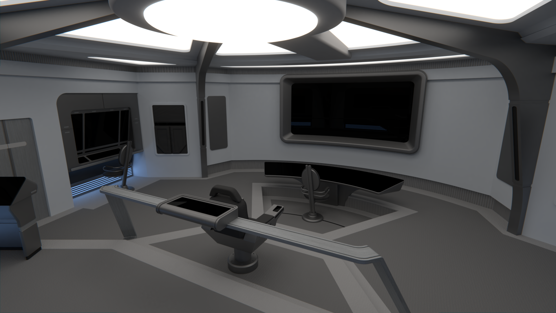
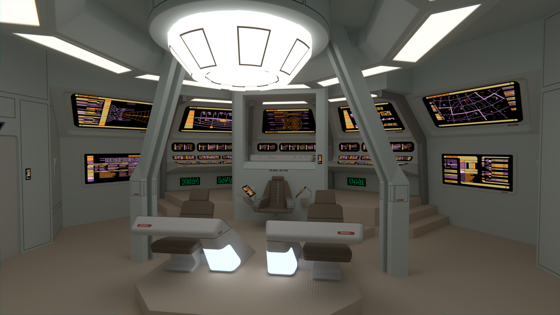
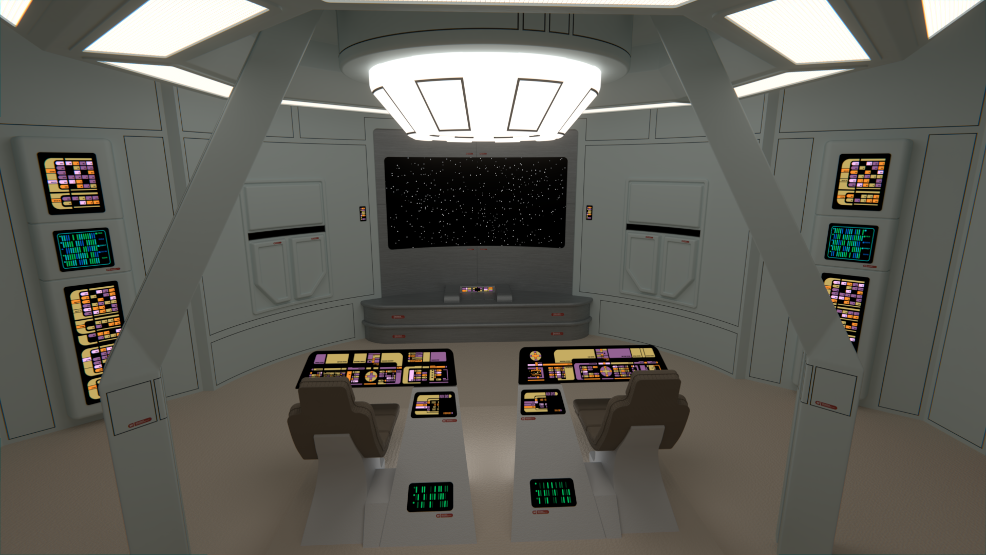
@Squiggy: Thanks! Are you referring at the consoles from my last post? Maybe the close ups didn't show them well enough in regards to their position in the bridge, but indeed they are looking at the viewscreen, you can see that better in the renders below.
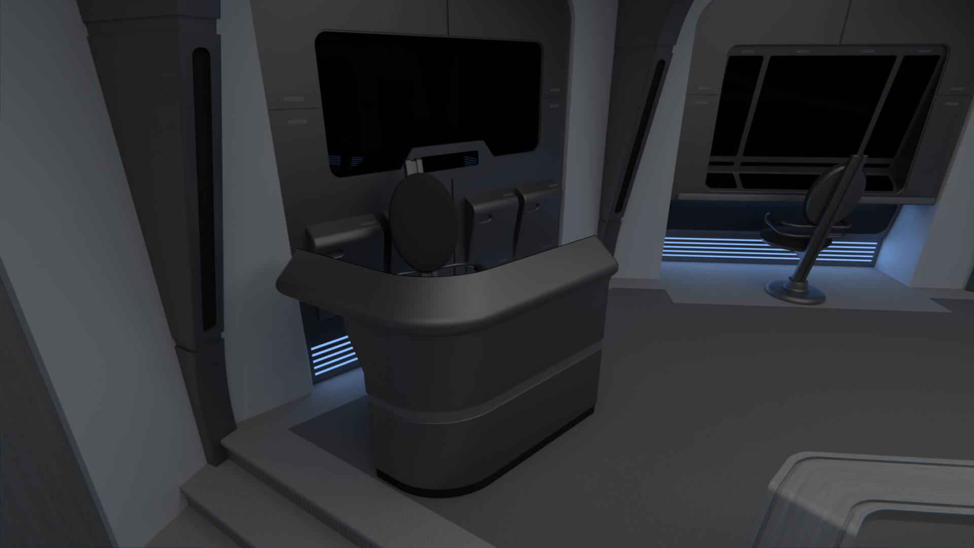
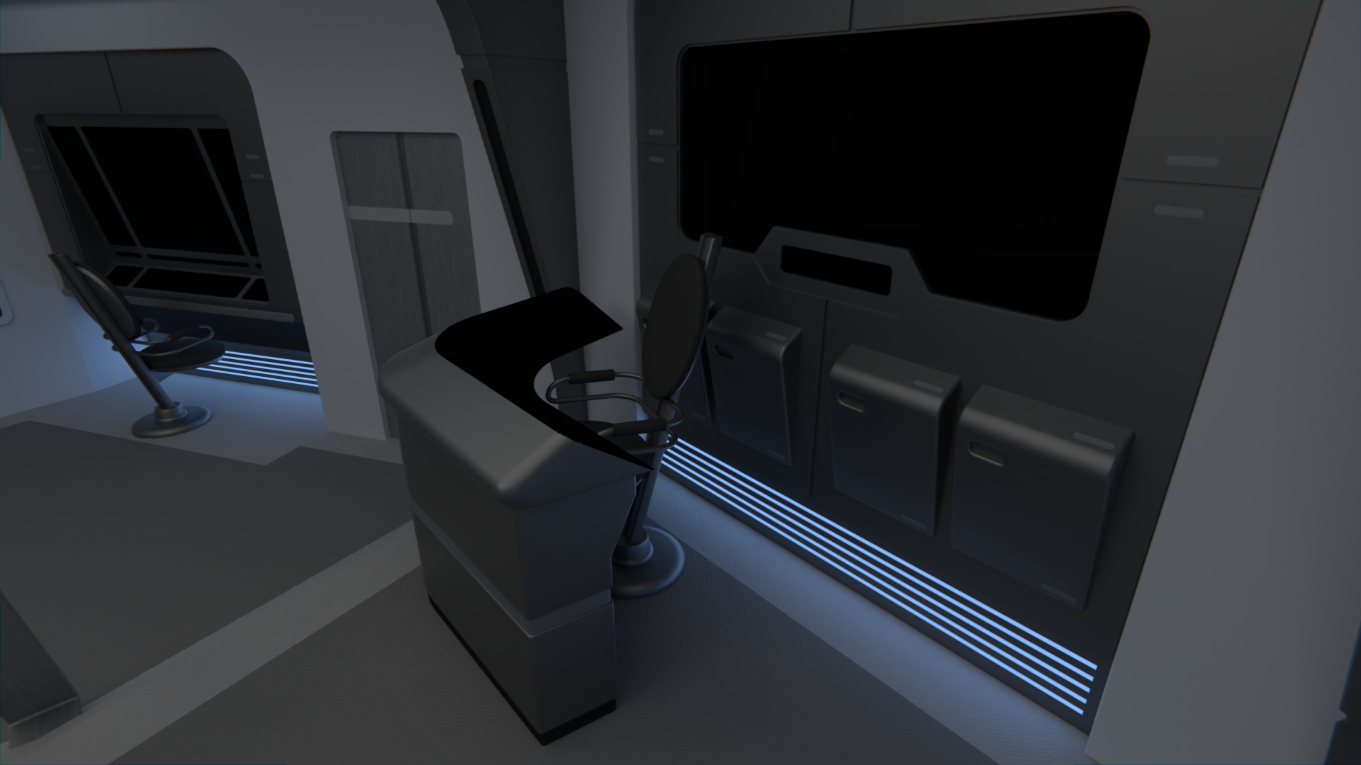
@Matthew Raymond: On the note about the side consoles, they're indeed a bit further towards the center now.
")
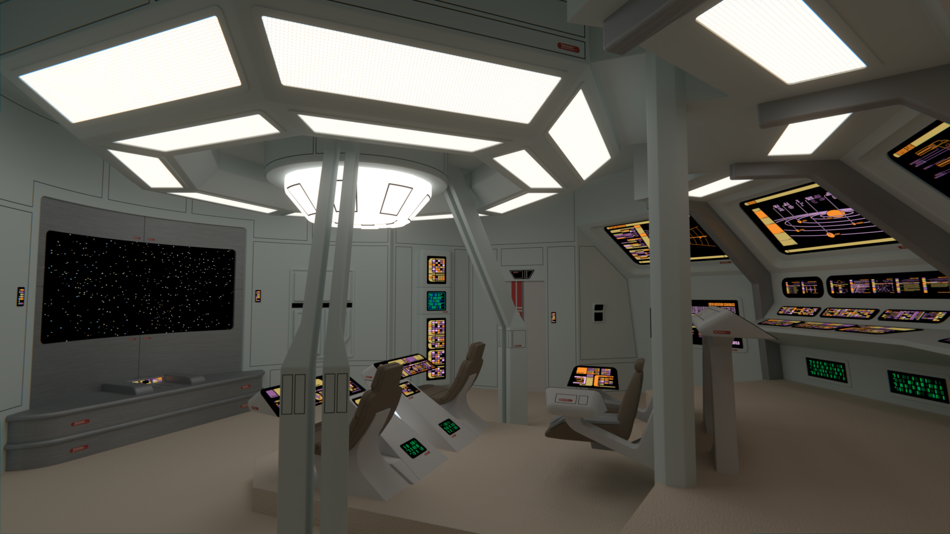
Regarding the viewscreen, I've added more details to that area and more are on the way, I hope you'll like it the more I add there.
Given
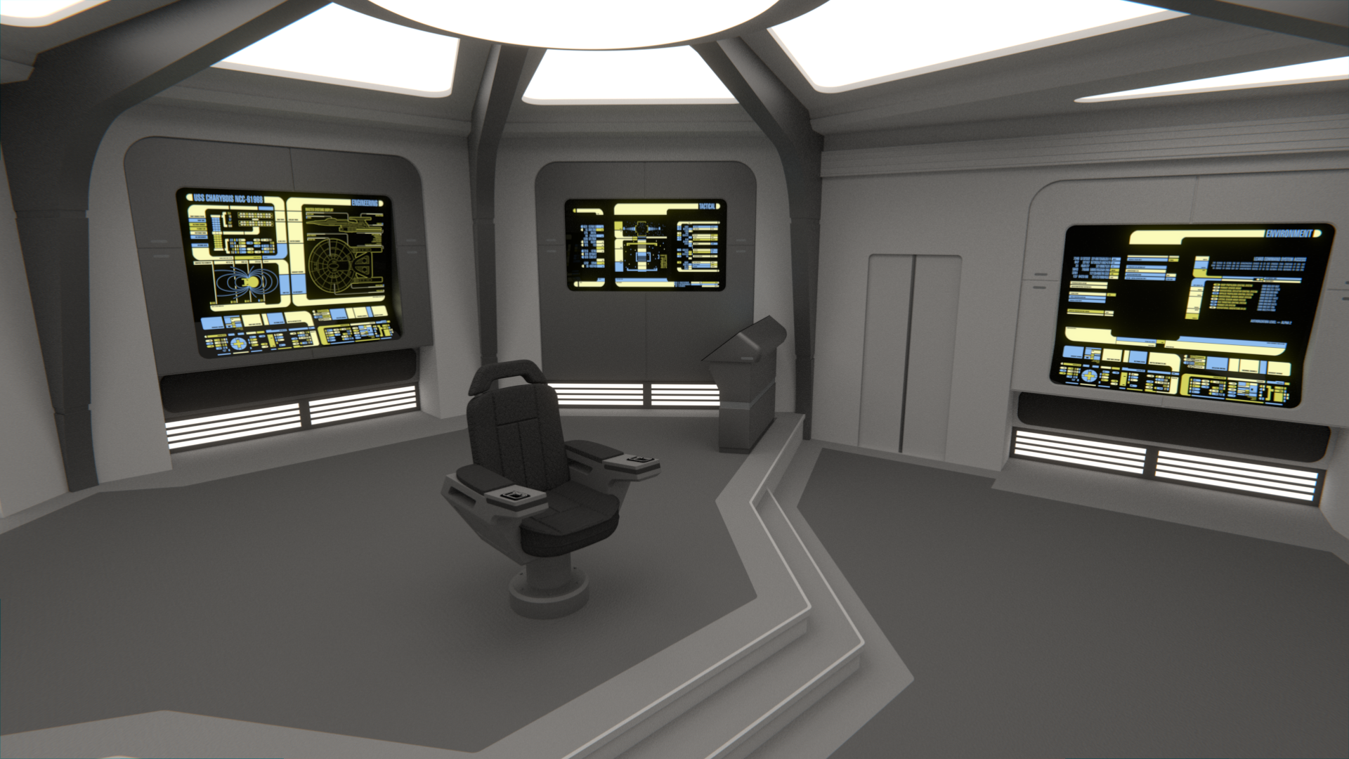
@BorgMan and
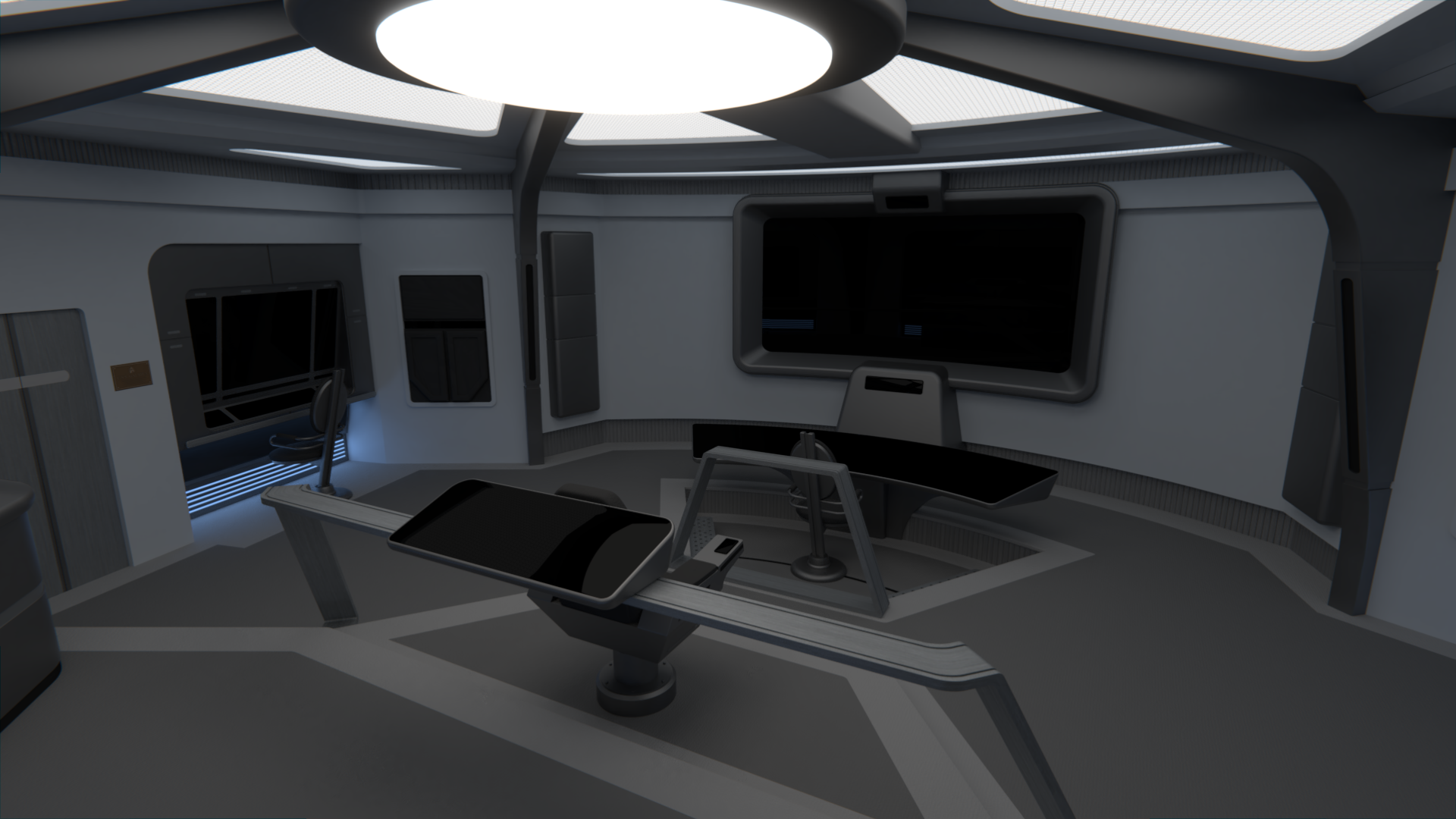
@The Librarian 's comments (and others on the other forums), I've changed the Tactical station to something larger (it now has more than one button!!) and a bit more similar in shape to the helm console. The viewscreen also got some love, it now has some blinking lights at the top and bottom (well, they don't blink yet
). I'll see about finishing up with the front area later today. The lights were also changed, all except the center light are now dimmer, while the ones closer to the viewscreen are dimmer still and a shade of blue. Oh, and there's a dedication plaque now.
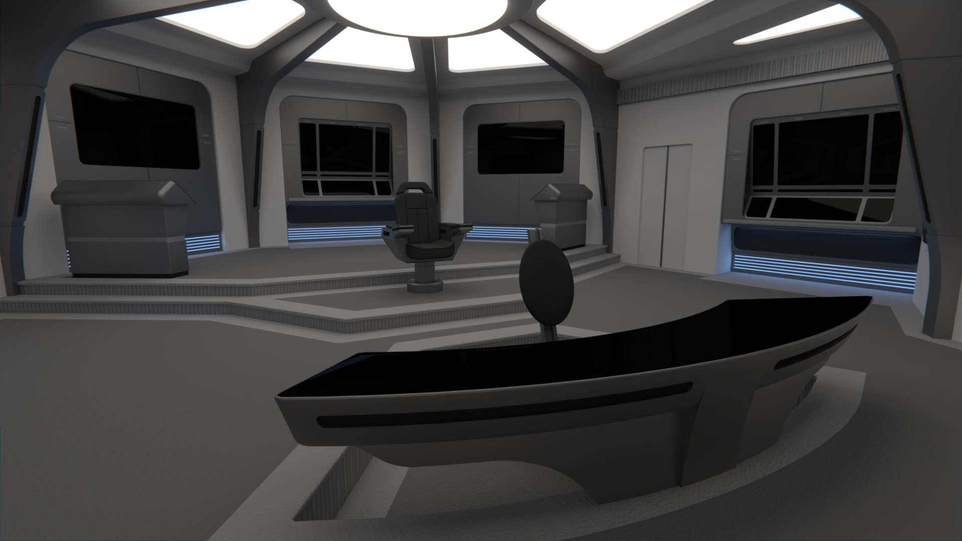
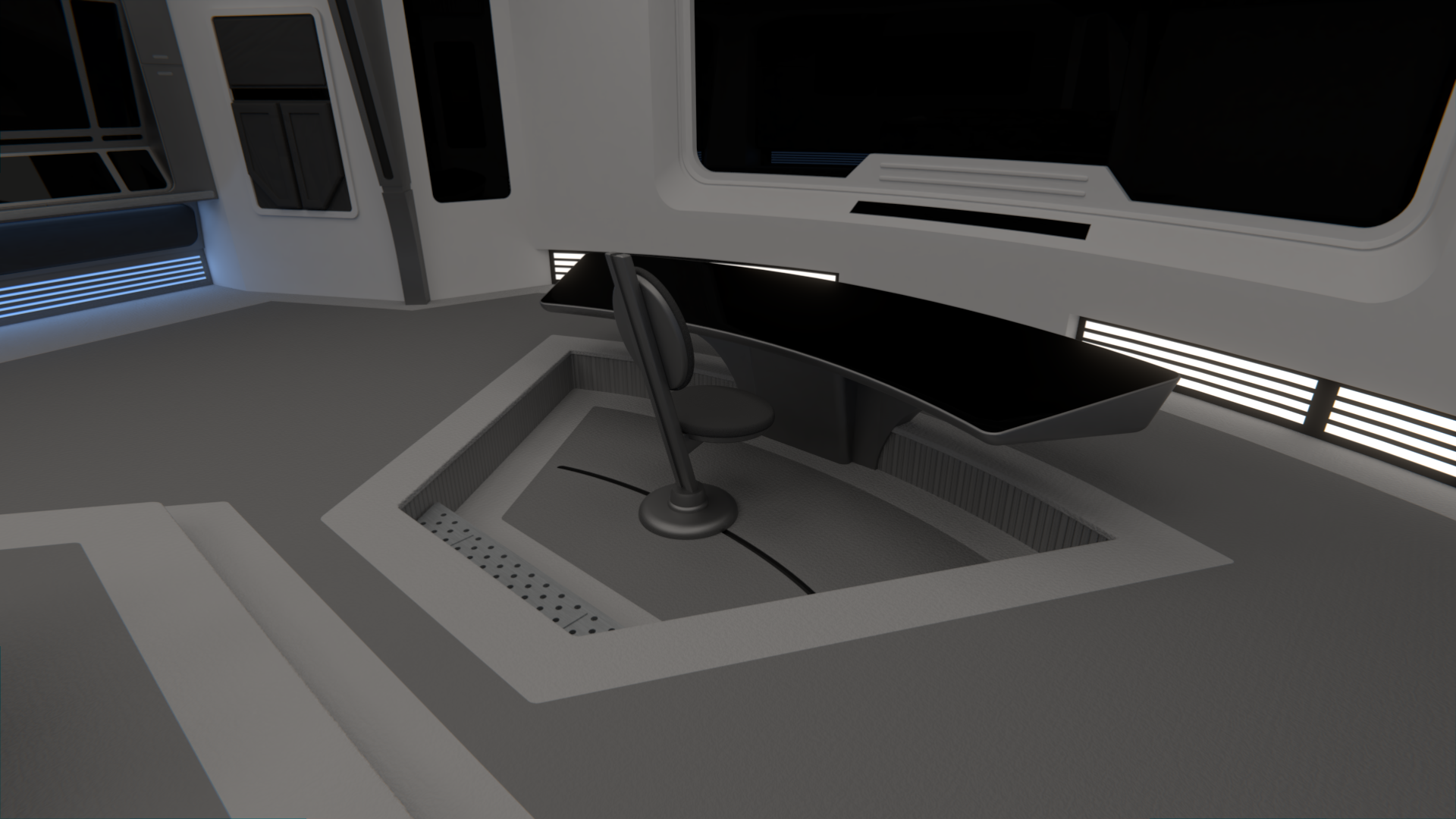
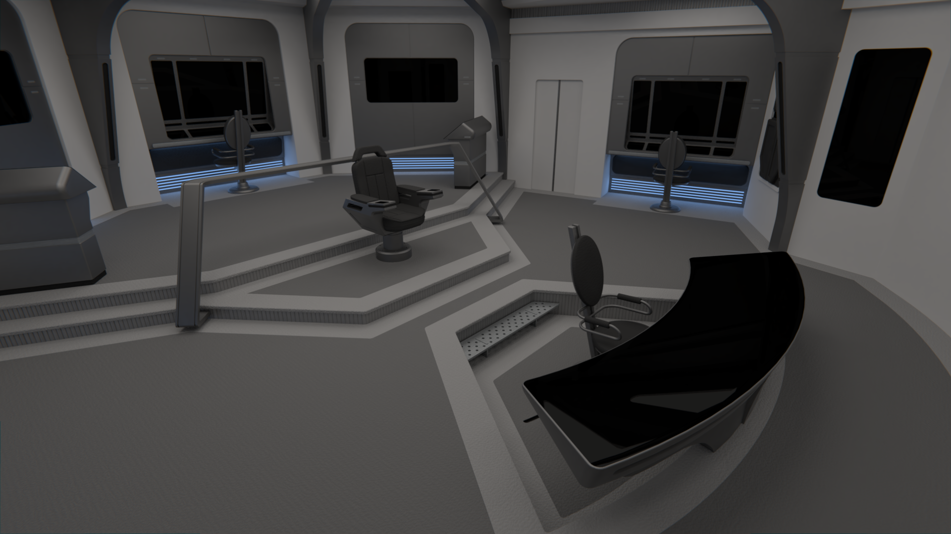
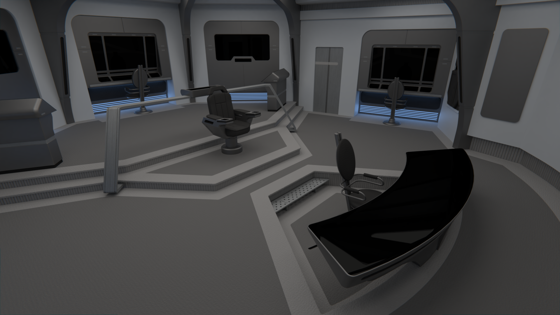
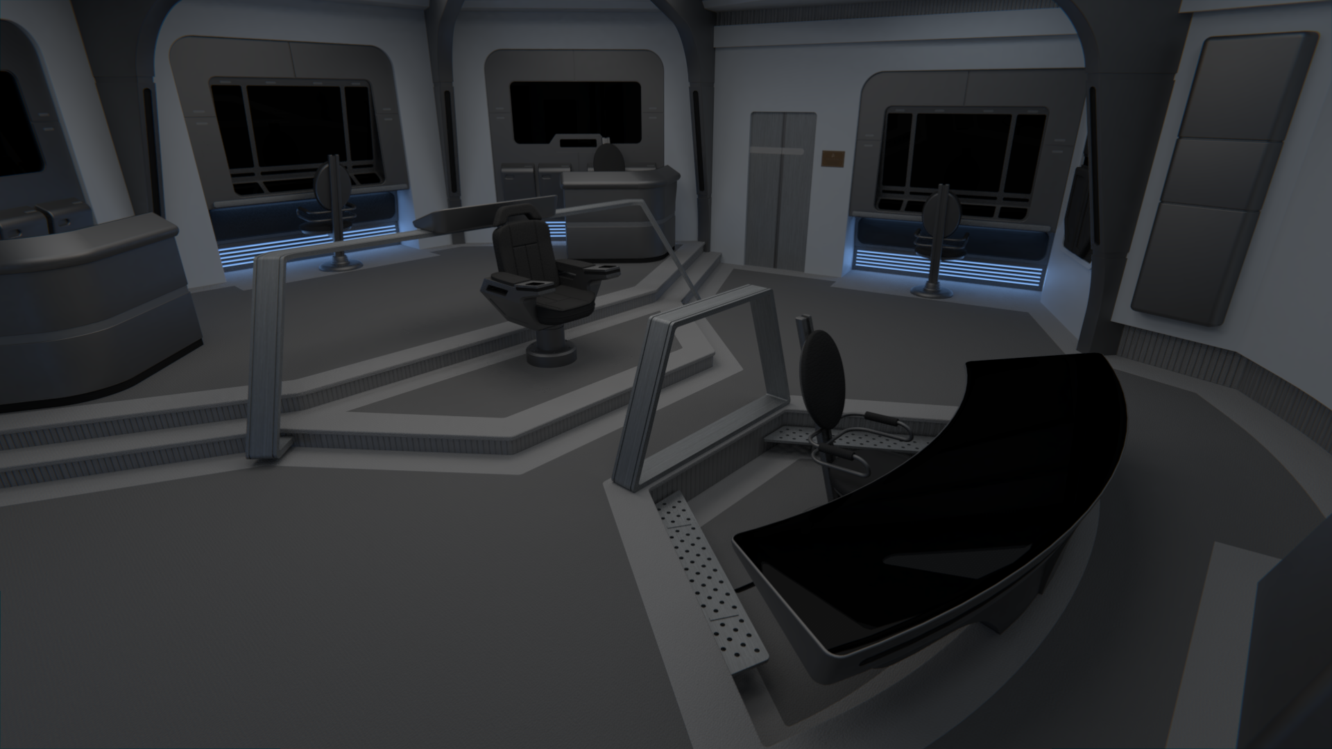
We've been talking a lot with my client about increasing the area between the Captain and Pilot a bit, and adding a bit of safety to it by adding a hand rail, as mentioned in a previous post. I've moved the step to the helm pit to the sides, and made the pit smaller to have some more space there, but we're not convinced about that handrail, maybe it would be best to just remove it. What do you all think? (just so you know, it doesn't hamper the Captain's view of the screen)

")