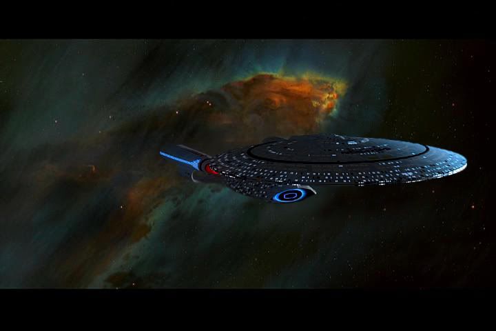
This is the ship I imagine as the Enterprise-E whenever I read the TNG novels now (which is rare).
http://www.trekbbs.com/showpost.php?p=9683923&postcount=1460
Designed by
Vektor.
That would have been miles above what we got.
^^Something along those lines would have been a better "movie upgrade" to the D. The problem with TNG's movie replacement ship was that it was a completely new and different ship. TOS's movie replacement did a credible job of pretending to be the original with a makeover.
Yup, I never considered the Refit Connie to be a different ship. It was the Enterprise of the series, but better.
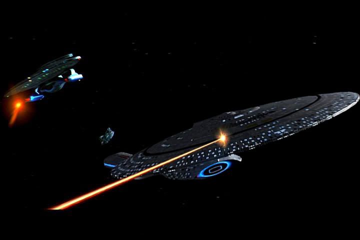
I do think the plating was overdone on the E, and the main dish is too small. Other than that, I think it's a huge improvement over the D, and the bussards with the lava-lamp effect in them are awesome.
I don't find the E sterile, but maybe too glamorous. The D was too much of a lumbering cruise-ship and the E is maybe too much of a sports-car. The sweet spot for the Enterprise is something in the middle, which is the refit.
I'm not sure if you mean the "AGT 3-Nacelled Refit" in which case I agree

E is a sports car in the sense that a Mazda Miata is a sports car. Both look "sporty" but still hideous.
One sure sign you have a weak design is that for it to look 'right' you have to put stripes or color panels on it. A ship should look good without any embellishment- an unpainted hull shape with only a single light striking it.
I think that puts the finger on why I never cared much for E-E. Other Enterprises (well TOS, A, and D) look good from almost any angle and there aren't a lot of distractions to taking in the overall design. "Grace" was always the word that came to my mind when I thought of the Enterprise's look. E is sleek, but does not have any grace. The nacelles don't work for me on the E, either.
I gotta say I like it better than B and C, however. They truly look cobbled together with odd proportions, and have no grace, either.
Mainly because it looked so different than the TOS Enterprise and A, it took me a while, but D grew on me over time because it had it's own style and grace, was simple in shape and detail, and looked good from a lot of angles.
I started hating the original TOS Enterprise. I thought it looked so rinky dink.
But I loved the refit in the movies! And this made the original grow on me.
I loved the D the moment I saw'er, it was love at first sight.
I didn't mind the Enterprise-E, but I felt it was unnecessary to destroy the Enterprise-D in Generations just to have a new ship in First Contact. The Enterprise-D could have been badly damaged in Generations, perhaps even losing an entire warp nacelle, and then brought back in the next movie as a new upgraded version with maybe sleeker nacelles & support pylons, and even another redesigned bridge.
I woudn't have played too much with the design. Making the nacelles a little more pointed and the saucer like 10% smaller would have done wonders for the design.
I don't know about you guys, but the Enterprise-E is ten times better than that mess of an Enterprise that is currently filling out theater screens. I honestly think the Abramsverse Enterprise is ugly...not the Enterprise-E.
I'll take the Abramsverse version over the 'E', everyday of the week and twice on Sunday.
Same here. I didn't immediately hate the Abramsprise. I thought it did a great job of respecting the original design, while modernizing what didn't work about the original, aesthetics wise.
It's lightyears ahead of the E. Not even a contest.
I'll take the Abramsverse version over the 'E', everyday of the week and twice on Sunday.
I also like the Abramsverse version of the
Enterprise....
Add me to the list that likes/prefers the Abramsverse Enterprise over the D or E.

I like the E over the D however. The D was the fat chick. The E was the hot chick.
I guess you could say my preference is:
1. Refit NCC-1701 (Star Trek I-III)
2. NCC-1701A (Star Trek IV-VI)
3. NCC-1701 (ST09-STID)
4. NCC-1701 (TOS)
5. NCC-1701-E (FC-NEM)
6. NCC-1701-B (GEN)
7. NX-01 (ENT)
8. NCC-1701-C (TNG)
9. NCC-1701-D (TNG-GEN)
The D was the fat chick and the E the hot chick?

More like the D was like one of those wrestlers who weren't tremendously ripped, but they were big and you'd best stay out of their way.
Enterprise E is like Japan designed it to look like a metal praying mantis. That's what it looks like to me.

I think the D's "small" nacelles help in this regard, too. Just like in photos of archaeologist's finds, you'll see a hammer, or some such familiar item, next to the object, to give it scale. So it was with the D: we were accustomed to the original Enterprise's nacelles, so the "smaller" ones (proportionally) lead us to seeing a bigger ship.
Exactly. This is probably the major reason why I have "believability" problems with both the
Enterprise-C (Rick Sternbach design) and the Abramsprise, the warp nacelles are way too big.
In one of the closed
Enterprise-C threads I had to provide an illustration featuring side views of both the Probert-C and the Sternbach-C.
Just for fun,
I reduced the Sternbach-C in size to match the height of its warp nacelles with the Probert ones. The "believability" factor increased, IMHO.
Bob
I have no idea of whatever fight you guys are having over this. I agree that Probert design looks fucking kick ass!
The "canon" Rick Sternback design looks like it was built out of legos.
Sorry Rick, Probert beat you on this one.
See, the trouble there is that the 'laid-back-ness' was a crucial part of The Next Generation's charm.
Which, IMHO, works best on TV and not in big-budget films. I'm not saying films have to be JJ-esque thrill-rides, but really, a lot of TNG was very quiet, slow-moving, and dull overall. IMHO,
There are probably only about a dozen or so really standout TNG episodes. The rest have some charming signature moments here and there but are surrounded by a lot of padding. Works in a casual TV watching environment but not as well accepted when you plunked down a lot of money on tickets and popcorn and you're rooted in your seat.
Perhaps the best decision would have been not to even try to transition TNG into films. I really think a lot of the politics of doing that was driven by Paramount just feeling like a Trek movie had to keep being pumped out every 2 years like clockwork.
Or how about, you know, doing a movie story that rivaled one of those really really good dozen episodes in the series?
I feel what TNG lacked was due to it being a series pre-CGI, and therefore very expensive to do quality FX work for it.
This is what I feel held TNG back (DS9 and VOY got to flex that CGI muscle once it became available)
TNG could have reaped the same benefits in their movies.
Just drop it already, good grief, no one cares.
It's not that I think no one cares. But I'm tired of seeing it pop up in seemingly every thread
Robert Comsol takes part in. Somehow it all ends up back at the
Enterprise-C.

For the record, that Probert Enterprise C is seriously cool. A true sister to the D.
I like the green one miles better, it looks like a successor to the B whilst being a precursor to the D perfectly. The top one looks like a stumpy toy to me.
It looks like it's built out of legos, or k'nex.
[
On a more general note, while I agree that the way the crew (and, incidentally, the filmmaker, as well) treats the ship is of paramount importance to the concept of succesfully making the ship 'another character', I have to say that this entire discussion of different ship designs having 'character' or 'soul' in and of themselves is pure bunk. Every post I see about this concept basically boils down to 'I just didn't like this design'. That's not 'bad design', it's plain old personal preference.
Well, to discuss your latter point (and not just because I'm one of those posters you're talking about!), I bring up the Stargazer as an example. I *think* within the show the Constellation is regarded as a non-too-elegant design, and even Picard confesses that the class and the Stargazer itself are not sleek, efficient, even favorable designs anyway. But Picard told Scotty that sometimes, if he could, he'd trade the E-D for the Stargazer because of that sentimental value. There's no accounting for taste, but it can be separate from personal preference of ship. Indeed, Scotty clearly much preferred the TOS bridge rather than its arguably more streamlined, uniformed, and more advanced movie incarnations. The Stargazer and the TOS Enterprise were the ships where Picard and Scotty cut their teeth with, much in the same way that a viewer connects with a particular ship if they watch for a long period of time.
Saying the design isn't 'sleek' isn't necessarily a value judgement - it's just a description. It's just as easy to value 'non-sleekness' as it is to value 'sleekness'. Saying it's inefficient is an in-universe judgement of its effectiveness at doing what it was designed for - something a man who captained it for decades would have to be honest about. Neither is really very connected to the question of what type of design someone prefers aesthetically. (I really have no idea what is mean by a 'favorable' design)
Ultimately, though, my point wasn't about people having personal preferences for one ship over another. Certainly, that's true, but I was talking about the fact that people have personal preferences for certain styles of design over others. That's all these posts about 'character' and 'soul' are - one person just doesn't like a particular type of design and so, even on first glance before the show has had any chance to build up the ship as a character, feels like that design has no 'soul' or 'character'. If the show is particularly effective at making people feel for the crew and making the crew feel for the ship, then many people eventually get over it. If not, you're left with two groups divided solely over the fact that they just like different styles.
People are fine for liking what they like. I personally think it's absolutely retarded to destroy the design of a ship than is an integral part of a series, and replace it with this unknown bastard thing.
It might have been easier to swallow if the new design was good.
If some people liked the E more than the D, I guess they benefited then.
")


 As Timby correctly pointed out earlier in this thread, there's a propensity towards too many angles in the design, "too much going on" as they say, even in the design as it was seen in First Contact. Things like those notches/alcoves/whatever in the sides of the saucer nacelle don't strike me as the design being 'clever', more an example of where it looks far too over-designed.
")