The U. Oregon Ducks called: they want their flag back.
-
Welcome! The TrekBBS is the number one place to chat about Star Trek with like-minded fans.
If you are not already a member then please register an account and join in the discussion!
You are using an out of date browser. It may not display this or other websites correctly.
You should upgrade or use an alternative browser.
You should upgrade or use an alternative browser.
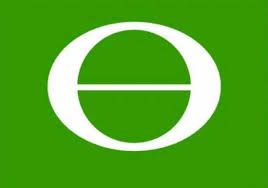
Earth Flag
- Thread starter TheWelshPirate
- Start date
The U. Oregon Ducks called: they want their flag back.


Ok. That is just ugly.
A graphic designer redid all the flags last year.
I like 'em.
The blue flag with the seals and the state name are usually ranked towards the bottom of the vexillologists' rankings.
Don't care for the California one. Where's the bear?
Ok. That is just ugly.
A graphic designer redid all the flags last year.
I like 'em.
The blue flag with the seals and the state name are usually ranked towards the bottom of the vexillologists' rankings.
Man, I never realized how sad state flags are.
WASHINGTON: WASHINGTON ON A FLAG!
could be more original y/n
Simply put: No.
We already use those colors (sans revision)—in the American flag. We're also already symbolized as being in rank and file with the other states, as a star in the American flag. We fly our flag below the American flag. Further normalization is both redundant and distasteful.
At least there is something manifestly Kentuckian on our flag as it is. While this artist (he or she speaks in the first person, but where the hell is the artist's name, anyway?!?) at least attempted to abstract the seal, there is literally nothing about the flag design that is intrinsically Kentuckian. On that account, it may as well have come from a Cracker Jack box.
As for experts ranking our flag near the bottom, I suppose that if the flags were all improved, there wouldn't be any flags ranking at the bottom anymore?
We already use those colors (sans revision)—in the American flag. We're also already symbolized as being in rank and file with the other states, as a star in the American flag. We fly our flag below the American flag. Further normalization is both redundant and distasteful.
I mostly agree. While I think many if not most state flags could use a redesign, especially the ones that are simply the state seal on a plain background, these just don't work. Restricting them to a few simple shapes and the same three colors robs them of any kind of individuality or identity. Not to mention it causes them to all blend together and be entirely forgettable.
Unity through diversity is the ideal that America has always tried to strive for, and that should be present in its flags. The Star-Spangled Banner is what represents our unity, so the state flags should be diverse as possible. The should be a proud representation of the unique "flavor" of that particular state. Not just variations of stars, stripes, and triangles in red, white, and blue.
I recently designed ranks and insignia for the Defense Forces of a united Earth and just decided to use the UN flag. My guess is that that will be the flag for Earth.
http://s429.photobucket.com/user/Michaelus1971/media/General/United Earth/unflag.gif.html
http://s429.photobucket.com/user/Michaelus1971/media/General/United Earth/unflag.gif.html
A graphic designer redid all the flags last year.
I like 'em.
The blue flag with the seals and the state name are usually ranked towards the bottom of the vexillologists' rankings.
I think many Texans would be pissed
I generally like the designs, but I could live with more colours.Ok. That is just ugly.
A graphic designer redid all the flags last year.
I like 'em..
A lot of them are very well designed, but a flag is more than just a good design. I imagine the designer doesn't have much of an attachment to many of the states he was redesigning flags for, and it shows.I generally like the designs, but I could live with more colours.Ok. That is just ugly.
A graphic designer redid all the flags last year.
I like 'em..
Take his California flag for example, he chose to represent the state with a curve for the coastal highways over say, the bear that is already on the flag, or the gold rush, or the mountains, redwoods, agriculture, or any number of things that Californians are far more attached to than a nice road. Beside that, the C is just lazy.
I don't care for the nautical symbol for Massachusetts. I grew up in a part of Massachusetts where the ocean is over an hour away, and still nearly an hour from the New York border.
Nautical lifestyle is nonexistent where I grew up and even where I am now.
Nautical lifestyle is nonexistent where I grew up and even where I am now.
I imagine the designer doesn't have much of an attachment to many of the states he was redesigning flags for, and it shows.
I think this nails it.
Unlike most flags it's reverse side is different (image of a beaver), not just a repeat of the front.And I wasn't just talking about our national flag, but also our state flags. For example, I grew up in Oregon, so my state flag looked like this:

Oh, and the redesigned flag of Washington State looks like shit.
An eagles head for George Washington? How? If it has to be changed, a outline of a evergreen tree might work, not sure of the background color. Best just leave the father of our country on the flag.
The Western half anyway.The green of the flag is from Washington being the "Evergreen State" ... And if you've ever hung out there... It is plenty green.
")
The Western half anyway.The green of the flag is from Washington being the "Evergreen State" ... And if you've ever hung out there... It is plenty green.
Yeah, the half with people in it!
I kid, I kid...
My current state, Oregon, is even worse... outside of Portland and Salem, I think there are more cows than people in the other three quarters of the place!
We should ask the cows what they think of these flags...
--Alex
Boring. Those designs look like generic graphic symbols from a clip-art book.
And speaking as a native Californian, I say: The bear rules!


Hey, I... well, you just...My current state, Oregon, is even worse... outside of Portland and Salem, I think there are more cows than people in the other three quarters of the place!
We should ask the cows what they think of these flags...
I can't really argue with you. And I'm even from the eastern side of Oregon.
Similar threads
- Replies
- 4
- Views
- 393
- Replies
- 2
- Views
- 524
- Replies
- 40
- Views
- 1K
If you are not already a member then please register an account and join in the discussion!