I was just reading this thread here: http://www.trekbbs.com/showthread.php?t=236215
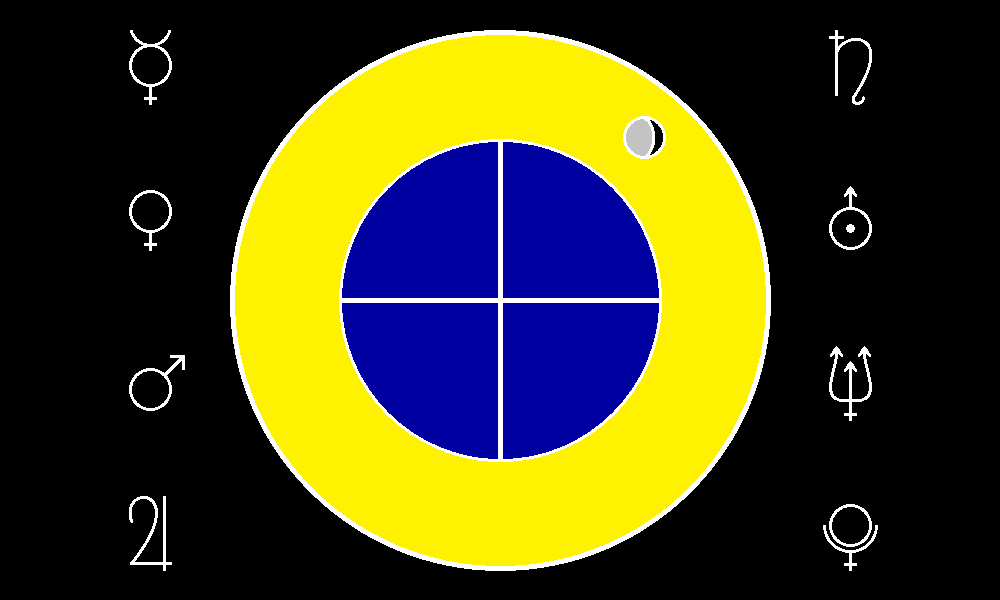
and I thought I'd take the general idea and design my own flag for Earth.
http://welshpirate1138.deviantart.com/art/EarthFlag-431538179
and I thought I'd take the general idea and design my own flag for Earth.
http://welshpirate1138.deviantart.com/art/EarthFlag-431538179
Last edited:
")

")


 Of the US state flags, the only ones that can be saved are Texas, Alabama, and maybe New Mexico. A couple can be reworked into something bearable with a few changes (Colorado has promise, and Alaska is cool in concept).