-
Welcome! The TrekBBS is the number one place to chat about Star Trek with like-minded fans.
If you are not already a member then please register an account and join in the discussion!
You are using an out of date browser. It may not display this or other websites correctly.
You should upgrade or use an alternative browser.
You should upgrade or use an alternative browser.
Design the Next Enterprise
- Thread starter Shikarnov
- Start date

Looks kinda awkward in a couple of angles, but I guess they all do.
Which angles? They all look good to me.
The front view feels weird, mostly the shape of the neck "inside" the hood.. and then the bottom view, it just feels like the saucer should be wider
But I dunno, after an hour or so to reflect, they're alright.
By the way, be on the lookout for Logan to post a link to the higher rez ortho - he tried once but the link iz broken
")
Really weird for me but the more I see of this ship, the more I love it. However this makes me not want to visit the STO boards too much atm, as there's one poster whose really getting on my wick currently.
Really weird for me but the more I see of this ship, the more I love it. However this makes me not want to visit the STO boards too much atm, as there's one poster whose really getting on my wick currently.
I know what you mean, but you can do this:
Click on his name, then on his public profile link, there will be a link to "Add to Buddy List" and beside it "Add to Ignore list"
It works
See, I try not to do that on forums, but I have to admit it's getting close over there.

I like it...better that the two letters that proceeded it.
Would love to see a high-poly count version though.
Now that there are some orthos, I'm sure someone will get to it. Are there any higher res versions than the one posted here? Kind of too small to do an accurate version, but enough for a start, I guess.
Capnlogan tried to link the supersized ones, but he put up the private link to his dropbox instead, so he should post the right link tomorrow:
http://forums.startrekonline.com/showpost.php?p=3663324&postcount=389
Just keep an eye on that thread, or the dev tracker, or I am sure someone will post em here
We have orthos:

I really prefer this color scheme.
Pretty Ship Hopefully we see Plastic toys and such soon
^ Oh I'm so with you there. She really does look swooshable, if you know what I mean. And I haven't gotten a Micro Machines or anything like that in ages.
Its to bad that not all of the STO designs look so good or well polished, otherwise they could probably market entire sets.
Its to bad that not all of the STO designs look so good or well polished, otherwise they could probably market entire sets.
We now have giant orthos: http://dl.dropbox.com/u/29303569/ENT_F/Ship_Fed_FC5F_Type1_Compilation.jpg
Jumbo Sized!

Edit: Foiled again!
Edit: Foiled again!
Foiled again!
Apparently I'm just slightly more obsessive with the F5 key than you are

Foiled again!
Apparently I'm just slightly more obsessive with the F5 key than you are
I had JUST refreshed to see if anyone had posted it yet.
So.. any idea what the little square with the dimple in the middle of the deflector is?
Also, I always though the rough design looked better with a wide saucer (if not close to completley round)
Opinions on this?

(pardon the hatchet job, I am no photoshop savant)
2nd edit: I just realized that with the wider saucer and a non-split neck, its close to what was in my head for my own DTNE entry, the Legoprise. Well, other than the nacelle orientation, of course.
Last edited:
The top/bottom views look WAY too much like the Intrepid class. They should have made the saucer round.
I don't think they captured the presence of Adam's original sketch.
I dunno..
http://www.ex-astris-scientia.org/scans/drex/intrepid-cgi-views.jpg
I guess the engineering hull from the top has the same design, but the saucher shapes are'nt that close, nor the nacelles or pylons.
I def. would prefer the wider saucer still, though.
Really weird for me but the more I see of this ship, the more I love it. However this makes me not want to visit the STO boards too much atm, as there's one poster whose really getting on my wick currently.
I hope it's not me. No Seriously.
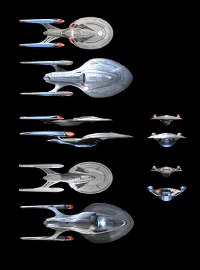
Just in case anyone wanted to see a side by side of the Enterprises E and F I did one up. The scale I used is exactly as it is in my original concept sketch. Which with the Sovereign being 687.5m brings the Odyssey in at 820-825m in length. Here it is.

I hope it's not me. No Seriously.
It's Richardson I'm sure.
 :rolleyes:") Statistically speaking, there was always going to be a "Richardson." That's the internet for you.
Statistically speaking, there was always going to be a "Richardson." That's the internet for you.I'm pretty blown away that CapnLogan would engage with him directly.
Congratulations btw
I really like the changes, but they definitely kept her "soul" so to speak Do you have a color scheme preference?
I hope it's not me. No Seriously.
It's Richardson I'm sure.
I'm pretty blown away that CapnLogan would engage with him directly.
Congratulations btw
Do you have a color scheme preference?
Hey Fuzzy,
Thanks again man. I was kind of thinking it was, I have let him know what I think of his critiques of Capnlogan's design sense, in a way that borders on flaming, but thinly veiled insults are still insults.
I have to say I watched the vid on Youtube and I am a fan of your design as well, One of these days i will finish my Cetea Class version, so everyone can see what I saw in my mind as I did the concept.
Not sure if you have ever seen my early sketches, but i actually had a few ideas similar to yours although yours had a sleekness I just didn't hit so I went another direction. Check of the 3rd, 4th, and 7th images. just goes to show great minds think alike.
As for the colors, I am undecided, I think I like the cleaner look.
Similar threads
- Replies
- 5
- Views
- 878
- Replies
- 5
- Views
- 3K
- Replies
- 3
- Views
- 5K
If you are not already a member then please register an account and join in the discussion!