Agreed. That's an effective shot.One instance where the digital FX artists got it right, IMO, was the picnic scene in “The Cage”/“The Menagerie.” In the original, the city of Mojave in the distance is obviously a painted backdrop. The remastered version subtly blends the background art with the foreground action without radically altering the overall look of the scene.

-
Welcome! The TrekBBS is the number one place to chat about Star Trek with like-minded fans.
If you are not already a member then please register an account and join in the discussion!
You are using an out of date browser. It may not display this or other websites correctly.
You should upgrade or use an alternative browser.
You should upgrade or use an alternative browser.
TOS-R question...
- Thread starter Warped9
- Start date
Almost all of their matte shots were that good.
Which really confused me. They were so faithful to TOS when dealing with the matte shots, yet they screwed the pooch on many of the space scenes.
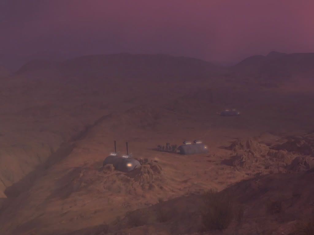
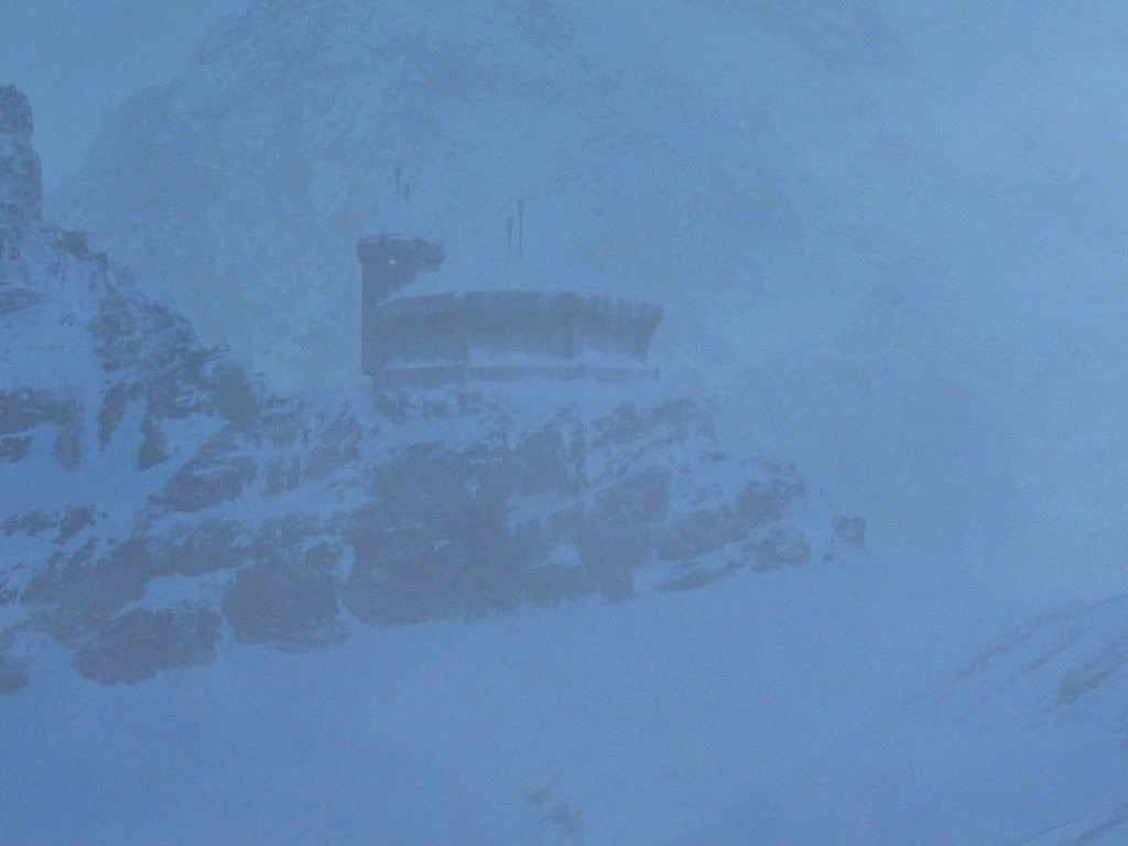
^^ The top one isn't bad even though it's quite a departure from what we saw. Not bad, though, and it still manages to look like something we could have seen in TOS.
The bottom one is okay, but somehow it doesn't work as well even though they remained faithful to the habitat's original design. I think they broadened the image more than it needed to be as there wasn't really anything wrong with the original.
The bottom one is okay, but somehow it doesn't work as well even though they remained faithful to the habitat's original design. I think they broadened the image more than it needed to be as there wasn't really anything wrong with the original.
And this one from Mudd's Women is very reminiscent to me of TNG's Coming of Age, though not in the best way.
This was damn near perfect - the episode needed something like this to give it some scope.
As with most all of the matte work, it is a nice perspective, and does indeed add scope. The similarity to the TNG shot may be seen only by me, and was more to do with the overall color and the general shape of the buildings. Still a nice addition though ")
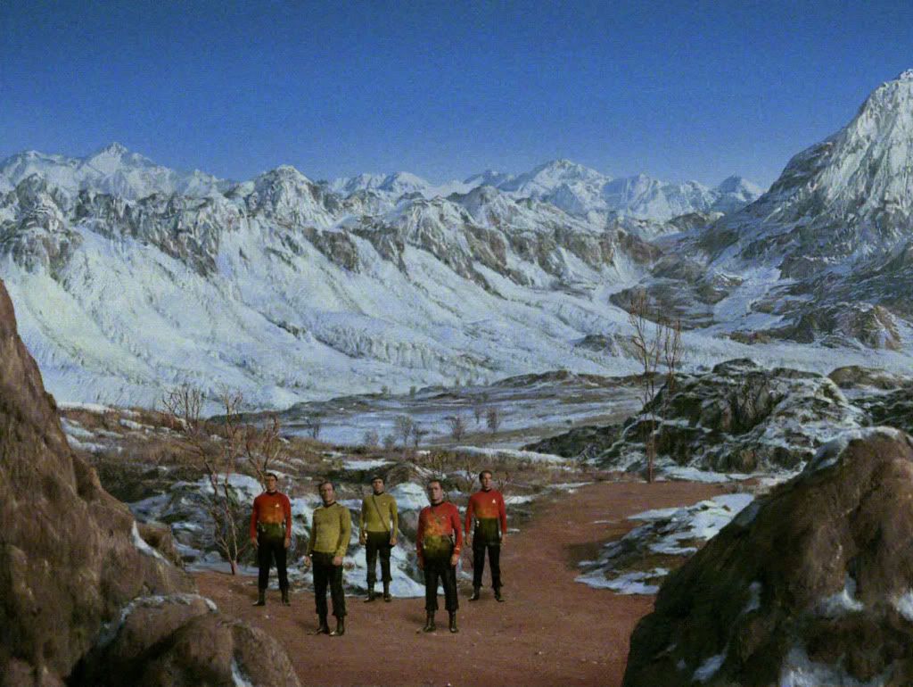
Here's another, from The Naked Time, this time, which also provides a great sense of place:
Here's another, from The Naked Time, this time, which also provides a great sense of place:
As with most all of the matte work, it is a nice perspective, and does indeed add scope. The similarity to the TNG shot may be seen only by me, and was more to do with the overall color and the general shape of the buildings. Still a nice addition though
Here's another, from The Naked Time, this time, which also provides a great sense of place:
This shot looked way too modern for me. Reminds me of Batman Begins where the League of Shadows was located.
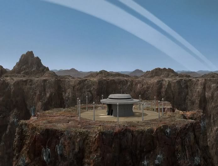
One of the more inventive matte painting extensions for TOS-R from Spock's Brain. Most of these types of enhancements were rather tastefully done and really do help to open up the planet exteriors in establishing shots
It's funny how those mountains disappear in the next shot.
No matter how spectacular the new fx are, putting them into a sixties tv show is pure rape!
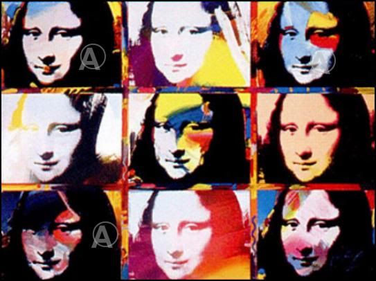
Hey, while we're at it ... let's put some new colours onto the Mona Lisa, the old paint Da Vinci was using just isn't up to modern standards ... :rolleyes:")
Hey, while we're at it ... let's put some new colours onto the Mona Lisa, the old paint Da Vinci was using just isn't up to modern standards ...
No matter how spectacular the new fx are, putting them into a sixties tv show is pure rape!
Overstating it a bit, perhaps?

Hey, while we're at it ... let's put some new colours onto the Mona Lisa, the old paint Da Vinci was using just isn't up to modern standards ...
Already been done. This Peter Max sells for $10,000 (plus $22.05 additional shipping) I personally wouldn't buy it, and I'm thankful the original is still around, just like TOS.
This is one of my favorites actually. The design is totally TOS and it looks like location footage.Here's another, from The Naked Time, this time, which also provides a great sense of place:
No matter how spectacular the new fx are, putting them into a sixties tv show is pure rape!
Don't guess you've been raped.
Hey, while we're at it ... let's put some new colours onto the Mona Lisa, the old paint Da Vinci was using just isn't up to modern standards ...
As has been pointed out, every kind of bloody thing has been done to copies of the Mona Lisa in the name of art and commerce. That's exactly what was done to copies of these less-than-Da-Vinci-quality episodes of an old TV series.
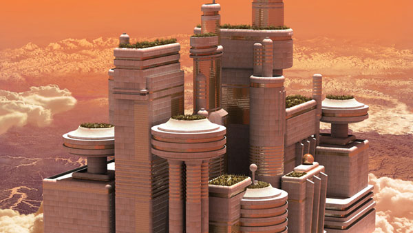
I also like the new, detailed views of the sky city that we see in "The Cloud Minders." The people of Stratos are obviously big fans of 1930s Streamline Moderne.
Beautiful.
The look of the buildings appears to have been partially inspired by the General Motors “Futurama” exhibit at the 1939 New York World’s Fair.

One instance where the digital FX artists got it right, IMO, was the picnic scene in “The Cage”/“The Menagerie.” In the original, the city of Mojave in the distance is obviously a painted backdrop. The remastered version subtly blends the background art with the foreground action without radically altering the overall look of the scene.
I agree that the new mattes are the best part of the revised episodes, but to me, this example was unnecessary. The original looked fine, and the new one is so subtle that I didn't even notice it the first time I watched it. Obviously, the city looks different, but the original looked fine, and horizon between the set and the matte look believable on the original. The new one looks beautiful, too, but it doesn't improve this shot for me.
Doug
I wasn't crazy about The Cloud Minders matte. It's like the Vulcan mattes in TMP E. Nothing wrong with them as such, they just look a little TOO modern. The beauty of the other mattes given as examples is that they still have that 1960's feel to them.
Plus it looks very Bespin. Hard to avoid under the circumstances, I know.
E. Nothing wrong with them as such, they just look a little TOO modern. The beauty of the other mattes given as examples is that they still have that 1960's feel to them.Plus it looks very Bespin. Hard to avoid under the circumstances, I know.
Similar threads
- Replies
- 3
- Views
- 2K
- Replies
- 75
- Views
- 6K
- Replies
- 11
- Views
- 2K
- Replies
- 32
- Views
- 2K
If you are not already a member then please register an account and join in the discussion!