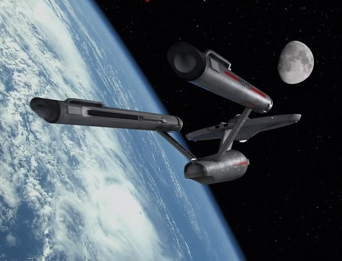
This is exactly how people react though...not "well its better because it looks sharper, has more detail and fits better with the alien's concept, and was lit better"...it's "well the original didn't need changing, it looked just fine, because that's how the designers meant it to look", and "smooth is better" (ignoring 40 years of real space design and advancing production techniques in scifi), "no the traveling mattes were meant to look that way". Because in fact...they can't look better, they never will. It will never look sharper or better lit, or more detailed or anything. It just won't, because of technical advancements that make a very technical area of filming TV better. I also think a melding of design sense...combining 60s sensibilities with modern concepts and 40 years of design improvements make for worthy successors to the originals. This is where the quibbles are worst...but I don't see one case where the new ships don't look better. Even so, the creators (or re-creators) take careful effort in making them appear like they might have come from the 1960s. I give them all credit for NOT making them look like NuBSG.
RAMA
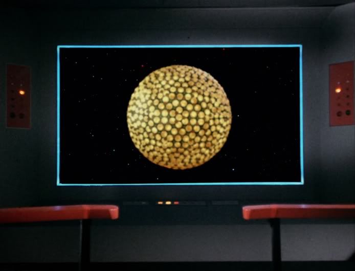
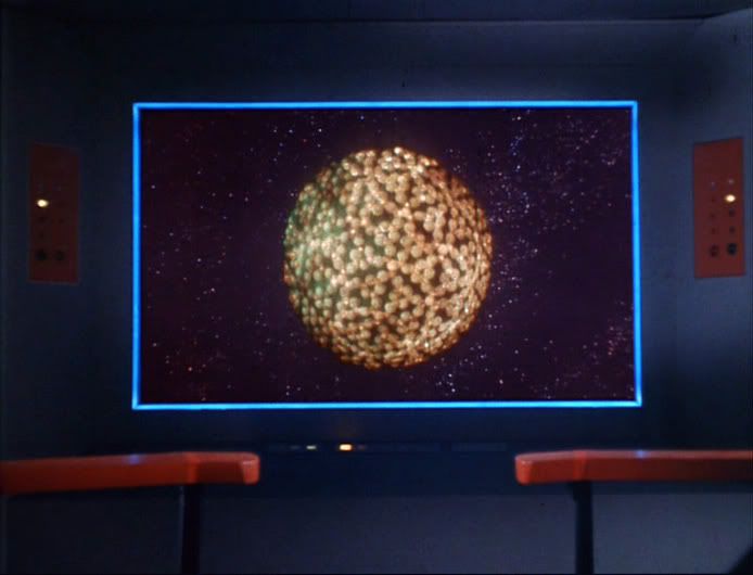
They could've simply used the original design. How do we know that the smoothness of the Tholian vessel wasn't intentional? You call it a block of wood but it could've been someone's attempt to give us something truly alien.
Changing something for the sake of changing it is usually a fool's mission.
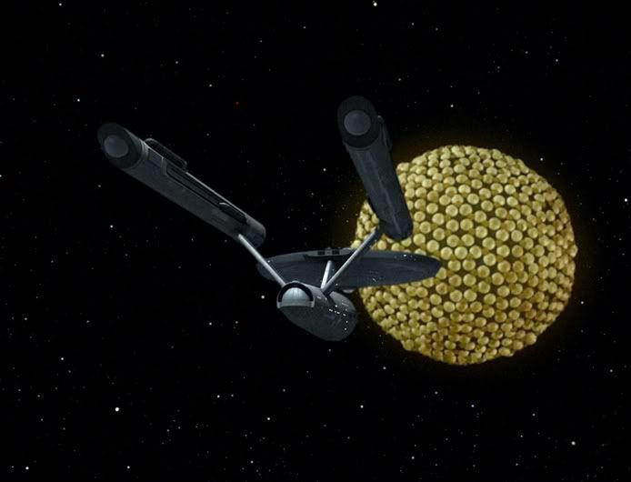
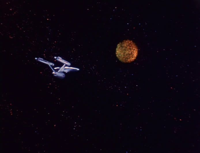
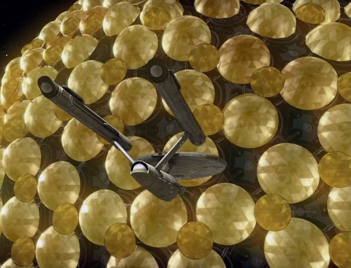
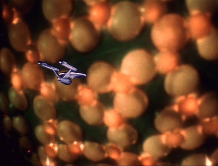
 Do they look like objects? Yes, and they move better and have better lighting and matting which makes them appear more real than the 1960s FX. I never saw one TOS-R ship that stuttered across the frame or had a matte wink out..making them more convincing.

 when I see one of the new shots because to my eye it just doesn't look right. I didn't say it looked bad, I'm saying it doesn't look right. There is a distinction.
 :rolleyes:")