• Welcome! The TrekBBS is the number one place to chat about Star Trek with like-minded fans.
    If you are not already a member then please register an account and join in the discussion!

Design the Next Enterprise

RoJoHen, Thanks. :D

Ihlecreations, here's the "vaguely polished rough" I made. From umpteen angles. :D

Screenshot2011-05-06at011904.png


Screenshot2011-05-06at011930.png


Screenshot2011-05-06at012232.png


Screenshot2011-05-06at012311.png


Screenshot2011-05-06at012341.png


Screenshot2011-05-06at012416.png


Screenshot2011-05-06at012455.png


Just a quick q...had you worked out a way for the Pylons to go "straight" (Perpendicular with the flow of the ship" or are they supposed to curl around? Personally I'd prefer a straight on version myself. :p
 
Wow, let the bashing begin.

Please listen to me when I say this, because it's really hard right now:

I'm really glad you won. They made a good choice. Your design is original. If they went with something safe (a sovereign clone) it would have killed me, because we were told to push boundaries.

Remember that negativity is louder than acceptance, and for every one person who attacks it, another hundred will love it and say nothing. That's the internet.

Good luck to you sir. I'd say that I don't envy you, but that would be a filthy lie.
 
If you are referring to the saucer pylons, I would guess that the saucer has a straight edge at the connection points parallel with the secondary hull. (So the saucer is not perfectly rounded when seen from above) Also, I am guessing (based on the isometric line drawing, not the silhouette) your pylons are too wide judging by your side view.
 
RoJoHen, Thanks. :D

Ihlecreations, here's the "vaguely polished rough" I made. From umpteen angles. :D

Screenshot2011-05-06at011904.png


Screenshot2011-05-06at011930.png


Screenshot2011-05-06at012232.png


Screenshot2011-05-06at012311.png


Screenshot2011-05-06at012341.png


Screenshot2011-05-06at012416.png


Screenshot2011-05-06at012455.png


Just a quick q...had you worked out a way for the Pylons to go "straight" (Perpendicular with the flow of the ship" or are they supposed to curl around? Personally I'd prefer a straight on version myself. :p

Wow that is real close, when I get back home, i am out of town ATM I will do some orthos, and I will put a little more effort to them :) kidding kidding. Fuzzy your design was great and it should have been a finalist but please remember it was just one contest and don't take it so hard.
 
please remember it was just one contest

I can take hearing this from anyone but you. As the winner, you have to take this seriously. Please don't trivialize it. I need to believe it means as much to you as it would have meant to me.

I do take this seriously, hell I am still in shock. And to be honest while I am trying to be modest I am jumping up and down on the inside. It means ALOT to me, I have been a designer for 15 years now and this is by far the coolest thing that could have happened to this here Trekkie.
 
I do take this seriously, hell I am still in shock. And to be honest while I am trying to be modest I am jumping up and down on the inside. It means ALOT to me, I have been a designer for 15 years now and this is by far the coolest thing that could have happened to this here Trekkie.

Good! That's more like it!...

...I've been staring at the smiley emoticons on the right for like, 5 minutes. There is absolutely nothing appropriate. Just take it in the most positive way you can...

... oh wait! This guy will work: :bolian:

lets try it out:
That's more like it!... :bolian:

Perfect ;)

I'm loosing it...

...gotta get outdoors...

[edit] Before I go... like, fucking camping or something... I did want to say that I emailed Cryptic and they emailed me back. To summarize, some of them liked it, but it sounds really unlikely that it will ever make it into the game, without them having said "no" flatout.

Also, by way of a source who will remain nameless for the sole purpose of inviting speculation, I was able to contact Scott Herbertson: http://www.imdb.com/name/nm0378643/
He did me the amazing favor of giving me his thoughts on my design, and I've found his words quite comforting.

I'm really hoping he won't mind me quoting him here:

I think it is pretty cool and streamlined while still paying tribute to the original architecture. I am not a vehicle guy but I have seen alot of re-works of the Enterprise and yours is just as good as many quite honestly... You clearly have a love of the genre and a strong skill-set. Keep working hard, you never know where it can lead.
 
Last edited:
Yeah, I would be interested to hear Okuda, Probert, Eaves, Drexler, Sternbach, et al's opinions on the designs/contest.
 
Funny thing is a lot of people are complaining that it is a rough drawing and I didn't put any thought to it (other forums) I guess I have been doing this too long, but I did exactly what I would do for any client I did a concept. Time constraints as well kept me from doing more. I contacted cryptic to see if they want more detailed drawing and they will let me know. Honestly where it goes from here is totally up to them.

Rough drawing? Isn't that what concept art is supposed to be? Geez, the ignorance. Personally, I love that concept sketch look. Wish I were talented enough to have done the same. I've spent hours staring at old McQuarrie, Eaves, and Sternbach material, to name a few. If they're complaining about that...well...ignore 'em. Fools, says I. While your design would not have been my first choice (and I completely disagree with Cryptic on the merits of the lateral view...it just doesn't do it for me), I am satisfied with it, I can accept it, and I'm looking forward to seeing it as a three-dimensional model.


~Belisarius

Actually I think that's CBS more than Cryptic, it was mentioned that they wanted a design that looked like an "Enterprise" in their words.

The compromise being here, I would assume, is that from the side view, it pretty much does look that way, while viewed from other angles you'll see that there is at least something different to its predecessors.
 
[edit] Before I go... like, fucking camping or something... I did want to say that I emailed Cryptic and they emailed me back. To summarize, some of them liked it, but it sounds really unlikely that it will ever make it into the game, without them having said "no" flatout.

For what its worth – and without taking anything away from the other entrants or Ihlecreations' win – your design was far and away my favorite. It's got something going on that I just really dig. It's got a very, very clean and distinctive silhouette and maintained that "clipper ship" feel of past Enterprise's while arranging the component parts in an unexpected way. It's a difficult task to balance and I think you did a great job.
 
I'm more surprised by the lack of quality in most of the runner up ships- aside from Vektor's, Momojoe's, and the J. Samuelson design, the majority of the runners up are either good background fodder or bad designs. I'm surprised Dac, Fuzzy Modem's and Sean's design didn't even get in there, considering their quality- they would've made far more sense than the Galaxy class saucer on a flying wing or that stretched out Sovereign they have on there.
 
Gah, my design last year was a cross between Ihlecreations winner and Fuzzy's fan Favorite. I should have submitted this. :P

Screenshot2010-05-31at001010.png


Screenshot2010-05-31at000937.png


Screenshot2010-05-31at001046.png
 
^Pull that secondary hull down and/or back a bit to give it some breathing room, and I think we'd have another winner.
 
I just wanted to congratulate Ihlecreations and let him know he's now forcing me to part with another $20 assuming this baby hits the Cryptic Store.
 
Congrats to the winner!

I could have entered the contest, but didn't, so I'm not going to bash any of the entries. What works for some falls flat with others (though DAC's rendering I think is helping to sell the winning design, for me anyway).

I do have to wonder though, as a matter of business sense, how you don't even acknowledge the most popular design with at least an honorable mention. Fuzzy's feelings aside, that's just a slap in the face to your customer base. Someone ought to let Cryptic and CBS know that in future, the point of these contests is to generate more interest and bring in more customers, not piss off and lose from what you already have.
 
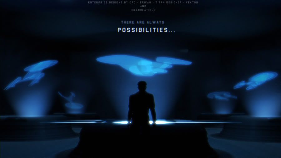
I think whatever history may say about the contest in and of itself, in the end, the judges picked a quality design and Ihlecreations gets my congratulations both for the win and a superb design.

I may not have said this to anyone, but I actually haven't played STO myself. My work and my lifestyle at present don't afford me that kind of time. Ironically, I'm kind of an archivist (and occasional co-author) of some of the earliest Star Trek games ever translated to a computer, including for the TRS-80 and the Apple II. So I know what it feels like (or used to feel like) to play a captivating Trek game. One of my earliest programming projects was updating an already popular Trek game (unlicensed, back in the days before Paramount had worked that out). I migrated a game based on TOS to the TMP era (back before The Wrath of Khan, so that'll give you a timeframe), and one of the additions that my friends and colleagues insisted I try was: Put a future Enterprise into the game.

We didn't have great graphics back then, but I still asked the question, what would make for a cool next-gen big-E?

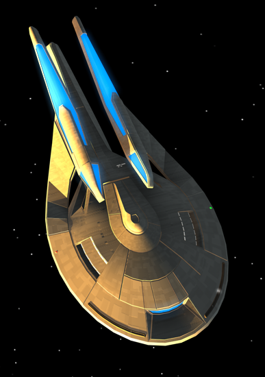
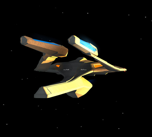
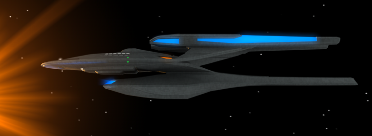
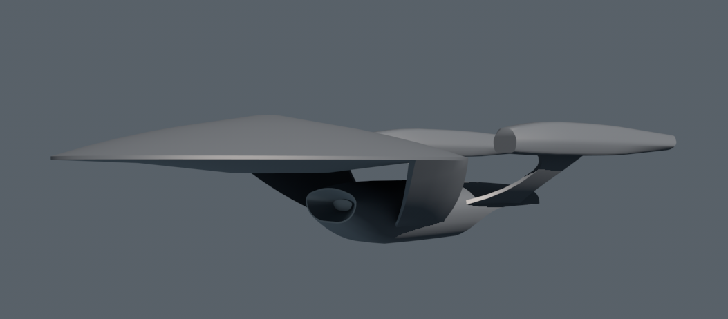
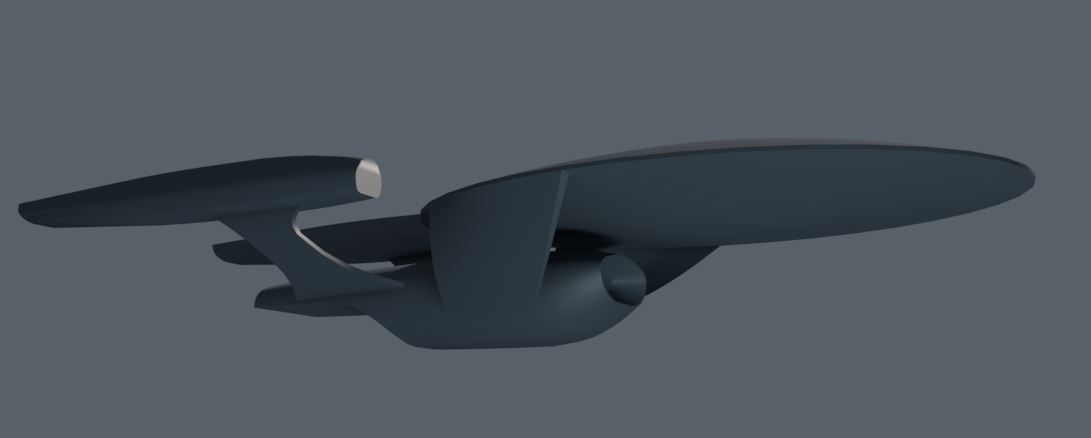
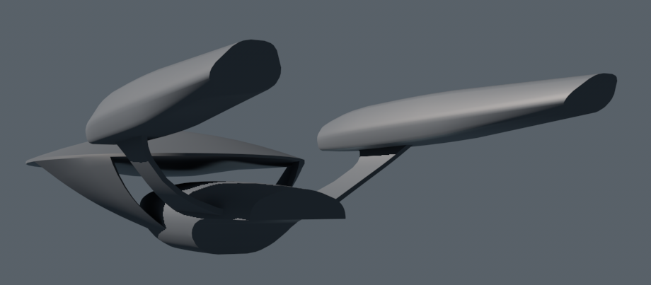
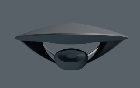
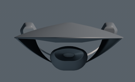
Ihlecreations has got a design that definitely answers that question in several regards. First of all, that deflector screams power. It's a "Don't Tread on Me" deflector. (Are those torpedo launchers in the center of it, Ihle, or is that just a double-port vent?) A lot of folks forget the degree to which the deflector is the analog of the front grille on an automobile. If you reduce the size of it or eliminate it, it doesn't matter how big you make the car, the reduced size of that element says "small" to the viewer. The newest renditions of the Chevy Camaro and Dodge Challenger have front grilles that are geometrically shaped in clever ways to make them seem bigger than they are, and to make the rest of the car feel bigger than it is. It's the front, not the tail, that screams power. Ihle's "F" screams power.

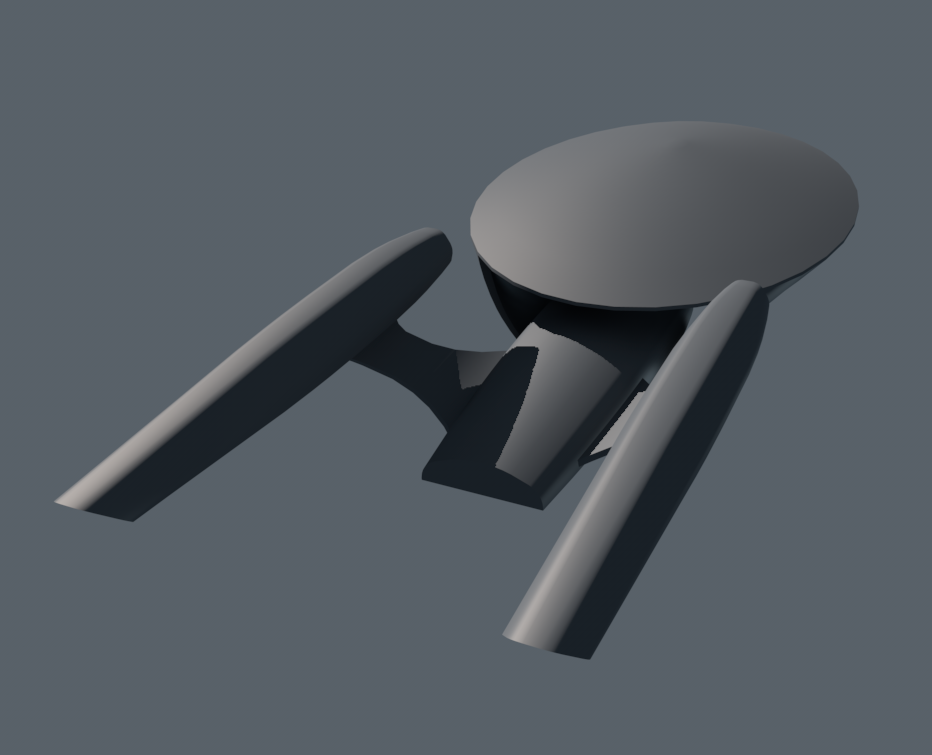
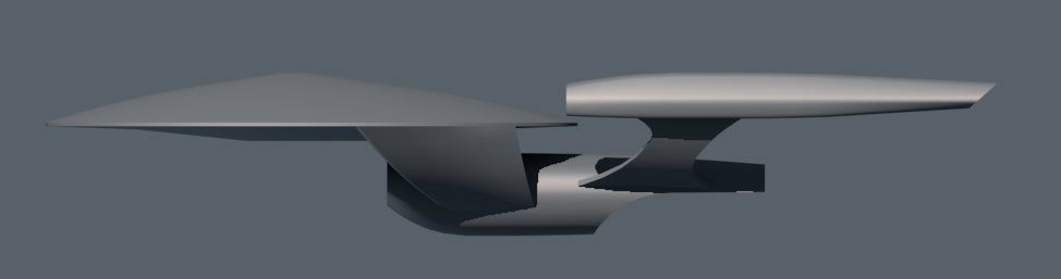
It also has a side-view silhouette that says "Enterprise" to any everyday passer-by, even a non-Trek fan. They're going to know what ship this is. This is even though the connecting element between the primary and secondary hulls is no longer the neck, because there ain't no neck (the Sovereign class eliminated the neck by fusing the hulls, and Ihle's F separated the hulls and no one misses the neck). My guess is, CBS insisted on a ship whose silhouette said "Enterprise." And Cryptic probably wanted a ship that said, "Wickedly cool variation."

There were a (small) number of beautiful renditions in this contest that did not take tremendous license with the basic style of the ship, but which I really adored. And there were other designs like Fuzzy Modem's which were out-freakin-standing, but which stretched the Enterprise concept in new directions. Ihlecreations is a very clever hybrid without a hint of compromise. Its side-view silhouette is a very clever combination of the Galaxy and Sovereign classes, integrating the best elements of both. But the new side-panel connections introduce a truly new design element that, when you rotate it toward the front, give the ship that "OOOh, wickedly cool!" aspect that you need if you're going to sell a new game around it.

When presenting a new work of art to any business for its approval, you must take account of the politics involved in the process, and you must accept that politics will be present in that process. You cannot assume that any concept, no matter how radical, will inspire your benefactors to leap beyond the boundaries of their original design specifications or requirements. (Just think of the rejected Doug Drexler or John Eaves or Rick Sternbach concepts for NX-01 that we'll never know about, because Paramount brought in an Akira photo and said, "Here, use this!") There were some magnificent design concepts put forward in this contest. But the one that wins is the one that stays ingenious while at the same time logically plays into the hands of all the benefactors involved in the process. And I can see where Ihlecreations succeeded brilliantly on all these fronts. It's a great ship that gives everyone some, or even a lot, of what he wants.

Again, well done, congratulations, and I really can't wait to see this baby fly.

D "F" Scott
 
If you are not already a member then please register an account and join in the discussion!

Sign up / Register


Back
Top