• Welcome! The TrekBBS is the number one place to chat about Star Trek with like-minded fans.
    If you are not already a member then please register an account and join in the discussion!

Weird TOS covors

ryan123450

Rear Admiral
Rear Admiral
I understand that because of the assumption of a second five year mission before TMP, the version of the Enterprise and the design of the uniforms doesn't always match the era of the book with regards to some older TOS novels.

But what about something like The Better Man by Howard Weinstien, which was obviously written to be post-TMP (stardate and references to the film), but which sports a cover with TOS-era Enterprise, Kirk, and Spock? Editorial boo-boo?
 
Editorial boo-boo?

Sometimes the cover art is commissioned and completed long before the manuscript is finalised. There were some stories where the then-Star Trek Office suggested that certain proposals be revamped as pre- or post- movie-era books.

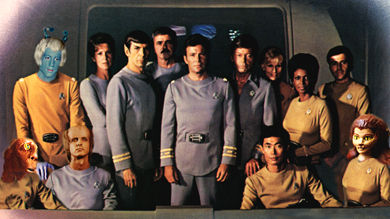
Some covers have been airbrushed to correct minor costume art elements. Some have ended up with a weird mismatch of insignia and uniform style. There are also novel covers that don't match the internal story because they are using the "new" uniforms as a cross-promotional cover for the current film of the day. ie. "The Entropy Effect", a TOS story with the characters in then-current TMP uniforms, and "Yesterday's Son", where Spock wears a blue version of the then-new "Star Trek II" maroon uniform.

Not necessarily "editorial boo-boos". Sometimes a marketing choice. Sometimes a publishing deadline problem.
 
Doesn't the majority of The Better Man flash back to events set during the original five-year mission and/or before?
 
I understand that because of the assumption of a second five year mission before TMP, the version of the Enterprise and the design of the uniforms doesn't always match the era of the book with regards to some older TOS novels.

No, there's no cause and effect there. There was never any formal, widespread policy of assuming a second 5YM; it's just something that a few of the novels implicitly seemed to be assuming (like My Enemy, My Ally, which was supposed to be seven years after "The Enterprise Incident" but still had Sulu as a lieutenant and Chekov as navigator). We're so used to having a clearly defined chronology for Trek today, but until 1988, there had never been a calendar date established for anything in present-day Trek. True, in TMP, it was made pretty clear in dialogue that Kirk had only commanded the Enterprise for five years, but in the days before home video and the Web, it was easy to forget details like that. And some people evidently assumed that since TMP was made a decade after TOS, it must've been set a decade after TOS too. Nobody ever formally came out and said so, but nobody really said otherwise either. The chronology was so ambiguous that different authors made different assumptions and weren't always on the same page. And it's just in retrospect that we look back on that part of Trek Lit history and deduce that a couple of authors seemed to be assuming something different about Trek chronology than most people did.

The mismatches between cover and content are for reasons totally unrelated to any of that. At first, since the books were coming out in the wake of TMP, it made sense to use TMP designs on the covers for promotional purposes, regardless of the books' content. The same way that, say, a reissue of a classic novel that's just had a movie adaptation made will stick the logo and star of the movie on the cover even if the movie has drastically changed the storyline. It's all about cross-promotion.

Later on, it was probably just a matter of different cover artists drawing on different photo references or having different preferences.

But what about something like The Better Man by Howard Weinstien, which was obviously written to be post-TMP (stardate and references to the film), but which sports a cover with TOS-era Enterprise, Kirk, and Spock? Editorial boo-boo?

Cover art for tie-in novels is often done before the manuscripts are finished. A cover artist may only have the outline to go from, or an editor's instructions based on the outline. Really, most novels that are set post-TMP haven't taken much advantage of that setting, haven't been too different from a 5-year-mission novel, so it can be hard to tell from the outline just when they're set.

Really, though, I think most people buying books are looking at the faces, not the uniforms. Whether the details on the cover match the story is a secondary consideration. The goal is to create an image that's appealing to the eye and makes the observer curious enough to pick up the book and read the blurb or page through it.


Doesn't the majority of The Better Man flash back to events set during the original five-year mission and/or before?

No. There are assorted scenes that flash back to events in McCoy's life ranging from 2236 to 2265, but they're nowhere near the majority of the book.

(And hey, I just noticed there's a starship in the 2250s scenes with a crewmember named Kara Choudhury. Maybe an ancestor of Jasminder...?)
 
I remember seeing a picture of the covers of the first few New Frontier "novelettes" that had Calhoun and Shelby in the TNG Season-3 (and later) uniform style.
 
Who seriously wants to buy a book with a picture of men in ugly pajamas on the cover? Just pretend that TMP uniforms never existed and you'll be a lot happier.
 
Cover art is a funny thing, and it definitely addresses marketing concerns before continuity concerns. At a convention a few years back, somebody was relating a story about how a romance novelist was thrilled to get a horse and a boat on their cover. It was irrelevant that neither of those was in the book; those elements helped sell copies.
 
Who seriously wants to buy a book with a picture of men in ugly pajamas on the cover? Just pretend that TMP uniforms never existed and you'll be a lot happier.

Speak for yourself. I find the TWOK uniforms far more unappealing.
 
Christopher, so do I. Those nasty red things were far too similar to one another, requiring a close glance to determine rank. I'm saying that I prefer the unis from the series. I was dismayed to find that the TNG people decided to show Cadet Picard in a TWOK uniform, as that meant that Starfleet held on to those hideous things for decades.
 
Gotta go with the WOK uniforms. The TMP uniforms were dull and generic-looking. The WOK costumes had much richer colors and looked far more striking on screen.

(No science fiction hero should ever wear beige or gray.)
 
Last edited:
Although IMO superior to the TMP uniforms, the Wrath of Khan gear made the Enterprise crew look like Space Mounties.
 
Gotta go with the WOK uniforms. The TMP uniforms were dull and generic-looking. The WOK costumes had much richer colors and looked far more striking on screen.

(No science fiction hero should ever wear beige or gray.)

I agree. Much better uniform and looked more professional.
 
Professional for the 19th century, maybe. For people in the 23rd century to go around constantly looking like they were dressed up for a historical drama was just silly. I could buy those as some kind of retro dress uniforms, but as everyday duty uniforms? Ridiculous. At least they should've ditched the jackets for everyday use, gone with just the undershirts, like in the pilots.
 
The problem with the Motion Picture uniforms is this:

The grey ones should have been a bit bluer.

Add some red uniforms.

The movie IS bland looking and is in definite need of some color.
 
Neither of the uniform styles from the first six movies looked as nice as the ones from the series. Simple primary colors and funky badges for the win.
 
If you are not already a member then please register an account and join in the discussion!

Sign up / Register


Back
Top