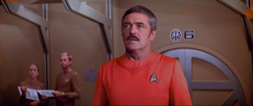
Experiment

Maybe it's my monitor or something, but that looks absolutely terrible! Sorry!
Looks like Scotty meets Miami Vice! Whoa! -- RR
Experiment

Maybe it's my monitor or something, but that looks absolutely terrible! Sorry!
Mike Minor always mentioned how Kirk's quarters were really ruined by the TMP art dept, and I guess that is the aluminum standard for messing up trek design (up until May 09.)
What were some of the things that Minor said were screwed up for TMP? I know very little (read: nothing) about Minor's opinions of TMP.
I definitely like uniforms with a little more pop. But I think, respectfully, that the TWOK--on uniforms look better just in red.
On this we can agreeI absolutely cannot STAND the TWoK-TUC uniforms. YUCH!
I definitely like uniforms with a little more pop. But I think, respectfully, that the TWOK--on uniforms look better just in red.
I absolutely cannot STAND the TWoK-TUC uniforms. YUCH!
On this we can agreeI absolutely cannot STAND the TWoK-TUC uniforms. YUCH!
I definitely like uniforms with a little more pop. But I think, respectfully, that the TWOK--on uniforms look better just in red.
Oh, I disagree. Going by that photoshopped image above, the TWoK uniform jackets look much better in blue. I'd like to see an image where all the jackets are a rich navy blue, not just Spock's. (It doesn't make sense to have color-coding on the outer jackets when you've already got it on the undershirts.)
I definitely like uniforms with a little more pop. But I think, respectfully, that the TWOK--on uniforms look better just in red.
Oh, I disagree. Going by that photoshopped image above, the TWOK uniform jackets look much better in blue. I'd like to see an image where all the jackets are a rich navy blue, not just Spock's. (It doesn't make sense to have color-coding on the outer jackets when you've already got it on the undershirts.)

Spock in the blue version looks like he's wearing the official Hanukkah uniform.
I definitely like uniforms with a little more pop. But I think, respectfully, that the TWOK--on uniforms look better just in red.
Oh, I disagree. Going by that photoshopped image above, the TWOK uniform jackets look much better in blue. I'd like to see an image where all the jackets are a rich navy blue, not just Spock's. (It doesn't make sense to have color-coding on the outer jackets when you've already got it on the undershirts.)
Spock in the blue version looks like he's wearing the official Hanukkah uniform.
Is that a problem? The Vulcan salute is actually based on a Jewish blessing.

On this we can agreeI absolutely cannot STAND the TWoK-TUC uniforms. YUCH!
I have never thought of them as my favorites, though I do like them, and I appreciate how well-thought out the whole scheme was - pins and so forth.
My main beef was that the uniforms felt so formal. I would have been happier if for this uniform set this was the Class A and there was a somewhat simpler Class B that everyone wore most of the time, combined with a variant of the cadet jumpsuits as a Class C.
 ), there is a school of thought towards trying to make uniforms "more" formal than regular outfits.
Excellent damage control on your part, addressing how screwed up that set was in TMP. Mike Minor always mentioned how Kirk's quarters were really ruined by the TMP art dept, and I guess that is the aluminum standard for messing up trek design (up until May 09.)
Actually, having sat in on a Uniform Board (sounds wacky, but yes, at least in my service we have them...), there is a school of thought towards trying to make uniforms "more" formal than regular outfits.
It ties in with the whole "military is a way of life" notion. (Yes, I know, Starfleet isn't military! But the same argument applies.) Call it "way of life" or maybe "higher standard", but there's an underlying theme of making uniforms relatively uncomfortable... to remind you to stand tall and look good.
Hopefully that makes sense -- hard to explain.
Cheers,
-CM-

 ) would fall prey to the characters/personalities on the board at that particular time.
 We use essential cookies to make this site work, and optional cookies to enhance your experience.
