Thanks.
I'm thinking of keeping this model around, as a class variant.
Maybe it can be the new Constellation?
I like that idea. I like it alot.

Thanks.
I'm thinking of keeping this model around, as a class variant.
Maybe it can be the new Constellation?
")
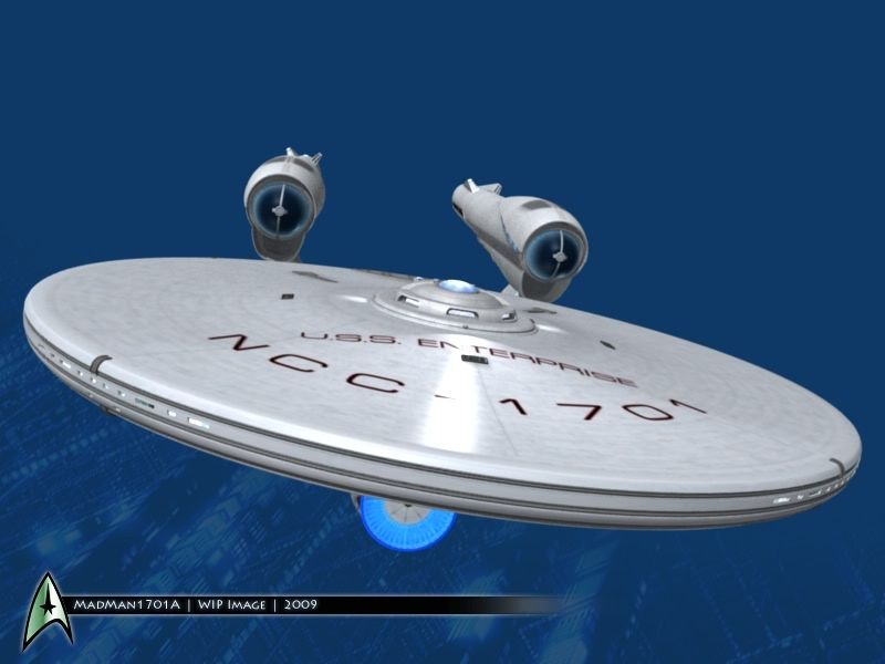

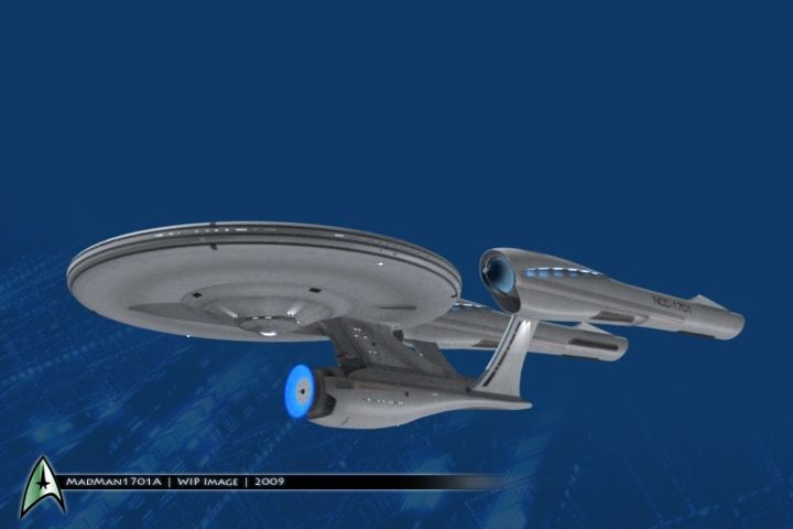
Yeah, that's a great difference, I think. It makes it look really brand new.Looking good, MadMan. One of the things I really do like about this design is the bright color.
Unlike the Ent-E which looked a lot worse than it had to because of the crappy dark hull color. The E looked best in FC when they were still using the brighter looking miniature, imo.
Yep, that's what I'm using as reference right now.Looking great!
Don't forget to check this out http://www.quantummechanix.com/Star_Trek_Gallery.html
 )
)


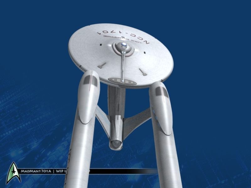
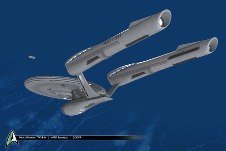
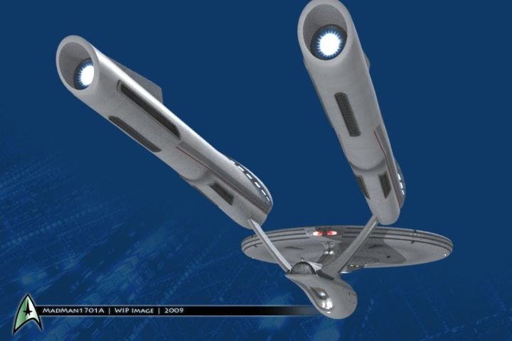
Oh, no.Is that a shuttle I see in the second picture...?!?
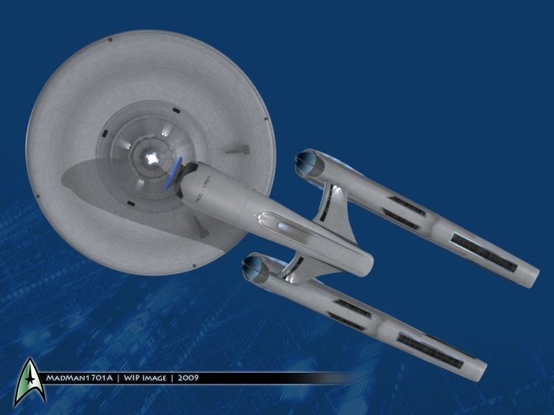
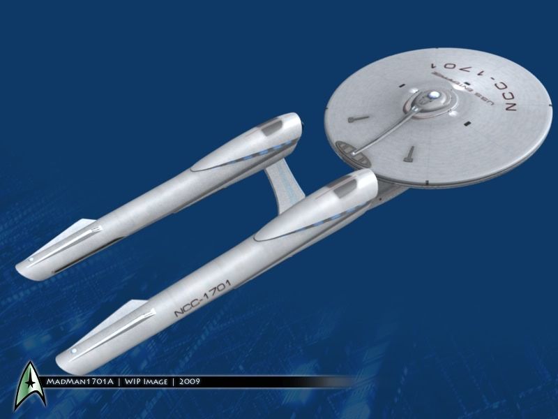
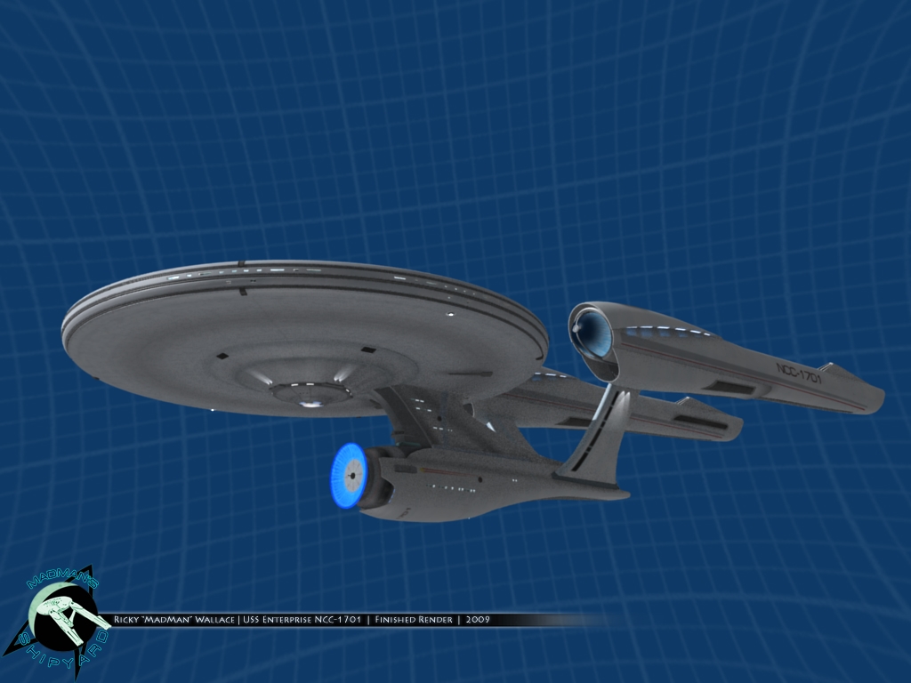
I know I'm in the minority on this, but I still think this is the ship's best angle.
We use essential cookies to make this site work, and optional cookies to enhance your experience.