• Welcome! The TrekBBS is the number one place to chat about Star Trek with like-minded fans.
    If you are not already a member then please register an account and join in the discussion!

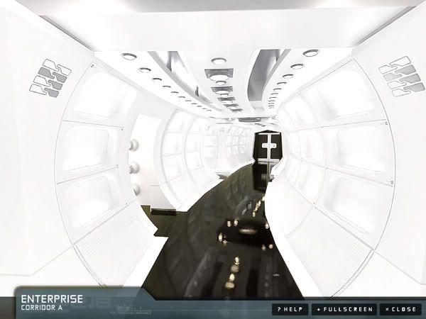
Panoramas of Enterprise interior on official site

The white walls! Oh, how I hate white walls! Reminds me of renting and every apartment I ever had. White walls. Still, the overall look is good. Nothing spectacular (it's just a corridor, after all for chrissakes!). But it looks good. But how 'bout some color? Or, light them with color like different TOS sets were sometimes lit. ;)
But really, wouldn't walking those shinny halls for a while give a person a headache?

What white walls ? They look pretty yellowish (beige ?) to me :confused:
Definitely not bright white.


even though I'm not too fond of the polished floors.

Reflective floors and skirts is Kirk's dream come true

Shit, I hadn't thought of that :lol:

Now, I love the polished floor :bolian:
 
I like it alot. It's highly reminiscent of a 60's design aesthetic, yet suitably futuristic - suggestive of some kind of 60's renaissance occurring at some point in the future. Combine the white corridors with the bright primary colours of other parts of the ship and the uniforms and it's perfect for TOS.
 
The white walls! Oh, how I hate white walls! Reminds me of renting and every apartment I ever had. White walls. Still, the overall look is good. Nothing spectacular (it's just a corridor, after all for chrissakes!). But it looks good. But how 'bout some color?
Or add people in brightly-colored uniforms, bustling from here to somewhere?

The colored lighting is cool, too, when not overused.
 
I wanna know who has the light bulb concession in this version of century 23. Now we know why this ship has 400 people on it, at least 40 just spend time switching out all these bulbs, plus there must be a large market for sunglasses.
 
I like it. It works for me.

While I know the series probably won't be outright acknowledged in the movie, the corridor looks like a natural evolution from what was seen on ENT.

Then again, I've had that same thought about how all the tech in the movie looks like that.

Just an observation. One that was probably coincidental on the filmmakers' part.
 
I wanna know who has the light bulb concession in this version of century 23. Now we know why this ship has 400 people on it, at least 40 just spend time switching out all these bulbs, plus there must be a large market for sunglasses.
Starfleet: a division of Osram-Philips-Sylvania.
 
Can't say it particularly appeals to me. It's an uncomfortable compromise between a clean aesthetic reminiscent of 2001/Andromeda Strain with the interior design equivalent of greeblies all over it. I would've preferred either a cleaner aesthetic or something more organically detailed through exposed piping and such. Also, the deck is ridiculously shiny. :wtf:

My initial reaction as well. I wonder if it wouldn't have been a bit better had they done away with the seemingly unnecessary wall recesses and changed the color scheme to matte blues rather than gloss white and black?

Like this, but with warm white light (or assorted colors ;)):
 
I like it alot. It's highly reminiscent of a 60's design aesthetic, yet suitably futuristic - suggestive of some kind of 60's renaissance occurring at some point in the future. Combine the white corridors with the bright primary colours of other parts of the ship and the uniforms and it's perfect for TOS.

You're spot on with this.
 
Seems to be a common theme with each new release of images. Posters say something looks 2001ish, or Galaxy Quest-esque, or New Battlestar Galactica like...

I'm kinda hoping it looks and feels like Star Trek.

Unfortunately, I have to agree with the majority. It does look like everything but Star Trek so far.

It DOES look like Star Trek to me. But every Star Trek has taken
inspiration from other places. Even TOS had other sources that
inspired it's designs. So saying that this has elements of other
shows designs is in no way taking away from the fact that it is and
does, IMO, look like "Star Trek". The fact is Trek has always been
a melting pot of real life, futuristic concepts, and ideas drawn from
other productions.

So the fact it may look 2001 or BSG-ish is to me simply following
the normal Trek pattern of borrowing, and in this case is a very good thing.
Not unfortunate.
 
Well, it's certainly...colorless. With some people in the primary color uniforms walking about I think it'll look better.

My first impression: It looks like a plastic model of the chunnel or something. Curved walls? Big...box shelves or something all over the place? What, is that where they put the candles or something? It seems a bit heavy on the arty nonsense to me.

The TOS doorway is kind of cute I guess.
 
what are the four white\black filled markings on the wall suppose to represent?
I was wondering that myself. They vary from corner to corner, so it's presumably some sort of code, but darned if I can figure out what for.
 
The white walls! Oh, how I hate white walls! Reminds me of renting and every apartment I ever had. White walls. Still, the overall look is good. Nothing spectacular (it's just a corridor, after all for chrissakes!). But it looks good. But how 'bout some color? Or, light them with color like different TOS sets were sometimes lit. ;)
But really, wouldn't walking those shinny halls for a while give a person a headache?

What white walls ? They look pretty yellowish (beige ?) to me :confused:
Definitely not bright white.


even though I'm not too fond of the polished floors.

Reflective floors and skirts is Kirk's dream come true

Shit, I hadn't thought of that :lol:

Now, I love the polished floor :bolian:


Buddy, if you are going to say that those corridors don't look white, I'm going to have to say you're responsible for the bad rap the Trek XI forum is getting. I know somepeople are trying a little too hard to completely open-minded about this movie, and some people won't accept any changes...but those corridors are white!
 
Last edited:
The white walls! Oh, how I hate white walls! Reminds me of renting and every apartment I ever had. White walls. Still, the overall look is good. Nothing spectacular (it's just a corridor, after all for chrissakes!). But it looks good. But how 'bout some color? Or, light them with color like different TOS sets were sometimes lit. ;)
But really, wouldn't walking those shinny halls for a while give a person a headache?

What white walls ? They look pretty yellowish (beige ?) to me :confused:
Definitely not bright white.


Reflective floors and skirts is Kirk's dream come true

Shit, I hadn't thought of that :lol:

Now, I love the polished floor :bolian:


Buddy, if you are going to say that those corridors don't look white, I'm going to have to say you're responsible for the bad rap the Trek XI forum is getting.

I've noticed that a few of the posters that we may possibly call 'gushers' are using this movie as a way of trying to show how 'open-minded' they are. We haven't seen the movie yet, so just let the people here say their piece about whether they like certain design aspects or not without analyzing why they think that way too much.

Buddy, we are not going to change the definition of white just because it suits someones argument.
It has nothing to do with open mindedness or the quality of the movie which for all I know could end up being complete crap.

This is bright and white and could cause seizures.

snapshot2009021401011222-1.jpg


This is clearly not quite white.

snapshot20090214010112-1.jpg


As for the rest of your "gushers' argument, it doesn't even deserve a proper response even though you were quick to edit it.
 
If you are not already a member then please register an account and join in the discussion!

Sign up / Register


Back
Top