• Welcome! The TrekBBS is the number one place to chat about Star Trek with like-minded fans.
    If you are not already a member then please register an account and join in the discussion!

Super Bowl ad screenshots

It certainly is a clearer beauty shot of a model, and that's exactly what it looks like. :)
I just thought I would interject, here... :)

Comparison.jpg


(Shameless plug. :) )

Really and truly, after staring at this thing as much as I have in the past few months, It's an awesome update.

Yep. It's just a little startling at first - as the TMP refit was, and certainly the Enterprise-D.
I'm still not totally convinced by the Enterprise D. And lets not even talk about the "B".

:)

-=MadMan=-
 
I like the one on the Right! :D

It certainly is a clearer beauty shot of a model, and that's exactly what it looks like. :)
I just thought I would interject, here... :)

Comparison.jpg


(Shameless plug. :) )

Really and truly, after staring at this thing as much as I have in the past few months, It's an awesome update. If you approach it from the mindset of seeing the Refit ship, and think to yourself, "how could I make this look older?", I think this is what you come up with. :)

-=MadMan=-

No offense, but the one on the left looks like Abrams tackling TAS, not TOS.
?

It's not THAT bad. :)

-=MadMan=-
 
[
Maybe that's why I'm the most fond of Trek when Nicholas Meyer is at the helm and Gene Roddenberry is as far away as the bounds of this planet will allow from the production.
I'll grant you that most of your post is well-written, even if I disagree with at least 80 % of it.

But you DO realize that THIS particular comment pretty much locks you in with TUC as the trek you're most fond? Trek with zero science fiction content, characters not merely drastically altered, but drastically altered for mere effect, and Trek that doesn't even work on a basic whodunit level.

It's all worth it to see Kirk exclaim "Let them die!" I'd waited 
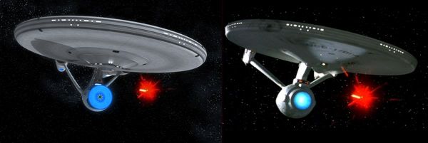
two movies for him to grieve over his dead son. The image of a worn-out Kirk and Spock serving aboard an equally worn-out Enterprise as they realized just how out-of-touch they'd become is just so compelling.

It's human and it speaks to me.

I've never really cared much for the Valeris sub-plot and viewed the fairly trite 'Cold War' setting as merely a vehicle to allow us to see our heroes at the end: bitter and used up.

You could say the same about various bits of TOS as well, but those aren't the reasons folks made an institution out of the thing. Part of it is characters, part of it is the overly-lauded optimism, and part of it is the presentation -- that is the look and the sound and the feel of the thing.

I like TOS the most when Kirk is filled with self-doubt privately but is unable to express that doubt, lest it damage his command, or when Spock wrestles with his dual nature while attempting to appear impassive. It's those character beats that make it all work. Was the design and the idea of a working ship in space compelling for the time? Sure, but that's not why I tuned in. That concept has been done so often, and many times better than Trek that hanging your hat on it now for the new production doesn't make a whole lot of sense. In any case, Star Trek means Kirk, Spock and (sometimes) McCoy to the vast majority of the uninitiated. This movie aims to give them what they expect, but hopefully in a novel fashion.

Folks can rattle on about matte lines and plywood if they choose, but they ought to acknowledge all the good in TOS design with the bad -- the set layouts in some instances, the expressionist cinematography, the use of largely black frames (go to when the bomb goes off outside in BALANCE OF TERROR for a great example) in an era of bright brighter brightest -- all of this is part of what made it endure, whether you choose to acknowledge its relevance or not (note I am distinguishing this from all the 'if you go warp 10 you becoms a toad' stuff from ModernTrek.)

I'm no student of cinema and I have to admit that many of the artistic choices of camera angle and framing go right over my head. That said, I think that much of what made Trek endure during the ten-year drought between TOS and TMP was the fan-fic: even the Kirk/Spock slash served to keep the fans aquainted with the people on the Starship Enterprise that they missed seeing every week on the small screen.
 
Last edited:
I never read a fanzine during the 70's.

I did, however, watch the show every weekday at four o'clock on Channel 4 after school.

That's what built the fanbase into the envy of every studio in Hollywood, not the sparsely distributed fanzines.
 
It certainly is a clearer beauty shot of a model, and that's exactly what it looks like. :)
I just thought I would interject, here... :)

Comparison.jpg


(Shameless plug. :) )

Really and truly, after staring at this thing as much as I have in the past few months, It's an awesome update. If you approach it from the mindset of seeing the Refit ship, and think to yourself, "how could I make this look older?", I think this is what you come up with. :)

-=MadMan=-

No offense, but the one on the left looks like Abrams tackling TAS, not TOS.

Um, MadMan made that model of the Enterprise based on the actual movie. :lol: I think it is very good! :techman:
 
:lol:

There's been some improvement in technique since 1992:

st09_sbcom_c.jpg


No doubt at all that both are the Enterprise, though.

By that standard, the same could be said of a pizza attached to a beer can and two foot long hot dogs.

This kind of cheerleading makes the New York Times look almost objective.

The same thing could be said for some people's close mindedness and and blowing trivial details way out of proportion.

It's the Enterprise, no doubt about it.
 
:lol:

There's been some improvement in technique since 1992:

st09_sbcom_c.jpg


No doubt at all that both are the Enterprise, though.

By that standard, the same could be said of a pizza attached to a beer can and two foot long hot dogs.

This kind of cheerleading makes the New York Times look almost objective.

The same thing could be said for some people's close mindedness and and blowing trivial details way out of proportion.

Yeah, that part of what you said is absolutely true. Somebody who went to the trouble of posting these two images and making an irrational statement to go with it, knowing full well it didn't hold water.

It's holds plenty of water, and it's a quite rational statement. He is showing that while some people are sitting and bitching about all the "horrible" things that are wrong with the new design, the new design, and one of the designs it was based off of, are not that different at all.
 
I mentioned in a thread elsewhere that I could probably dig out and post some crappy pics I took in the 1980s and be able to pass them off as images from this movie, just on the basis of how flared out and blurry they look. That's an improvement? Sure, same as the way gouging out your eyeballs improves your vision. You go try it.
 
I mentioned in a thread elsewhere that I could probably dig out and post some crappy pics I took in the 1980s and be able to pass them off as images from this movie, just on the basis of how flared out and blurry they look.

You think you can?

Then do it. Show us all.
 
And I can trust you to look at something I post in an objective manner? Fat chance.

Why don't you go look at the TMP promos that had a streaked refit over Kirk & Spock and see how much better the ship looks (to you) because it seems out of focus? That'd be in keeping with buying into 'haze looks better' over 'physical object lit in a vaguely realistic way' that seems to have such credibility around here.

If you go back upthread, you'll see me say that I don't understand why these shots from the film look this bad given the high quality of the profile view we've all seen of this ugly ship. I've put my remarks in context, repeatedly, which is more than I can say for most of the folks around here.

EDIT ADDON: Or if you're really serious about your post, then pay me to come up with something.
 
Again...with so much that is known you still have to wait for the accident. Meanwhile thinking that this philosophy negates peoples points about the film when they use a trailer, an interview or some other fact about the movie.

There shoudn't of been a new movie. Especially this Star Wars prequel band wagaon mess. Abrams should of started with a new TV show first. Say 5 seasons, then take that series to do movies. Remember DS9 was great because it "Stood on its own 2 feet" and didn't have to rely on the "gimmicks" to sell it. It was good enough on its own. A series that went beyond TOS. Is that such a big thing to ask for now?

Let me ask you, would you have done this or what idea do you have?

DS9, really, DS9.

Liked it-reasonable show, got a little tedious after about two seasons, and really ugly towards the end. Kind of like NUBSG-surprise!

This movie will be better than the BEST episode of DS9, if for no other reason than it won't have some totally inane and self-involved morality tale at it's center.

Did you really want a DS9 movie? Really?

Not my idea of fun
 
I hate to interrupt, but Starship Polaris inspired me to create a little comparison, hope you enjoy...


I put them behind thumbnails, I wasn't really sure what was acceptable size-wise, thanks for letting me know :)
 
Last edited:
I hate to interrupt, but Starship Polaris inspired me to create a little comparison, hope you enjoy...

http://img13.imageshack.us/img13/1932/ne1il6.gif

http://img26.imageshack.us/img26/6303/oldvm3.gif

I'm really sorry if these are too big, I will resize or put a link to them if someones on dial-up or something... let me know
The pixel dimensions are fine, but the filesize is pretty huge on both. If you could make them links or put them behind thumbnails, it would be better, and you wouldn't have to downgrade the animation quality that way.
 
If you are not already a member then please register an account and join in the discussion!

Sign up / Register


Back
Top