I'd have said onscreen that the ships in Season 1 were based on Hur'q designs from that era of Klingon history and what T'Kuvma's fleet and their allies had to rely on since the Empire had fallen into such instability that other, more traditionally recognizable warships were impossible to come by. That way, if nothing else, the huge discrepancy in looks would have made more sense and we'd actually get a look at Hur'q aesthetics and technology.
-
Welcome! The TrekBBS is the number one place to chat about Star Trek with like-minded fans.
If you are not already a member then please register an account and join in the discussion!
You are using an out of date browser. It may not display this or other websites correctly.
You should upgrade or use an alternative browser.
You should upgrade or use an alternative browser.
Spoilers Starship Design in Star Trek: Picard
- Thread starter pst
- Start date
I like that. Fairly elegant. It has some Probert E-C lines to it on the 2H. Not sure I'm a big fan of those bussards, though. Everything else is pretty damn good.
That design definitely does feel like it would lead directly into the Universe-class Enterprise-J less than 200 years later.
That would have been a very cool tie-in to many fandom speculations on the origins of Klingon vessels.I'd have said onscreen that the ships in Season 1 were based on Hur'q designs from that era of Klingon history and what T'Kuvma's fleet and their allies had to rely on since the Empire had fallen into such instability that other, more traditionally recognizable warships were impossible to come by. That way, if nothing else, the huge discrepancy in looks would have made more sense and we'd actually get a look at Hur'q aesthetics and technology.
Unfortunately, the VFX guys on ENT kind of screwed the pooch on that one, when they used a 23rd century K't'inga in a 22nd century show.
Paramount suits: "Go ahead and use it - the idiot fans won't know the difference".
I would agree that the Nacelles need work, but I kinda love everything else about it.I like that. Fairly elegant. It has some Probert E-C lines to it on the 2H. Not sure I'm a big fan of those bussards, though. Everything else is pretty damn good.
I dunno what exactly it is, but I just dislike that ship. It's so..... ostentatious?
I don’t think it’s ostentatious. I think it’s unoriginal and looks too much like the ship that came before it.
That was one of the (many) problems with that ‘Design the Enterprise-F’ contest. Most of the entries differed little from the Enterprise-E.
Paramount suits: "Go ahead and use it - the idiot fans won't know the difference".
That was definitely the mentality when they were going to originally use an unaltered Akira class for the NX-01 in ENT until Drexler convinced them to let him tweak the design. Love the design or hate it, it’s still better than that.
Some of them definitely look too busy and over-designed, espeicially compared to the Connie Refit, which imo was the perfect balance of form and function, as was the E-D. But a lot of thought and design drafts and other considerations were applied to the creation of those iconic ships. The Connie III looks too busy to me, just like the Refit but with some unnecessary pieces thrown on to set it apart. There are a few PIC ships that I really like though, including the Excelsior II and the Duderstadt Class.I think I just don't like the bulkiness and overly cluttered look of all these late 24th, early 25th century designs.
I liked the Disco Klingon Bird-of-Prey. It literally looked like they were flying around in a statue of a bird, which was a cool aesthetic, if not really fitting Klingons as we know them.
That has become my single most hated ship in all of Star Trek, possibly all of sci-fi in general.
The problem with alot of the DSC Klingon stuff, up to and include the Klingons themselves, look good they just don't look Klingon.
Things like the Sarco ship, the Qoj and variants, still at least have a Klingonesque look. The Sarco ship shares a similar overall shape to something like a D7.
At least the designers of the SNW Enterprise did the right thing and kept the design at least similar to what we saw in TOS.
DSC jaded me so hard to nuTrek that it's hard to recover from.
Had DSC premiered and had a similar visual style to SNW... i'd probably be less of an anti-DSC zealot and be overall more ok with the whole "visual update".
It's the whole overall jaded outlook that didn't let me enjoy what good there was. I unilaterally hated ALL the Klingon ship designs in DSC for a long time, but eventually as my utter and complete hatred for DSC turned into more of a mild loathing, I was able to see some of the minute amount of good in it.
I do like the Duderstadt class a fair bit. It was definitely the best of the newer designs. Excellent II isn't horrible, I just wish the neck wasn't so long. If it had a neck more proportional to that of the Original Excelsior, I think it would look better.Some of them definitely look too busy and over-designed, espeicially compared to the Connie Refit, which imo was the perfect balance of form and function, as was the E-D. But a lot of thought and design drafts and other considerations were applied to the creation of those iconic ships. The Connie III looks too busy to me, just like the Refit but with some unnecessary pieces thrown on to set it apart. There are a few PIC ships that I really like though, including the Excelsior II and the Duderstadt Class.
But that's me.
Which is why I love them. Why should the designers repeat what we know? Where's the fun in that? Study naval design, ship design, and fighter design and you'll find a wide variety of variations on theme. Now remove requires of specific shapes need for drag reduction from nautical and aeronautics and you can have more variety, not less.I liked the Disco Klingon Bird-of-Prey. It literally looked like they were flying around in a statue of a bird, which was a cool aesthetic, if not really fitting Klingons as we know them.
https://www.deviantart.com/pundus/art/Ex-Astris-STO-Odyssey-Class-Names-1038280867
The VFX guys didn't want to use the K'T'inga, IIRC it was Berman(?) who wanted them to because he didn't like the windows on the alternate design they came up with.Unfortunately, the VFX guys on ENT kind of screwed the pooch on that one, when they used a 23rd century K't'inga in a 22nd century show.
I really like the D4 battle cruiser design they came up with. I wish it had gotten to appear onscreen.
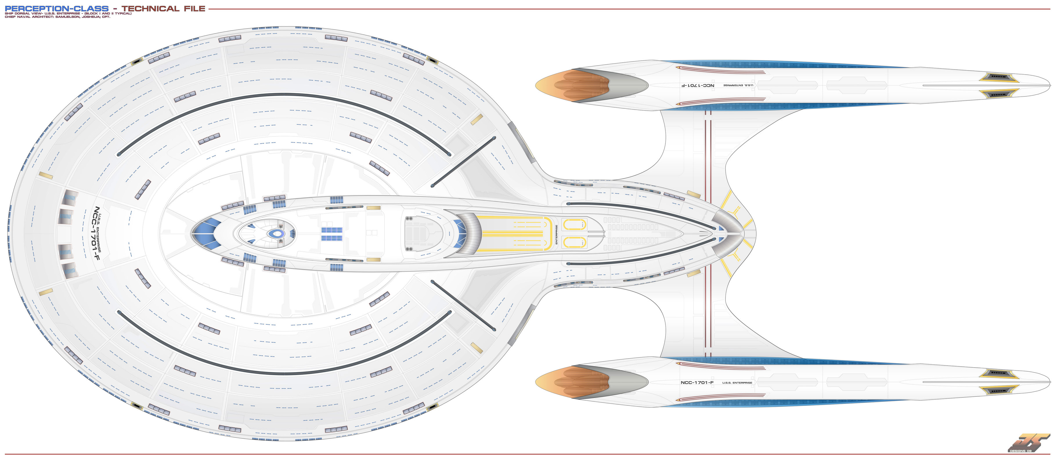
If we are talking about an alternate design for the Enterprise F the Perception Class always stuck in my head, at least until the Odyssey Class was canonised.


If we are talking about an alternate design for the Enterprise F the Perception Class always stuck in my head, at least until the Odyssey Class was canonised.


Again, there's little difference between this design and the Sovereign class. I mean, I can see the differences close up, but they're not enough. If this ship and a Sovereign were seen in the background, you'd be hard-pressed to be able to tell which was which.
That's one of the reasons why I didn't like them using the Ross class. It looks far too much like a Galaxy class for no real good reason, and many times when I saw it on screen, I thought I was seeing a Galaxy class ship.
Now That's A 25th century Constitution class.I think I just don't like the bulkiness and overly cluttered look of all these late 24th, early 25th century designs. I still wish we had got this for an Enterprise-F design.


It has a grace to it that I find lacking in the later ship designs.
Too skinny in the pylons, and big in the saucer.I think I just don't like the bulkiness and overly cluttered look of all these late 24th, early 25th century designs. I still wish we had got this for an Enterprise-F design.


It has a grace to it that I find lacking in the later ship designs.
The skinny pylons are one of the things I like most about it. It harkens back to the designs of the 23rd century, without being overly retro.Too skinny in the pylons, and big in the saucer.
I'll take your word for it. To me it looks entirely unsubstantial and bizarre.The skinny pylons are one of the things I like most about it. It harkens back to the designs of the 23rd century, without being overly retro.
The secondary hull is nice and the pylons are decent. There is a good ship in there somewhere.
Similar threads
- Replies
- 62
- Views
- 8K
- Replies
- 0
- Views
- 3K
- Replies
- 6
- Views
- 298
- Replies
- 482
- Views
- 59K
If you are not already a member then please register an account and join in the discussion!

