-
Welcome! The TrekBBS is the number one place to chat about Star Trek with like-minded fans.
If you are not already a member then please register an account and join in the discussion!
You are using an out of date browser. It may not display this or other websites correctly.
You should upgrade or use an alternative browser.
You should upgrade or use an alternative browser.
A critical look at TMP set design…
- Thread starter Warped9
- Start date
lol, perhaps Starfleet hired one of those aliens to redesign the uniforms.Many alien species do not see in colour and/or in the 'visible' spectrum. They will probably be fine. They have plastic armour.
Admiral: “what is this? We told you to keep the same colours!”
Designer: “I did”
Admiral: “no, you didn’t!”
Designer: “looks exactly the same to me”.
Since Voyager's sets were built in the same places using the same basic structure in some cases, it could serve as such an example to a lesser extent, as well.
They were built over the top of the previous sets. When the soundstage was completely cleared for "Enterprise" - for the first time since 1977 - they were removing long wood-rot encrusted support struts that still read "Star Trek II", as in the "Phase II" cancelled TV series.
Interestingly many of the reviews of the TMP-DE 4K restoration state the uniforms pop and really come off a lot better as well as a lot more background colour and detail is much more apparent. Many say the film doesn’t look washed out and sterile anymore.
Correct. You can even see the gold and silver leopards and eagles on the $10,000 red robes of the Chief Betelgeusian Ambassador as he swishes them around in the background, between Sonak and Kirk ascending the travelator.
Last edited:
There were already tight looking (if not spandex) uniforms, as in the series UFO:I'm just glad the original Battlestar Galactica kept to the then-trendy "padded deep browns, beiges, and blues". Disco turned the world into pastel puke... I blame Buck Rogers (1979) for introducing the spandex nightmares, though at least few were... pastel *shudder*...

I get the idea of the TMP uniforms, but I question the execution.
Having the trousers attached to the shoes or bootlets was to promote a sleek look, but it was awkward and in some shots looked weird. More traditional trousers or slacks would have been better. Close fitting dress slacks are available today just as they were in the ‘60s, and we have better fabrics today.
The same colour used for tunic and slacks can make some think of pyjamas or a pantsuit, which can look odd on a man. This was accentuated by the cut of the tunic’s hem which was rather unusual. It might also have been better to opt for trousers and boots that were darker than the tunic.
I did not like the beige tone used. It bugged me. There are nicer, more appealing, soft or taupe brown/golds that could be used. And if used for command staff it would have tied in back to the TOS colour scheme. The blue/grey should have been for sciences. A different colour could have been found for support services.
There were already tight looking (if not spandex) uniforms, as in the series UFO:
I forgot about that. Especially when the navy shirtless-yet-vested outfits were far more memorable. More so as I never saw the show but had seen a couple photos...
Wow

I get the idea of the TMP uniforms, but I question the execution.
Having the trousers attached to the shoes or bootlets was to promote a sleek look, but it was awkward and in some shots looked weird. More traditional trousers or slacks would have been better. Close fitting dress slacks are available today just as they were in the ‘60s, and we have better fabrics today.
The same colour used for tunic and slacks can make some think of pyjamas or a pantsuit, which can look odd on a man. This was accentuated by the cut of the tunic’s hem which was rather unusual. It might also have been better to opt for trousers and boots that were darker than the tunic.
Really all they needed to do was take Kirk's pants and boots from his dress uniform. Darker than the tunic, and didn't have the interconnectedness. Maybe black boots instead of grey.

Really all they needed to do was take Kirk's pants and boots from his dress uniform. Darker than the tunic, and didn't have the interconnectedness. Maybe black boots instead of grey.
Haven't fiddled with the tunic yet, but I did get to the pants and shoes, as the shoes alone looked a bit naff:

Try these on. I made one small change since Scotty didn't want to be there but Spock did?!


Kirk - the original space traffic light and power ranger!
Kirk - the original space traffic light and power ranger!
That looks great. I don't think the dress uniforms need contrasting pants as much as the duty uniforms, though. Maybe it's all the white.
I think dark pants and boots paired with the gray tunics would have been perfect.with the gull-grey tunics.

I think dark pants and boots paired with the gray tunics would have been perfect.with the gull-grey tunics.
Legs are NSFW?
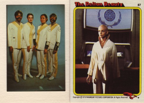
Some various commentaries about the robe being too short and such?
https://www.trekbbs.com/threads/why-did-the-vger-probe-take-ilia.247237/page-3
https://screenrant.com/terrible-moments-for-women-in-star-trek/
https://www.theyboldlywent.com/trekbooks/2020/01/star-trek-the-motion-picture-novelization-review/
etc
You guys are missing the most important thing.
Was Chief DiFalco a total smoke show or what?
Was Chief DiFalco a total smoke show or what?
Here's what Persis herself said about the outfit:
That outfit I worn in Star Trek, the white one, it was my idea. I was supposed to wear one of those same gray uniforms. I said, "Look, give me something white. Give me a pantsuit with something that has a little collar to it." So they did. I then walked into Gene Roddenberry's office and pulled the pants off. I said to Majel and Gene, "Listen guys, I've got the best legs, so why don't you use them!" (Laughs) You see, being bald and wearing that gray starship uniform, I would have looked like a boy. I wanted to look like a sexy female.
Was Chief DiFalco a total smoke show or what?
I really wish Lafferty had remained the ship’s navigator in the sequel films because Kirstie Alley never tickled my fancy (even before she began slowly sinking to the center of the planet under her own weight).
I thought TOS true colors would've been better especially through the cinematic lens. Could you color it to look like that; Kirk's dress uniform look more like the avocado green look from "Journey to Babel" no whites just a lighter color of green on the mid torso and darker version of on the sides and arms? The same with science for Spock, a different shade of blue. McCoy's outfit could look more like the shirt sleeve tunic he wore. Just for fun. Please?Try these on. I made one small change since Scotty didn't want to be there but Spock did?!
Kirk - the original space traffic light and power ranger!
As opposed to this leaden comment...I really wish Lafferty had remained the ship’s navigator in the sequel films because Kirstie Alley never tickled my fancy (even before she began slowly sinking to the center of the planet under her own weight).
Try these on. I made one small change...
We are censoring women's legs now?
Persis rejected her matching slacks. She wanted people to see her legs. It wasn't GR's idea.
Costumes of "Star Trek: The Motion Picture" by Ian McLean, on Flickr
Attachments
We are censoring women's legs now?
Persis rejected her matching slacks. She wanted people to see her legs. It wasn't GR's idea.
Costumes of "Star Trek: The Motion Picture" by Ian McLean, on Flickr
I thought I had read everything about the film over the past 40 years yet only recently saw that interview where she insists she was the one who pushed for the robe without pants. I, too always thought it was GRs idea.
In fairness, I'm pretty sure Gene didn't put up much of a fight when she suggested it. 
Similar threads
- Poll
- Replies
- 22
- Views
- 1K
- Replies
- 192
- Views
- 28K
If you are not already a member then please register an account and join in the discussion!