I feel like I need to use Wexley/Majel on all of my correspondence.
-
Welcome! The TrekBBS is the number one place to chat about Star Trek with like-minded fans.
If you are not already a member then please register an account and join in the discussion!
You are using an out of date browser. It may not display this or other websites correctly.
You should upgrade or use an alternative browser.
You should upgrade or use an alternative browser.
Weird Logos from the Books?
- Thread starter Stevil2001
- Start date
I know, I love it. I kind of want to make it the header font on my blog, if I can remember how to do that.I feel like I need to use Wexley/Majel on all of my correspondence.
Last edited:
I feel like I need to use Wexley/Majel on all of my correspondence.
I read that as Wesley/Majel.
")
Thanks all for your help; here's (finally) the resulting post...
Excellent! That unusual "Wexford" logo on "The World of Star Trek" and other Ballantine Books' titles also appeared on these 1979 Aviva ST:TMP puffy stickers:
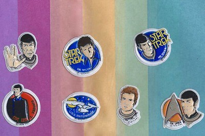
The Motion Picture puffy stickers by Aviva by Ian McLean, on Flickr
Last edited:
That unusual "Wexford" logo on "The World of Star Trek" and other Ballantine Books' titles also appeared on these 1979 Aviva ST:TMP puffy stickers
The Shatner likeness on those puffy stickers leaves something to be desired...

The Shatner likeness on those puffy stickers leaves something to be desired...
Probably made before it was decided which toupee was to be used.
Interesting that the Spock uniform does have the (late addition) black undergarment, but a TOS science icon teamed with a TMP Science Divison (orange) colour patch.
And here's my discussion of the fonts/logos used on the books during the modern era, when the books started to devise their own logos more-- mostly because they had to because they started doing more books not based on specific tv shows: https://lessaccurategrandmother.blogspot.com/2021/02/the-title-fonts-and-logos-of-star-trek.html
Hm, I don't think I ever noticed that The Best and the Brightest didn't use the TNG logo on the title page inside. The generic branding definitely fits the story better, but no doubt the marketers won out. (I'm still surprised Forgotten History was published under the DTI banner when I was led to expect it would be published under the more marketable TOS banner, and wrote it accordingly.)
As for The Case of the Colonist's Corpse, I suspect they used the "generic" movie logo instead of the TOS logo because it wasn't a TOS novel per se, but "A Sam Cogley Mystery." As you suggest, it was pretty much the house style at the time to use the movie/DS9/VGR logo font for non-series-specific books.
As for why the Prometheus title font is "on fire," it's probably a nod to Prometheus's mythical role as the giver of fire to humanity.
Yeah, I get it. But it feels more TOSssy to me than non-series-y (there's a big role for the Enterprise, right? it's been a while). Maybe I should move which bookshelf I keep it on.As for The Case of the Colonist's Corpse, I suspect they used the "generic" movie logo instead of the TOS logo because it wasn't a TOS novel per se, but "A Sam Cogley Mystery." As you suggest, it was pretty much the house style at the time to use the movie/DS9/VGR logo font for non-series-specific books.
I get that, though I can see how my wording doesn't indicate that. I mean more like, "I get that Prometheus has a fire theme, but STILL! It looks ridiculous."As for why the Prometheus title font is "on fire," it's probably a nod to Prometheus's mythical role as the giver of fire to humanity.
Hm, I don't think I ever noticed that The Best and the Brightest didn't use the TNG logo on the title page inside. The generic branding definitely fits the story better, but no doubt the marketers won out.
Well, there was that solicitation cover which used the generic logo with the YA Starfleet Academy title beneath, so it seems to have been a very late decision - possibly after the typesetting had been finalised?
I should have scrolled down further on the MA article when I looked up the publication date! I hadn't known that. Thanks for the tip, that's neat. (I can see why they would want to avoid using a YA-oriented logo.)Well, there was that solicitation cover which used the generic logo with the YA Starfleet Academy title beneath, so it seems to have been a very late decision - possibly after the typesetting had been finalised?
That was a nice trip down memory lane as most of those books came out when I started reading Trek novels and was the peak-era of Trek-reading for me. I have trailed off a bit in the last five or so years.And here's my discussion of the fonts/logos used on the books during the modern era, when the books started to devise their own logos more-- mostly because they had to because they started doing more books not based on specific tv shows: https://lessaccurategrandmother.blogspot.com/2021/02/the-title-fonts-and-logos-of-star-trek.html
Yes, I feel like in retrospect the era from 1997 to 2008 was a bit of a Golden Age for Treklit. Still at two-plus books a month for much of that time, so lots of room to experiment. Some duds, of course, but when you're putting out 24 a year, a lot of room for successes too. The slots for the original fiction concepts have really dried up in the past decade.That was a nice trip down memory lane as most of those books came out when I started reading Trek novels and was the peak-era of Trek-reading for me. I have trailed off a bit in the last five or so years.
The Enterprise has a very small role in it. They're in it just long enough to justify calling it a TOS book, but that's about it. It's a Perry Mason novel with Sam Cogley in the Mason role.Yeah, I get it. But it feels more TOSssy to me than non-series-y (there's a big role for the Enterprise, right? it's been a while). Maybe I should move which bookshelf I keep it on.
And I had fun reading it. Again and again.The Enterprise has a very small role in it. They're in it just long enough to justify calling it a TOS book, but that's about it. It's a Perry Mason novel with Sam Cogley in the Mason role.
And to this FontShop thread:Interesting thread here, and ideal follow-up to Typeset In The Future, which I read over the Christmas break...
https://www.fontshop.com/content/the-typography-of-star-trek
I made some additions and tweaks this morning based on your all's comments: https://lessaccurategrandmother.blogspot.com/2021/02/the-title-fonts-and-logos-of-star-trek.html
Mostly I wanted to add what @DarkHorizon said about the solicitation cover for Best and the Brightest, but I realized that to put that in context, I needed to talk about the Starfleet Academy logos, and I ended up adding in Worf's First Adventure, the Starfleet Academy videogame novel, the Shatner Academy book (which features a unique logo), and the Kelvin Timeline Starfleet Academy books!
Mostly I wanted to add what @DarkHorizon said about the solicitation cover for Best and the Brightest, but I realized that to put that in context, I needed to talk about the Starfleet Academy logos, and I ended up adding in Worf's First Adventure, the Starfleet Academy videogame novel, the Shatner Academy book (which features a unique logo), and the Kelvin Timeline Starfleet Academy books!
I made some additions and tweaks this morning based on your all's comments: https://lessaccurategrandmother.blogspot.com/2021/02/the-title-fonts-and-logos-of-star-trek.html
Mostly I wanted to add what @DarkHorizon said about the solicitation cover for Best and the Brightest, but I realized that to put that in context, I needed to talk about the Starfleet Academy logos, and I ended up adding in Worf's First Adventure, the Starfleet Academy videogame novel, the Shatner Academy book (which features a unique logo), and the Kelvin Timeline Starfleet Academy books!
Regarding your comment on The Best and the Brightest -- "I get why they ultimately wouldn't want to use middle-grade branding for an adult-aimed novel" -- I wonder if that had anything to do with the fact that TB&TB had perhaps the first depiction in Trek Lit (or at least one of the first) of a same-sex romance, even though it was really vague and implicit. At the time, that would've been considered "adult" subject matter by the censors.
I just read the entry on it in VOI, where Susan Wright says Paramount was fine with it as long as she didn't use the term "gay" or "homosexual," considering those to be outdated in the 24th century. There's nothing about her comments or the book itself to make me think it was ever actually planned as a YA/middle grade book.Regarding your comment on The Best and the Brightest -- "I get why they ultimately wouldn't want to use middle-grade branding for an adult-aimed novel" -- I wonder if that had anything to do with the fact that TB&TB had perhaps the first depiction in Trek Lit (or at least one of the first) of a same-sex romance, even though it was really vague and implicit. At the time, that would've been considered "adult" subject matter by the censors.
There's nothing about her comments or the book itself to make me think it was ever actually planned as a YA/middle grade book.
No, but that's the point -- that they didn't use the YA Academy branding because it could attract young readers to a book that wasn't aimed at them.
Oh, I see what you mean.No, but that's the point -- that they didn't use the YA Academy branding because it could attract young readers to a book that wasn't aimed at them.
Similar threads
- Replies
- 82
- Views
- 2K
- Replies
- 10
- Views
- 12K
- Replies
- 11
- Views
- 1K
If you are not already a member then please register an account and join in the discussion!