-
Welcome! The TrekBBS is the number one place to chat about Star Trek with like-minded fans.
If you are not already a member then please register an account and join in the discussion!
You are using an out of date browser. It may not display this or other websites correctly.
You should upgrade or use an alternative browser.
You should upgrade or use an alternative browser.
Spoilers Starship Design in Star Trek: Picard
- Thread starter pst
- Start date

Because there's no common design language.
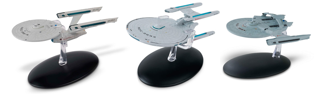
Look at these three starship classes from the TOS era. Similar hull geometry, similar nacelles, similar colouring, hull markings, registry placement.
Next, how about these from TNG era...
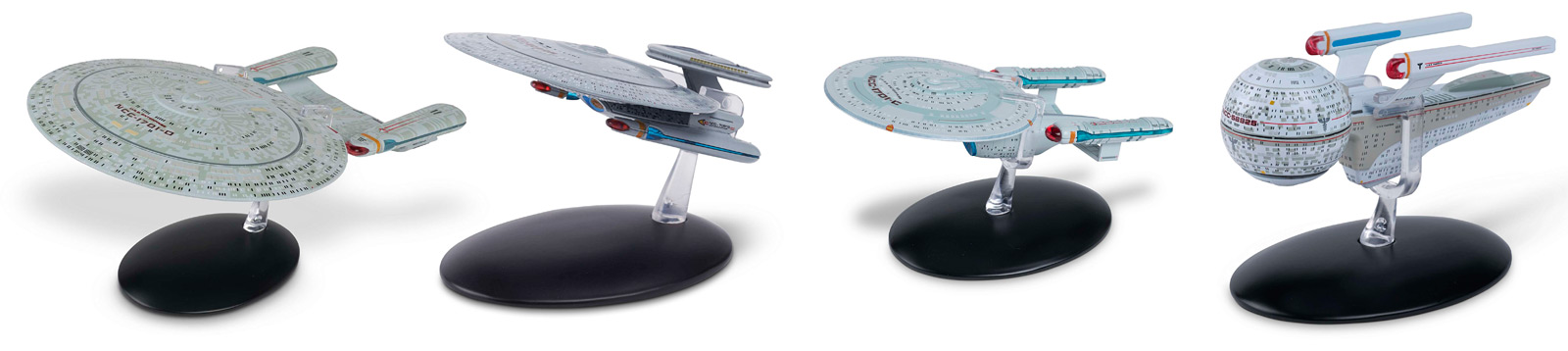
Exactly the same, the design of each just flow from one to the other.
Now look at Discovery era designs:
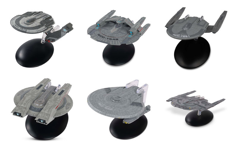
I see a lot of sharp angles, I see abrupt contrasts between sharp angles and round saucers, I see cut-ins, I see dark metallic hulls, I see a lot of aztecing, I see what looks like two broad types of nacelles (which is plausible enough -- not every jet engine looks alike from the outside). They all look like attempts to do variations on the basic saucer-and-nacelles Miranda configuration (which makes sense; almost all Starfleet ships are in real-life terms either variants on the Enterprise saucer-engineering-nacelles design or the Miranda saucer-and-nacelles design.) They all look very John Eaves to me; I figured he had designed them in the first episode before I ever looked it up to verify. So, no, they all look like they have a common lineage to me.
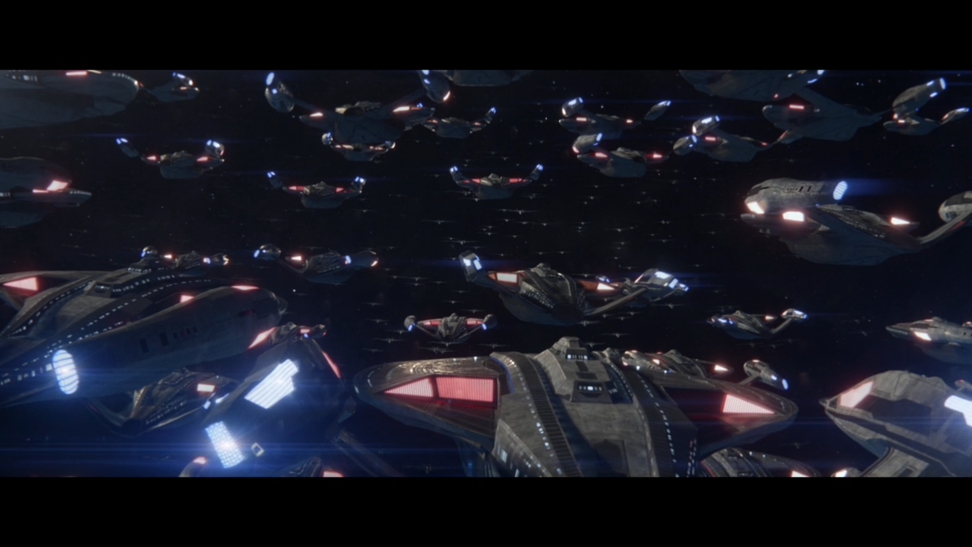
I'm surprised if you think this is an example of "beautifully composed". Ultra wide, low detail, nothing for the eye to latch onto, perspective out of the window, so wide that the Romulan ships are just tiny specks of dust. If you want an example of a beautifully composed space battle shot, here:
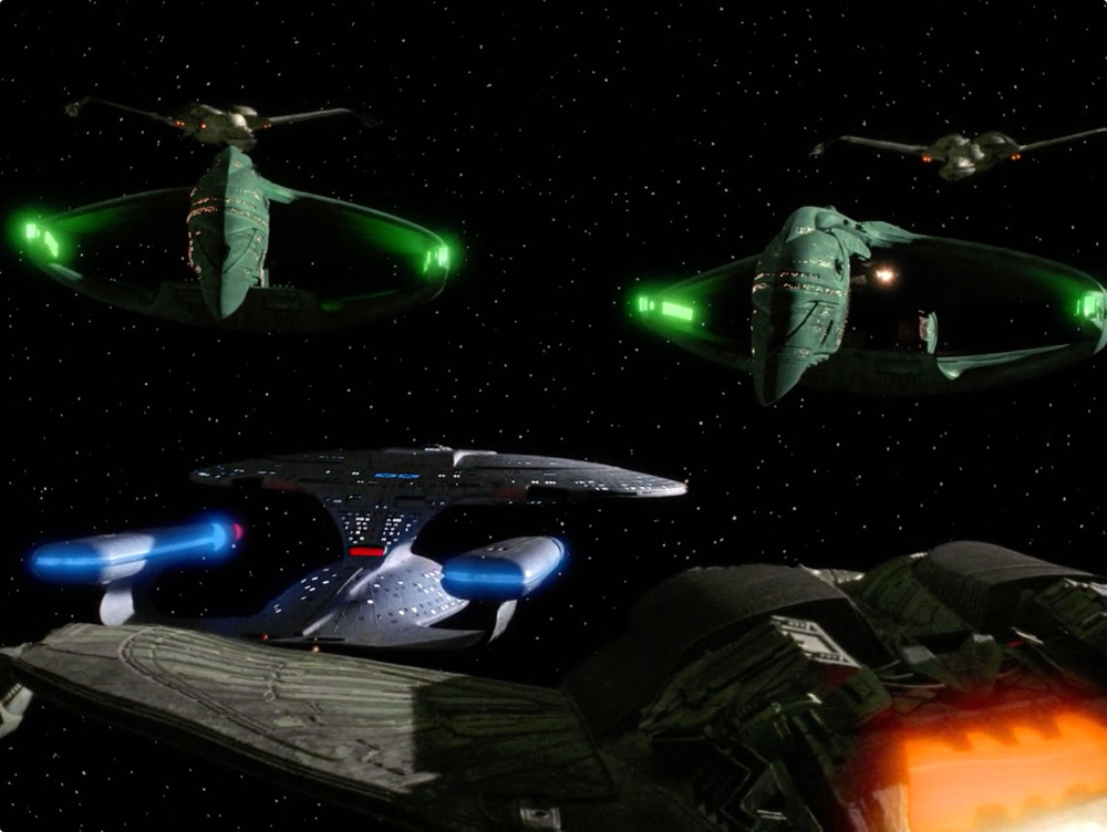
I genuinely prefer the Picard composition over the Next Generation composition. This is partially a function of the aspect ratio; I find rectangular aspect ratios more pleasing than the boxy aspect ratios American television used before the 2000s. But I like the fact that the ships are a bit further apart (they look very cramped together in the TNG one), I like the fact that the Romulan ships are so far away, I like the fact that the eye is basically drawn to the ship at the bottom of the image to ground you while the rest of the ships create the sensation of overwhelming force, of being lost in the storm. The composition does everything it needs to do for me.
And that's...bad...???
Yes. It is. A common design language or design document is a pretty important part of design in general. Let alone designing a fleet.
they look very cramped together in the TNG one
And the USS Copy Pastes DON'T???
What about the other shots I provided. Gorgeous framing, with actual thought put behind them. Picard's space visual effects have never been very good compared to other tv shows and movies, but the fleet shots were a new low.
I like the fact that the Romulan ships are so far away
Why though?
That's what happens when you go ultra wide angle, the image gets distorted, perspective is completely lost and detail is pretty much gone.
And yes, I could tell those were John Eaves designs without looking them up too, they have his signature style of over-designing, pointless details and even more pointless cutouts, monochrome dark grey, hard lines, inelegant nacelles and a complete lack of common design language.
Look I get it, he probably had a short timeframe to design 6 or 7 brand new starship classes and that was the best he could do. But putting that aside, it's just a mess and it's a shame that each of those 6 looks nothing like the other.
Yes. It is. A common design language or design document is a pretty important part of design in general. Let alone designing a fleet.
Sci said:they look very cramped together in the TNG one
And the USS Copy Pastes DON'T???
So, to me, the Federation fleet and the Romulan fleet in "Et in Arcadia Ego, Part II" look like they're close to their fellow ships (but not each other) with motivation: To create a feeling of unity and force against potential enemies. But neither fleet is that close to the other fleet, which is intuitive; being near the enemy fleet does nothing to help them.
Whereas the ships in that TNG episode look like they're close together, in spite of being from factions hostile to one-another, because they needed to be to fit into the shot.
What about the other shots I provided. Gorgeous framing, with actual thought put behind them.
I agree that they are gorgeous shots! But they're also gorgeous shots with different creative intents behind them. The shots from those movies are designed to be from the points of view of the Enterprise-A and Enterprise-D, respectively; they're almost starship point of view shots.
There is clear thought put behind the shots from PIC, and the intent there is to make the audience feel small and overwhelmed. Instead of trying to make the audience identify with the massive, powerful behemoth of the Enterprise, the shot is intended to make the audience feel like the equivalent of a small civilian boat caught between two massive battlefleets. That's part of why the distance between the Romulan and UFP fleets works -- because it emphasizes how small La Sirena is and how powerful the forces it's caught between are.
And yes, I could tell those were John Eaves designs without looking them up too, they have his signature style of over-designing, pointless details and even more pointless cutouts, monochrome dark grey, hard lines, inelegant nacelles
So you recognize a common design lineage, gotcha.
So, to me, the Federation fleet and the Romulan fleet in "Et in Arcadia Ego, Part II" look like they're close to their fellow ships (but not each other) with motivation: To create a feeling of unity and force against potential enemies. But neither fleet is that close to the other fleet, which is intuitive; being near the enemy fleet does nothing to help them.
Whereas the ships in that TNG episode look like they're close together, in spite of being from factions hostile to one-another, because they needed to be to fit into the shot.
There was no thought given in the Picard episode, it was just fill the screen with as much noise as possible (as we've seen in both Discovery season premieres and the season 2 finale). You can talk about "unity" but that's the most basic read possible.
The TNG sequence, apart from being far more memorable and dramatic, was perfect executed. One lone ship in the Neutral Zone, suddenly comes across two menacing enemies appearing right in front of them... which then are outflanked by three Klingons. It was perfectly executed. Lightyears beyond the pacing, tension and drama of the Picard fleet face off.
There is clear thought put behind the shots from PIC
In 20 years you won't remember any of the Picard (or Discovery) space shots, whereas all the shots I posted have stuck in the memory far longer because there's purpose to them, they were deliberately and memorably framed to stick in the mind.
So you recognize a common design lineage, gotcha.
No, I recognise the telltale signs of a substandard starship artist's mediocre work. I never said he didn't have a style, he certainly does
 but there's no cohesion to his designs, at least not on Discovery.
His style is subjective. His ability to create a unified design isn't.
But, I don't think that is necessary in the Discovery ships. Given that the Federation is still a growing power having some variation in design language is what I expect from an interstellar power with various members. I don't expect every ship to be a clear line from one to another.Yes. It is. A common design language or design document is a pretty important part of design in general. Let alone designing a fleet.
Mileage will vary and obviously my desire to see variety is different than others. But, I don't think its bad.
On the show, maybe most of those and a even a single new PIC ship for the Zheng He would have been enough.
Yeah, the cut-and-paste fleet wouldn't have been so bad if there was an actual noticeable command ship leading them, a larger ship with a noticeable name and registry.
I've pointed this out before, and I think someone else did on this forum as well, but the design does look similar to a design Eaves did for the original Star Trek Online developers, the saucer does at least.
Chabon also said one of the approved designs, had an 'open ring like' saucer, which might have been based on the design on the right. That one didn't appear to make it into the episode though.

I can't find any other angles for this design, so no comparisons there.
Chabon also said one of the approved designs, had an 'open ring like' saucer, which might have been based on the design on the right. That one didn't appear to make it into the episode though.
I can't find any other angles for this design, so no comparisons there.
Last edited:
So given the most common Display Aspect Ratios in recent history, which do you prefer for your personal use?I genuinely prefer the Picard composition over the Next Generation composition. This is partially a function of the aspect ratio; I find rectangular aspect ratios more pleasing than the boxy aspect ratios American television used before the 2000s. But I like the fact that the ships are a bit further apart (they look very cramped together in the TNG one), I like the fact that the Romulan ships are so far away, I like the fact that the eye is basically drawn to the ship at the bottom of the image to ground you while the rest of the ships create the sensation of overwhelming force, of being lost in the storm. The composition does everything it needs to do for me.
4:3
3:2
5:4
16:9
21:9 AKA 7:3
24:9 AKA 8:3
I've pointed this out before, and I think someone else did on this forum as well, but the design does look similar to a design Eaves did for the original Star Trek Online developers, the saucer does at least.
Chabon also said one of the approved designs, had an 'open ring like' saucer, which might have been based on the design on the right. That one didn't appear to make it into the episode though.
I can't find any other angles for this design, so no comparisons there.
That was me
") I really would like to see the CGI models for the other two unused ships to see how close they looked to these designs. Unfortunately I don't know if they were even realized beyond the concept art.
I really would like to see the CGI models for the other two unused ships to see how close they looked to these designs. Unfortunately I don't know if they were even realized beyond the concept art.Yeah, we'll probably have to wait to either a convention with the artists (which is probably unlikely, unless they do something online) or the Eaglemoss model, which probably won't be for a year plus.I really would like to see the CGI models for the other two unused ships to see how close they looked to these designs. Unfortunately I don't know if they were even realized beyond the concept art.
Eh. I'm no fan of the copy and paste fleet, but TNG-era Trek's M.O. of always having ships practically rubbing noses or up each other's asses was pretty stupid. That was something that budget forced TOS to get right...starships should be fighting BVR.Gorgeous framing
Last edited:
But, I don't think that is necessary in the Discovery ships. Given that the Federation is still a growing power having some variation in design language is what I expect from an interstellar power with various members. I don't expect every ship to be a clear line from one to another.
You can come up with all sorts of in-universe explanation to explain away pretty much anything, realistic or not. That's what fans do. It's just a shame that Eaves has made that necessary.
That's pure Eaves. Dark grey, angular, over-detailed, a million bits and pieces on the nacelles, zero elegance, over designed as usual.
Shame to you, fun for me.You can come up with all sorts of in-universe explanation to explain away pretty much anything, realistic or not. That's what fans do. It's just a shame that Eaves has made that necessary.
That's been my fan experience since I watched TOS.
I concur, there's VERY little reason to fight that close, there's only downsides IMO.Eh. I'm no fan of the copy and paste fleet, but TNG-era Trek's M.O. of always having ship's practically rubbing noses or up each other's asses was pretty stupid. That was something that budget forced TOS to get right...starships should be fighting BVR.
I prefer that they find ways to portray battles at realistic distances in space.
Unfortunately, we are now fighting against decades of portrayal of fights being like naval and air battles just in space.I concur, there's VERY little reason to fight that close, there's only downsides IMO.
I prefer that they find ways to portray battles at realistic distances in space.
We gotta change at some point.Unfortunately, we are now fighting against decades of portrayal of fights being like naval and air battles just in space.
We do?We gotta change at some point.
Why do you want every battle to look like it's from the "Age of Sail" or "WW1"?We do?
IRL, battles are only getting further away from each other in terms of relative distance between us and our enemies.
I didn't say I wanted every battle to look like that. I was curious as to the "gotta" or need to update. What is the need there if it works?Why do you want every battle to look like it's from the "Age of Sail" or "WW1"?
IRL, battles are only getting further away from each other in terms of relative distance between us and our enemies.
Similar threads
- Replies
- 88
- Views
- 9K
- Replies
- 0
- Views
- 3K
- Replies
- 6
- Views
- 361
- Replies
- 482
- Views
- 60K
If you are not already a member then please register an account and join in the discussion!