I admit I've struggled with getting that yellow/orange astrogator dial to look right. It was a colored transparent plastic disc that laid atop the coordinate graphic underneath, and I've modeled it as such. But Unreal's translucent material renderings aren't the greatest and no matter how I fiddle with it, I can't get it to look 100%. I'd probably have more luck if I just colored the astrogator dial graphic itself in that area, without utilizing a translucency, but oh well.I don't know, that Astrogator orange is a bit more vivid in the set picture... and (besides the people) that's the only thing that would indicate to me that these are different at all!
-
Welcome! The TrekBBS is the number one place to chat about Star Trek with like-minded fans.
If you are not already a member then please register an account and join in the discussion!
You are using an out of date browser. It may not display this or other websites correctly.
You should upgrade or use an alternative browser.
You should upgrade or use an alternative browser.
Donny's TOS Enterprise Interiors
- Thread starter Donny
- Start date
Continuing on with the bridge as it appeared in Season One. I know this one doesn't differ too much from my previous Season Two/Three build, but the completionist in me demands I make a post about this one as well ") I should note that this is supposed to represent an early Season One look, about the time of the episode "The Galileo Seven". Later as the season went on, things like the overhead displays and the captain's chair control panels were changed to be more in line with how they ended up looking in the later seasons. I have stuck with the earlier details to further differentiate this version from my later seasons version.
I should note that this is supposed to represent an early Season One look, about the time of the episode "The Galileo Seven". Later as the season went on, things like the overhead displays and the captain's chair control panels were changed to be more in line with how they ended up looking in the later seasons. I have stuck with the earlier details to further differentiate this version from my later seasons version.


Now, to point out some differences between the bridge as it appeared in Season One versus its other appearances.
1) The bridge retained it's more vibrant color scheme from WNMHGB, but the set designers went a step further to inject even more color onto the set in Season One. Colored lights were added in the ceiling bulkheads above each perimeter station, as well as "vents" with colored lights behind them below each console. The blue-black console surfaces from the pilots were all painted a glossy black for the rest of the series.
2) The hard-surfaced floors were abandoned after the pilots in favor of carpeting. A dark grey carpet was used on the level with the perimeter stations whereas a beige carpeting was used in the command pit and on the conn itself. This carpeting remained the same in Seasons 2/3.
3) The macao orange trim color is retained from the WNMHGB version of the bridge, and would remain through the rest of the series.
5) The large overhead displays change from their WNMHGB appearance to once again display photos of astronomical bodies and other spatial phenomena, however their housing was painted from black to a muted blue and each display was outlined by a brighter blue. These displays were swapped with each other usually from episode to episode, and their quality improved as the season went on. In early season one, these displays appeared more "washed out" than in later in the season when their black levels were adjusted. This was probably due to the set dressers refining their method of projecting these images onto the displays, however this was accomplished. (Just to maintain another difference between this set and my Season 2/3 set, I have retained this more "washed out" look)
6) The smaller display screens at eye-level of each perimeter station remain unchanged throughout the remainder of the series, however in Season One, a few of these displays were turned off during scene, seemingly at random.
7) The Burke chairs were upgraded to include slip-on leather backs and three triangular-shaped objects planted on to the rear of the chair. The chairs were also painted a light blue color, and this look would be the standard going forward.
8) The gooseneck viewers from the pilots are completely gone in Season One. In their place at every bridge station except ESSM and DSSM are blue desktop intercom units.
10) The bulkheads flanking the viewscreen received some new display panels, consisting of a board with dome lights within colored rectangles and a small row of rocker switches. The red alert indicators were moved slightly from the center of the bulkheads towards their outer edges.
11) The bridge railing is virtually unchaged from it's WNMHGB appearance.

The captain's chair received another upgrade before the regular season started. On the right-hand side, a data-card slot was added, as well as a flat intercom panel. On the left-hand side, prismatic buttons replaced the "aircraft-style" rectangular buttons. A row of multi-colored rocker switches was added here as well. The gooseneck viewer was removed, as was the "3C 42" placard. The captain's chair would change slightly in the episode "Court Martial" where the right-hand control panel's buttons were changed all from green to a more multi-colored layout. The captain's chair would remain virtually the same until the last episode of the series.


The rounded rectangular viewscreen from "The Cage" and "WNMHGB" was replaced completely with one without rounded corners. This was probably done to make it easier for the special effects editor to mask out the viewscreens optically. A row of indicator lights were added below the viewscreen, as were two banks of blinking lights flanking either side of the screen.


The helm's trim color pattern was refined a bit from it's WNMHGB appearance, and the blue-black was painted a true black. The control panels now sported prismatic style jeweled buttons instead of the "aircraft style" buttons. Rocker switches were added to each station and on the astrogator housing, probably to give the actors actual switches they could press. A flat intercom unit was added to the astrogator housing as well as the ship's chronometer and the three-pronged heading dial. The red-alert indicator's shape was changed to a more tapered wedge. These additional details really helped round out the look of the helm, which seemed very unfinished in the earlier appearances. The astrogator "coordinate-grid" graphic, which was light-grey in the pilots and in later seasons, appeared black in the negative space beyond the circular grid in some shots of Season One. I've reflected this in these renders.
This is the Communications station, which shared a layout similar to most other bridge perimeter stations. Although the gooseneck viewers were removed, almost every perimeter station got the standard upgrade of a flat intercom unit, a row of rocker switches, and a holder and slot for data-cards. Like other control panels, prismatic jeweled buttons replaced the rectangular aircraft-style buttons.

The Science Station also got the standard upgrade, with the addition of a row of flip-swtiches on the library computer. The cloth mesh that appears on the intercom units was added to the recessed area of the library computer as well. Notice that the "adding-machine" buttons below the scope were removed, leaving a plain black panel in its place.

A close-up of the Engineering station's left-hand control panels, shows the new prismatic buttons. Unreal's translucency rendering isn't the greatest, so these don't appear to be translucent like they do in the series, unfortunately. I settled on what I though looked best given the limitations I am working with. Again, a big thanks to @feek61, who was a great help at speeding up my process of making all the unique control panels around the bridge. He provided me with infographics for these panels, which I used as reference. You can view those infographics on his site!

The stations for Engineering, Environmental, and Engineering Sub-Systems Monitor (ESSM, for short). The ESSM console's rectangular panels received the standard upgrade to the primsatic buttons and the left-hand panel received a row of rocker switches.
The stations for Navigation, Defense, and Defense Sub-Systems. There stations were first seen in Season One, although their appearances were rare. The DSSM station never got control panels of any kind.

The turbolift alcove is mostly the same from WNMHGB, except the door jamb was painted grey to match the rest of the surrounding bulkheads. The ship schematic display was brighter than it's earlier appearances. The panel at the foot of the door was removed.
I feel some new screens of my Season 2/3 bridge are in order! I've upgraded a few materials and the burke chairs, so it may seem fitting to produce some new renders following the camera angles I've used in these last three screenshot posts. Thoughts? Or have you had enough TOS bridge screens for now?
I should note that this is supposed to represent an early Season One look, about the time of the episode "The Galileo Seven". Later as the season went on, things like the overhead displays and the captain's chair control panels were changed to be more in line with how they ended up looking in the later seasons. I have stuck with the earlier details to further differentiate this version from my later seasons version.Now, to point out some differences between the bridge as it appeared in Season One versus its other appearances.
1) The bridge retained it's more vibrant color scheme from WNMHGB, but the set designers went a step further to inject even more color onto the set in Season One. Colored lights were added in the ceiling bulkheads above each perimeter station, as well as "vents" with colored lights behind them below each console. The blue-black console surfaces from the pilots were all painted a glossy black for the rest of the series.
2) The hard-surfaced floors were abandoned after the pilots in favor of carpeting. A dark grey carpet was used on the level with the perimeter stations whereas a beige carpeting was used in the command pit and on the conn itself. This carpeting remained the same in Seasons 2/3.
3) The macao orange trim color is retained from the WNMHGB version of the bridge, and would remain through the rest of the series.
5) The large overhead displays change from their WNMHGB appearance to once again display photos of astronomical bodies and other spatial phenomena, however their housing was painted from black to a muted blue and each display was outlined by a brighter blue. These displays were swapped with each other usually from episode to episode, and their quality improved as the season went on. In early season one, these displays appeared more "washed out" than in later in the season when their black levels were adjusted. This was probably due to the set dressers refining their method of projecting these images onto the displays, however this was accomplished. (Just to maintain another difference between this set and my Season 2/3 set, I have retained this more "washed out" look)
6) The smaller display screens at eye-level of each perimeter station remain unchanged throughout the remainder of the series, however in Season One, a few of these displays were turned off during scene, seemingly at random.
7) The Burke chairs were upgraded to include slip-on leather backs and three triangular-shaped objects planted on to the rear of the chair. The chairs were also painted a light blue color, and this look would be the standard going forward.
8) The gooseneck viewers from the pilots are completely gone in Season One. In their place at every bridge station except ESSM and DSSM are blue desktop intercom units.
10) The bulkheads flanking the viewscreen received some new display panels, consisting of a board with dome lights within colored rectangles and a small row of rocker switches. The red alert indicators were moved slightly from the center of the bulkheads towards their outer edges.
11) The bridge railing is virtually unchaged from it's WNMHGB appearance.
The captain's chair received another upgrade before the regular season started. On the right-hand side, a data-card slot was added, as well as a flat intercom panel. On the left-hand side, prismatic buttons replaced the "aircraft-style" rectangular buttons. A row of multi-colored rocker switches was added here as well. The gooseneck viewer was removed, as was the "3C 42" placard. The captain's chair would change slightly in the episode "Court Martial" where the right-hand control panel's buttons were changed all from green to a more multi-colored layout. The captain's chair would remain virtually the same until the last episode of the series.
The rounded rectangular viewscreen from "The Cage" and "WNMHGB" was replaced completely with one without rounded corners. This was probably done to make it easier for the special effects editor to mask out the viewscreens optically. A row of indicator lights were added below the viewscreen, as were two banks of blinking lights flanking either side of the screen.
The helm's trim color pattern was refined a bit from it's WNMHGB appearance, and the blue-black was painted a true black. The control panels now sported prismatic style jeweled buttons instead of the "aircraft style" buttons. Rocker switches were added to each station and on the astrogator housing, probably to give the actors actual switches they could press. A flat intercom unit was added to the astrogator housing as well as the ship's chronometer and the three-pronged heading dial. The red-alert indicator's shape was changed to a more tapered wedge. These additional details really helped round out the look of the helm, which seemed very unfinished in the earlier appearances. The astrogator "coordinate-grid" graphic, which was light-grey in the pilots and in later seasons, appeared black in the negative space beyond the circular grid in some shots of Season One. I've reflected this in these renders.
This is the Communications station, which shared a layout similar to most other bridge perimeter stations. Although the gooseneck viewers were removed, almost every perimeter station got the standard upgrade of a flat intercom unit, a row of rocker switches, and a holder and slot for data-cards. Like other control panels, prismatic jeweled buttons replaced the rectangular aircraft-style buttons.
The Science Station also got the standard upgrade, with the addition of a row of flip-swtiches on the library computer. The cloth mesh that appears on the intercom units was added to the recessed area of the library computer as well. Notice that the "adding-machine" buttons below the scope were removed, leaving a plain black panel in its place.
A close-up of the Engineering station's left-hand control panels, shows the new prismatic buttons. Unreal's translucency rendering isn't the greatest, so these don't appear to be translucent like they do in the series, unfortunately. I settled on what I though looked best given the limitations I am working with. Again, a big thanks to @feek61, who was a great help at speeding up my process of making all the unique control panels around the bridge. He provided me with infographics for these panels, which I used as reference. You can view those infographics on his site!
The stations for Engineering, Environmental, and Engineering Sub-Systems Monitor (ESSM, for short). The ESSM console's rectangular panels received the standard upgrade to the primsatic buttons and the left-hand panel received a row of rocker switches.
The stations for Navigation, Defense, and Defense Sub-Systems. There stations were first seen in Season One, although their appearances were rare. The DSSM station never got control panels of any kind.
The turbolift alcove is mostly the same from WNMHGB, except the door jamb was painted grey to match the rest of the surrounding bulkheads. The ship schematic display was brighter than it's earlier appearances. The panel at the foot of the door was removed.
I feel some new screens of my Season 2/3 bridge are in order! I've upgraded a few materials and the burke chairs, so it may seem fitting to produce some new renders following the camera angles I've used in these last three screenshot posts. Thoughts? Or have you had enough TOS bridge screens for now?
Last edited:
"Enough"? Is there such a thing?
These are fantastic, they've given me a new appreciation of both your own work, and the sets themselves. I especially like what you did with the "Cage" bridge -- the more muted grayscale palette shows a better evolution from that design to the TMP bridge than the "NBC IN LIVING COLOR" version we're more familiar with.
These are fantastic, they've given me a new appreciation of both your own work, and the sets themselves. I especially like what you did with the "Cage" bridge -- the more muted grayscale palette shows a better evolution from that design to the TMP bridge than the "NBC IN LIVING COLOR" version we're more familiar with.
One thing I discovered (for myself anyway) was the subtle use of colored lighting on the Cage bridge. Many people take a look and just see grey. But there are every-so-subtle hints of green, purple, blue, and gold from the spotlights lighting the set. I've tried to capture that in my renders, and it seems to be something others that have attempted to depict "The Cage" bridge have missed."Enough"? Is there such a thing?
These are fantastic, they've given me a new appreciation of both your own work, and the sets themselves. I especially like what you did with the "Cage" bridge -- the more muted grayscale palette shows a better evolution from that design to the TMP bridge than the "NBC IN LIVING COLOR" version we're more familiar with.
Although the color grading on this photo is severely in the purple range, check out the differing spotlights above:
Splashes of warm colors in the turbolift alcove and near the command platform:

Aggressive purple coloring near the front of the bridge and in the upper ceiling area:

Subtle hint of green near the viewscreen in this shot:
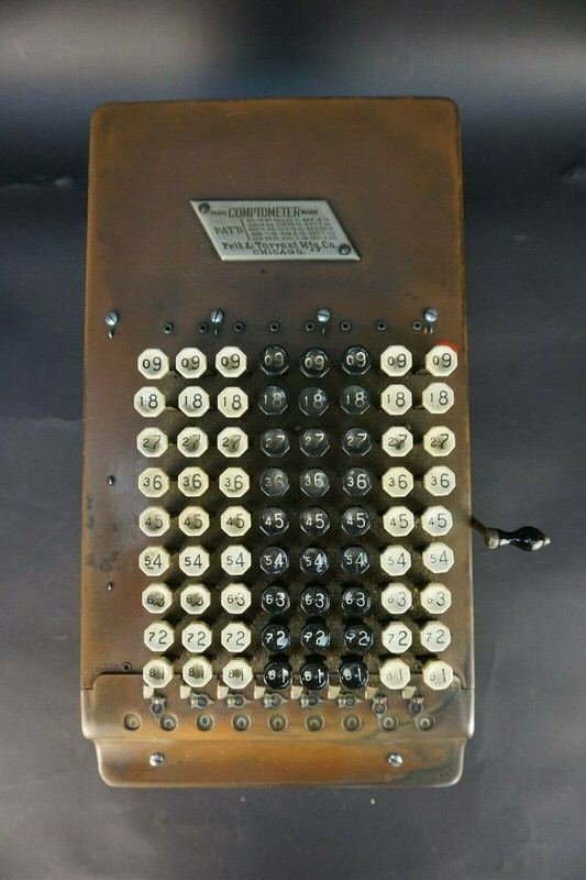
That adding machine keyboard kind of looks like this:
https://www.ebay.com/itm/Vintage-Fe...590726?hash=item5b573c41c6:g:7U8AAOSwihJc8E3k
https://www.ebay.com/itm/Vintage-Fe...590726?hash=item5b573c41c6:g:7U8AAOSwihJc8E3k
Yep! The exact layout is the same if you remove those first two columns of black keys.That adding machine keyboard kind of looks like this:
https://www.ebay.com/itm/Vintage-Fe...590726?hash=item5b573c41c6:g:7U8AAOSwihJc8E3k
I don't believe they were projected. I think they were just translights, backlit.[...]This was probably due to the set dressers refining their method of projecting these images onto the displays, however this was accomplished. (Just to maintain another difference between this set and my Season 2/3 set, I have retained this more "washed out" look)
I suspected as such too. Poor wording choice on my part.I don't believe they were projected. I think they were just translights, backlit.

Absolutely stunning as usual. I scrolled down a bit fast to the first image of the bridge, and even though my brain knew it was your work, it still couldn't help register it as "screenshot from show". I LOVE your Cage era bridge! Seeing you do that version is..well, it's something I always hoped for but never thought would happen. Getting to see different angles, especially angles and views we've never seen before is, frankly, more awesome to me than seeing something like Avengers: Endgame. I've waited much longer to see work like yours, and while I love all the stuff you do, your Star Trek stuff is easily my all time favorite! I've waited decades to see something like this, and it was worth it!
I really love the classic bridge, and I'd forgotten how cool the two pilot versions are when it comes to the buttons. I've always loved the regular "lightbrite" style buttons because they defined "futuristic" to me as a kid in the early 70's and with Star Trek being my first exposure to any type of sci-fi. But I love the earlier versions buttons even more now because, well, they actually look functional what with the buttons having labels.
Keep up the amazing work and thanks Donny!
Hi! The designer on DSC says in articles on the "new" Enterprise bridge that the door, trim etc. were "really" red that photographed orange.
“There is a distinct Enterprise Red,” Deverell explains. “I actually took that color from the CBS archives ... and it was orange! In certain episodes of TOS, the red became more of an orange. I went insane looking at different color tests. It is red. But, in canon, it’s also orange. In the end, I think it was fine and everyone was happy.”
(https://www.syfy.com/syfywire/star-...how-uss-enterprise-bridge-and-colors-returned
In S3 HD screencaps where other colors seem right including skintone, the doors seem red to me. What's your take on the color? Is it the same as the helm/nav? Apologies if this is covered upthread.
We actually did have some discussion, but it occurred in my other thread due to some overlap in topics: Donny's Refit Enterprise Interiors (Version 2.0).Hi! The designer on DSC says in articles on the "new" Enterprise bridge that the door, trim etc. were "really" red that photographed orange.
“There is a distinct Enterprise Red,” Deverell explains. “I actually took that color from the CBS archives ... and it was orange! In certain episodes of TOS, the red became more of an orange. I went insane looking at different color tests. It is red. But, in canon, it’s also orange. In the end, I think it was fine and everyone was happy.”
(https://www.syfy.com/syfywire/star-...how-uss-enterprise-bridge-and-colors-returned
In S3 HD screencaps where other colors seem right including skintone, the doors seem red to me. What's your take on the color? Is it the same as the helm/nav? Apologies if this is covered upthread.
In my studies, it appears to me that the trim colors in seasons 1 and 2 have a distinctly more orange hue to them, whereas in season 3 everything looks much more red. It could be film stock, it could be lighting changes, or it could be a result of the remastering process of Season 3. Or perhaps the sets were given a new touch of paint for season 3 (I should note that this may be likely, because at least the transporter room was repainted for season 3, from grey to lavender. It may follow that all sets got a touch-up. The briefing room set underwent some painting as well, but I've had trouble recalling when that occurred, because the painting scheme shifts mid-season). I'm not sure, but for my renders I've decided to go with a red/orange (what some call "macao orange") in WNMHGB and Season One. For my season 2/3 build (which was really intended as a Season 3 build originally), I've gone with a straight up red, just to reflect what we see in S3 HD screencaps. Whether or not these hues were the actual ones used on the set is up for debate.
I don't think the red / orange color ever changed on the bridge and I know for a fact the helm console red never changed. When I examined the helm we matched the color which was very red; not at all orange. It did have many layers of paint on it which could be seen through all of the chips in the finish and the color was the same on every level except the base color from the Cage era. I think the differences we are seeing are from lighting, film stock and post production color correction. There are other examples of colors being widely different when in fact they never changed ( for example, greens on many of the screens can appear anywhere from white, yellow, green, also the buttons on the console can appear to be wildly different as well).
On another subject, here is a photo of a matching keyboard for the "WNMHGB" science station keyboard.
On yet ANOTHER subject; great job as always Donny, your work is second to none!!
On another subject, here is a photo of a matching keyboard for the "WNMHGB" science station keyboard.
On yet ANOTHER subject; great job as always Donny, your work is second to none!!
...Donny, your work is second to none!!
If those nuns are supposedly better than Donny, how come they never post their efforts?!
Forum members: "Bill, you idiot! That's 'none', not 'nun'!"
That's NUN of your business!!!!! ")
For Donny - Regarding the astrogator yellow disc transparency problem, have you considered just putting the graphic in that area on just a solid amber surface and not worrying about the transparency of it? I personally think it would look better and would look the same.
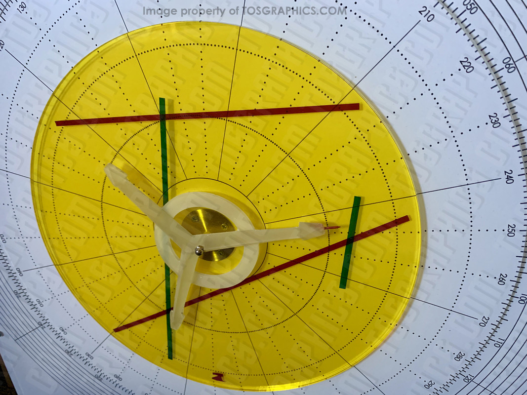
For Donny - Regarding the astrogator yellow disc transparency problem, have you considered just putting the graphic in that area on just a solid amber surface and not worrying about the transparency of it? I personally think it would look better and would look the same.
Good to know! Your up close and personal experience with the actual screen-used helm console trumps speculation. For many years I thought everything was red, and it wasn't until recently that I started seeing the red/orange and thought maybe I was wrong. Looks like I was right all along.I don't think the red / orange color ever changed on the bridge and I know for a fact the helm console red never changed. When I examined the helm we matched the color which was very red; not at all orange. It did have many layers of paint on it which could be seen through all of the chips in the finish and the color was the same on every level except the base color from the Cage era. I think the differences we are seeing are from lighting, film stock and post production color correction. There are other examples of colors being widely different when in fact they never changed ( for example, greens on many of the screens can appear anywhere from white, yellow, green, also the buttons on the console can appear to be wildly different as well).
Needless to say, I think I'll be staying with the red/orange for my S1 and WNMHGB renders to stick with the final result we see in the show (I could keep it red and just do some post processing instead, but I wouldn't no where to begin when messing with color grading).
That's NUN of your business!!!!!
For Donny - Regarding the astrogator yellow disc transparency problem, have you considered just putting the graphic in that area on just a solid amber surface and not worrying about the transparency of it? I personally think it would look better and would look the same.
I had considered it, actually, but never followed through on the idea. I'll do some tests soon.
Did you?? I don't recall that. I'd love to take a closer look if you have it handy, if I do eventually want to try to keep the material itself red and use post-processing color grading to bring it to orange.I thought I sent you the red color match. It really doesn't matter I guess since you are trying to replicate what was seen on screen.
I know this is in a videogame engine, but are there rendering programs that incorporate known film-stock qualities into their workflow, sort of a fancy version of a Polaroid image filter?
Similar threads
- Replies
- 482
- Views
- 58K
- Replies
- 43
- Views
- 11K
If you are not already a member then please register an account and join in the discussion!