• Welcome! The TrekBBS is the number one place to chat about Star Trek with like-minded fans.
    If you are not already a member then please register an account and join in the discussion!

USS Enterprise (eventually) on Discovery?

This is getting into the debate that's been raging here for quite a bit.
Discovery absolutely dropped the ball with the aesthetic. People who say "it's the 60s its outdated" don't really know what they are talking about honestly. As I've explained before, mid 20th century design is actually considered very sleek and modern even till this day. You know that little franchise Ikea? The core of it's design philosophy and style was laid down in the 1920s.
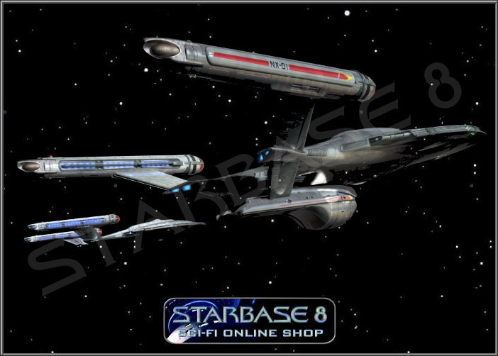
You can do 60s and still make it look sleek and cool I've posted numerous images on this board of great 60s sci-fi design that still holds up wonderfully till this day. (avatar included)
1130d848116193.56082323070b8.jpg

How is something like this not just way cooler and sleek than the awful uniforms we get in Discovery? It's the style of the era that TOS was based on (Post-War Sci-Fi) but updated to modern standards.
Hell Gucci's 2017 collection, guess what it was inspired by, let me see if you can tell?
1217761.jpg


The thing is also, Star Trek takes place in the future. Fashion and trends are cyclical, there is no reason for characters to not have a more 60s look to them, frankly it actually makes the setting look more alien and futuristic simply because it doesn't look just like now in space ships which Discovery honestly suffers heavily from (both in the writing and the aesthetic).

I just honestly do not get why you would set a show during the Cage era and not use the TOS aesthetic. It will always be mindboggling to me. Why not set Discovery then 50 years before closer to ENT or 50 years post Voyager?
First off, I love your avatar and the larger photo to lead off your post!

When I first saw the campaign for the 2017 Gucci line, I was so incredibly excited that one of the design aesthetics I've always loved (my favorites have been from Art Deco up to the 1960's) made it to major exposure!

I play in a Rockabilly band, and when we play we generally wear 1950's styled clothing. Since I also portray Buddy Holly, I try to have as much vintage or vintage styled clothing to wear for shows. But, I've also had the mood strike me to wear some of it to work. The thin tie, rounded collar shirt and blazer or sport jacket get people saying I look the sharpest because it's styling that works and looks nice.

There's something to be said about design aesthetics that are cyclical like that, and never seem to be fading away. They look good, have pallettes that excite or look cool, and it just works.
 
I mostly like it. Apart the shortened neck and the angled pylons this is pretty much what I wanted to see.

And truth be told I didn't even notice the shortened neck strut until later in the evening. All in all, it's a good Enterprise. It still looks like the TOS, DS9 and ENT versions of the Connie even if it's not a carbon copy. I'll give the creators credit for not turning her into a gaudy, bloated monstrosity.
 
As a great comedian once said when commenting on a prostate exam

"the finger going into your arse is less than pleasant... coming out isn't the worst fucking thing ever happened".
I had the same feeling when I saw the new redesign.

Very much like it. Anyone who doesn't is a canon hater.
 
After letting it sink in for a few hours, honestly, I'm not in love with the redesign. It's not bad at all, but I feel like they kept it too retro, and it doesn't really fit in with the rest of the Federation fleet. The neck and deflector dish are the parts that annoy me most. Oh well, it is what it is. I honestly like the Kelvinverse 1701-A alot better.
I am fine with the neck shortening as it makes the ship look sleeker without losing too much internal capacity, I also like the enlarged engineering section but I would have liked to see some lighting in the deflector dish, a blue tint would have finished it off nicely.

I would have preferred it if they had kept all of the Starfleet ships as round nacelles or all of them as angular nacelles, rather than angular (Shenzou), then square (Europa et all), then round (Connie) then angular (Disco) that we have got.

It just interrupts the design lineage more than I would like, like the round nacelles were a failed experiment and discontinued which they are not, other than that it is fine and it doesn't look too outdated next to the Discovery, it certainly looks better than the original would in the same scenario.

Liked the Kelvin 1701 (ample nacelles indeed) and loved the Kelvin 1701 A.
 
Yeah, I'd have at least mixed up the nacelle designs during this time period and had a blend of rounded nacelles with orange or red Bussard collectors and more angular and rectangular ones with whichever color they wanted. Just like if you're going to show California Raisin Klingons throw in some Augment Klingons and TNG-style warriors to show how eclectic the Empire is at this moment in history. Oh well. There's always Season 2.

We'll see.
 
Did anyone watch After Trek, and Mira asks Anthony Rapp about Stamets meeting Spock? He then says that Stamets and McCoy could gang up and insult Spock.

Do you want to tell him, or should I?
 
...putting Nimoy next to Quinto and a picture of the original cast in the last film takes you out of suspension of disbelief and reminds you that none of the actors even resemble the original cast.
Urban looks like a young Bones to me, and Quinto's close enough.

The others not so, admittedly.

Just like if you're going to show California Raisin Klingons throw in some Augment Klingons and TNG-style warriors to show how eclectic the Empire is at this moment in history. Oh well. There's always Season 2.

Yeah, seeing representatives of the different houses would have been an ideal opportunity.
 
Drexler's refit design might have worked in a conjectural Season 5 of ENT but he himself said in a Trekyards video that there were never any plans to give the NX-01 that major a visual refit had the series been renewed for at least one more year. I suppose the design could have come into use had ENT survived to a sixth or even seventh year and the show been deep into the storytelling of the Earth-Romulan War, but we'll never know for sure.
 
Slotted vents at the backs of the nacelles and inside exhaust cowls or hoods. Reddish-orange bussard collectors. Round nacelles. The right shape and proportions. The saucer is largely identical save for a few small details. Yeah. It's the TOS Enterprise, or close enough to it that even my nitpicky ass is satisfied and can't wait to see the next episode!
 
...Apparently, the requirement that Eaves give square nacelles to all the other ships was aimed at creating this very distinction. I wonder what the writers will make of it in the end.

Timo Saloniemi
 
If you are not already a member then please register an account and join in the discussion!

Sign up / Register


Back
Top