-
Welcome! The TrekBBS is the number one place to chat about Star Trek with like-minded fans.
If you are not already a member then please register an account and join in the discussion!
You are using an out of date browser. It may not display this or other websites correctly.
You should upgrade or use an alternative browser.
You should upgrade or use an alternative browser.
Spoilers The Orville - Starships and Technologies
- Thread starter Nerroth
- Start date
I noticed the nacelle nubs on the lowest ring too. I suspect it's the ship's version of the Hydrogen ramscoops/Bussard colelctors from Trek.
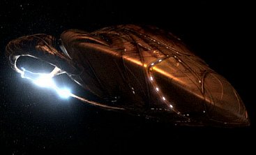
I thought the "bussards" were actually some kind of energy weapon. We do see energy bolts emanating from them in a couple of episodes, including the pilot.I noticed the nacelle nubs on the lowest ring too. I suspect it's the ship's version of the Hydrogen ramscoops/Bussard colelctors from Trek.
Has any concept art been released? I would love to see what kind of different ideas they had leading up to the final design.
It seems any weapons fire comes from little slits along the "saucer" section of the ship.

I have a dumb question about the uniform colours. Blue is command, green is medical and red is security, but what's orange? And purple? And the grey jumpsuits?
Or are they just going with whatever looks best on the actors?
Or are they just going with whatever looks best on the actors?
Ahhhhh, gotcha.Well, purple seems to be for flag rank - admirals wear purple.
Red, as you said, is security. The rest of the stuff that for some reason was lumped in with security or command on Trek - engineering and operations - is orange.
{ Emilia } remarked something along the lines of "the colors are awful" on this show, and while I don't agree I think I see what she means at least where the uniforms are concerned.
When Theiss designed the costumes for TNG he brought in a color consultant to help him select the shades and variations of the three colors he'd used on TOS that would be most flattering to actors and work best with the show's lighting design and palette. So, whether you like what they ended up with or not I think the colors are more interesting and somewhat less garish.
Orvillle borrows Trek's color-coded uniform thing, and then just goes Full Crayola Eight-Pack - "pure" bright primary colors like apple red, a true blue and leaf green, Halloween orange etc.
I think it suits the tone of the show, myself, which is pretty much big splashes of old TV adventure stuff and high-concept sf premises.
Last edited:
![91hhEvOpXQL[1].jpg](https://www.trekbbs.com/data/attachments/2/2906-ed1c4f83fcc01be7f5520bfa0a8bbcf6.jpg "91hhEvOpXQL[1].jpg")
![91wN+JP-nzL[1].jpg](https://www.trekbbs.com/data/attachments/2/2907-847c8f1900f3bca13a57d690cd2a20f2.jpg "91wN+JP-nzL[1].jpg")

![26804729_2036425386385653_1032602428234407390_n[1].jpg](https://www.trekbbs.com/data/attachments/3/3059-54e3dc408695e60911837dbb7f0977cf.jpg "26804729_2036425386385653_1032602428234407390_n[1].jpg")
![orvillepreview[1].jpg](https://www.trekbbs.com/data/attachments/3/3060-07125729aab78c7e970ad45e58c4fd91.jpg "orvillepreview[1].jpg")
Similar threads
- Replies
- 40
- Views
- 4K
- Replies
- 11
- Views
- 1K
- Replies
- 482
- Views
- 60K
If you are not already a member then please register an account and join in the discussion!