http://bit.ly/DSCatSDCC17
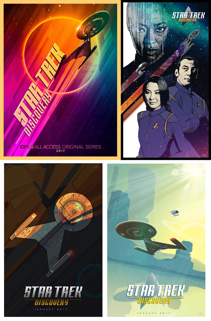
Discovery details at SDCC. New poster!
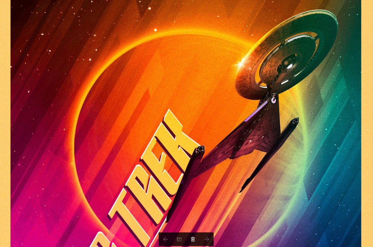
Higher resolution poster with uss discovery @startrekcbs: #StarTrekDiscovery beams into @Comic_Con! Panelists & moderator revealed plus more: http://bit.ly/2uvDndH #SDCC2017 https://twitter.com/startrekcbs/status/886980043439603712/photo/1
Discovery details at SDCC. New poster!
Higher resolution poster with uss discovery @startrekcbs: #StarTrekDiscovery beams into @Comic_Con! Panelists & moderator revealed plus more: http://bit.ly/2uvDndH #SDCC2017 https://twitter.com/startrekcbs/status/886980043439603712/photo/1
Last edited:


")