AND IT'S NOT JUST THE CAPS...SO MANY OF THOSE QUOTES ARE WALLS OF TEXT! I'D GO ON TO DEMONSTRATE, BUT I THINK YOU KNOW WHAT I MEAN!
-
Welcome! The TrekBBS is the number one place to chat about Star Trek with like-minded fans.
If you are not already a member then please register an account and join in the discussion!
You are using an out of date browser. It may not display this or other websites correctly.
You should upgrade or use an alternative browser.
You should upgrade or use an alternative browser.
The Making Of Star Trek....
- Thread starter Warped9
- Start date
The second thing I noticed was that there is no mention whatsoever of Herb Solow while GR was fleshing out his ideas and pitching the series to studios and networks. On these pages it's made to look like it's all Roddenberry with no mention of anyone else or their input. That's quite in contrast to how the events are recounted in Inside Star Trek: The Real Story by Herb Solow and Robert Justman.
I was hit by that too, when I read Inside Star Trek and thought back to the older book. TMOST gives GR all the credit.
His words were meant to be IMPORTANT. We were supposed to be hanging off every one of them!
Yes. Those massive-looking quotes seem to lay early groundwork for the Roddenberry-as-Great-Man cult that flourished throughout the 1970s. They look like the words inscribed in the Lincoln Memorial.
TMOST was the first Star Trek book I ever had. It's hard to overstate this volume's importance to the masculine side of fandom: it was the trailblazing book for future Making Of's, as well as the whole Technical Manual genre. Franz Joseph obviously devoured TMOST as his major source of research.
Incidentally, there was a time in my childhood when the cover photos on TMOST were my only glimpse of the show in color. That was tantalizing, especially the eight pictures on the back.
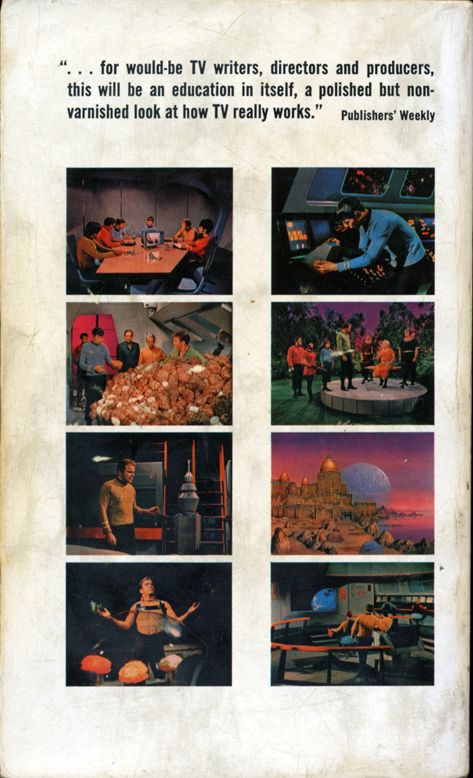
And that's even with seven of the eight pictures flopped!
They look like the words inscribed in the Lincoln Memorial.
A literal wall of text...possibly the inspiration for the phrase.
They look like the words inscribed in the Lincoln Memorial.
A literal wall of text...possibly the inspiration for the phrase.
I can't find that confirmed anywhere, but that's an insightful observation nonetheless.
This! I've recently been picking through this book hither and yon, and that's a very annoying feature.
EVEN IN THE LATE 60S THEY MUST HAVE HAD THE MEANS TO SET APART EXTRACTED QUOTES WITHOUT MAKING IT SEEM LIKE THE GREAT BIRD OF THE GALAXY IS YELLING AT ME FROM BEYOND THE GRAVE!
Except they didn't have the Internet in the late '60s (except for the earliest forerunners of the technology), so the convention of all caps representing "shouting" wasn't really around yet. If anything, at the time, it probably would've reminded people of telegrams or teletype messages, since they were written in all caps.
Given the more limited and labor-intensive mechanical typesetting techniques of the time, it was probably easier to set large blocks of text in all caps in normal font than it would've been to set them all in bold print or italics or a different font. So doing it that way may have been for the sake of economy or efficiency.
The parts that I've reread also strike me as a bit shoddily organized...especially devoting a chapter early in the book to the story outline for "The Cage". Seems like that would have been better in an appendix where it wouldn't interrupt what narrative flow the book has. Whitfield wasn't a professional author and it shows in how the book is put together. The question is, where was his editor?
I never had a problem with it. No reason a reader couldn't just skip over the chapter if they didn't want to read it. And it made sense to me to organize it chronologically. David Gerrold's The Trouble With Tribbles does the same thing, inserting the various story and script drafts within the narrative at the points where they logically fell.
After all, people back then didn't have the short attention spans of the modern audience. Lots of older books have long digressions in the middle.
Same.The parts that I've reread also strike me as a bit shoddily organized...especially devoting a chapter early in the book to the story outline for "The Cage". Seems like that would have been better in an appendix where it wouldn't interrupt what narrative flow the book has. Whitfield wasn't a professional author and it shows in how the book is put together. The question is, where was his editor?
I never had a problem with it. No reason a reader couldn't just skip over the chapter if they didn't want to read it. And it made sense to me to organize it chronologically. David Gerrold's The Trouble With Tribbles does the same thing, inserting the various story and script drafts within the narrative at the points where they logically fell.
After all, people back then didn't have the short attention spans of the modern audience. Lots of older books have long digressions in the middle.
This! I've recently been picking through this book hither and yon, and that's a very annoying feature.
EVEN IN THE LATE 60S THEY MUST HAVE HAD THE MEANS TO SET APART EXTRACTED QUOTES WITHOUT MAKING IT SEEM LIKE THE GREAT BIRD OF THE GALAXY IS YELLING AT ME FROM BEYOND THE GRAVE!
Except they didn't have the Internet in the late '60s (except for the earliest forerunners of the technology), so the convention of all caps representing "shouting" wasn't really around yet. If anything, at the time, it probably would've reminded people of telegrams or teletype messages, since they were written in all caps.
Gene Roddenberry was also alive in the 1960s, so sarcasm is clearly indicated.
Conflating a well-organized book with a short attention span is barking up the wrong tree.
As for the extracts, a little left and right indent and a slightly different font size in upper-lower case would have done wonders for making those quotes more friendly on the eyes. Or even set them in the normal text width and font but set them apart with asterisks or another ornament above and below. All caps must have been amateurish book design even then.
As for the extracts, a little left and right indent and a slightly different font size in upper-lower case would have done wonders for making those quotes more friendly on the eyes. Or even set them in the normal text width and font but set them apart with asterisks or another ornament above and below. All caps must have been amateurish book design even then.
All caps must have been amateurish book design even then.
It's the sort of thing you'd do if all you had was a regular typewriter, so, yes, it was.
All caps must have been amateurish book design even then.
It's the sort of thing you'd do if all you had was a regular typewriter, so, yes, it was.
Or, again, for the sake of typesetting without having to do more complicated and time-consuming and expensive techniques like switching between multiple fonts. The same all-caps use for special text is also used, for example, in James Blish's Cities in Flight novels, where the lordly voice of the City Fathers computers is rendered so. (Of course there, the metaphor of teleprinting was probably on Blish's mind.)
TMOST was the first Star Trek book I ever had. It's hard to overstate this volume's importance to the masculine side of fandom: it was the trailblazing book for future Making Of's, as well as the whole Technical Manual genre. Franz Joseph obviously devoured TMOST as his major source of research.
Incidentally, there was a time in my childhood when the cover photos on TMOST were my only glimpse of the show in color. That was tantalizing, especially the eight pictures on the back.
And that's even with seven of the eight pictures flopped!
I vote for six of eight flopped. Isn't the one of Kirk with the Providers printed correctly?
I vote for six of eight flopped. Isn't the one of Kirk with the Providers printed correctly?
I think Greg is right, seven are backward.
When I scanned that cover, I actually did save a flipped copy, to have the thing both ways.

It's a must-read for any serious TOS fan. It was also one of the first really in-depth books about television production, so in its day it had a lot of impact beyond Trek fandom, I believe. It was certainly the book that created my lifelong interest in film production, and its glimpses into the work of writers may even have helped inform my eventual choice to become one. (I never considered that possibility before just now, but it seems logical.) It's definitely one of the best "making of" books I've ever read.
^ This.
TMOST was a treasure for anyone longing to uncover the secrets of TV production. The pre-TMOST issue of American Cinematographer and any fantasy media magazine covering TOS x 1000 would not come close to the volume of valuable information about TOS. Being released while the show was still in production, fans would forever watch episodes following it with a sense of being an insider--seeing stories from both sides of the camera.
Not uncommon for ST, TMOST was a groundbreaking, and if one adds Gerrold's The World of Star Trek & The Trouble with Tribbles, you could walk away getting a great idea of what it would mean to tackle a career in film--including the rough, disappointing sides of it.
"Making of" books were far and few between in that period, but I would add John Gregory Dunne's The Studio (the behind the scenes look into 20th Century Fox business, TV & film production during 1967), and the wonderful Superman: Serial to Cereal (1977), with its extensive insights on the Fleischer cartoons, Alyn serial, Reeves series and the marketing of Superman in general.
Most would rather browse Memory Alpha, and while its there to be a go-to resource, there's no replacing all that TMOT offers. It was the ultimate "you are there" book on TV.I've come across threads on this BBS where people didn't know where these ideas came from, and it startled me that there are Trek fans out there who haven't read TMoST. I think of it as essential reading.
"Gosh, Mister Roddenberry, this all-caps comes off like the Voice of God or sump'in!"
"It does? I like that!"
"It does? I like that!"
As for the extracts, a little left and right indent and a slightly different font size in upper-lower case would have done wonders for making those quotes more friendly on the eyes. Or even set them in the normal text width and font but set them apart with asterisks or another ornament above and below. All caps must have been amateurish book design even then.
But the numerous production memos reproduced in the book, many of which were written by Roddenberry, were set off by indented margins and so on. If Roddenberry's own musings had been set off the same way, they might've been confused with the memos.
Extracts and other special elements appear together in professionally designed books all the time...it just takes a little consideration being put into the design. Less is more, and ALL CAPS definitely ain't less.
I vote for six of eight flopped. Isn't the one of Kirk with the Providers printed correctly?
I think Greg is right, seven are backward.
When I scanned that cover, I actually did save a flipped copy, to have the thing both ways.
Its six. The orange Provider is on the left as he was in the episode, and Kirk's diagonal scar and hair part are correct.
Its six. The orange Provider is on the left as he was in the episode, and Kirk's diagonal scar and hair part are correct.
Thanks, GS. As long as we've got it nailed down, I'm going to put a detailed caption in the meta-tag of my full-size scan.
My first copy of TMOST was a 10th printing from '73; the white cover with the production-revision E firing phasers. Many years later, I ran across a first printing in a second-hand bookstore for a couple of bucks. Paging through it I found that two of the cast photos had been autographed: by Doohan and Takei. Best two dollars I ever spent.
The back page of the first edition has an ad for Paul Erlich's The Population Bomb; the great-granddaddy of today's chicken-little eco-porn. The more things change...
The back page of the first edition has an ad for Paul Erlich's The Population Bomb; the great-granddaddy of today's chicken-little eco-porn. The more things change...
Similar threads
- Replies
- 87
- Views
- 21K
- Replies
- 118
- Views
- 6K
- Replies
- 1
- Views
- 434
- Replies
- 0
- Views
- 2K
- Replies
- 32
- Views
- 2K
If you are not already a member then please register an account and join in the discussion!