• Welcome! The TrekBBS is the number one place to chat about Star Trek with like-minded fans.
    If you are not already a member then please register an account and join in the discussion!

WIP - My take on the TOS Enterprise.

abaldwin360

Lieutenant
Red Shirt
It's been slow going, I only get to work on it for a few hours off and on, and it's been FOREVER since I fired up a 3D program.

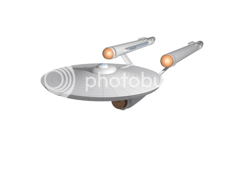
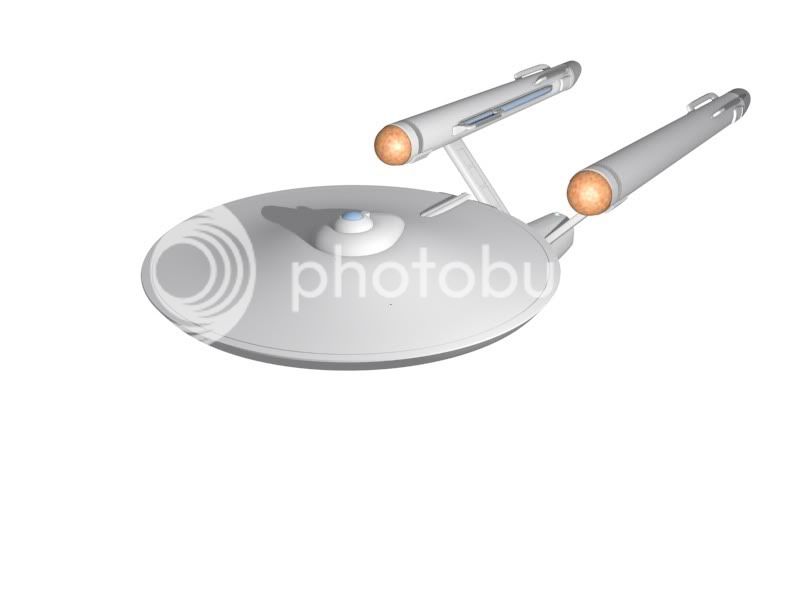
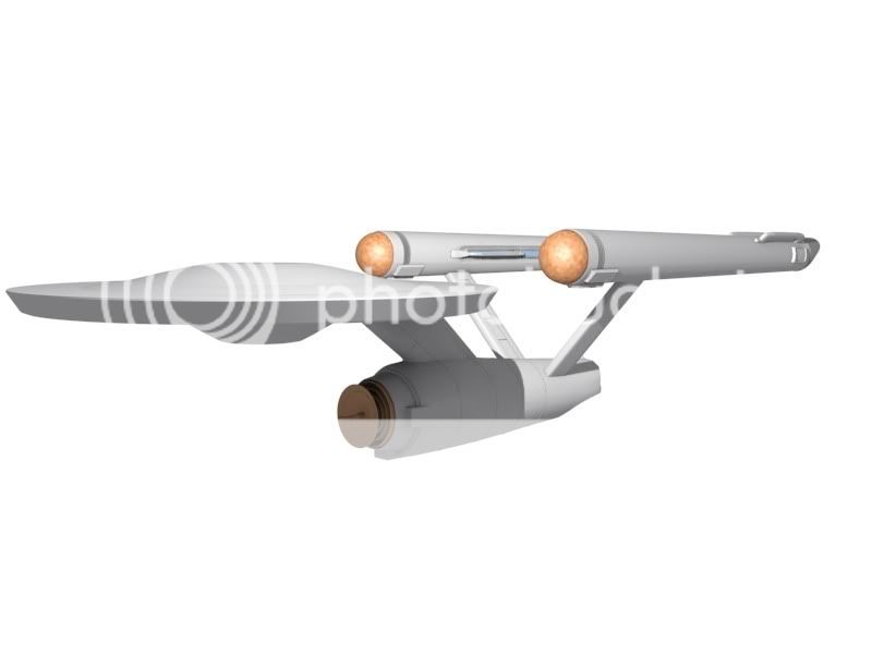
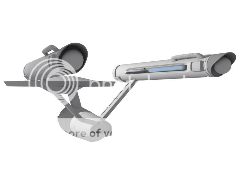
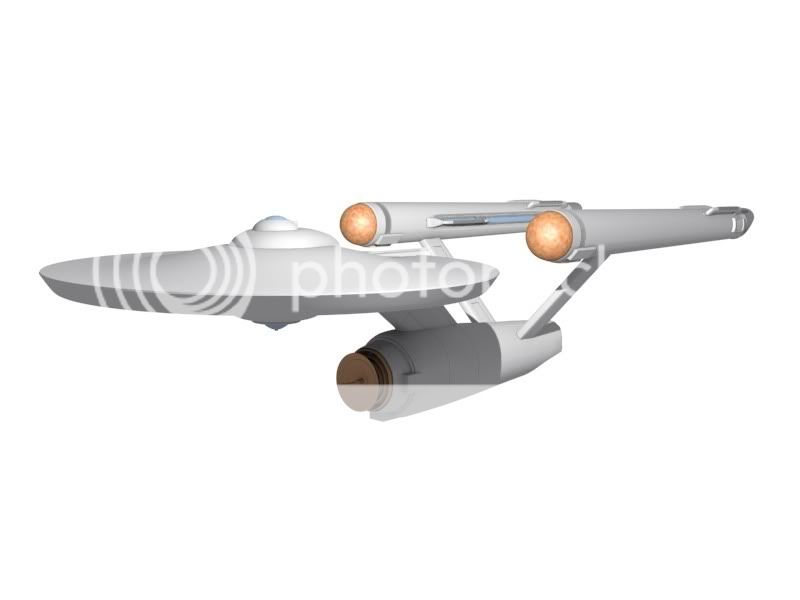
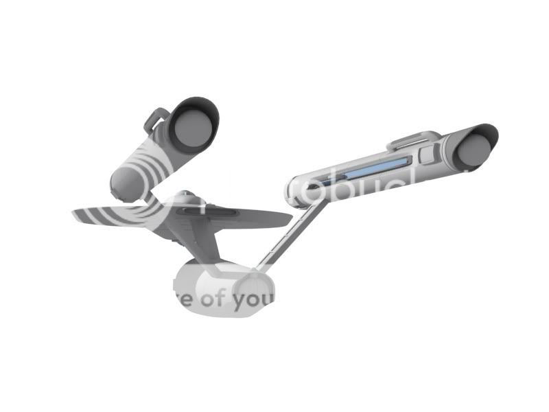
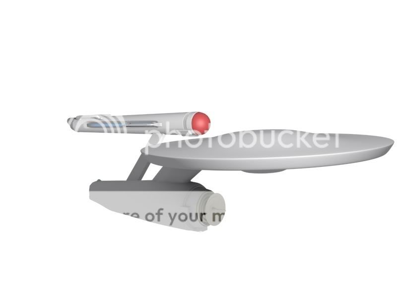
Here's what I have so far, I hope to get more work on it done tonight.

pic1.jpg
 
Very nice. She looks like a Connie, with nice little changes! I like the impulse section, and the subtle scribed lines.
 
:techman: Good choice! Alan Sinclair's Enterprise blueprints are just about the best publicly-available plans available.

I look forward to watching your progress!
 
:confused:

Did I say anything negative about Charles' blueprints? They're good, too. Just because I characterize Alan Sinclair's work as one of the best doesn't detract from the excellence of the Casimiro plans.

Honestly, some people just go looking for an argument...
 
No argument, honest! :)

I just wondered about the benefits of one versus the other. Clearly my tone of voice didn't carry well in text ;)
 
Okay, need some feedback. Cut a bunch of panel lines into the saucer section, and I decided I REALLY don't like the way it looks. Seems like too much... What do you guys think?

lines01.jpg
nolines1.jpg


lines02.jpg
nolines2.jpg


(In the mean time, I'm going to work on the impulse vents and some other detailing).
 
The grid lines look out of place because the original never carried them, or certainly not to that level of prominence (you can occassionally see something in the extreme close-ups, such as the "Cage" zoom in). There's been a fair bit written on this already on the TrekBBS and it seems that the "grid" on the 11 foot model was a pencil drawn guide for lining up the special effect shot. As far as I know there's never been anything on the lower saucer in the original series.
I have no idea why the grid became so prominent in later official drawings and diagrams.

So my vote - keep it clear!

Your ship is looking excellent BTW - I particularly like the mottled effect on the nacelle forward endcaps.
 
You might try making the grid lines shallower, or even come (just barely) out from the saucer (and have a less specular material) rather than go in. The shadows wont be as harsh that way and might actually be more like the original since they were drawn on the surface and not carved in.
 
You've got the right number of pie-shaped radial "slices" (28) if you're trying to mimic the pencil lines on the upper surface of the 1960's studio model, but I think you may have too many concentric rings. The original model was divided into seven rings of roughly (but not quite equal) width. If you're using the Sinclair or Casimiro blueprints I'd stick with their measurments of this feature--too many rings and you make the ship's scale look wrong.
 
You've got the right number of pie-shaped radial "slices" (28) if you're trying to mimic the pencil lines on the upper surface of the 1960's studio model, but I think you may have too many concentric rings. The original model was divided into seven rings of roughly (but not quite equal) width. If you're using the Sinclair or Casimiro blueprints I'd stick with their measurments of this feature--too many rings and you make the ship's scale look wrong.

Thanks! That makes sense, I'm going to work on it some more tonight! A lot of this is like I'm learning to model all over again. It's been YEARS since I've worked on 3D stuff.
 
If you are not already a member then please register an account and join in the discussion!

Sign up / Register


Back
Top