Well, I'm anxious to see an animation of how those are going to look.
Any chance of putting one up sometime soon-ish?
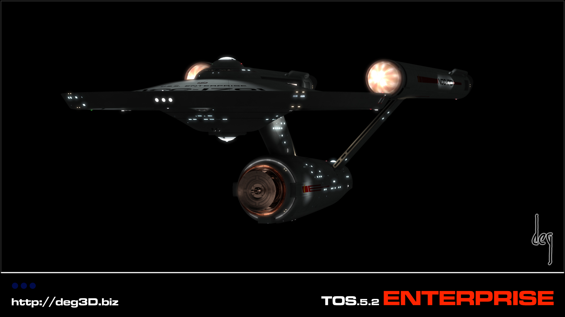
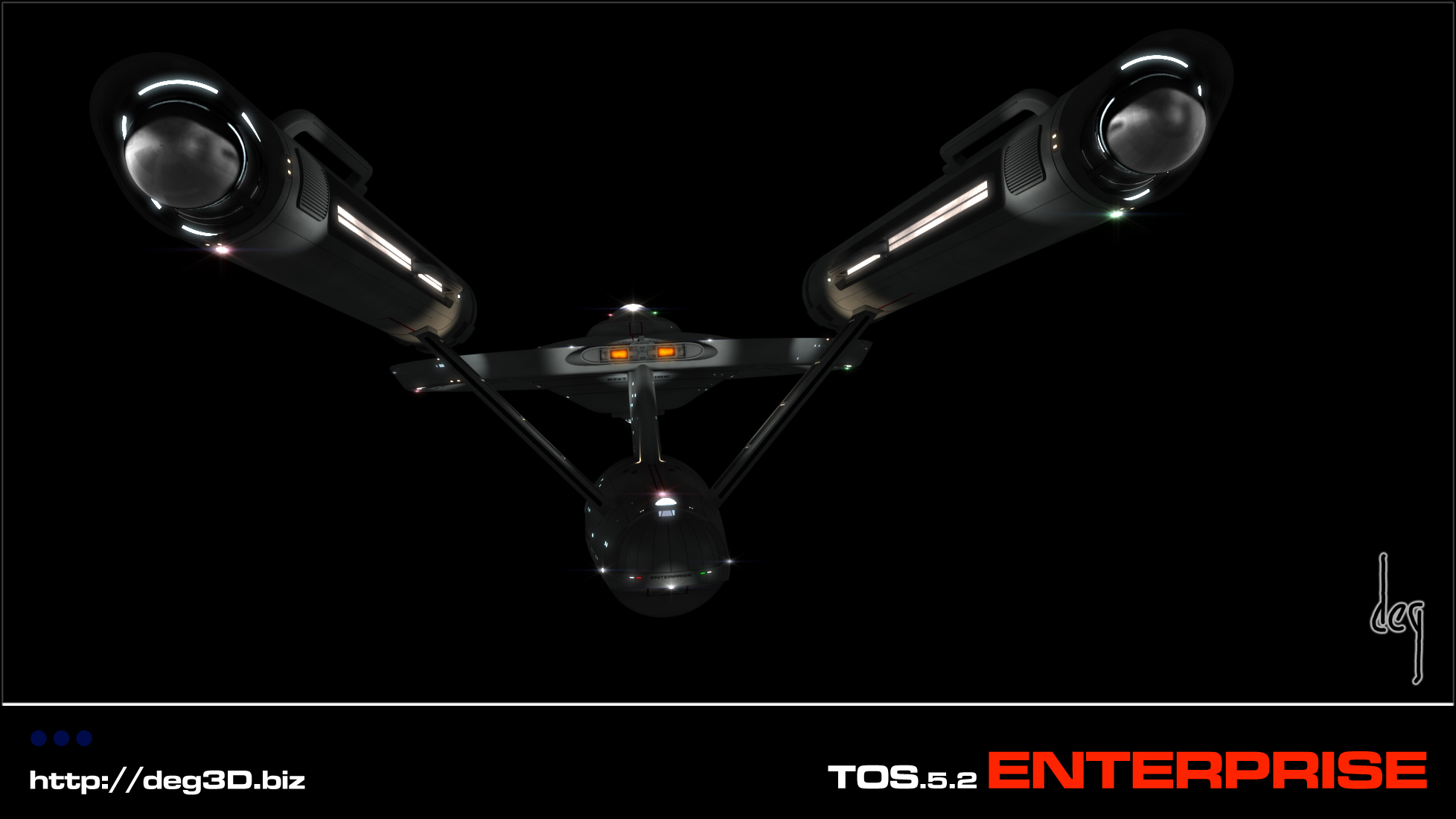
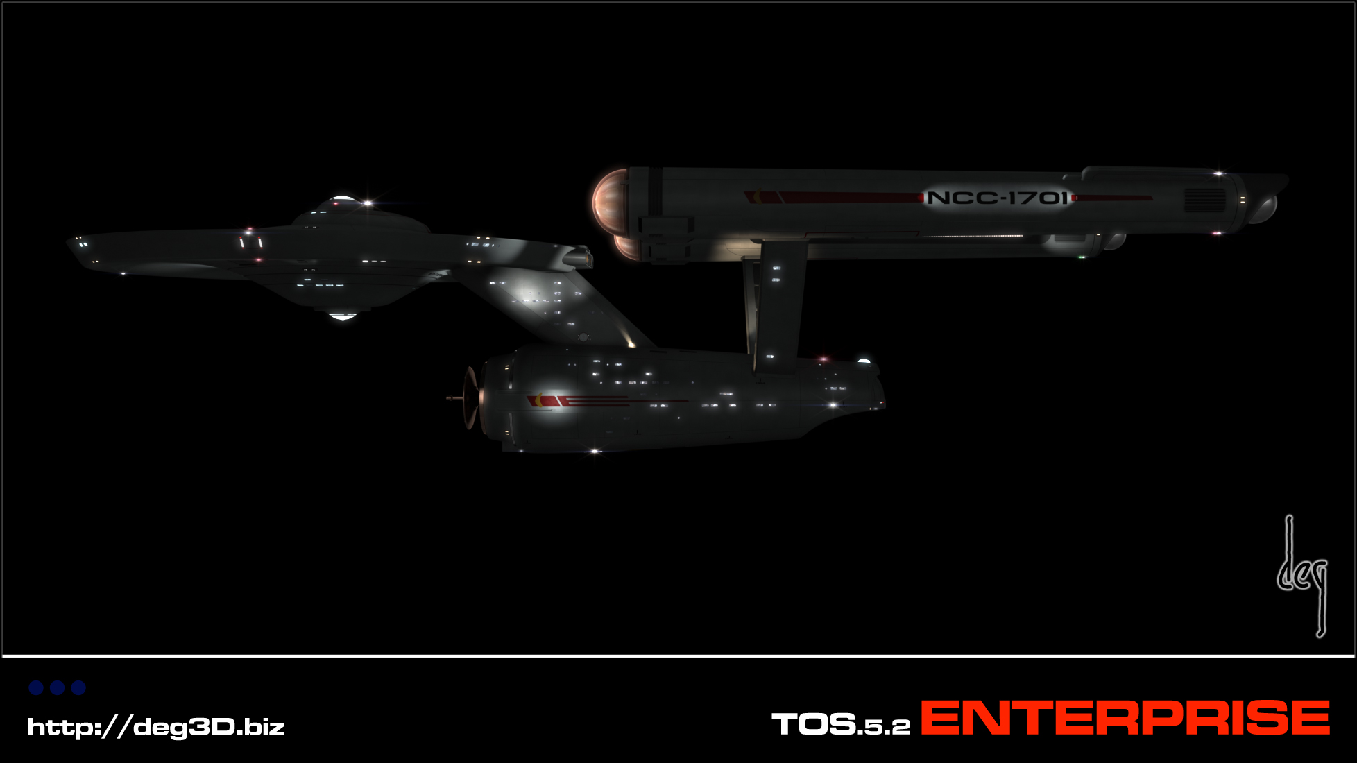
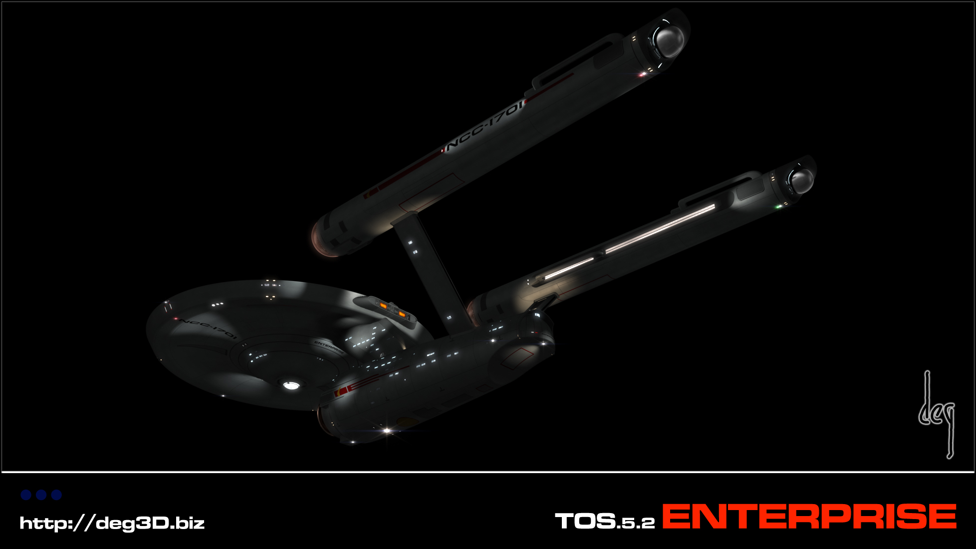
The "front dome" effect is one of those things that really is "most likely to be reinterpreted," I think... and it all comes down to what you choose to treat the domes as. For me, they'll always be "gas collectors" so whatever is in there, it needs to look like there's superheated gas swirling inside (something that the TOS effect did quite well, IMHO) This was my main quibble with Gabe's take... and with that of many others. I don't care for "glowy mechanical bits." The "glow" should be coming from the hot gas, as far as I'm concerned. That fact that it flashes and sparks and so forth is fine... that's what real plasma tends to look like in similar situations.
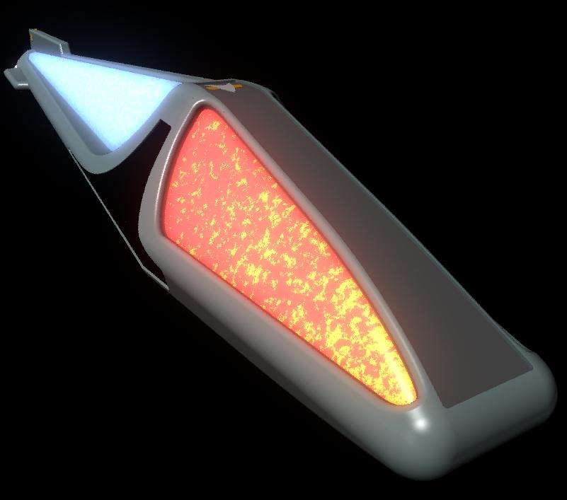
Still... on Vega, I did my own "gas intake" effect using an animated "3D texture" in Maya, which I was very happy with (and once I get my new system up and running, I do plan to finish that!). Here's a shot of the Vega's nacelle (replicated twice, of course!)
The "TNG-era glowing primary-color red orbs" never really worked for me, because it never felt like anything except "red L.E.D.s." (Which, of course, it was, essentially!) Something dynamic has to be happening there.
So, let's see your "dynamics," shall we?
")
I think you nailed it. Looks awesome.
")