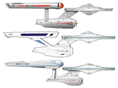
Clunky? That classic, timeless, sleek, elegant design is CLUNKY?? Sacrilege!. . . I'm totally mystified by the group that thinks the original looks better. The original looked exactly like what it was - a clunky model built on a limited budget. The design looks dated even when it's done with CGI. The parabolic radio dish is so ridiculously out of place on a ship that is supposed to be hundreds of years in the future.
And it's not a “radio dish” -- it's a sensor-deflector dish.
Yup, clunky - at least compared to the refit. The cylindrical nacelles and the vertical pylons (viewed from the side) are eyesores by comparison.
I have to call BS on the sensor-deflector. It looks exactly like a parabolic radio antenna and it just screams 20th-21st century. The blue bubble on the refit is way more believable as a sensor-deflector since it doesn't look like any present-day technology and it's much prettier.
The original was perfectly acceptable in it's day but it can't compare to the refit.
One thing that bugs the crap out of me with almost all starfleet ships is that they fire the main phasers from the primary hull. It looks pretty but it is senseless. Matt Jeffries specifically designed separate living quarters and engineering spaces and with good reason. Channeling huge amounts of power from the engineering section through the living quarters to the phaser emitters just doesn't make sense. At least they put the torpedo bay where it belongs on the refit.
Last edited:
")


 )
) .
.