So am I, but I can see them on TV - and TV itself isn't exactly limited to a 19-inch diagonal these days. I'll pay the big bucks to see Avatar or a naked Anne Hathaway in IMAX - but TOS? Probably not. 
Indeed I did. I think it may have been the second DOS game I bought. Heck, I even played Universe (or tried to) on the Apple ][.What? You actually played one of those games?!Huzzah! I LOVED that game!
Those displays look like they work AND they look like TOS. Nicely done.
Wow, this is a real roller coaster of a thread.Yeah that's not unreasonable. And probably what the majority of Joe and Jane Public thinks.
I don't remember if it was fan speculation, or someone from the production team suggested it, but I recall such an idea being bandied about early in the production process. Perhaps that was the intention, I don't know, but for me, that's not what we got.Someone hit the nail on the head with the Galaxy Quest comparison: I think it would have been possible to get something closer to the TOS bridge but make it "real". To get the feeling of "Ohhh, this is what it was supposed to look like all along." You know, like you'd have in a $150 million dollar movie. I think they NAILED that with the uniforms, btw. (And I haven't heard anyone say that those were unusable. At least not since they actually used them.)
")
So, I'm trying to phrase this so that you know it's a real question and not rhetorical: Does anyone love the JJ bridge?
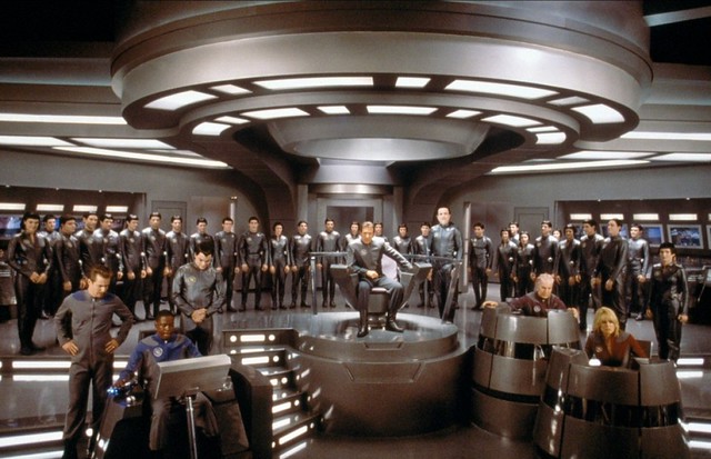
Putting stations behind these panels creates relatively isolated groups of stations where it seems like people would be able to concentrate more easily. And yet they are also still in easy call of the captain. Having more people on the bridge is much more realistic. I like the bridge officer standing over the captain's shoulder. She is hot. I am fine with the viewscreen. I felt that there were many times in TOS when a port looking out into space would have easily solved the problem at hand. And the new viewscreen loses none of the functionality of TOS.J.J. Abrams stated the difficulty of depicting the future was that much of modern technology was inspired by the original series, making it seem outdated. As such, the production design had to be consistent with the television series while also feeling more advanced than the real world technology developed after it. [28] Specifically, he felt that the original series had a "kitschy quality" to it which had to be abandoned for the sake of realism. [29]
According to production designer Scott Chambliss, redesigning the Enterprise and especially the main bridge began with laying out a framework of ground rules: the sets had to reflect the optimism of the original series, while also having a real functionality to them. "There was a strong, sleek, modernist vision at play in the 1960s when the television series began," says Chambliss. "That was something we wanted to infuse in our look." As such, the Enterprise draws inspiration from the work of Pierre Cardin and the sets from the 1968 film 2001: A Space Odyssey. (Production notes)
Chambliss maintained the layout of the bridge from the original series, but added more consoles and glass data displays to increase its functionality and make it more "busy." He also altered it aesthetically, with brighter lights and colors. The main viewscreen was turned into a window that could have images projected on it to make the space environment palpable. The bridge set was built on gimbals so the ship's rocking motions when it was attacked or when it accelerated to warp were more realistic. More railings were added to the bridge set to make it appear safer. [30] [31]
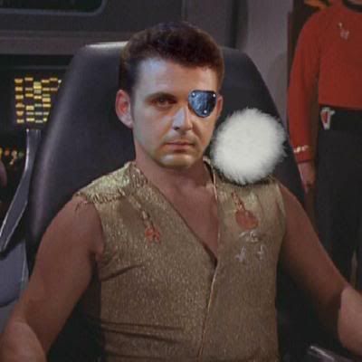
I already complained on another board a few years ago now that they distorted the insignia and that is not to my liking. Also, I don't like the sciences symbol. They botched that one. However, command and engineering are fine. The shirts and everything else is fine. The dresses are A-OK, and their sleevelessness rocks.I think they NAILED that with the uniforms, btw. (And I haven't heard anyone say that those were unusable. At least not since they actually used them.)
Ditto. I like the way Dennis put it, they threw us TOS fans a bone with that one. As I said upthread, the Kelvin sequence made me think that this was how The Cage would "really" look.To me, if they had done something more like the Kelvin for the Enterprise bridge, I'd have been ecstatic.
@Dennis re:Protector --- Thanks, that's awesome.
")
Heck, I even played Universe (or tried to) on the Apple ][.
Oh I'd definitely pay to see it. Heck, I'd pay to see Exeter, or Farragut, or Phase II on a big screen. I never tire of seeing good stories in that setting. But then, I'm a fan.
Oh I'd definitely pay to see it. Heck, I'd pay to see Exeter, or Farragut, or Phase II on a big screen. I never tire of seeing good stories in that setting. But then, I'm a fan.
Theoretically, or in this case, hypothetically speaking, what do you think a J.J. Abrams version of Exeter or Farragut would be like?
We use essential cookies to make this site work, and optional cookies to enhance your experience.