-
Welcome! The TrekBBS is the number one place to chat about Star Trek with like-minded fans.
If you are not already a member then please register an account and join in the discussion!
You are using an out of date browser. It may not display this or other websites correctly.
You should upgrade or use an alternative browser.
You should upgrade or use an alternative browser.
What Enterprise is the better design part 2 ?
- Thread starter Stardate
- Start date
They represent two different lines of thinking in design.
One is for exploring/peacetime, and the other is more for military/wartime. That being said, while I love both designs I gave the nod to the Sovereign.
One is for exploring/peacetime, and the other is more for military/wartime. That being said, while I love both designs I gave the nod to the Sovereign.
The Galaxy Class is Hideous. Sovereign isn't much better, but it IS better.
A
Amaris
Guest
I voted for the Galaxy Class. A pristine, bejeweled city in space, leaping to the unknown on the gossamer hope of knowledge triumphant and the burning desire to see the unknown. 
J.
J.
Galaxy class for me - it looks sufficiently different from its movie era predescessors and is attractive from some angles. The Soverign is trying too hard to look like the refit IMHO.
J. Allen said:
I voted for the Galaxy Class. A pristine, bejeweled city in space, leaping to the unknown on the gossamer hope of knowledge triumphant and the burning desire to see the unknown.

A
Amaris
Guest
A beaker full of death said:
J. Allen said:
I voted for the Galaxy Class. A pristine, bejeweled city in space, leaping to the unknown on the gossamer hope of knowledge triumphant and the burning desire to see the unknown.


Yeah.
J.
trevanian
Rear Admiral
LCARS 24 said:
Not at the same scale, but . . .
I think I get your point; they BOTH have lousy silhouettes.
J. Allen said:
I voted for the Galaxy Class. A pristine, bejeweled city in space, leaping to the unknown on the gossamer hope of knowledge triumphant and the burning desire to see the unknown.
J.
Must you be so coarse?
")
trevanian said:
LCARS 24 said:
Not at the same scale, but . . .
I think I get your point; they BOTH have lousy silhouettes.
Okay, well, what about the 1701-C, then?
Tough choice... because I hate both designs so much. As others have mentioned the 1701-D over-sized, oval saucer unbalances the whole design. The lines of the ship are too soft and look like someone melted a Constitution-Class saucer section. It only looks good from a couple angles and even then it doesn't look *that* good. The 1701-E on the other hand... is just ugly.
trevanian
Rear Admiral
LCARS 24 said:
trevanian said:
LCARS 24 said:
Not at the same scale, but . . .
I think I get your point; they BOTH have lousy silhouettes.
Okay, well, what about the 1701-C, then?
Nacelles are a little higher, almost there ... guess you gotta go back to Kirk's ship for the best silhouette (though according to Nilo Rodis, if you shot the refit in profile it didn't look right.)
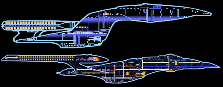
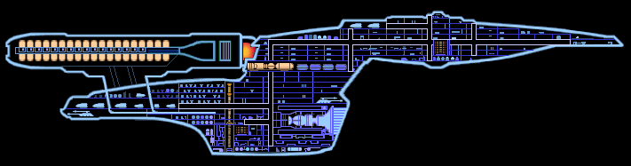
I have cutaways like these of the Ent-B and NX-01, but I can't say they cut handsome profiles, either. Maybe the Akira class beats all of these when viewed from the side, but we haven't had a real Akira-class Enterprise.
The Galaxy-Class as Andrew Probert originally intended it to be, not the additions made be others after he left the production team.
Some of those intentions can be viewed in the Ed Whitfield blueprints and not the Sternbach-Okuda blueprints.
Ed Whitfield's Galaxy-Class Blueprints
One of the things that I liked the most about Probert's original intentions was that the edge of the saucer was tapered with windows lining the upper part and lower part of the deck for viewing, where there was no room for a Ten-Forward.
The Galaxy seems to be winning, despite the loudness of the opposition.
Anyway, neither design is terrible, but I find the E-E too squatty, neckless, and oddly shaped. It tries to be an ENT-B too much, with a giant leap backwards in deflector design and huge, illogical impulse vents. Not to mention all the crap stuck on the bottom of the saucer. It looked Ok in FC but went down hill with the redesign.
Anyway, neither design is terrible, but I find the E-E too squatty, neckless, and oddly shaped. It tries to be an ENT-B too much, with a giant leap backwards in deflector design and huge, illogical impulse vents. Not to mention all the crap stuck on the bottom of the saucer. It looked Ok in FC but went down hill with the redesign.
Have to go with the Galaxy. Like I've said before, the Enterprise-E looks terrible. It's a TNG type-2 phaser with nacelles on it. The Enterprise-D was meant for long term exploration and to have families aboard because of it. Hence, the large primary hull. There was no need to make the secondary hull too big because the only people there would be engineers. Although neither design holds a candle to the original Enterprise refit.
Similar threads
- Replies
- 4
- Views
- 2K
- Replies
- 60
- Views
- 9K
- Replies
- 0
- Views
- 3K
If you are not already a member then please register an account and join in the discussion!