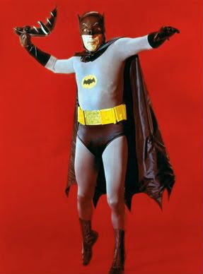
I hope the enterprise gets redesigned quite a lot, lets be honest here the design has aged very very badly, the original has aged as well as a a knackered oldsmobile and looks far too 60's not to mention fragile.
It wasn't a attractive ship to begin with with it looking very awkward, hell there were early publicity shots shown upside down as people thought the ship looked daft the other way up.
The BoP is a much better design which has stood up very well, the old enterprise looks like it would crack aprt at its spindly anorexic seams if it ever tried anything stressing like moving.
With all do respect, you seem to know very little of spacecraft design. The original looked both elegant and functional, which is difficult to pull off.
With all due respect you know very little about spacecraft design. The original looked both as elegant as giraffe in roller skates and the polar-opposite of functional, which is difficult to pull off.
I fail to see why anyone would design a ship with so many structural load points, so little interior volume to outside dimensions and with so little access to the import bits.
''oh noes! there is a problem with the nacelle! I will have to get up there, up this long and very tight pylon which isnt wide enough unless i breath in while its flexing back and forth and might as well have targets painted on it for the enemy to aim at as one hit will completely cripple the ship!''
The E got better with redesigns but the ToS version was pretty dire.
Aloha, I really think that your post is based upon trying to pick a fight rather than trying to argue a point. You're saying things you KNOW that many, if not most, of the folks around here will disagree with and you're saying them in the mosts mocking, inflammatory fashion possible.
You're spoiling for a fight. Why?
Here's the fact. The 1701 is not an actual space vessel. It's a work of art associated with another work of art. Whether or not it's "high art" we can debate, but it's art nevertheless.
Now, there are many issues, both scientific and artistic, associated with the design of this ship. And the design is, by and large, DEEPLY APPRECIATED by people who... let's be blunt here... have a HELL of a lot more experience and scientific knowledge than you seem to have.
It's considered beautiful, and ICONIC, by a hell of a lot of people throughout the population of the planet.
It's not considered beautiful by you. OK, fine, we get it. That's where the "art" part comes into play. I don't particularly appreciate Picasso's work. I think it looks stupid and goofy. Yet, it's still ART.
If I were to come along and paint a new picture... maybe a much BETTER picture (from my perspective) and claim that it should "replace Picasso's original," how do you think people would react to that?
Now, to me, Matt Jeffries' design for the 1701 is gorgeous... it's high art from my standpoint. So your suggestion to "replace" it has the same ring as saying that you want to replace the Mona Lisa with your kindergarten finger-painting and call it the same thing. Go into the gallery where the original is hanging, take it down, and put YOUR "version" up instead... but keep calling it the same thing.
You don't have to LIKE it. And you know what? That's fine.
But I really, REALLY get the impression that this isn't about "not liking it" so much as it's about "let's piss off the people who really DO like it."
Am I wrong about your intentions here? If so.. please explain, just what, exactly, is your POINT?


 :rolleyes:")


")