I assume one of those was supposed to say Orville?Discovery looks ok, it gets the job done, but it certainly doesn't stand out like Disco
-
Welcome! The TrekBBS is the number one place to chat about Star Trek with like-minded fans.
If you are not already a member then please register an account and join in the discussion!
You are using an out of date browser. It may not display this or other websites correctly.
You should upgrade or use an alternative browser.
You should upgrade or use an alternative browser.
I assume one of those was supposed to say Orville?
Maybe he meant Disco era, the 70s. That era definitively had its own distinct visual style.
I never could get a consistent feel for the scale of different ships as they were shown on-screen. It all felt very arbitrary from episode to episode (through ep. 9).I feel like a lot of the space combat shots unintentionally (with their close-in cropped shots and blur filters) create a "tilt-shift" effect, making it seem like the ships are tiny models rather than full-size.
I assume one of those was supposed to say Orville?
DOH yes.
Maybe he meant Disco era, the 70s. That era definitively had its own distinct visual style.
I shoulda went with that.
I never could get a consistent feel for the scale of different ships as they were shown on-screen. It all felt very arbitrary from episode to episode (through ep. 9).
So basically, Star Trek
IMO (and including 'The Expanse') all current shows are on about the same level as VFX go. Nothing done by "The Oville' VFX team stands out as above anything else, and hell, on occasion they've just had the ships 'hanging there' firing at each other (probably trying to ape the various Trek effects from the 1990ies as that is a style choice they seem to be going for.)
Nothing from any of these shows stands out to me as 'jaw dropping/amazing'. As long as the SFX are used to serve whatever story is being told, and complement said story. That's all I care about. YMMV.
Orville has a lot of physical models.
Discovery looks ok, it gets the job done, but it certainly doesn't stand out like Disco, Dark Matter looks pretty friggin good though.
Especially considering it’s fairly low budget. I thought the Raza was a physical model in some shots. It’s designs are good too, which always helps.
Gravity bombs in space?
Magnets.
Since I do CGI Visual Effects for a living, and starships vfx as a hobby, I'll chime in. I have to agree with the OP, I'm disappointed in almost all of Discovery's exterior starship shots. There are a few in the Battle of Binary Stars that look great, but every episode after that has this weird shift in the image aesthetic. Colors way too constrasty and over saturated. The bussards glow like the sun. The highlights on the aztecs are far too bloomy/bright.
Pixomondo is one of the best VFX studios in the world, so it's not because of lack of talent. They could nail it. Someone in the production pipeline wants these shots to look the way they do. I say if you aren't going to stylize the live action footage, then don't stylize the CG either. Otherwise they don't go together.
In my work, I put photorealism as priority one. After I have hit that mark, THEN I worry about making it "beautiful." I did this flyby of the Shenzhou just as a little test of how I would do the shots if I worked on the show. I feel like it's realistic looking, but also works with the "look" of the rest of the show. I didn't add all the crazy blooms and saturated as hell colors.
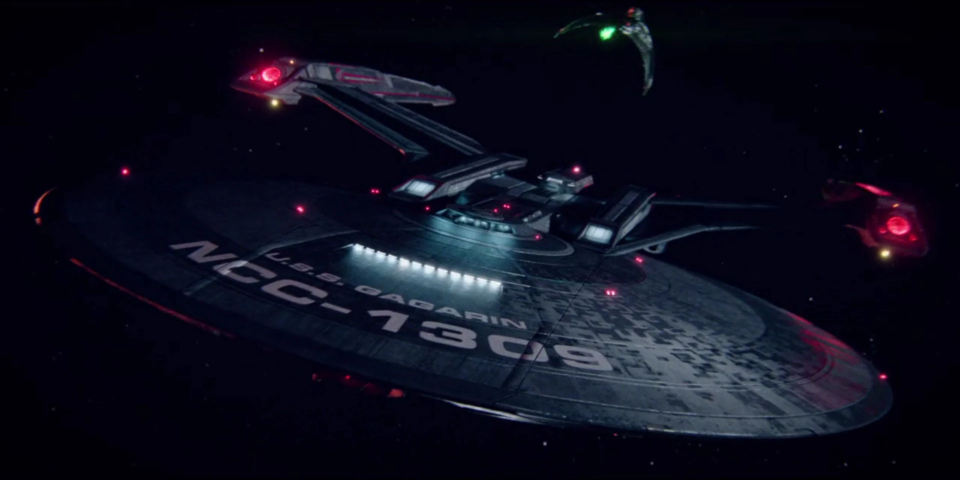
I will say, one starship shot I thought Discovery NAILED was this close up of the Gagarin. It looks very real and natural.

Pixomondo is one of the best VFX studios in the world, so it's not because of lack of talent. They could nail it. Someone in the production pipeline wants these shots to look the way they do. I say if you aren't going to stylize the live action footage, then don't stylize the CG either. Otherwise they don't go together.
In my work, I put photorealism as priority one. After I have hit that mark, THEN I worry about making it "beautiful." I did this flyby of the Shenzhou just as a little test of how I would do the shots if I worked on the show. I feel like it's realistic looking, but also works with the "look" of the rest of the show. I didn't add all the crazy blooms and saturated as hell colors.
I will say, one starship shot I thought Discovery NAILED was this close up of the Gagarin. It looks very real and natural.
Last edited:
The Gagarin is my favorite Discovery ship so far. A real blend of classic TOS style with a modern touch.
Since I do CGI Visual Effects for a living, and starships vfx as a hobby, I'll chime in. I have to agree with the OP, I'm disappointed in almost all of Discovery's exterior starship shots. There are a few in the Battle of Binary Stars that look great, but every episode after that has this weird shift in the image aesthetic. Colors way too constrasty and over saturated. The bussards glow like the sun. The highlights on the aztecs are far too bloomy/bright.
Pixomondo is one of the best VFX studios in the world, so it's not because of lack of talent. They could nail it. Someone in the production pipeline wants these shots to look the way they do. I say if you aren't going to stylize the live action footage, then don't stylize the CG either. Otherwise they don't go together.
In my work, I put photorealism as priority one. After I have hit that mark, THEN I worry about making it "beautiful." I did this flyby of the Shenzhou just as a little test of how I would do the shots if I worked on the show. I feel like it's realistic looking, but also works with the "look" of the rest of the show. I didn't add all the crazy blooms and saturated as hell colors.
I will say, one starship shot I thought Discovery NAILED was this close up of the Gagarin. It looks very real and natural.
The ships actually look better in STO than on screen xD
OK I'll bite. For these two examples, I think the sheer number of ships in DS9 helps make it look better in absolute terms. If I were to spend ages looking at quality of special effects in detail and try not to let the sheer scale of the battles influence me I think I might go either way, but perhaps sticking with your conclusion that the improvement in 20 years appears non-existent to negative.
However, I think DSC has used more of its special effects budget on other stuff - I'll admit it's been a while since I watched a lot of DS9 but my memories are that "lots of the cash seemed to be saved for a few big scenes" whereas DSC uses it routinely to make bridge scenes, the away missions etc look far better than anything we saw on DS9.
...I think 'Tears of the Prophets' did an excellent job in portraying a massive fleet battle scene for its time. I mean, I'm thinking the CGI cost a pretty penny back in 1997. That would probably explain why the producers duplicated so many Excelsior-class (original versions & not even refits...don't ask me why?) & Miranda-class starships in the lead-ins to fleet battles. To me it wasn't particularly...convincing.
As for DISCO, I'm still waiting [or have yet to peruse a thread] for an expert opinion as to why the phaser banks spew out bolt-like charges as oppose to full on phaser beams, considering that the timeline is pegged as 2256. I'm to understand that the Constitution-class has been in service for a decade with what we have come to see as standard federation phaser banks. Just some thoughts this early morning local time.
Last edited:
...I think 'Tears of the Prophets' did an excellent job in portraying a massive fleet battle scene for its time. I mean, I'm thinking the CG was a pretty penny back in 1997.
As for DISCO, I'm still waiting [or have yet to peruse a thread] for an expert opinion as to why the phaser banks spew out bolt-like charges as oppose to full on phaser beams, considering that the timeline is pegged as 2256. I'm to understand that the Constitution-class has been in service for a decade with what we have come to see as standard federation phaser banks. Just some thoughts this early morning local time.
...and while we're on the subject of DISCO, what's up with the uniforms? I mean, they're super cool & all but how will it factor into the drabby first editions (2254) & primary colors lineup (2266) we're so used to? #PrimeUniverse
...I smell a Kelvin crossover. lol
Last edited:
As far as the quality of the images goes, DSC looks shockingly cheap. They've got bright colors and bloom and lens flares all over the images, but at base most of the CG models are very simple, the texturing basic, and the shaders unconvincing. The wacky lighting and very short establishing shots help cover for it, so I can only assume the last-minute change of VFX vendors left very little time to nail down a look, resulting in Pixamondo cooking up a style that covers up how slapdash the whole thing is. And now we're stuck with it, because that's what the client approved.
THIS!! Very much this! I dabbled a bit in some cgi stuff a decade or two ago, and one thing I learned very quickly is, textures are King. And that's where Disco fails. The models are stunning. The textures however, are weak. Sometimes. You look at Discovery, and even in distant shots, you can clearly see the textures are shoddy, while Shenzou looks a lot better. Not sure what happened there really. Lighting rigs are also King. These usually are also not setup properly, creating weird glowing effects on the hull.
So, yeah. A lot of the times the effects are a bit off. Still, overall, I've seen a lot worse, and the show itself is awesome to make me friggin love every second of it.
So basically, Star Trek
...ok, so when talking DISCO, the ship pales in comparison to Galaxy-class. In whatever Starfleet compendium, encyclopedia or Okudagram that's being used as basis for doctrine these days, the Crossfield-class is pretty on par with the dimensions of even the Constitution. At first, the perspective was not so defined. In reference to field of scale.
For 2256, you wonder where's the dreadnoughts, the massive fleet carrier vessels or command ships? Of course in 50 years of Trek, we've only seen what we know as 'canon'...but now I'm kinda diverging into the days of Starfleet Battles. Where you could find some really cool "off-camera" starships. I'm wondering if DISCO will make use of that with some of designs we saw in battle at the Binary Stars.
...and while we're on the subject of DISCO, what's up with the uniforms? I mean, they're super cool & all but how will it factor into the drabby first editions (2264) & primary colors lineup (2266) we're so used to? #PrimeUniverse
...I smell a Kelvin crossover. lol
Pike's Enterprise in 2254 had the same uniforms as the aired pilot in 2265.
DSC has just possibly retconned the designs.
Pike was 2254, not 64, 2 years before Discovery.
I stand corrected, Admiral. 2254...typo.
...so basically crews onboard a Constitution-class vessel would currently be wearing something of that dusty blue & beige uniform. Presumably. Unless an assigned Trek writer has explained that bit of curiosity somewhere & I missed it.
I stand corrected, Admiral. 2254...typo.
...so basically crews onboard a Constitution-class vessel would currently be wearing something of that dusty blue & beige uniform. Presumably. Unless an assigned Trek writer has explained that bit of curiosity somewhere & I missed it.
Well the first tie in novel says exactly that, but that's non-canon.
Also Pike's (and TOS ep1) had 3 colours, Pike and Kirk's uniforms were gold'ish, and operations had a sort of bronze'ish uniform.
DSC has both of those colours, the only one missing is science Blue, but they made the uniform it's self blue so that wouldn't have worked.
Since I do CGI Visual Effects for a living, and starships vfx as a hobby, I'll chime in. I have to agree with the OP, I'm disappointed in almost all of Discovery's exterior starship shots. There are a few in the Battle of Binary Stars that look great, but every episode after that has this weird shift in the image aesthetic. Colors way too constrasty and over saturated. The bussards glow like the sun. The highlights on the aztecs are far too bloomy/bright.
Pixomondo is one of the best VFX studios in the world, so it's not because of lack of talent. They could nail it. Someone in the production pipeline wants these shots to look the way they do. I say if you aren't going to stylize the live action footage, then don't stylize the CG either. Otherwise they don't go together.
In my work, I put photorealism as priority one. After I have hit that mark, THEN I worry about making it "beautiful." I did this flyby of the Shenzhou just as a little test of how I would do the shots if I worked on the show. I feel like it's realistic looking, but also works with the "look" of the rest of the show. I didn't add all the crazy blooms and saturated as hell colors.
I will say, one starship shot I thought Discovery NAILED was this close up of the Gagarin. It looks very real and natural.
...I think the first Starfleet vessel I've noticed with red Bussard collectors. I didn't notice any among the Federation fleet at the Binary Stars.
Similar threads
- Replies
- 37
- Views
- 16K
- Replies
- 49
- Views
- 4K
- Replies
- 37
- Views
- 1K
- Replies
- 6
- Views
- 153
- Replies
- 2
- Views
- 2K
If you are not already a member then please register an account and join in the discussion!