-
Welcome! The TrekBBS is the number one place to chat about Star Trek with like-minded fans.
If you are not already a member then please register an account and join in the discussion!
You are using an out of date browser. It may not display this or other websites correctly.
You should upgrade or use an alternative browser.
You should upgrade or use an alternative browser.
USS Grandeur - One... More... Time!
- Thread starter Vektor
- Start date

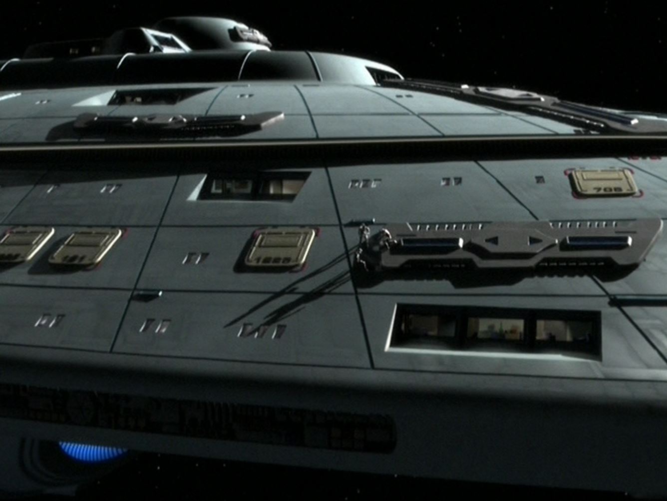
Only 4, actually. A single quantum torpedo launcher on the bottom of the saucer, another one below the main deflector, and a standard twin torpedo launcher above the deflector. The two weapons at the front of the saucer are wyvern cannons, basically like the Defiant's pulse phasers only biased toward power over rate of fire. They are pretty much one shot, one kill weapons but they require a relatively long time to recharge. Oh, and the two emitters on either side of the deflector are actual pulse phasers.
")
Well yes, the Sovereign class doesn't have any sort of phaser cannons.
And I'd watch your tongue Admiral Kaiser, as I hold Eaves in a very high regard! The Grandeur does not make Eaves' designs look like garbage, it's just Eaves' designs doesn't have quite the organic elegance that Probert puts into his designs, but I still think that they have their own beauty. I think that the Avalon class is a combination of Eaves' simpler design elements and some of Probert's more complex organic curves (specifically the nacelle pylons).
So the "Wyvern" cannons are sort of like the Phaser Cannons on the Vesta-class? They may or may not be related in some way perhaps.
Speaking of which, is the Avalon class commissioned around the same time as the Vesta class or later? And does she have Quantum Slipstream, or was the Avalon class designed too early to be incorporated into the design? For clarification, the Vesta class entered service no later than 2380, though I'm having trouble tracking down a more specific commissioning date for the Vesta herself.
Looking sweet! I dig everything except the little fins coming off the nacelle struts, and even those are justified by way of visually balancing that upward curve.
You also seem to be losing some deflector detail when it glows blue, which is still visible when it doesn't. I almost prefer it with no glow. Maybe tone it down a notch?
Ever consider implying rooms behind those windows? More like Voyager and less like the Enterprise D? I'm a big fan of using photographs of office building windows at night as ambient maps, with the flat white you have now as a spec map gloss, and inverted for the bumpmap to imply an indentation. It could give you another +1 to realism.
Don't know how finished this version is though, so maybe something to think about for your next project?
I'm also quite jealous of you lack of visible poly corners, especially up close. Is it all NURBS? Can we get a look at the current wireframe?
Maybe add variations in hull panel spectacularity, like the interference paint of the TOS refit?
But maybe now I'm just pushing my personal sense of aesthetic on you.
There have been so many Treks, and so many design elements to either cling on to (yuk yuk) or abandon...
Last edited:
Well, these last couple of images are just renders of the untextured model with most of the coloration and many details hand-painted in Photoshop. The windows, running lights, underside gridlines, secondary hull maneuvering thrusters and phaser strips, and the entirety of the bow-mounted wyvern cannons were all painted in by hand.
I certainly will be placing "window boxes" behind the windows to give them more depth and visual interest. In fact, I was one of the first people to use that technique way back in the mid-90s on my Franz Joseph U.S.S. Constitution model. For the paintover, though, I opted for relatively simple white windows.
Most of this model was built with Sub-Ds but have since been converted to Editable Poly objects. The iterations were high enough that it holds up pretty well even at close distances. I have also done a LOT of mesh optimization to keep the poly count down. I haven't posted any wireframes in a long time so I'll try to do that some time this week.
The final texturing will include some aztecing and specularity variation, but I wasn't going to take the time to paint that in by hand for these most recent images.


Your right i should
Sorry John Eaves and fans of his work here
Don't be, you're perfectly justified to share your opinion!
Furthermore, IMO this isn't the first time Vektor has blown an official design out of the proverbial water, with respect to their relevant designers.
JES: I may admire Eaves' take on Klingon vessels and some of his pre-TOS designs, but the Ent-E just looks bad - not only are there some glaring errors (Impulse exhaust to the face, anyone?) but to me it looks like a hastily thrown together kludge, as a result of trying to pay homage to too many previous Enterprises.
The Grandeur (big black patches aside
") ) does a near perfect job of melding some of the best aspects of those that came before, while remaining fresh and unique. There very few minor changes I'd make to the design.
) does a near perfect job of melding some of the best aspects of those that came before, while remaining fresh and unique. There very few minor changes I'd make to the design. The Ent-E on the other hand... there are equally few things I'd vote to keep.

The underside is lovely as everyone has said.
Do you think the hardest part of trek ships is doing a side view.
I've tried to sketch out Galaxy class designs with raised nacelles, and the supports always look to chuncky. I like raised nacelles, but in some respects lowered ENT-D versions seem more fluid.
Have you tried sharply angled lines atop nacelle supports to either side to make struts look more rakish than they actually are?
I think the pattern of darker sections on the underside looks fantastic; the top side not as much, but maybe I need to see it from a couple more angles.
As for the wyvern cannons, you mentioned that they are "one shot, one kill" and take a lot of time to recharge. Do they fire in tandem, or does the ship get to take one shot with each 'barrel'?
As for the wyvern cannons, you mentioned that they are "one shot, one kill" and take a lot of time to recharge. Do they fire in tandem, or does the ship get to take one shot with each 'barrel'?
The underside details, even if painted, still look stunning. They didn't even look that way, and I would probably have never even noticed if you hadn't posted close-ups or mentioned it.
Blip: What you say about the Sovereign class having unrefined aspects and errors in her design is true, especially the placement of the impulse drives (I would have probably put at least a pair in the nacelle pylons; those, she would use while together, while the saucer impulse drives would work brilliantly only after the saucer section had cleared the engineering hull) but she is still a beautiful design. There is a difference between looking like trash, and being unrefined or under-detailed.
The Grandeur has surely benefited from having a much longer time of development, and I get the feeling that the deadline prevented John Eaves from making further design refinements to the Ent-E, and I speculate this is why she lacked visible aft weapons on her engineering hull, like the ones she had in Nemesis.
she is still a beautiful design. There is a difference between looking like trash, and being unrefined or under-detailed.
1) In your opinion it's beautiful. It's an opinion I and many others don't necessarily share.
2) I said kludge, not trash. The attempts at homage are crude, and lack subtlety; while the overall attempts at a sleek "fast" look are undermined by the presence of numerous clunky elements and harsh angles (eg, the pointless stepped ventral saucer, indents in the saucer rim, giganto impulse drives, etc)
I'm sure that Mr Eaves was on a deadline, and am well aware of Berman and co.'s predilection for interfering in the design process. But IMO if he'd wanted to improve the Ent-E for Nemesis there are a multitude of areas he should have addressed. Slapping on a dozen extra torpedo launchers just doesn't cut the mustard.

Not to stir the pot, but there is a rationale for impulse engines being reactionless and not actually emitting an exhaust that would incinerate the nacelles or pylons or whatever. The mere fact that they are capable of operating in reverse argues in favor of this.
That being said, I've always made a point of not putting anything directly behind them myself, but I'm not personally inclined to criticize those who do.
That being said, I've always made a point of not putting anything directly behind them myself, but I'm not personally inclined to criticize those who do.
They don't provide any meaningful thrust but they are the exhaust of the impulse fusion reactors so helium/other fusion products and probably a lot of heat are expelled from there which you probably still don't want to have near your nacelles and/or pylons. "She's got to have a tailpipe."
"She's got to have a tailpipe."Similar threads
- Replies
- 482
- Views
- 61K
- Replies
- 192
- Views
- 29K
If you are not already a member then please register an account and join in the discussion!