-
Welcome! The TrekBBS is the number one place to chat about Star Trek with like-minded fans.
If you are not already a member then please register an account and join in the discussion!
You are using an out of date browser. It may not display this or other websites correctly.
You should upgrade or use an alternative browser.
You should upgrade or use an alternative browser.
")
Shuttlecraft Galileo of the Enterprise F.
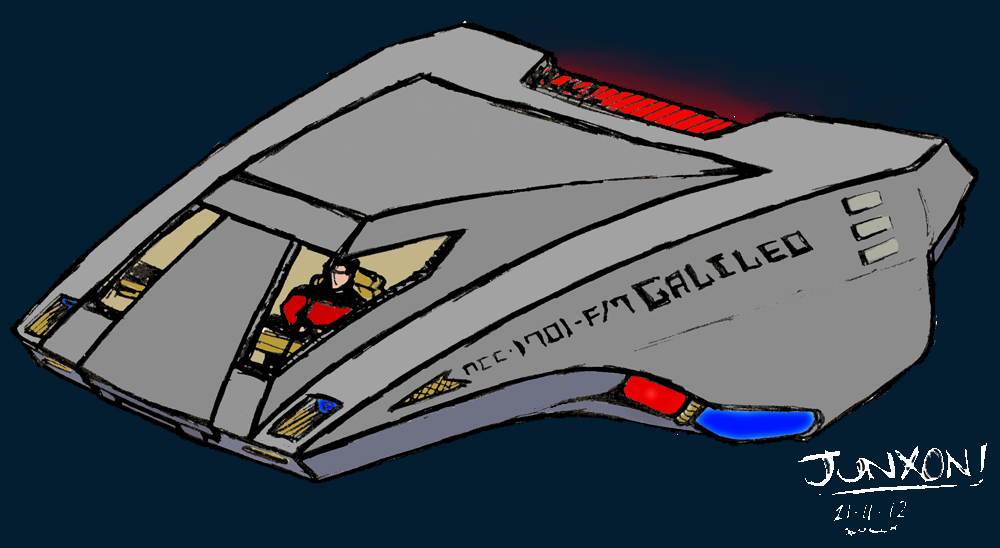
quick sketchyness drawn with just a pen and lack of pencil-planning stage hence the roughness. and then badly coloured in photoshop.
Sort of 50% shuttlecraft 50% 1970's italian sportscar. just wanted to inject a bit of sexyness into the humble shuttle. whether i pulled that off or not is open to debate haha
Hmm, I actually like that one quite a lot. Is it intended for the STO Enterprise F? Because I think the curves fit the overall massively cetacean lines of that big 'ol space whale quite well.
And more
vaguely defiant-ish sort of ship. wanted it to look like it'd fit in with star trek online ships for a change. it sort of reminds me of something but i can't remember what..
bad photoshoppery of the reds and blues and doing writing in a curved perspective is hassle.
also i like topside deflectors. no idea why.
I think this is an awesome design. Want to see more of this one.
Here is an idea..do some orthos for this design
http://books.google.com/books?id=D2...fee+shop+mural+Best+western+Space+age+lodge+G
http://www.bestwesternspaceagelodge.com/html/Restaurant.htm
A refit with cranked nacelle supports looks cool enough.
http://books.google.com/books?id=D2...fee+shop+mural+Best+western+Space+age+lodge+G
http://www.bestwesternspaceagelodge.com/html/Restaurant.htm
A refit with cranked nacelle supports looks cool enough.
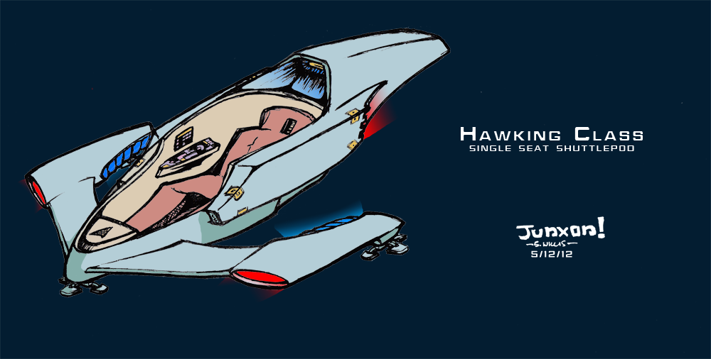
Great shuttle! was it inspired by the Bertone Lancia Stratos?
Yeaah, Bertone makes some of the best concept cars in the world.
Italian design is one of the best in the world, and has produced many of the most exotic automobiles ever built.
I've always had in my mind that the next shuttlepods should be sized more like supercars: super compact in design, and more like performance jets but maybe stretched out for the sake of more carrying capacity, as opposed to being tall and blocky like that Type-15 shuttlepod.
Just some stuff i've drawn recently, thought you peoples might like a look. Also figured i should do something more than making occasional stupid remarks in the miscellaneous section
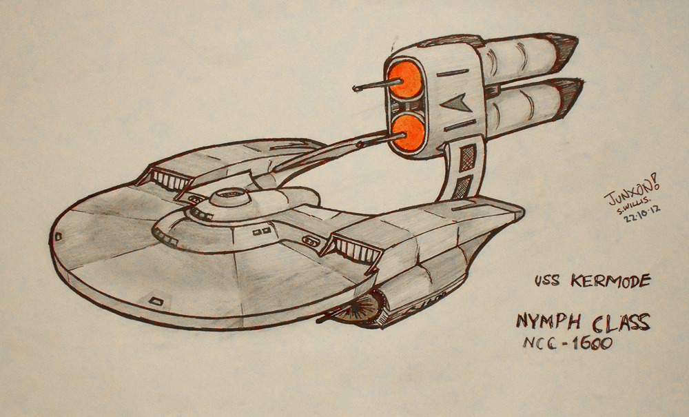
slightly pre TOS design, perspective probably not quite right, but its a nice distraction from doing university work. ship named after a film critic.
more stuff to come at some point!
This is a really interesting design! I'm not a fan of the over/under nacelles though. If I may suggest, I think a config where you have the nacelles on outboard pylons like NX class and where you have the nacelles now have a sensor pod or similar.
Tall and boxy is easier from a production standpoint.
Too bad aerodynamic and production standpoints don't always coincide.
At least the shuttle design for The Final Frontier looked sleek overall, and actually looked a little aerodynamic.
I think the Type-15 is probably the worst offender.
another shuttle:
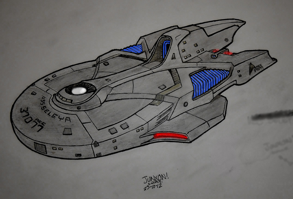
definitely not practical from a production standpoint. i could see the Seleya having a few on board. far side nacelles a bit wonky but my brain was too tired to work out what it should be like. suppose it could be a fighter if you're so inclined, but i never liked star trek fighters. it has a see-through canopy. or a force field. who knows.
and i swear it was less greenish more blue-grey earlier
Last edited:
Similar threads
- Replies
- 2
- Views
- 268
If you are not already a member then please register an account and join in the discussion!