• Welcome! The TrekBBS is the number one place to chat about Star Trek with like-minded fans.
    If you are not already a member then please register an account and join in the discussion!

Trek 11's ship IS the Enterprise

Status
Not open for further replies.
I gotta say, I think there are pros and cons to almost every Enterprise design I've ever seen.

I do however have my favourites:

- The Refit Enterprise 1701 (TMP) and the Enterprise 1701-A - this is still the design which reaches near perfection in my own list - something I've loved ever since I first gazed upon her, many years ago... Beautiful from almost every angle, IMO. I love the concentric, aztec-covered Primary saucer, the nacelles, the nacelle pylons, the forward deflector - the art-deco lines, etc... just brilliant!

- The Enterprise 1701-D (TNG) - not the prettiest enterprise, but she appeals in ways I cannot entirely articulate - possibly its the huge Primary Saucer that does it for me. It looks strong - like it won't go down quietly in a fight.

- The Trek XI Enterprise - Once again, it's similarity to the Refit Enterprise makes it an obvious choice for me. I like how it has a flatter saucer. I also love it's forward deflector - more pronounced and without the side cowling (encasement).

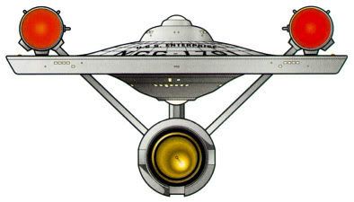
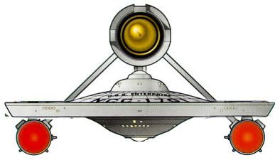
- The TOS Enterprise - a fantastic iconic starship. Beautiful, and distinct in it's visual personality. Love it to bits.

- Enterprise 1701-B - probably the least favourite Enterprise for me - simply because I like the lines of the Excelsior, and the Ent-B looks a wee bit cumbersome by comparison, IMO.

- Enterprise 1701-E - a great design which looks great alongside other ships of it's era.

- Enterprise NX-01 - I didn't like this when it first saw the light of day, but it has a place in Trek lore, as much as any of the other starships of her name. I respect it more than I initially did.

- Enterprise 1701-C - I love the giant circular saucer, and the nacelles - The weakest aspect of this design is it's neck, but I can live with it, nonetheless.


With Trek, I've come to value each design for what it is. I love the look of the USS Kelvin - it's one design that is growing on me daily - I hope that someone produces a great model of this starship...

:) I think that, even though they could have re-used the TOS Enterprise, I'm glad they didn't, and decided to redesign her again in new variation. If a new movie means new ship designs, then that is all good with me! In fact, I would go as far to say that I consider myself to be something of a starship wh*re...

;)

EDIT: Just found this album of Trek card models - very kewl!
http://s63.photobucket.com/albums/h123/strangename19/Cardmodel Images/
 
Last edited:
I'm one that thinks they also obviously went with a 50s design aesthetic...and I don't mean that to sound bad.
I think it was done to subconciously say to the fans "This is before the stuff you know," and since Trek was on TV in the 60s it makes some sense. you don't have to make the whole thing look like Tom Corbett: Space Cadet, but doing little things with the ship helps.
Yes -- the ship is obviously new-looking, but has details that are reminiscent of a retro-1950s or 60s design. This will help the average non-fan say to himself (even subconsciously) "this is in fact a new film, but it may have some qualities the old TV show."

Did they NEED to update the Enterprise? No -- pehaps not; they could have possibly made a very good film using a "very slightly" updated TOS design. But that's not the type of film Abrams wanted to make -- he wanted to make a Star Trek film that had a whole new look -- so that's what he did.

If someone is a type of person who is vehemently opposed to "a whole new look", then this film perhaps is not for them. But that doesn't negate the fact that this film may be a perfectly valid entry into the Star Trek Franchise, or the fact that it may be a film that is enjoyed by many Trek fans and non-trek fans alike.
 
Right now I'd rank them:

TOS
TMP
JJPrise
"D"
NX-01

If I had to kitbash an "ideal" movie Enterprise out of all that it'd be the ST:TMP ship with some elements of the JJprise - the engines, maybe the sensor dish and some of its "streamlining."
 
I'm not some stereotyped nerd just because I have an opinion about the ship. To me the original is an icon, and one that took Jeffries many tries to get; just look at the sketches prior to the "a-ha" moment. The design gelled, and with some refinement became a work of high art. It spawned an entire universe of ship designs. As a designer, I know just how much work goes into making something look completely new, but in retrospect, completely obvious. The challenge is getting there, and it's not accomplished that frequently. I think that deserves some honor.

Well, IIRC, the A-HA moment was really a mistake. Roddenberry looked at his design upside down and picked it. Jefferies design had the saucer at the bottom and the nacelles like shuttlecraft (landing-support) type nacelles.

As it looked on TV (TOS)
ef1.jpg

Matt Jefferies "Final" design:
ef2.jpg
 
Last edited:
Exactly.


"The saucer is flatter than the TOS ship."


"The nacelles are closer together and shaped too differently from the TOS ship."


"The secondary hull is further forward and the undercut below the shuttle is longer than on the TOS ship."

In fact, there's nothing "too close" or out-of-balance about the placement or design of the nacelles, and the placement and attachment of the secondary hull is a big logical improvement over the original ship. The only thing that's maybe less sensible is that the nacelle attachments look even more structurally weak than those of the TOS ship, further emphasizing this as a major flaw in the original that every later design has addressed in one way or another.

Yes. I am saying that compared to the Enterprise, this new version does not look as good. But, NO, it's not too different for me to appreciate as a ship class unto itself. That is to say, if it were a ship called the Congo, and was a Republic Class (or whatever), then yes. It has some merit.

However, based on my opinion on the technical and aesthetic values of this ship, there are many pointless changes (in relation to the Enterprise), and it’s proportions look wrong.

With some minor changes, this ship would indeed fit into the Trek universe around the time period in question, but it should have been used as new class ship on new adventures, with a new crew.

But I’m not arguing with you. This is the “New Enterprise”. I just don’t think it’s better. This ship looks like a messy blending of the Enterprises from TMP, TOS, Phase II, and a little TNG. Yet all bizarrely twisted with 1950’s inspired warp nacelles.

That does not make this Enterprise NEW and updated for today’s savvy and discerning moviegoers who are supposed to be wowed buy this look… They could have easily have just updated TOS Enterprise with great detail that would have looked fantastic on the big screen.

Even you may have liked it.
FOR THE LAST TIME! this is a NEW universe:scream:!! it DOSEN'T HAVE TO FIT in to the original timeline! GAAWWDDD!!!

Ok...

How about -- It's ugly and we just don't like it?

Does that work? Cos that's basically how I feel about the damned thing!

I don't really care if it "fits a timeline", "goes with canon", etc., etc...add your own Trekkie cliche comment...

I'm a designer who's been drawing since I was five years old -- and I say it's butt fugly and I don't LIKE it.

Nothing personal...but it's ugly.

As much as I may end up liking the film as a whole, during the movie-going experience I'll be thinking "This is (I hope) a great movie, but damn that Enterprise is fugly!"

Richard Taylor and Andy Probert's Enterprise kicks this one's ASS all over the universe.

The end.

No...wait! I'd like to add that I've seen 3D designs from people like Dennis and others here whose designs ALSO kick that JJPrise across the universe!

Ok, now I'm finished.
 
Last edited:
How about -- It's ugly and we just don't like it?

Does that work? Cos that's basically how I feel about the damned thing!

Yep, that's the only kind of response that really matters.

Some folks don't like the way it looks and some do. End of story.

I like it a lot. ;)
 
Probably not, because we're trekkies and we already like it. There's no particular reason to think that any of the original designs would especially impress viewers whose references for technology are more modern or current.

What is rarely pointed out is that almost none of the original Trek designs for anything have been resurrected for forty years, except as the occasional one-shot nostalgia exercise directed specifically at the appreciative trekkie audience. Roddenberry and company would not even use them in ST:TMP. The notion that any of them would be unearthed and reused for a brand-new version of Star Trek was never more than a fannish pipe dream.

I agree Roddenberry moved forward, but then, so did the story... This particular story is about the origins of TOS though...

No, that's not why. What you're offering is simply a long-time fannish rationalization that Roddenberry encouraged (you can't apply it, for instance, to the appearence of the Klingons in ST:TMP). It's because none of the designs were deemed adequate in their original form after ten, fifteen or thirty years.

First, it ultimately doesn't matter because the refit made sense in the timeline. Second, the Klingons in TMP were pretty irrelevant, as they could have been any aliens for that brief screen time.

I'm not some stereotyped nerd just because I have an opinion about the ship. To me the original is an icon, and one that took Jeffries many tries to get; just look at the sketches prior to the "a-ha" moment. The design gelled, and with some refinement became a work of high art. It spawned an entire universe of ship designs. As a designer, I know just how much work goes into making something look completely new, but in retrospect, completely obvious. The challenge is getting there, and it's not accomplished that frequently. I think that deserves some honor.

Well, IIRC, the A-HA moment was really a mistake. Roddenberry looked at his design upside down and picked it. Jefferies design had the saucer at the bottom and the nacelles like shuttlecraft (landing-support) type nacelles.

As it looked on TV (TOS)
ef1.jpg

Matt Jefferies "Final" design:
ef2.jpg

Fair enough, Roddenberry claims the a-ha moment. :)
 
First, it ultimately doesn't matter because the refit made sense in the timeline. Second, the Klingons in TMP were pretty irrelevant, as they could have been any aliens for that brief screen time.

No, what ultimately doesn't matter at all is whether the refit made sense in the timeline.

What matters most of all is how it looked, and that is why it was redesigned.

That is why the Klingons were redesigned.

That is why the uniforms were redesigned - all because the people in charge did not consider the TOS designs to be adequate for a more modern film with a substantial budget.

All because, no matter how cool or beloved the originals were, they were understood to be compromises with what was possible and affordable in 1966 rather than what was desirable in the present day.

And that is why Trek is being redesigned again, and why if it continues into the future everything familiar about it will be redesigned again and again, over and over, ad infinitum.
 
Of course, it is cool and fun that most of the changes in the TOS visuals could be fit into "canon" and what didn't, like the Klingons, really didn't matter.

I suspect it will be the same for this film.
 
Of course, it is cool and fun that most of the changes in the TOS visuals could be fit into "canon" and what didn't, like the Klingons, really didn't matter.

True, but trekkies did then talk and debate about those damned Klingons for another three decades. It tasked them, it tasked them... :lol:
 
I'm heading out to look at the 11 footer. The model that was so affordable... May come back and argue, may not. :)
 
The eleven-footer is not holding up well. NASM needs to break it down and reinforce the structure, which is really starting to sag badly. The internals supporting the nacelles are only wood and bolts.

Unfortunately, that kind of thing costs money that the museum has always been loathe to spend. The 1992 refurbishment was done - excellently, except for one aspect of the paint job which trekkies have gnashed their teeth about endlessly ever since - on a much more limited budget than would have been afforded to most of the museum's "real" collection.

I saw it in '92 and I HATED that paint job they gave it.

That was a travesty.

I hope if the model is refurbished again, they put it in the hands of a restoration team that knows what it is doing.

I am pretty sure the primary hull didn't have a big black spider (grid lines) painted on he bottom of it during the shows original run...

The new weathering is WAY way overdone to say the least.

:rolleyes:
 
I saw it in '92 and I HATED that paint job they gave it.

That was a travesty.

I hope if the model is refurbished again, they put it in the hands of a restoration team that knows what it is doing.

I am pretty sure the primary hull didn't have a big black spider (grid lines) painted on he bottom of it during the shows original run...

Yeah, yeah, heard it... :rolleyes:

The new weathering is WAY way overdone to say the least.

That, at least, approaches being a reasonably proportionate and accurate observation.

Ed overdid the weathering and over-emphasized the faint grid lines on the original. There are one or two other minor things that people jumped on and got way worked up over - the cross-section of the sensor dish antenna ain't quite right, and some tiny unreadable signage turned out to include some jokes. Considering what they paid for it, and considering how completely awful and destructive each of their previous in-house "restorations" had been, they got a bargain on a pretty good job.
 
I saw it in '92 and I HATED that paint job they gave it.

That was a travesty.

I hope if the model is refurbished again, they put it in the hands of a restoration team that knows what it is doing.

I am pretty sure the primary hull didn't have a big black spider (grid lines) painted on he bottom of it during the shows original run...

Yeah, yeah, heard it... :rolleyes:

The new weathering is WAY way overdone to say the least.
That, at least, approaches being a reasonably proportionate and accurate observation.

Ed overdid the weathering and over-emphasized the faint grid lines on the original. There are one or two other minor things that people jumped on and got way worked up over - the cross-section of the sensor dish antenna ain't quite right, and some tiny unreadable signage turned out to include some jokes. Considering what they paid for it, and considering how completely awful and destructive each of their previous in-house "restorations" had been, they got a bargain on a pretty good job.

How much did they pay for the restoration? -- 50 cents? :lol:

Come on, Dennis...you know what quality work is.

That '92 restoration was tantamount to vandalism.

No offense to the guy who did it, but he was out of his league...clearly.
 
Come on, Dennis...you know what quality work is.

That '92 restoration was tantamount to vandalism.

You're entirely mistaken. You've gotten so worked up about the overdone airbrushing that you evidently didn't notice much of anything else.

What NASM's people had done to the model previously was, if anything, "tantamount to vandalism." Ed fixed most of that.

Try comparing the '92 version to any previous refurbishment (you can't call any of these "restorations") or to the condition in which the model arrived at NASM. Ed restored the ship to easily 90 percent of its on-screen condition circa 1969. Although his research and methods don't meet museum archival standards, it's the best treatment that model has seen since someone at Paramount threw it in a crate.

Of course, I didn't see it once or twice. I worked down the street from NASM during the period of the exhibit, and used to check it out two or three times a week on my lunch hour for about a year. I've looked over the hundreds of photographs of the model's disassembly and repair (the wooden parts, in particular, were cracking and falling apart in the early 90s and look now as if they're disintegrating again) and what was involved in rewiring and matching the "original" (1969, not necessarily 1964) paint colors on the thing - one of the first "repairs" someone at NASM had done to the model was to spray over everything but the upper saucer surface and bridge dome with a neutral grey primer.

The model sits in the NASM gift shop now. During the period that I was creating the Lightwave mesh of the Exeter for that fan film I used to run down there every few days to check out some detail or another. I wish I had had a better 35 mm camera and more skill in using it back then. Now, as I said, the whole thing is sagging and plastic detail parts are peeling off it again.
 
Come on, Dennis...you know what quality work is.

That '92 restoration was tantamount to vandalism.

You're entirely mistaken. You've gotten so worked up about the overdone airbrushing that you evidently didn't notice much of anything else.

What NASM's people had done to the model previously was, if anything, "tantamount to vandalism." Ed fixed most of that.

Try comparing the '92 version to any previous refurbishment (you can't call any of these "restorations") or to the condition in which the model arrived at NASM. Ed restored the ship to easily 90 percent of its on-screen condition. Although his research and methods don't meet museum archival standards, it's the best treatment that model has seen since someone at Paramount threw it in a crate. The curators had the input and cooperation of the guy who supervised the 1964 construction of the model - Richard Datin? - and at the time he was completely on board with what they were doing (caveat: he wasn't an expert on what was done to the model between 1966 and 1969, just on the original).

Of course, I didn't see it once or twice. I worked down the street from NASM during the period of the exhibit, and used to check it out two or three times a week on my lunch hour for about a year. I've looked over the hundreds of photographs of the model's disassembly and repair (the wooden parts, in particular, were cracking and falling apart in the early 90s and look now as if they're disintegrating again) and what was involved in rewiring and matching the "original" (1969, not necessarily 1964) paint colors on the thing - one of the first "repairs" someone at NASM had done to the model was to spray over everything but the upper saucer surface and bridge dome with a neutral grey primer. Ed rebuilt a close semblance of the rotating mirror-and-lights nacelle effect for the first time in the model's display history.

The model sits in the NASM gift shop now. During the period that I was creating the Lightwave mesh of the Exeter for that fan film I used to run down there every few days to check out some detail or another. I wish I had had a better 35 mm camera and more skill in using it back then. Now, as I said, the whole thing is sagging and plastic detail parts are peeling off it again.
 
Status
Not open for further replies.
If you are not already a member then please register an account and join in the discussion!

Sign up / Register


Back
Top