• Welcome! The TrekBBS is the number one place to chat about Star Trek with like-minded fans.
    If you are not already a member then please register an account and join in the discussion!

TMP Bridge Set

DS9Sega said:
^^^ Full impulse is .25c according to WHAT? The TNG tech manual? I discount that re TMP if that's the case.

Actually it's a misreading of the TNG Tech Manual. What the manual says is that, due to relativistic considerations, "normal impulse operations are limited to a velocity of 0.25c" (p. 78). On p. 75, it defines "high impulse" to mean "velocities above 0.75c." At no point does it use the term "full impulse" or equate it with any specific velocity.

So the idea that impulse engines can't go above 0.25c is pure urban myth.

Of course, there's no friction in space, so continuous thrust would result in continuous acceleration, not constant speed. So there wouldn't be any "maximum speed" a ship was physically capable of achieving. Heck, a lightsail accelerating at 0.0001g will eventually reach a fair clip of lightspeed as long as it can keep accelerating long enough. So "full impulse" would refer to a maximum acceleration, not a maximum velocity.
 
hutt359 said:
And Kirks order to go to "Warp point five"... Full impulse is .25C anything above that is a "warp point X"

Using the Warp factor cubed formula, "Warp point five" would be .125c ;)
 
Zero Hour said:
hutt359 said:
And Kirks order to go to "Warp point five"... Full impulse is .25C anything above that is a "warp point X"

Using the Warp factor cubed formula, "Warp point five" would be .125c ;)

Well, I've been shown... I've been dealing with canonites too long. I'm sorry for that treknological flub.
 
The sets for the Enterprise in that film were great designs,

Let's compare the Star Trek The Motion Picture Enterprise bridge design to the 2009 STXI Enterprise design


Concept design image
Phase II concept for the refurbished bridge - circa 1977. The globe in front of Kirk's chair was supposed to project holographic star maps. Picture by Mike Minor
[As we all know Phase II became ST:TMP]
SOURCE


Lee Cole was hired as graphic designer for Phase II details here how the designs for the consoles came to be.
http://trekbbs.com/showpost.php?p=2528962&postcount=5


It looks similar to:
2009 Star Trek XI
bridge image 1
bridge image 2


some very nice stuff at this link of Andrew Probert's Concepts and designs for TMP all the way through PERPETUAL ENTERTAINMENT 2006 concept designs for STAR TREK ONLINE GAME:
http://www.probertdesigns.com/Folder_DESIGN/

His Official Trek related job titles:
STAR TREK: THE MOTION PICTURE, 1979
PRODUCTION ILLUSTRATOR

STAR TREK: THE NEXT GENERATION, 1986-87
SENIOR CONSULTING ILLUSTRATOR

Perhaps you want to talk with Andrew Probert yourself?
FYI he has an upcoming appearance next week in Los Angeles, CA:
APPEARANCES:
The Hollywood Show
April 25-26, 2009, Burbank, California
Price: $20.00 General Admission 1 day pass.

He will be on Star Trek: TMP Blu-Ray edition.
Conducting an in-home Interview for the upcoming Star Trek: TMP Blu-Ray edition.
behind the scenes photo here

I'm not turning this thread into a STXI thread I'm just mentioning the comparison between the 1978-79 designs and the 2007 designs...
 
My god I can barely watch TMP because of that crappy bridge, it got respectable in II and III with some minor changes but wasn't cool looking until V.

It was so bland looking.
 
I really like the TMP design and think they are the best bridge set.

But then, I did not like TMP that much, so.
 
Last edited:
My god I can barely watch TMP because of that crappy bridge, it got respectable in II and III with some minor changes but wasn't cool looking until V.

It was so bland looking.

Actually ST V's bridgre was very bland. All flat surfaces and nothing interesting to look at.
 
My issue with the TMP bridge was mostly the way the set was lit. It got a little better in TWOK, but not much.
 
My god I can barely watch TMP because of that crappy bridge, it got respectable in II and III with some minor changes but wasn't cool looking until V.

It was so bland looking.

Actually ST V's bridgre was very bland. All flat surfaces and nothing interesting to look at.

It was great, because when things went bad, it got more interesting looking, instead of just turning red. Good design for storytelling.
 
The sets for the Enterprise in that film were great designs,

Let's compare the Star Trek The Motion Picture Enterprise bridge design to the 2009 STXI Enterprise design


Concept design image
Phase II concept for the refurbished bridge - circa 1977. The globe in front of Kirk's chair was supposed to project holographic star maps. Picture by Mike Minor
[As we all know Phase II became ST:TMP]
SOURCE


Lee Cole was hired as graphic designer for Phase II details here how the designs for the consoles came to be.
http://trekbbs.com/showpost.php?p=2528962&postcount=5


It looks similar to:
2009 Star Trek XI
bridge image 1
bridge image 2


some very nice stuff at this link of Andrew Probert's Concepts and designs for TMP all the way through PERPETUAL ENTERTAINMENT 2006 concept designs for STAR TREK ONLINE GAME:
http://www.probertdesigns.com/Folder_DESIGN/

His Official Trek related job titles:
STAR TREK: THE MOTION PICTURE, 1979
PRODUCTION ILLUSTRATOR

STAR TREK: THE NEXT GENERATION, 1986-87
SENIOR CONSULTING ILLUSTRATOR

Perhaps you want to talk with Andrew Probert yourself?
FYI he has an upcoming appearance next week in Los Angeles, CA:
APPEARANCES:
The Hollywood Show
April 25-26, 2009, Burbank, California
Price: $20.00 General Admission 1 day pass.

He will be on Star Trek: TMP Blu-Ray edition.
Conducting an in-home Interview for the upcoming Star Trek: TMP Blu-Ray edition.
behind the scenes photo here

I'm not turning this thread into a STXI thread I'm just mentioning the comparison between the 1978-79 designs and the 2007 designs...

You've got a hotlink problem there - and their "no hotlinking" message is one of the most moronic I've ever seen. At least, I guess, it's not pornographic.
 
My issue with the TMP bridge was mostly the way the set was lit. It got a little better in TWOK, but not much.

I never understand what people have against the TMP's lighting. Seemed very real if you asked me. The most real of trek really.


My god I can barely watch TMP because of that crappy bridge, it got respectable in II and III with some minor changes but wasn't cool looking until V.

It was so bland looking.

Actually ST V's bridgre was very bland. All flat surfaces and nothing interesting to look at.

I think that combining the TFF bridge and Lcars displays with the TMP style keys and buttons would look the best, myself.
 
Weren't they rehashed in Season 2(1988-89) and Season 4(1990-91)on ships like the USS Lantree?
 
My issue with the TMP bridge was mostly the way the set was lit. It got a little better in TWOK, but not much.

I never understand what people have against the TMP's lighting. Seemed very real if you asked me. The most real of trek really.

I've always thought it seemed too dark, personally. I imagine this might be to make the instruments a little easier to read, but I think it would keep me from staying alert.

Otherwise, I quite liked the design. The only thing that annoyed me a bit was the asymmetry of many of the stations, but that's a taste nit and it did overall add to visual interest and perhaps reality to have each station be different.

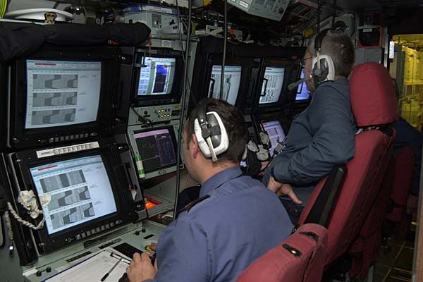
Not that far from the lighting of a submarine:

1748.jpg
 
To answer the question the OP asked about the chairs:

I don't know what ultimately happened to them, but at least ONE was refurbished and used on one of the ship sets of seaQuest DSV.
 
hutt359 said:
And Kirks order to go to "Warp point five"... Full impulse is .25C anything above that is a "warp point X"
Using the Warp factor cubed formula, "Warp point five" would be .125c ;)
I addressed and basically demolished this idea right here.

You've got a hotlink problem there - and their "no hotlinking" message

All of the links worked yesterday. You must allow all ads and cookies.
Allow ads and cookies? If I may...

F*CK that.

As you were. ;)
 
I love how the TMP bridge was designed primarily to be functional, and not just to look "cool". It's why that set still looks futuristic today, whereas the Enterprise-E bridge from NEM looks more like the sales floor of a Best Buy than anything else. Every time I see one of the last 3 TNG films, I always expect Captain Picard to turn towards the camera and try to sell me DirecTV.
 
My god I can barely watch TMP because of that crappy bridge, it got respectable in II and III with some minor changes but wasn't cool looking until V.

It was so bland looking.

Actually ST V's bridgre was very bland. All flat surfaces and nothing interesting to look at.


I always liked the 2d panels better, the TMP bridge buttons looked like something off an old amstrad computer rather than something from the future.
Some of the stuff looked cool:

http://www.ex-astris-scientia.org/gallery/artoftrek/er-consoles-st2.jpg

Just not very futuristic, more like something from a 1980s submarine.

Tell me this does not look more futuristic:

http://www.webolutionary.com/3d/images/bridge_tuc-7.jpg

...than this:

http://images4.wikia.nocookie.net/memoryalpha/en/images/6/6c/Constitution_class_refit_bridge_1.jpg

If you like the raised buttons then STVI bridge had the perfect balance.


Of course you want a cool looking set theres no contest:

http://www.ussenterprise.co.uk/enterprise/ente/other/ebridge.jpg

Then theres the "i'm trying SO hard to make it look futuristic i'm making it look like a sci-fi parody set from a bad British comedy"...look: :lol:

http://www.ex-astris-scientia.org/articles/new_enterprise/enterprise-bridge.jpg

..luckily the hot fucker in the command chair makes up for the OTT set ;)
 
Last edited by a moderator:
If you are not already a member then please register an account and join in the discussion!

Sign up / Register


Back
Top