• Welcome! The TrekBBS is the number one place to chat about Star Trek with like-minded fans.
    If you are not already a member then please register an account and join in the discussion!

The Valiant

EliyahuQeoni

Commodore
Commodore
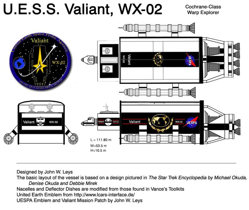
This is my take on the SS Valiant, mentioned in Where No Man Has Gone Before. The basic layout is based on the design seen in the Star Trek Encyclopedia. The nacelles are modified versions of Vance's Daedelus Nacelles & the deflector dishes are taken from his toolkits as well.
Valiantcopy.jpg

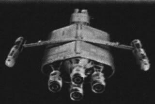
and for reference, this is the picture from the Encyclopedia:
SS_Valiant07.jpg
 
Why is the cockpit so tiny? It's not at all in scale with the rest of the design.
 
Why is the cockpit so tiny? It's not at all in scale with the rest of the design.

The cockpit is roughly the size of the Space Shuttle cockpit, while the ship as a whole is a couple times longer than the Shuttle. I'm not sure I see the problem.
 
Well, I don't mean to offend or anything, but it really looks tiny in comparison to the other components. The pic used by Okuda seems to have a command pod that's more consistent with the main hull.
 
Well, I don't mean to offend or anything, but it really looks tiny in comparison to the other components. The pic used by Okuda seems to have a command pod that's more consistent with the main hull.

Oh, no offense taken at all. If I didn't want feedback I wouldn't post :) Yeah, the Okuda version's cockpit is bigger in relation to the rest of the ship, but I felt that this made the whole ship appear too small. So I enlarged the main hull and kept the cockpit at a size I felt was appropriate. It does look a little awkward, I suppose, but I was going for utility rather than beauty.

Thanks for the feedback, it is much appreciated!
 
Not a problem. :) I try not to nitpick too much (:angel:), but if I do it's only out of curiosity. And perhaps because I can offer a useful suggestion.
 
The nacelles would look better if they were swept out further from the main hull, at a less-steep angle, like the Encylcopedia photo you posted.

The main hull looks better in the photo as well; it is more rounded so it looks like a TREK warp-driven starship. If I were drawing this particular design, I'd stick to the diamond-shaped front profile, or make it more space-efficient by going to a wide ovular cross-section.
 
The main hull looks better in the photo as well; it is more rounded so it looks like a TREK warp-driven starship.

Well, I personally didn't like the way the ship looked in the photo, which is why I redesigned it. I considered staying with a more rounded shape, but thought that the squared off hull was more utilitarian & helped make it look less advanced than the warp-ships seen in Trek.

Thanks for the feedback!
 
The engines seem a bit differentfor the photo.

Are you using the photo as a starting point for your vision or are you attempting to match the photo?

It is however a good start...
 
The engines seem a bit differentfor the photo.

Are you using the photo as a starting point for your vision or are you attempting to match the photo?

It is however a good start...

I just used the photo as a starting point. I liked the general layout in the photo, but was never crazy about the specifics of the design, so I decided to have a go at it myself.

Thanks!
 
If you are not already a member then please register an account and join in the discussion!

Sign up / Register


Back
Top