Yeah, I see what you're saying... but I still like the look of the nacelles too much, to remove the lower "scoop" section.
As far as the horizontal line goes, I was going to have a larger, more traditional pinstripe down the middle.
I still like the severe undercut, though. I don't know why, it just looks "right" to me.
")
That's fair enough - you've got to go with your own instincts and create the ship with the style cues you want.
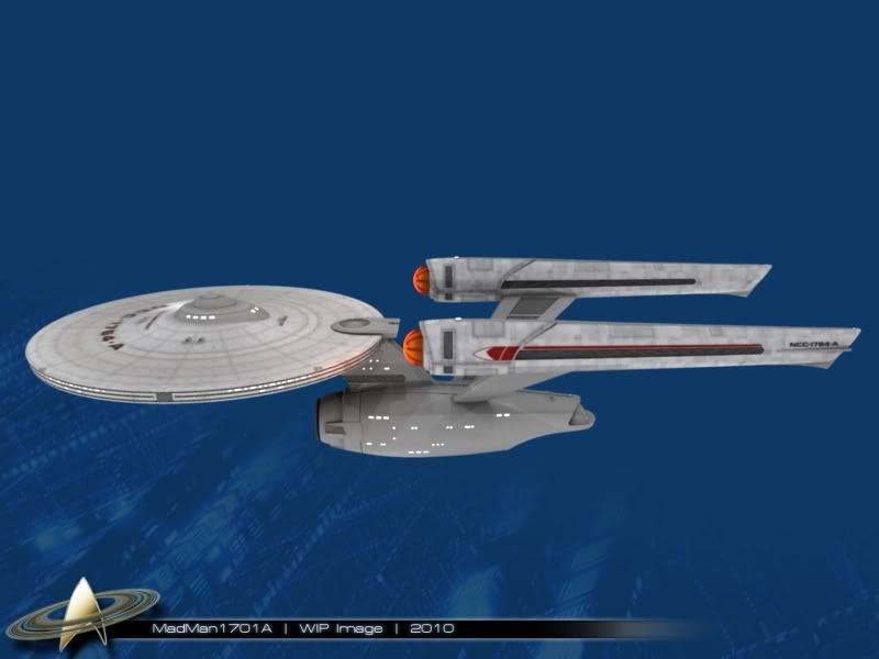
Now that there is a comparison image, it's definately the lack of horizontal cues in the secondary hull that is bothering me. The things that lend to this are:
- The introduction of the TMP style torpedo bay.
- A slight straightening of the spine (to accomodate the torpedo bay).
- The change from a long base where the warp pylons join the secondary hull.
- Smoothed out hull - now symmetrical above/below the deflector dish.
Concerning my own "tweak", I was thinking what would it be like if you were to introduce a stripe styled similar to one of the three "deflector rings" that run around the saucer rim?
Concerning the warp nacelles. OK the scoop bits could be kept. But again the nacelle stripes are on a slight upslope, which to me doesn't work.
Cheers,
S.O.