-
Welcome! The TrekBBS is the number one place to chat about Star Trek with like-minded fans.
If you are not already a member then please register an account and join in the discussion!
You are using an out of date browser. It may not display this or other websites correctly.
You should upgrade or use an alternative browser.
You should upgrade or use an alternative browser.
The Photoshop Thread, Part IV
- Thread starter Shaw
- Start date
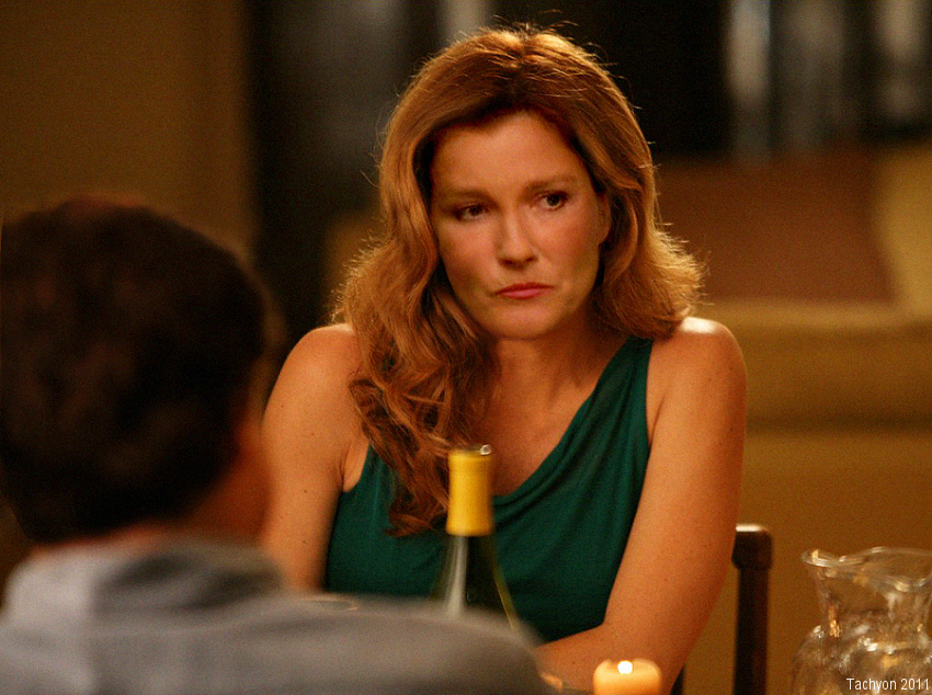
Thanks for the tips. The original shot had the focus on Kirk, with Saavik a little blurry. So I went with keeping that focal perspective. I did add blur, but you're right that there's still more information there. The lighting is too warm, so a little blue would probably help. I wanted to try incorporating some of the reflections that were on Saavik's onto Sandra's, but that'll take much more work.You should have added a touch of blue on her face and darkened her face. Maybe added some grain or... blur or something to make her less HD-y vs. Kirk.
Hm... You gotta tweak around a bit to get it super perfect. That's what I did with Morrissey.
The trick is to start with a photo of the "add on" person having the same lighting angles. Looks like you had that with Morrissey to start and then accentuated a little.
Actually, Morrissey looked a lot different. Here's the original:
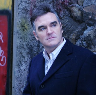
^ Wow... you're right. That is quite a difference! The good thing with a shot like that is that existing lighting and shadows are very diffused and uniform. It's tough when your starting photo has strong shadows already in it. What technique did you employ to create the bright spots on his forehead and nose? To create shadows, I use a polygonal selector tool with feathering set to 5, then go to Hue/Saturation and cut back on Lightness. I also play with turning down Brightness on the Contrast tool. I didn't have good results with introducing shine, so I tend to avoid doing it. I think maybe the issue was having feathering set too high.
Some of the ideas are cooler than the execution..! But I love em!
-Greg

-Greg
(Waves arms around)
Dude! Behind you! Dude!
(Flinches)
Aw, hell. Kirk killed another one.
Dude! Behind you! Dude!
(Flinches)
Aw, hell. Kirk killed another one.
")
So....you don't think that guard could take Kirk in a fight? What if it were face to face?
Aside from the belt...how does that uniform look?
-Greg
-Greg
The guy's left sleeve (on our right) looks way too long!Aside from the belt...how does that uniform look?
 Otherwise it looks normal. Btw, who is he? Also, I wonder what the deal with Kirk and his heavily rumpled shirt. It looks a little peculiar for this body pose... was it pieced together from different scenes?
Yes, two scenes put together. Now, Kirk was not altered in any way so I am not sure why he looks "rumpled" I guess he just was. The security guard is me trying to get onto a fan -produced show. So I need to fix the uniform...? Would I take Kirk...?
^ Ah, OK I get it now. It must be that really wide waistband that's making your arm look so long. I always thought that they were centered on the top of the pants, but it looks like you must have the bottom edge closer to the pants top edge.
As for Kirk, I guess it's because he was taken from a scene where he just got up after wrestling with someone. In this scene, I'd expect him to be standing more upright and with one leg forward, as though approaching you from behind. Maybe if you move him a little closer (forward and to the left), it might work a bit better. As if he were just able to leap onto your back.")
As for Kirk, I guess it's because he was taken from a scene where he just got up after wrestling with someone. In this scene, I'd expect him to be standing more upright and with one leg forward, as though approaching you from behind. Maybe if you move him a little closer (forward and to the left), it might work a bit better. As if he were just able to leap onto your back.

Well done!

Similar threads
- Replies
- 26
- Views
- 4K
If you are not already a member then please register an account and join in the discussion!