-
Welcome! The TrekBBS is the number one place to chat about Star Trek with like-minded fans.
If you are not already a member then please register an account and join in the discussion!
You are using an out of date browser. It may not display this or other websites correctly.
You should upgrade or use an alternative browser.
You should upgrade or use an alternative browser.
The Photoshop Thread, Part IV
- Thread starter Shaw
- Start date

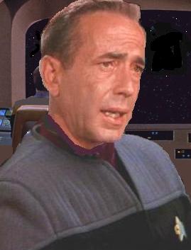
Cool Spock portrait.

Great pick with the head shots. Love it
")
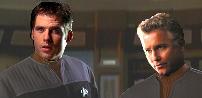
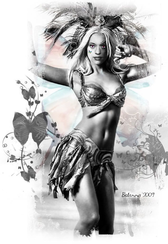
Here's one I threw together...
I've posted this before but here it is again..their not great but I like them..
You need to work on the brightness/contrast on these. On my monitor at work, they look fine but at home, the faces are very rich and the bodies/background are bright and washed out. Everything should balance no matter what monitor people view them on.
Play with your own monitor's brightness, contrast and color temperature settings to get everything as neutral as possible and use that as your reference point.
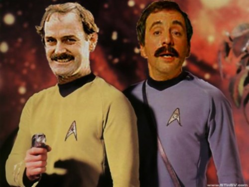
Here is my newest fiddle of Janeway/Torres
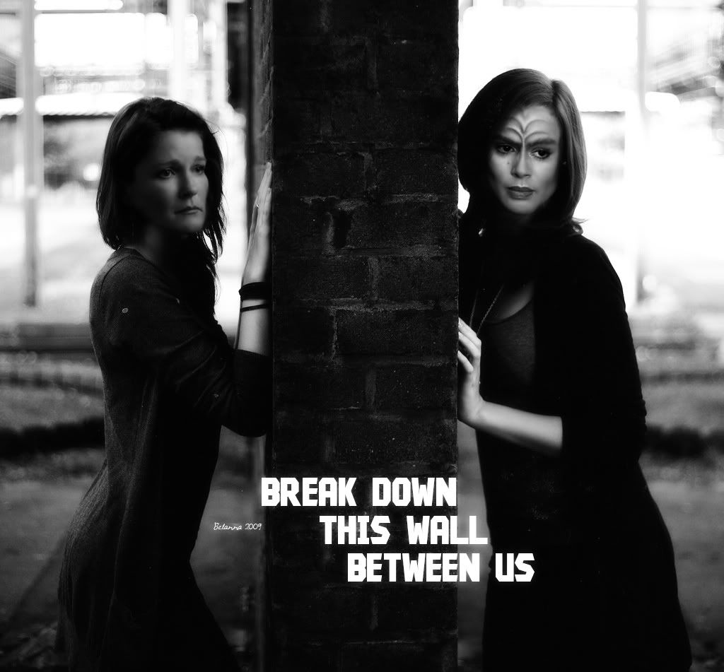
Oooooo...Very, very cool.

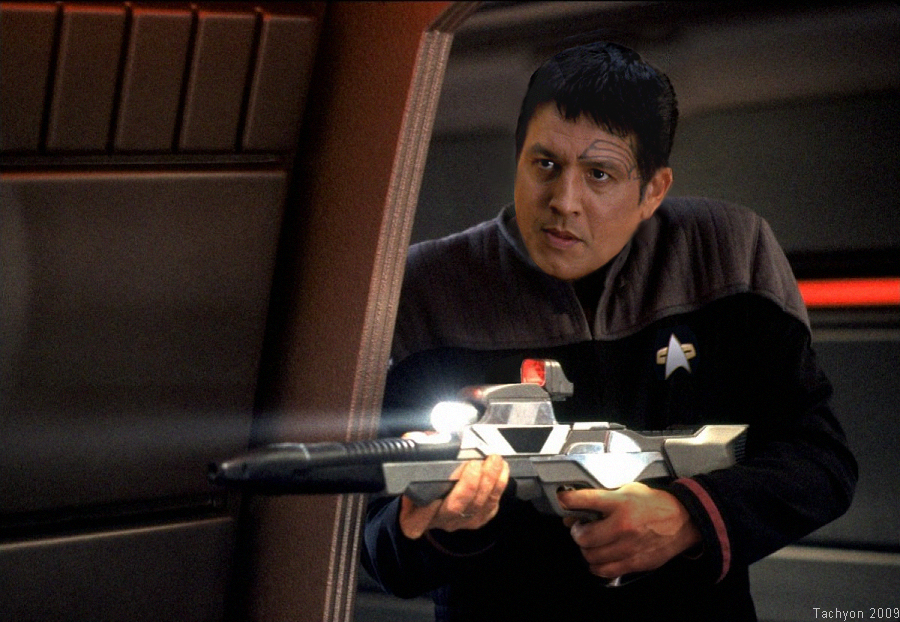
Here's one I threw together...
I've posted this before but here it is again..their not great but I like them..
You need to work on the brightness/contrast on these. On my monitor at work, they look fine but at home, the faces are very rich and the bodies/background are bright and washed out. Everything should balance no matter what monitor people view them on.
Play with your own monitor's brightness, contrast and color temperature settings to get everything as neutral as possible and use that as your reference point.
Thanks I give it a shot.

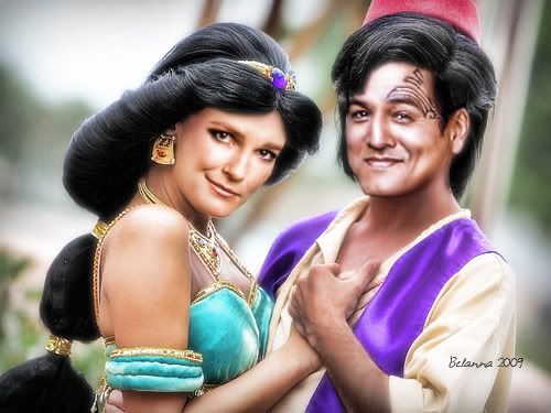

And yet again I return to the Faux-Soviet Poster type thing:

Great work, everyone!
And now - let's get arty. Let's get farty. Let's get arty and farty:

Your work continues to impress, ITL. You should get a DeviantArt and put these up.

Similar threads
- Replies
- 26
- Views
- 4K
If you are not already a member then please register an account and join in the discussion!