• Welcome! The TrekBBS is the number one place to chat about Star Trek with like-minded fans.
    If you are not already a member then please register an account and join in the discussion!

The OFFICIAL STNG-R general discussion thread!

Status
Not open for further replies.
Another reason could be that they'd already hired Jerry Goldsmith to do a theme, and when they didn't like what he came up with (can't blame them, it's horrible), they got him to rework the TMP theme?

It was actually Dennis McCarthy who wrote and conducted the rejected theme.

Really? Well, that makes me feel a little better about Jerry, and makes me dislike McCarthy even more.
 
The only time they ever had a problem with Jerry regarding themes was with the scene in TMP with the travel pod doing the tour of the new Enterprise, where he got so carried away with the grand sweeping music that he failed to include a theme at all. He was slightly embarrassed at that one.

Besides, his Voyager theme is arguably the best Star Trek theme music of the entire lot.

Agreed on Voyager, and I'd add the themes for First Contact and Insurrection (pretty much the only good thing about that film, IMO).
 
The only time they ever had a problem with Jerry regarding themes was with the scene in TMP with the travel pod doing the tour of the new Enterprise, where he got so carried away with the grand sweeping music that he failed to include a theme at all. He was slightly embarrassed at that one.

Besides, his Voyager theme is arguably the best Star Trek theme music of the entire lot.

Except that theme then became the TNG theme, and when you watch it now your brain associates it with Star Trek.
 
The 4-ft model is just very clunky looking with thick edges and just, oy. It reminds me of a larger Playmates toy or something.

Wait what?

I always thought the model used in series 1 and 2 was way too light and undetalied and just made the series look a bit cartoonish.

When the smaller model came in mid series 3 I thought the series took a step up in FX quality.
Finally, a model with surface details that could take a good close up!

The only disadvantage of the 4ft model was that it couldn't seperate so that option was quietly dropped from the series after BOBW (until the movie) and the D always went into battle with the families present, which was a bit weird.
 
The main reason the 6ft model looks like it doesn't have enough detail to some would most likely be the blurry final edits of the episodes. Just look at it in Generations or the trailer for TNGR. That detailing is beautiful, and not overly chunky like the 4ft.

I'd have less trouble with the 4ft if it wasn't for the proportions all being way off. Chunky detail aside, the 4ft is just a straight up ugly duckling.

I think I'm used to the proportions of the 4ft and the 6ft is the one that looks way off to me.

This is what happens when you grow up with the show in perpetual reruns and come into it about season 4 at the age of about 8 or 9...you think that's the way things should be and everything else is wrong!

And about that remastered clip, the model looks ok before the warp shot but it still loses a lot of detail and looks a lot darker during the stretchy part of the warp.
I wonder if that's one of the effects they'll have to recreate.
(Not that TNG ever bothered doing another straight up warp shot than the three they were supplied by ILM...did the warp effect REALLY cost that much or did no-one else know how to do it? :confused: )
 
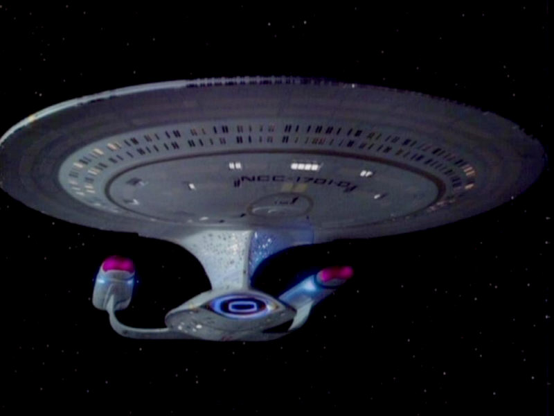
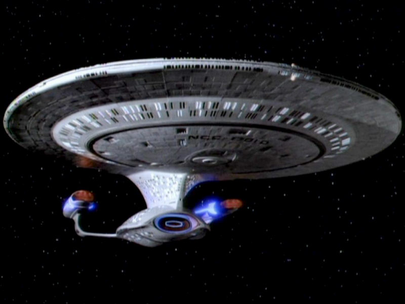
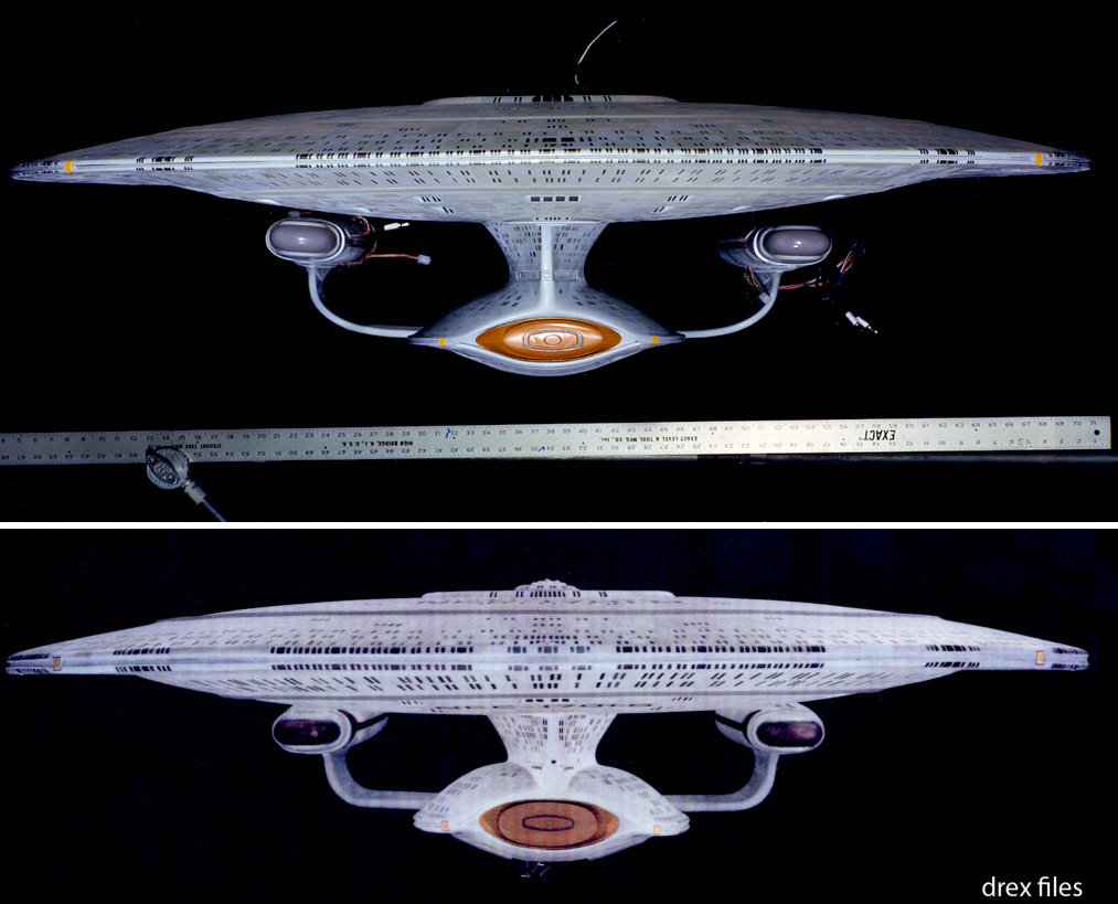
Beisdes the change in lines, I couldn't ever see any surface details on the 6ft, when it broadcast, I could with the 4 ft. Of course again the lines, not just surface details is changed on that.

But with a larger screen and high screen resolution (or when looking at detailed photos), you can see the detail that is on the six footer.

Now I do have preference for what was broadcast with the 4ft, for two reasons. One that I could see detail, and 2nd that it was such an easier model to film, the amount of shots we got went up dramatically.

Of course, I am a little scared to see what the 4 ft looks like with a large screen in HD.
 
Another reason could be that they'd already hired Jerry Goldsmith to do a theme, and when they didn't like what he came up with (can't blame them, it's horrible), they got him to rework the TMP theme?

It was actually Dennis McCarthy who wrote and conducted the rejected theme.

OMG. I'd never heard about this before. I just looked it up on YouTube. It's, uh... :ack: :thumbdown:

It sounds like they wanted the TMP theme all along. Leaving aside the horrible orchestration, the melody was obviously intended to evoke the TMP theme without actually being the TMP theme. A similar example is "Married... with Children" on Netflix streaming, which has a truly awful theme based on "Love and Marriage," which I presume they couldn't use because of licensing issues. A slightly less awful example is TAS's theme, based on TOS's.
 
This is what happens when you grow up with the show in perpetual reruns and come into it about season 4 at the age of about 8 or 9...you think that's the way things should be and everything else is wrong!
I can certainly appreciate that. Apologies too, if it seemed like I was trying to change your mind. Whichever one you prefer is up to you. I don't want to be that guy who says "Your opinion is wrong!" :)

And about that remastered clip, the model looks ok before the warp shot but it still loses a lot of detail and looks a lot darker during the stretchy part of the warp.
That's due to the way the original effect was created...there wasn't enough room in the studio to pull back that far from the 6ft model, so on the warp flash it switches to a 2ft version. As I understand it, the 2ft one also had no lighting system for the windows, which is why they turn off suddenly. Thankfully, they have fixed that slight (necessary) goof on the rematsered versions. :)
 
Six foot model -- sleek, curvy, graceful (if a big top-heavy):

galaxy-6ft-11001001.jpg


Four foot model: fugly:


galaxy-4ft-bloodlines.jpg


Just my opinion, of course. There was a site that compared them side-by-side in detail, and I was actually pretty amazed by how far off the shape of the 4-footer was. Less curved, bulgy in odd spots -- it's like the Enterprise just really let herself go.

EDIT: I found one comparison shot.

enterprise-d-6ft-4ft-fore.jpg
 
Yeah, and if he uploads them on Photobucket, he is stealing the images.

That as well.

Anyway, to me, the 4ft model does superficially have a more "realistic" appearance because of the chunkiness of the detailing, but considering that the saucer section of the Enterprise-D is meant to be nearly half a kilometre across, perhaps the fine detail on the saucer is a little too chunky. In the end, it does come down to personal aesthetics.
 
Status
Not open for further replies.
If you are not already a member then please register an account and join in the discussion!

Sign up / Register


Back
Top