The Oberheim DMX, by the way, is not a mixer, but a drum machine. ")
Unless I'm missing another part of the console you are talking about.
Unless I'm missing another part of the console you are talking about.
I do understand and sympathise with this, but as with all these found objects, it only sticks out if you know what the original item is. I've never worked with sound mixers, so don't know what one looks like. Most cinemagoers will be the same, so it's fine for a few brief shots.
Once the director has indicated the direction he wants to take in the design process, the designers just have to go with it. Why go to the trouble and expense of designing something bespoke when you have a very small budget to start with? Just get something off the shelf and install it. It looks fine and does the job nicely.
If it was that way from the start, it wouldn't have been a problem. But "saving budget" is less of a factor when you throw away something that was already made in order to build something new, only to be cheap with it in the process.... that kinda rubs me the wrong way. It also makes an additional rub when we get a super close up in ST6, but never get a good closeup shot of the aforementioned Okudagram panel in ST5. Its like the only one that "deserves" to be seen close-up is the one they ripped off of something else. Unless it was product placement or something, though I see no commercial evidence of that.
Wow, you're assuming quite a lot of things there. There's no obvious product placement, since there's no Oberheim logos visible, nor is anything listed in the credits (like it was for Kraft and Levi-Strauss in Final Frontier or Pfaltzgraff in Undiscovered Country). And even if it were a product placement, Oberheim stopped making the DMX in the mid-80s, so that would be the worst product placement ever. More likely, a bunch of DMXs were being, or had already been replaced in various recording studios at Paramount in favor of newer drum machines, so these were up for grabs, they fit the aesthetic Meyer wanted, problem solved. But you seem determined to ride this hobby horse until it collapses, so again, we'll just have to agree to disagree on the aesthetics.If it was that way from the start, it wouldn't have been a problem. But "saving budget" is less of a factor when you throw away something that was already made in order to build something new, only to be cheap with it in the process.... that kinda rubs me the wrong way. It also makes an additional rub when we get a super close up in ST6, but never get a good closeup shot of the aforementioned Okudagram panel in ST5. Its like the only one that "deserves" to be seen close-up is the one they ripped off of something else. Unless it was product placement or something, though I see no commercial evidence of that.
Bingo!I guess the decision was taken to move it more in-line with Meyer's take on the Trek universe, and that was a cost-effective way to do it. It obviously wasn't product placement as no logos are visible - it's just use of a found object. Also remember that TNG was airing at the time and was very popular, with ubiquitous touchscreens. Physical switches is an easy design cue that the Enterprise-A is an older ship.
It isn't.I think it's the case that the Excelsior bridge is entirely Okudagrams...
Now that you point it out, Meyer did like his insert shots of people working the controls. And you're right about not just the verisimilitude, but also the drama of it, particularly Chekov stabbing the button on his console when Kirk orders him to fire.It's probably just that Meyer liked insert shots of people doing things than Shatner did, and most of the clicky buttons were on the helm (though some of the touch-screen panels make clicky-button sound effects), plus it increases verisimilitude when the buttons react; the toggles toggle, the buttons depress, where, even with sound effects, it wouldn't sell the same way if some just poked a static picture of a button. Also, a lot of the TFF/TUC touchscreen panels look less usable than the TNG versions, or the push-buttons of the TMP version, being just long fields of identical square buttons, a la TOS. Especially nowadays, when people use fields of identical square touch-screen buttons all the time and we have a sense of how that sort of an interface should work.
Wow, you're assuming quite a lot of things there.
I think it's the case that the Excelsior bridge is entirely Okudagrams, which is a nice way of showing it's a more advanced ship, and closer to the TNG Enterprise-D.

Physical switches is an easy design cue that the Enterprise-A is an older ship.

Ah thanks - I did have a quick look at Trek Core but didn't immediately see any physical switches. I assumed there would be some on the science station, as it was a straight reuse of the Enterprise set. I was 50/50 on the helm console - this shot makes it look like it's all touchscreen. I'm very likely thinking more of the Enterprise-B.It isn't.
extended portion of science station (lower left of frame)
helm console
Though all the physical controls are gone when the set is redressed to serve as the bridge of the Enterprise-B:
EAS: photos of the science station and the helm & nav consoles
That's the other issue... the Enterprise-A was not an older ship, it was a brand new ship. Granted it was "put together my monkeys" as Scotty would say, BUT it was of modern build at the time, with more advanced engines and electronics. It should have at the very least been as advanced as the NCC-2000 Excelsior, and moreso than its NX-2000 version (as they clearly changed some things over those few years). Why would we treat the Enterprise-A as old and obsolete in only its second film?
Going off what we can see from those screencaps, it looks like the inner half of each console was all Okudagrams, and the outer half had a small row of Okudagrams across the top, with the DMX panel in the bottom corner. Since Chekov also had the DMX on his side of the panel on the Enterprise, it's logical to assume the Excelsior's nav console was arranged similarly.Ah thanks - I did have a quick look at Trek Core but didn't immediately see any physical switches. I assumed there would be some on the science station, as it was a straight reuse of the Enterprise set. I was 50/50 on the helm console - this shot makes it look like it's all touchscreen. I'm very likely thinking more of the Enterprise-B.
I think I like it better with the overhang; I'm also thinking the columns could extend to different lengths assuming that they had to place the hospital in an area that isn't entirely level, and someone forgot their little wooden shim to keep the hospital from wobbling.Alright, so I'm working on a hospital module that can be deployed during crisis situations. I'm in a bit of a pickle: I can let the underside of the module be flat, so that it just lands on dampening feet and there's that. However, I also have the option of letting a little bit of the structure jut out on the underside. Doing this requires that on the other side of it, stabilizer feet will need to extend from the main fuselage, or it would topple over.
Adding something like that, in my head, means extra stuff that needs to work in order for the module to be functional. If the feet fail to extend, it's bye bye emergency hospital, stranding those poor Federation citizens because a machine did an oopsie. But it has its advantages, mainly creating an overhang under which people can gather as well. Any insights?
"Put together" from spare parts and scrap perhaps! Everyone knows the Enterprise-A was originally the Yorktown. Or the Ti-Ho. Or something.
In any case, there's the best part of a decade between the two films.
Alright, so I'm working on a hospital module that can be deployed during crisis situations. I'm in a bit of a pickle: I can let the underside of the module be flat, so that it just lands on dampening feet and there's that. However, I also have the option of letting a little bit of the structure jut out on the underside. Doing this requires that on the other side of it, stabilizer feet will need to extend from the main fuselage, or it would topple over.
Adding something like that, in my head, means extra stuff that needs to work in order for the module to be functional. If the feet fail to extend, it's bye bye emergency hospital, stranding those poor Federation citizens because a machine did an oopsie. But it has its advantages, mainly creating an overhang under which people can gather as well. Any insights?
Purely from a design perspective the one with the feet and the overhang looks much more interesting to me. No idea about the practicality of it.Alright, so I'm working on a hospital module that can be deployed during crisis situations. I'm in a bit of a pickle: I can let the underside of the module be flat, so that it just lands on dampening feet and there's that. However, I also have the option of letting a little bit of the structure jut out on the underside. Doing this requires that on the other side of it, stabilizer feet will need to extend from the main fuselage, or it would topple over.
Adding something like that, in my head, means extra stuff that needs to work in order for the module to be functional. If the feet fail to extend, it's bye bye emergency hospital, stranding those poor Federation citizens because a machine did an oopsie. But it has its advantages, mainly creating an overhang under which people can gather as well. Any insights?


Here's an idea: how about crediting the flickr members you're linking this stuff from? I drew those an eon ago.That is the torpedo load panel, not the fire control panel.
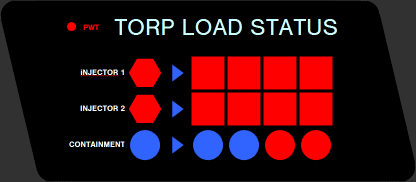
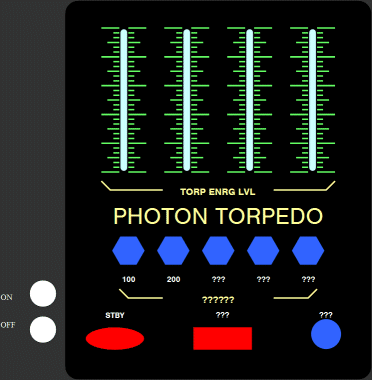
The sliders would control the yield of the torpedo, and the indicator apparently displaying said yield in magnitudes of quarters (i.e. 25%, 50%, 75% and 100%) blinking when said torpedo is loaded into injector 1 and 2. Control of actually firing them is then operated by the Fire Control panel, where the operator can select the quantity and to initiate fire.
Also keep in mind at this time Photon Torpedoes were still energy weapons, not a physical warhead (speaking with regards to the production, not canon, which had later changed). Wrath of Khan changed that because Nick Meyer wanted his manual labor Navy scene.

Oh, since I did not claim they were mine, I didn't think of crediting. Plus the image links should go to that same flickr anyway, I believe. Either way, I apologize.Here's an idea: how about crediting the flickr members you're linking this stuff from? I drew those an eon ago.
Another reason they change stuff on sets is because sometimes elements on the set get damaged, ripped out and repurposed, or outright stolen. It's not impossible that a chunk of the helm was missing and someone said, "put some physical switches there."
(signature) SketchUp: not for the faint of heart!
- I'm too late, but agree with the reasons for landing legs - particularly @cardinal biggles' "bumpy ground" and @Michael's "more interesting look"Thanx for the advice guys. Overhang is a go, that much is for sure. Since we're talking modules here, I might incorporate a landing deck in one variant, but probably not all. Then again, these structures are pretty massive, so it could be a possibility to just give them all hangars without too much of a space penalty...
")
In short, somebody asked about a model used in a promotional render not realizing it was the EVA Pod from "2001: a Space Odyssey. The poster simply did not know what it was. That, in turn reminded me of another incident elsewhere. Somebody saw the 2001 EVA Pod and assumed , "Hey, whoever made that is ripping off Star Wars! They simply took a TIE Fighter and tore off the solar panels!" I could have cried! I mean, Kubrick's seminal work is only 9 years older than the original "Star Wars". Can it be so thoroughly forgotten already? If nothing else, the numerous memes it has generated should keep it in the public eye. A "TIE fighter" with missing panels, indeed!
We use essential cookies to make this site work, and optional cookies to enhance your experience.