Thanks for all the great comments, guys... it's appreciated! A few comments sort of require a response, so I'll try to combine a bunch of 'em in one...
I really like it! btw you could always say that its a sub class of the original Bonaventure to 'justify" the diferences, kinda like the Royal Navy's Bellerophon class battleships which were slightly altered versions of the original HMS Dreadnought.

Well, I was thinking that this is THE "Bonaventure." The "first ship with warp drive." However, it's not the only ship of its general design... it was probably the first one, and later ones followed-on with changes (significant or not), as is always the case with prototypes.
I actually imagine this being built at the same time as the "Baton Rouge" class starship... which is what I've always imagined was the class of the first ship Kirk commanded (prior to being promoted to the rank of Captain and being put in command of Enterprise)... a ship I've sort of adopted the name "U.S.S. Alexander" for. For anyone not familiar with the Baton Rouge class... here's a good place to check it out.
http://startrek.wikia.com/wiki/Baton_Rouge_class
ANYWAY... I see these two ships as contemporaries. And while the Bonaventure was the first ship outfitted with "warp drive" (able to go faster than ~ 75C), I don't expect that she was the LAST. And it's easy to envision that the ship was a test job on an existing hull, not a totally new-built ship.
So, there were probably quite a few of these ships doing "police cutter" duties along major spacelanes and territorial borders eventually, though they may have looked a little bit different in some details.
Looks good, Cary! The only thing I'm not sure about is the 'guy wires' on the nacelles. Otherwise, nice job.
I had two reasons for putting those in. First... it just sort of fits, with the triad of little screw sockets around the base of the TOS 1701's nacelle domes, and the original gold spike coming out of the center of that dome. I wanted it to resemble the sort of construction we see today, where tall towers require this sort of thing. It does give it a more "crude" appearance, which is what I was going for, but also makes a semblence of sense. I'm not convinced that every ship oughta have those, but for the first ship, it makes sense. Later ships may have used shorter spikes that didn't require the additional stability, and eventually they dumped the sensor spike altogether... so there's a sense of progress there in my eyes.
[...]
The only counter-argument I can see is that the pre-TOS 1701 had a larger dish, and it became smaller over time.
But I'd love to hear your take, so c'mon, tell me what you're thinking!

That is exactly what i think about it. Of course, this is probably a "learned" impression, equating the changes made from the first pilot to the series version of the
Enterprise with "advancement" in technology (The same goes for some changes from the TOS ship to later ship designs (like the nacelles getting smaller in relation to the rest)).
As it is now, the dish seems to be smaller in comparison to the rest of the ship as on either version of the TOS
Enterprise.
Of course this is more of a gut feeling, i didn't take any measurements (you probably would have seen me stalking around your shipyard
")
)
Well, it's hard to get good night watchmen at the shipyards...
Seriously, I get you point, and if I were doing this entirely "from scratch" I'd be inclined to go along with what you suggest. However, remember, my goal was to match as closely as I PRACTICALLY could the appearance of the ship on TAS. I made some changes, but they were ones that I felt were necessary to make the ship "work" or that didn't alter the overall impression as seen from the side. My one major exception to that was the height of the nacelles...and that was because I tried it the other way and HATED it. The ship isn't the most graceful one ever seen, in any case, but that just made it totally goofy in my eyes. (I may post an image of it with the high-mount nacelles one of these days... making that change, then tweaking it back, wouldn't take much time... like I said before, it's one of the advantages of working with a parametric, engineering-based modeler rather than a "visually-oriented" one where you have to restitch everything if you alter any dimensions.)
But to your point... the dish's small size is a clear "yardstick" for the side profile of this ship. If I made it twice as large, the ship simply doesn't look the same.
Now, "in universe," perhaps this ship had a literally undersized dish... and that caused it problems. So they increased the output along with the size for later-built ships, which gave a less mechanically-robust solution but allowed the thing to work as intended. Then, eventually, someone managed to pump more power into a smaller package and the general scale went back down to the "original design intent."
In other words... maybe this represents a DESIGN FLAW. Think of it that way... and that would explain why the dishes got bigger!
")
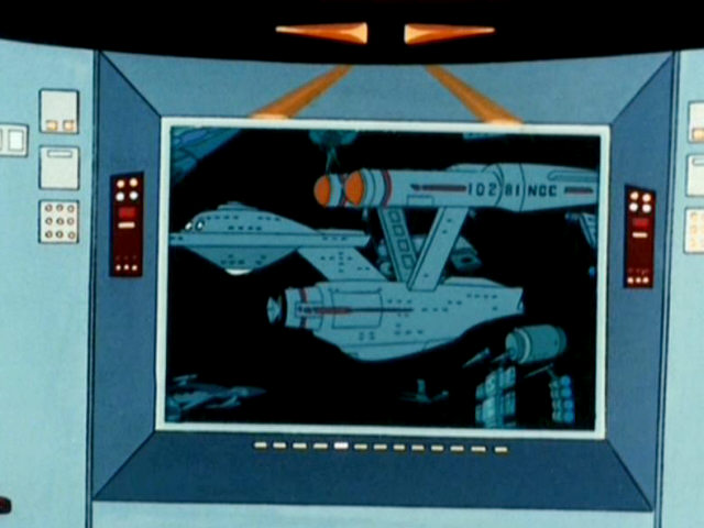
Nice distinction - 102 81 NCC... not "NCC-10281.
If you absolutely had to make some sense of this, that would be the most appropriate avenue. It shies away from long held fanon (specifically NCC and its meaning regarding construction contract) and takes only what is presented without much interpretation. Best yet is to not even attempt to explain it at all.
Believe it or not, I agree... if you're on the productio staff. Coming up with explanations is what fans do the best, though.
And we all get to have our own explanations for anything that hasn't been OFFICIALLY established, huh?
I'm just sayin' what my own PERSONAL view of the number is. As I often say, "your mileage may vary."
As for MJ's statement regarding 17th model and first ship (1701); I am still under the impression that it is his own retconning; much after the fact.
Possibly, but then again, M.J. did tend to think things through much more thoroughly that he's sometimes given credit for (though I do feel that his work represents "sketches" rather than "final designs." The guy never bothered to route the complete plumbing system of the Enterprise, the cad!)
What leads you to conclude "after the fact?" I've never heard anything to support that, or to deny it... so I'm just curious if you have.
If you truly needed/feel compelled to back your assessment of a contact code may I suggest the following: Enterprise is often identified not simply as Enterprise, but has the additional data NCC-1701 attached in the identification process (TV series and movies). This is also seen in the Motion Picture where other ships are identified not only with ship name but alpha and numerical quantifiers attached. This makes little sense unless it is some form of code to specifically identify the ship (likely more than the simple explanation of a model number 17th design first in series) than the fanon explanation equivalent to a license plate number. For civilian governments this license plate theory has little meaning.
But, that's more "by the book" than most would like to acknowledge I suppose.
That's the beauty of having the NCC stand for "navigational contact code," IMHO. It's a MEANINGFUL number... it represents the "IFF Transponder" code that the ship broadcasts to identify itself to other ships. Which isn't really all that different from what you suggest (re: it being similar to the ship's license plate).
I just imagine that the code would probably be related to the official designation of the ship as well, and very likely to the construction order, just because that makes for cleaner bookkeeping.
Like the design a bit. I'd like to see the nacelle struts a bit higher myself.
Perhaps initially they were set this high for a reason, or lowered later for another reason.
One of these days I'm sure I'll give you that to check out (and see if you agree with my take that it sort of ruins the "balance" of the design!).
Can you put a Connie beside your Bonnie for size comparison?
I'd love to, but I don't have a model of the Constitution to work with. I've been planning on making one, one of these days, but I've never quite gotten around to it.
If anyone has a nice-quality, pretty accurate 1701 model in a format that I'd be able to read in, I'd love to try that side-by-side comparison. I have Maya, I have ACCESS to lightwave (but don't really know it) and I have access to a few other packages, plus my CAD package (and the 3rd-party renderer/converter I bought a couple of months back). I can convert most file formats, but you always lose SOMETHING in the translation... so the best option is to do "Lightwave" and just accept it'll be a poor-quality render since I don't know much about using Lightwave!
Alternatively, if there's someone who has an E and wants to put the Bonaventure next to it, let me know...
Very nice work! I like how you've updated the design, yet kept it very close to the original.
I wonder if the Bonaventure was a one-off test bed or if others were built as a class of ship. 'Course either answer could be right as no other reference is made to the ship outside the TAS episode. Size-wise, it would make a nice border cutter during the early TOS era.
That was actually my thought... I was thinking it was sort of the TOS-era equivalent to the Nova we saw in Voyager...
Wow, that work really came along quickly! And I like your version slightly better than the one of Aridas Sofia which is saying something.
Thanks. As a long-time appreciator of his work (and all the others from the "heyday" of fan published works!) that means a lot to me.
Starting from the somewhat unfortunate depiction in TAS, considering the supposed heritage, the tricky task is to keep it recognizable yet set it apart from the graceful Enterprise as much as possible. IMHO, you have done so quite convincingly, but you could tweak it a little more in that direction:
I would support the notion to increase the dish antenna, making also the resonator housing a little larger and cylindrical.
If you look, you'll notice that my earlier "pre-tweaked" version had a simple cylindrical resonator assembly (btw, that's MY term, not anything I've ever heard in "official trekdom" documents... it just looks like a resonator to me!). I adjusted it to make it look more like the animated shot... and actually, I think it's much more aesthetically pleasing with the taper as well. So, that's not going to change... at least not on MY version. Of course, anyone can do their own version at any time... and I encourage folks to take what I've done and "run with it" and implement your own take. This is a HOBBY after all... so go have fun!
I know you have done it like it was seen on screen, but how about exchanging the nicely upswept rear section of the engineering hull straight (diagonal) or convex, rather than concave (form follows function)?
I get what you're saying, but over the years I've often wondered why Matt Jeffries put that in there to begin with, and I've come to two conclusions:
1) It makes the design feel a bit more graceful... ie, it's a positive on purely aesthetic grounds. Yes, that does matter... just not as much as the technical stuff does.
2) It's something that's reminiscent of the fantail on NAVAL vessels... which is there for a functional reason. Ships sail better with fantails than the do without. Well... why would a STARSHIP need that? Perhaps it has to do with the shape of the subspace bubble in warp... maybe having this cut-out allows you to "surf subspace" a bit more stably? The fact is, EVERY major Trek ship has had a fantail of that nature, except the NX-01. It's entirely make-believe, but I take this as being a feature that gives the ship better warp stability... like the keel of a sailing vessel gives it better water-borne stability.
That's how I look at it, and that's why I want to keep it.
The endcaps on the warp engines look very honed to me. What do you think about something along the lines of Aridas' Eagle or Tritium class?
I do plan to add additional detail back there. Not sure WHAT yet... but as I said before, I MAY choose to borrow some design details from Aridas' work (assuming he doesn't object, which I find unlikely to be the case!) The idea is that his nacelles are of the same generation as these... but not NECESSARILY the exact same MODEL.
As you are already planning, put a lot of plumbing and other surface structure on the ship. That is how Earth-built space ships and satellites have always looked and while we know that the forms get much more refined by the time of TOS, I think when the Bonaventure was built, that time had not yet arrived.
I'm not planning on "a lot" because it doesn't make sense to me. There will be additional detail, but I don't plan on turning this ship into a "movie-quality renderable" model anyway... this was a thought-experiment as much as anything else. I don't plan on creating texturing, for instance... but I'd happily let someone else do so and get part of the credit!
As for why I don't want to see tons o' greeblies... it's pretty simple, and it goes back to the Jeffries concept. If you're going to be flying in space, a very hostile environment to people, you want to avoid going outside unless you have no choice! So you keep as much of the hardware of the ship as possible INSIDE, where you can work on it in your shirtsleeves. If something HAS to be outside, the next best option is to have it detachable so you can go outside, unhook it, bring it in... and work on it in your shirtsleeves.
There's literally NO reason to have exposed piping outside of the hull... is there? Not unless the pipe is a heat-rejection device (like, say, an intercooler). If the plumbing can be run inside, it SHOULD be run inside.
That also goes back to something Ancient mentioned about the thickness of my walls, decks, and hull. Yes, they are VERY thick... in this case, nearly 3 feet thick! But that includes the outer hull skin, the internal framing, the deck, the ceiling, the life support hardware, all the plumbing and wiring, all variety of hardware, tucked into the spaces between the floor and the next ceiling, or between two walls, or between the outer hull and inner hull... THAT is why the thick walls are there. So you don't HAVE to go outside to repair stuff. Makes sense?
In short, make this into kind of a somewhat ugly duck from which would over time evolve the lovely swan!
That was the intention... and I hope I've succeeded, at least somewhat!

Large areas of it need to be covered with foil and thermal insulation blankets, with lots of attachment points and bolted-down panels on the exposed metallic areas. Borrow heavily from the ISS for exterior detailing. Make that hump over the shuttlebay a storage hatch for a robotic arm that can inchworm its way over the ship for repairs and cargo manipulation.
Hmmm...
Well, with a smaller ship, more plating detail will be visible if you look closely enough, sure... but I plan on having this thing covered with the same "light grey thermocoat" that the TOS 1701 had, with much the same color scheme for markings, as well.
The foil and blankets is something we see today... but expecting to see that in the future is, to me, like expecting to see vines used to tie together ocean liners because the first rafts used vines. This ship may be less advanced than the later stuff we've seen, but it's a very near predescessor to the TOS E, so it shouldn't "feel" all that different.
On the other hand, the idea of an exterior "hull repair robot" isn't a bad idea... I kinda like that one! Probably a bit more robust than the ISS version, though... more like a big spider. But I'm actually liking that idea a lot... not just for this ship, either!
Thanks, everyone, for your comments...
Now... anyone got a good 1701 model that they can share?

 )
)


