• Welcome! The TrekBBS is the number one place to chat about Star Trek with like-minded fans.
    If you are not already a member then please register an account and join in the discussion!

The Much-Maligned TAS Bonaventure

No fair! No fair!

You stole my idea for a Bonaventure-redesign thread! :)

I have some ideas of how to redesign the ship, based on the fundamental image of the Bonnie from TAS "Time Trap", but also taking the NX-01 "Akiraprise" into account.

I'll post some of my ideas when I get time to put pencil to paper and draw them.

Neat saucer there, Cary.
 
Umm, yuck?

It's not your talents, but it seems like you're scared to use artful, complex shapes with this, and it's really hurting the design.
 
Umm, yuck?

It's not your talents, but it seems like you're scared to use artful, complex shapes with this, and it's really hurting the design.

Well...he is making it in Maya, which has about the worst modeling tools around for building hard-bodied craft. :p
 
Umm, yuck?

It's not your talents, but it seems like you're scared to use artful, complex shapes with this, and it's really hurting the design.

Well...he is making it in Maya, which has about the worst modeling tools around for building hard-bodied craft. :p
Actually, no... I'm doing it i Pro/ENGINEER, which is built around doing real engineering design, not "art." I use Maya for other stuff...

As for the lack of "artful shapes," well... this is due to three things:

(1) "Artful" shapes tend to be what's most WRONG with modern-day Trek design. Look at the 1701-E thread in this forum right now... basically, my position is that form must follow function.

"Artful" shapes without a purpose behind them (even an imaginary one) are just stupid, in my opinion. The Sovereign-class is just chock-full of "artful shapes" that generally ruin the design.

(2) The original ship wasn't SUPPOSED to look at nice and polished as the 1701. It was, as has been pointed out, a bit "clunkier." Which is, really, my goal here... to show something that leads to the 1701 style (not to the TNG style, as the NX-01 did!) while being a lot less refined. Function over style... style comes as the technology matures.

(3) The ship needs to make sense. If an "artful curved surface" means that the ceiling in an inhabited space goes from a full 9' down to a 4'... then that is BAD DESIGN. It's a bit easier to be "artful" with larger ships, where the resolution of the design (based upon deck spacing) is a bit finer overall. But in a smaller ship (such as this one), you really need to build the ship around the fact that its function is to carry PEOPLE, and that people need the spaces which they inhabit to meet actual HUMAN constraints.

Honestly, why in the HELL should we feel forced to follow a "standard Trekkian style?" Honestly, I've heard SO many statements that "that's not what a Trek ship ought to look like" over the past few years... usually from people who are strongly inclined towards the post-TNG "blobby-curvy" designs. Most of the "blobby-curvy" designs end up with large volumes which are incapable of housing any actual PEOPLE, or regions which are virtually inaccessible from other parts of the ship.

The Eaves-designed 1701-E has lots of artful stuff in the design, but in order to place windows along the artful curved surfaces, it ends up that the interior decks can't possibly be flat... apparently the inside of the ship is set up in curving "hillsides" style?

So you're right, I'm NOT going for "artful curves" but it has nothing to do with being "afraid" of them.
 
One what are you basing the giganto impulse deck?
Well, the whole thing as originally drawn was just totally assymmetrical. And even with putting my topside and bottomside structures offset to the fore... with the length I'm constrained to (200' for the saucer diameter) I just couldn't justify anymore offset without ending up with something that looked even worse, or had way too much unusable space.

SO... I compensated by creating a larger impulse deck. This gives the full "offset" appearance as see from the side, so that was an attempt to match details.

Second, though, was that I wanted this ship to be less advanced than the 1701, and obviously so. And realize, that impulse deck handles the mass of the whole ship, not just the saucer, so it's not as "oversized" as it seems at the moment... the secondary hull is far more massive than the saucer, and don't forget about the nacelles either.

I basically started off with the general "TOS-style" impulse deck, but made it cruder. I did discover, and think that this is a GOOD thing, that the extension does give a clear visual tie to the NX-01's saucer engines.

Realize what's in there. There are eight fusion reactors, each of which has an exhaust accelerator coil. There are big super-high-pressure tanks holding the supercooled hydrogen slush. There are power conversion systems, and all of the control hardware. And structure to carry the load of the engines into the structure of the ship, too. And realize that this is all in an area smaller than a basketball court. It's not really all that "huge." ;)

It's just a dinky little saucer which happens to, at impulse, be "towing" a comparably rather massive secondary hull and a pair of big honkin' nacelles. ;)
 
Just a quick update for the BBS... but a fair amount done on the ship.

As I mentioned before, I wanted to do something for this which would be broad and flat, like the Baton Rouge Class, but also evolutionarily moving towards the TOS 1701 design. The version shown on-screen really doesn't make a lot of sense 3-dimensionally, anyway, so what I've really tried to do was to try to match the side view in terms of general shapes, but not to worry too much about the implied overall shapes.

SO...

Here's the secondary hull, pretty much completely "roughed in"... along with the beginning feature of the warp drive nacelles.

bonaventure428088bq5.jpg


And again, for comparison, the ship as seen on-screen...

tasdeltatriangle4hp4.jpg
 
Its looking pretty good. Comparing to the on screen image it looks to me like the saucer section of the original is a bit longer than your version, but overall it looks very faithful to what is seen in TAS
 
As for the lack of "artful shapes," well... this is due to three things:

(1) "Artful" shapes tend to be what's most WRONG with modern-day Trek design. Look at the 1701-E thread in this forum right now... basically, my position is that form must follow function.

"Artful" shapes without a purpose behind them (even an imaginary one) are just stupid, in my opinion. The Sovereign-class is just chock-full of "artful shapes" that generally ruin the design.

(2) The original ship wasn't SUPPOSED to look at nice and polished as the 1701. It was, as has been pointed out, a bit "clunkier." Which is, really, my goal here... to show something that leads to the 1701 style (not to the TNG style, as the NX-01 did!) while being a lot less refined. Function over style... style comes as the technology matures.

(3) The ship needs to make sense. If an "artful curved surface" means that the ceiling in an inhabited space goes from a full 9' down to a 4'... then that is BAD DESIGN. It's a bit easier to be "artful" with larger ships, where the resolution of the design (based upon deck spacing) is a bit finer overall. But in a smaller ship (such as this one), you really need to build the ship around the fact that its function is to carry PEOPLE, and that people need the spaces which they inhabit to meet actual HUMAN constraints.

Honestly, why in the HELL should we feel forced to follow a "standard Trekkian style?" Honestly, I've heard SO many statements that "that's not what a Trek ship ought to look like" over the past few years... usually from people who are strongly inclined towards the post-TNG "blobby-curvy" designs. Most of the "blobby-curvy" designs end up with large volumes which are incapable of housing any actual PEOPLE, or regions which are virtually inaccessible from other parts of the ship.

The Eaves-designed 1701-E has lots of artful stuff in the design, but in order to place windows along the artful curved surfaces, it ends up that the interior decks can't possibly be flat... apparently the inside of the ship is set up in curving "hillsides" style?

So you're right, I'm NOT going for "artful curves" but it has nothing to do with being "afraid" of them.

Hear,hear!

I start to be believe that a less laughable, yet recognisable Bonaventure is possible - and I hope PTrope will be able to accept it, too!
 
Its looking pretty good. Comparing to the on screen image it looks to me like the saucer section of the original is a bit longer than your version, but overall it looks very faithful to what is seen in TAS
I tend to agree, actually... I was trying to match the dimensions as measured (roughly) from the semi-established length and the on-screen proportions, but also trying to make things work with human-sized deck heights (9', with deck structures thick enough to contain structure and mechanical support... a bit under 3' in this case).

I went ahead and enlarged the OD of the saucer a bit as a result (which consequently reduces the size of the impulse deck, since I established it by its aft plane, not by distance from the edge of the hull). I've also edited the dorsal to give it a slightly steeper angle (to better match the on-screen presentation).

You'll note that I've refined the shape of the deflector array quite a bit at this point. I've also altered the lower sensor dome enclosure to better match the one on the top.

There are quite a few "tweaks" to the secondary hull general shape, but these are most obvious near the hangar facility.

And most significantly, you can see my new warp nacelles (not complete obviously). The front end, as seen on-screen, did resemble the Enterprise's... with some differences. And that's the simplest part to copy, really, so that's what I've done first.

You'll note that I've taken another liberty here... I've put "guy wires" around the nacelle-front hydrogen sensor spike. These are actually pretty large right now (the "wires" are 9" in diameter!) but I want them to be visible. The idea is that there were similar "wires" on the pilot-version E, but they just didn't show up on our TV sets due to limited resolution. ;)

Again, comment are solicited.

Click the link to see the "full version" of this image:

 
The Final Configuration (less detailing, texturing, etc!)

Okay, this ship has fallen together pretty quickly. I have a bit of detail still to add (I may "borrow" from Aridas's ideas for that), markings, etc... but overall, it's done. The configuration is "locked in" and I don't plan to alter that at all.

First, here are some general orthographic views.


And here's the section view, same as the last ortho view, to give a sense of scale and proportion. Note that the saucer is mainly living quarters, the small medical bay, and the command/control systems, plus the impulse drive. The secondary hull is cargo, a shuttle hangar, and the main power systems (which are HUGE compared to what you'll see in later-generation ships)


I've also got some nice render shots from a variety of "common" perspectives, for comparison to other starships. It's a bit "clunky" but not too bad, really... more like a Nova or Grissom type than a Constitution or Sovereign...


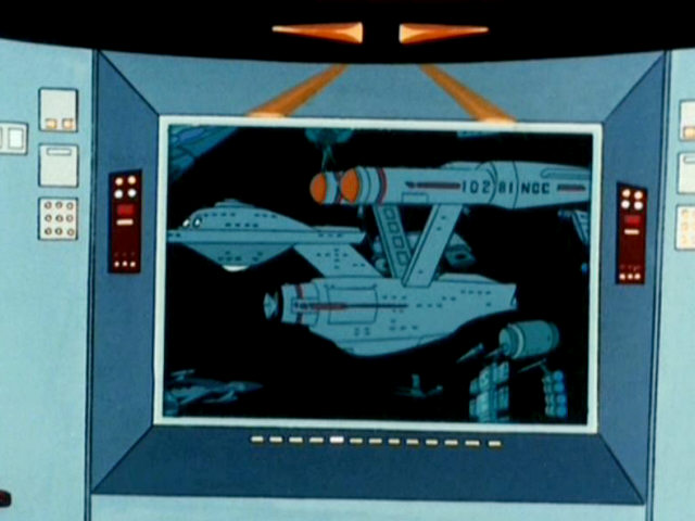
And here's one last one... the view I'd replace the TAS shot with.


Compare that to the original:


The biggest single compromise I made was to lower the warp nacelles. I tried having them as high as shown here, but the ship just looked bad from every other angle BUT this one, and it also made no sense from an engineering standpoint. You need the nacelles to have an unobstructed view forward, and for the nacelles to be a "safe" distance from the hull... but you do NOT want to have the pylons be too long and spindly. So, I shortened them and here we are.

Since that's the "final" configuration (as I said, less detailing work and so forth), I guess comments are appreciated... but let's talk more about how to dress her up! ;)

By the way, I can export this into a variety of other formats, so if anyone's interested (once I get the last mechanical details in place), just let me know, K? As always, just don't use it without providing proper credit! :)
 
I really like it! btw you could always say that its a sub class of the original Bonaventure to 'justify" the diferences, kinda like the Royal Navy's Bellerophon class battleships which were slightly altered versions of the original HMS Dreadnought. :cool:

Nice job! :techman:
 
Lokks OK, but there is one thing that bugs me about it (even more with the overall less cartooney approach) and that is the size of the main deflector/sensor. Personally, i think, doubling the "dish" size would look better.
 
Lokks OK, but there is one thing that bugs me about it (even more with the overall less cartooney approach) and that is the size of the main deflector/sensor. Personally, i think, doubling the "dish" size would look better.
Fair enough... can you provide an argument in favor of making that change? To me, it "feels" just fine, but it wouldn't be too difficult to adjust the size in-model if I thought it were necessary (that's one of the advantages of using engineering software... I can drive the whole bleedin' model by altering individual parameters... and the rest of the stuff that's attached to those features will just move right along with it. Granted sometimes things "blow up" but smart modeling practices can avoid that).

The purpose of that dish is really to sweep out debris from in front of the ship's path. There's the dish and the "resonator" behind it (the cluster of concentric cylinders) which make up the deflector. It feels reasonably appropriate to me.

The only counter-argument I can see is that the pre-TOS 1701 had a larger dish, and it became smaller over time.

But I'd love to hear your take, so c'mon, tell me what you're thinking! :D
 
Nice work. Looks to have something like 12 decks. But dang, are those decks are thick! What is that, 4ft of decking in there between each?

As far as detailing, I think you could probably get away with doing whatever you want to the inboard nacelle sides, since they aren't really visible in the original version.
 
[...]

The only counter-argument I can see is that the pre-TOS 1701 had a larger dish, and it became smaller over time.

But I'd love to hear your take, so c'mon, tell me what you're thinking! :D

That is exactly what i think about it. Of course, this is probably a "learned" impression, equating the changes made from the first pilot to the series version of the Enterprise with "advancement" in technology (The same goes for some changes from the TOS ship to later ship designs (like the nacelles getting smaller in relation to the rest)).

As it is now, the dish seems to be smaller in comparison to the rest of the ship as on either version of the TOS Enterprise.

Of course this is more of a gut feeling, i didn't take any measurements (you probably would have seen me stalking around your shipyard ;) )
 
Note that the markings on the side of the nacelles read as follows:

102 81 NCC... not "NCC-10281"

I treat the term "NCC" as "Navigational Contact Code." Basically, this is the IFF transponder code broadcast by the ship for recognition purposes, not the "Naval Construction Contract" or the "type designation."

So... in the cases of my "Bonaventure," I'm going to treat this as the 81st experimental hull design launched by the Federation, with a Navigational Contact Code of 102.

Or, at least... that's the plan for now.
Nice distinction - 102 81 NCC... not "NCC-10281.

If you absolutely had to make some sense of this, that would be the most appropriate avenue. It shies away from long held fanon (specifically NCC and its meaning regarding construction contract) and takes only what is presented without much interpretation. Best yet is to not even attempt to explain it at all.

As for MJ's statement regarding 17th model and first ship (1701); I am still under the impression that it is his own retconning; much after the fact.

If you truly needed/feel compelled to back your assessment of a contact code may I suggest the following: Enterprise is often identified not simply as Enterprise, but has the additional data NCC-1701 attached in the identification process (TV series and movies). This is also seen in the Motion Picture where other ships are identified not only with ship name but alpha and numerical quantifiers attached. This makes little sense unless it is some form of code to specifically identify the ship (likely more than the simple explanation of a model number 17th design first in series) than the fanon explanation equivalent to a license plate number. For civilian governments this license plate theory has little meaning.

But, that's more "by the book" than most would like to acknowledge I suppose.

Like the design a bit. I'd like to see the nacelle struts a bit higher myself.
Perhaps initially they were set this high for a reason, or lowered later for another reason.
 
If you are not already a member then please register an account and join in the discussion!

Sign up / Register


Back
Top