• Welcome! The TrekBBS is the number one place to chat about Star Trek with like-minded fans.
    If you are not already a member then please register an account and join in the discussion!

The Bridge. Are you on it or want to jump off it ?

The Bridge. Vote or feel the wrath of Robau


  • Total voters
    127
If sparks don't fly out of it I will leave the cinema right then and there. Sparks flying out of damaged consoles is a Star Trek staple. It must happen, OR ELSE, I will angrily come to TrekBBS and protest. :lol:
 
I love it! :techman:

I just think its a little to futuristic for something set in the 23rd C.
How can anything set in the 23rd century look too futuristic?

Because people aren't thinking of it in terms of advancing 2009 tech 200 years, they're thinking of reverting The Cage. By those somewhat strange standards, it looks too futuristic as it doesn't look like it was built in the mid 1960s.

I voted OK...still good. I'm not loving the blue neon ceiling, or the strange and poorly disguised barcode scanners, but other than that, I like the design.
 
In the 1960's The Cage looked futuristic, but in 2009 IT DOES NOT, simple as that. Our technology has progressed fast, in ways people didn't see coming. The same can be said for the 23rd century.
 
My idea of realistic future tech is it will be more like previous Trek movies design. You know, less cluttered but I understand it is a movie and has got to be flashy for today's audiences. I might even get a big kick out of all that flashiness on the big screen. :cool:
 
My idea of realistic future 23rd century tech is.... well I have no idea what the tech will be like in 200 years and I doubt anyone else really does.
 
My idea of realistic future 23rd century tech is.... well I have no idea what the tech will be like in 200 years and I doubt anyone else really does.

I know it wouldn't look like Luis took an iPod and fired his enlarger ray from "Honey, I Blew Up the Kid" at it.
 
I went with "It's ok". There have been much worse bridge designs, I like what they did with Kirk's chair (the most important part, naturally) and love the large viewscreen. If it didn't have the glass panels and the barcode scanners I would have voted "love it".
 
I like the way the view screen tends to be a Window, that allows computer graphics to be layered onto it.
 
I don't like it based purely on previews. It's got some good ideas, but it also looks like they just said screw it and glued a bunch of desk lamps and barcode scanners onto it, which look terrible. I also find its circular lights and pillars to look pretty dumb. Then there's the issue with the glare on the viewer.

The rimless screens look good, the captain's chair is pretty good, the consols in the pit are a good use of space, the larger viewer makes sense, the other chairs are pretty good, making the viewer closer to the captain is good. The glass circuit boards make no sense at all, but they call back to Scotty's engineering circuit board, so I'm not too bothered by them.

Btw, I thought it was Abrams or one of his people who first drew comparisons to Apple.
 
I'm on the fence. Its not what I would have done, but its not terrible. I'll wait to see it in action before I pass final judgment.
 
ok but not what i would have done.
i like some of the displays and the over all configuration.

dont like the hostess stations plus over all it is so while and blinding light i dont know how the crew would be able to function very long .

talk about blinded me with science.
 
Image3.jpg

Finally, Chekov and Sulu each have their own staplers.
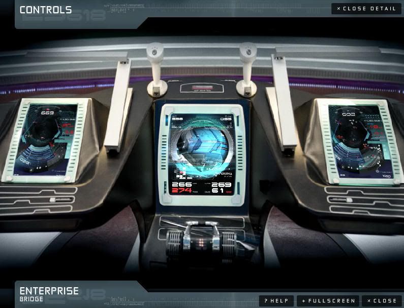
I suppose those things in the front are joysticks (for space combat?). Awesome.

Actually they are checkout scanners.
 
Undecided for now - initially I did not like it at all but I am trying to keep an open mind.
 
Yeah, a ton of modifications.

Like clearing out all the extraneous crap and making the designers tell me what the hell everything there is for and why that was the best design to perform that function.

It looks pretty dumb, for the moment.
 
I like the basic shapes and colours, some of the finer details such as the lights around the console displays are kinda tacky, though.
 
As with everything else I've seen, it looks like there's just too much superfluous nonsense stuck onto everything just to make it look cool and subjectively futuristic. It looks like they just kept going until they ran out of crazy glue. And what's up with the blue neon strip club lighting? To quote a word I've understandably seen a lot lately, iPrise indeed.
 
If you are not already a member then please register an account and join in the discussion!

Sign up / Register


Back
Top