For one thing, the cover artist may not have had photo reference for the actors. (That painting suggests that the artist just got a description of Spock as "pointed ears, greenish skin, intellectual" and based it on that.) For another, Bantam may not have had likeness rights to the actors.
-
Welcome! The TrekBBS is the number one place to chat about Star Trek with like-minded fans.
If you are not already a member then please register an account and join in the discussion!
You are using an out of date browser. It may not display this or other websites correctly.
You should upgrade or use an alternative browser.
You should upgrade or use an alternative browser.
The Blish books...
- Thread starter LMFAOschwarz
- Start date
The complete mystery man on the cover of 8 looks pretty buff, too. Seems to sport the same style of uniform as on 6...same round belt buckles...the same distinctive look to its Enterprise as well.
Whatever reference, or lack thereof, was used, they both seem to portray a consistent 'universe'.
Whatever reference, or lack thereof, was used, they both seem to portray a consistent 'universe'.
If J. A. Lawrence is/was James Blish's wife/widow, all of book 12 and most of book 11(I don't know which adaptations) were done by her alone, as James Blish had died before they were finished. She probably had a hand in earlier volumes as well, due to his failing health.
He died before finishing Star Trek 12. 11 was already done. J.A. Lawrence was the author of Shore Leave and And the Children Shall Lead, leaving the two Mudd's to her as well.
Lawrence was Blish's widow, yes (still is, apparently; isfdb.org at least has no date of death for her, and she'd be only 74 years old). According to David Ketterer's biography of Blish, Imprisoned In A Tesseract, Lawrence and her mother wrote basically all the adaptations from Star Trek 5 onward, as Blish was suffering a severe case of writer's block.
I have a hard time believing she did all of the writing from 5 onward because a) how much would writer's block really prevent him from adapting already written scipts? and 2) her style was different from his. She was more "cutesy" honestly and I didn't find her work nearly as good.
^Maybe Lawrence did the drafts and Blish polished them?
In the bad old days of the 70s, when Star Trek could only be seen in syndication on a grainy UHF channel and you usually had to wait months--if not years--to see your favorite episodes, the Blish books were the only way to bridge the gap. And yes, while somewhat inaccurate, the covers were visually striking.
LOL! I remember those days. Fotonovels were like a godsend because now I could actually SEE all the cool uniforms and tech clearly!
My question is what you all thought of the cover art. We all spent time in our youths looking at them, and I was wondering what you thought at the time. Did any make you think of specific episodes, or anything like that?
The beauty of the Blish covers is that they were created at a time long before the age of lifeless airbrush copies of publicity photos (see the Pocket books Star Trek novels), with not much script or essence on the cover.
The late 60s/early 70s was a period where the influence of the Mid Century explosion of dramatic, abstract and suggestive cover art remained in vogue. Ordinarily, tie-in novels from live action TV series lead to common photos slapped on the covers, with no representation of the contents.
With the Blish novels, few of the painted covers had much to do with the episode content, save for James Bama's beautiful NBC promotional art for WNMHGB used for novel #1, or ST 7--clearly taking inspiration from "Who Mourns for Adonais", but as noted above, unlike the then-future with Pocket books, the Blish covers captured an essence and drama of the series.
That feeling of mystery, distance and the fantastic (particularly captured in season 1) was felt in the artwork. Additionally, the work, along with cover descriptions such as:
"A chilling journey through worlds beyond imagination"
"The Enterprise blazes new star trails to danger.."
...tied in with the art, making the tie-in seem as at home in novel form as stories born in print.
I recall some were not too happy with the interpretive versions of the Enterprise shape & color from a few covers, but I found that interesting too, again, adding to the mystery and essence of the series.
I cannot point to a post 70s ST novel cover that is as imaginative or unique as that created for the Blish novels.
This! I'm not a fan of modern book covers because they lack a sense of wonder and they just don't grab me like old covers do. As a kid these Trek covers really grabbed me and took me "out there". I probably nitpicked an element here and there, but there was still something that brought me back to them. It was like this Star Trek that wasn't quite Star Trek. Sort of like watching WNMHGB when I was a kid.
I probably thought "the enterprise can't be under in an atmosphere" or "the warp engines don't shoot fire" or "communicators don't have antennae", but again, I really was drawn in by those covers in the days when we couldn't just download a billion photos of Star Trek.
The covers from 4 on up are awesome, with an emphasis on 4-8. I've gained a new appreciation for the cover of 4. When I was a kid, my little brother and I bought that one for my dad for Christmas. Since I saw that one more than any other (It was also the cover to the Star Trek Puzzle Manual and I may have had a mini-poster of it), it didn't realy "wow" me after a couple of years. Now, decades later, I appreciate it, not just for nostalgia's sake, but from an artistic standpoint.
My all time fave is the cover to 8. I found an edition with the text at the top, leaving most of the image uncovered. Probably more so than the others, this is that "Star Trek that isn't the Star Trek that we know". I did an homage cover to this one because I love it so much. There's a certain weirdness in the fact that when I Google searched "Lou Feck" before replying, that my image pops up fairly close to the top of that search.
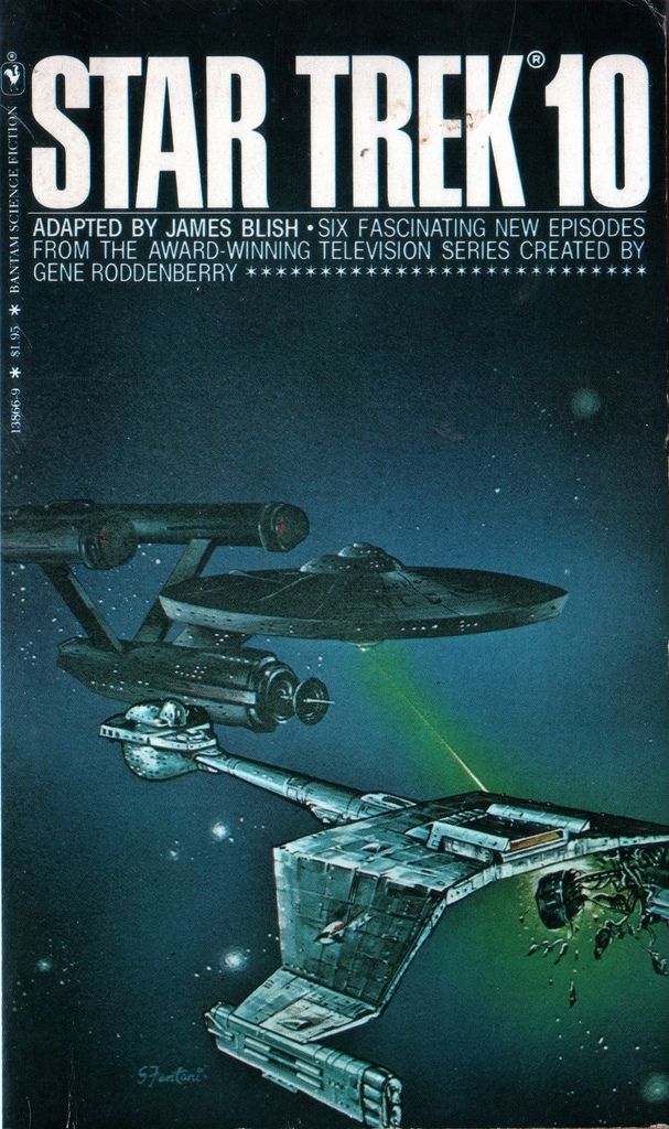
The covers for 9-12 (except for 10) are less familiar to me. This is when there was a definite shift in the art style and it looked like it was going in something like a light Chris Foss-esque style (especially once you get to New Voyages). My dad bought me 10 while on a family vacation in Colorado. I can still remember the store where I got it. Mudd's Angels was also on sale, but I wanted the book where the Enterprise was phasering a Klingon so bad that you could actually see the inside girders and stuff.
The other thing for 10 is that my brain processed the way the light was on the Klingon so that the "wing" part closer to the viewer actually looked like it went down, then out at the bottom (even though that effect is not present on the other side.) Yeah, it seems weird now, but comic legend John Byrne said that the first time he saw Superman's "S", he saw the negative space and not the "S", so it's not so weird.
The other thing for 10 is that my brain processed the way the light was on the Klingon so that the "wing" part closer to the viewer actually looked like it went down, then out at the bottom (even though that effect is not present on the other side.) Yeah, it seems weird now, but comic legend John Byrne said that the first time he saw Superman's "S", he saw the negative space and not the "S", so it's not so weird.
It's not just your brain. Looking at it now, I'd say that's actually how the artist interpreted it, as angling down and then outward. It is present just a bit on the other side, at the rear of the strut. And look particularly at the silver rectangular panel just above the port nacelle and just under the writing. There's a sort of protruding cowling there, kind of a half-cone shape, and if you look to the right of it, it's casting a shadow that's consistent with the cowling being on top of a horizontal surface, rather than on the side of a vertical surface. So what you thought you saw (and what I always saw in the cover too, I think) is what the artist actually intended. It seems the artist misinterpreted the perspective on a reference photo.
Whew! I do feel better that it wasn't just me!

Does anyone know who did the covers for #4-8?
Lou Feck did 4,6 and 8.
Mitchell Hooks did 5
edited
'CHB' did 7 (as pointed out below by G. Schnitzer)
Last edited:
So what you thought you saw (and what I always saw in the cover too, I think) is what the artist actually intended. It seems the artist misinterpreted the perspective on a reference photo.
I see what you're saying, but I think the artist made a technical, painting error rather than a structural error. I think he just slightly mismanaged the lighting aspect of the Klingon ship. It looks like he was working directly from the AMT box covers, and followed their odd as well as their cool aspects:


It's still a sensational cover.
1 James Bama
2 photomontage
3 photomontage
4 Lou Feck
5 M. [Mitchell] Hooks
6 Lou Feck
7 CHB
8 Lou Feck
9 Eddie Jones
10 Eddie Jones (as "S. Fantoni")
11 Eddie Jones (as "S. Fantoni")
12 Eddie Jones
Mudd's Angels: Bob Larkin
2 photomontage
3 photomontage
4 Lou Feck
5 M. [Mitchell] Hooks
6 Lou Feck
7 CHB
8 Lou Feck
9 Eddie Jones
10 Eddie Jones (as "S. Fantoni")
11 Eddie Jones (as "S. Fantoni")
12 Eddie Jones
Mudd's Angels: Bob Larkin
This was my homage to Lou Feck's cover to number 8. I'm definitely no Lou Feck, but hopefully this cover would've brought a smile to his face.")

Sure do. I authored "You Will NOT Believe a Starship Can Fly" in Best of Trek #13.Anyone remember the Best Of Trek books that were collections of fanzine articles (I believe)?...
I see what you're saying, but I think the artist made a technical, painting error rather than a structural error. I think he just slightly mismanaged the lighting aspect of the Klingon ship.
Yes, that's what I mean -- that he misintepreted the perspective from that 2D shot because he couldn't see it from other angles and understand how the shape of the wing really worked. The version you showed of the final cover is cropped on the right side, but there's another version earlier in the thread that shows more of the starboard wing/nacelle, and there it's clear that the artist didn't get the structure quite right on the starboard side, and that informs how he interpreted the angles on the port side.
I think he just slightly mismanaged the lighting aspect of the Klingon ship. It looks like he was working directly from the AMT box covers, and followed their odd as well as their cool aspects:
It's still a sensational cover.
Would this novel cover be the first time ST ships were treated to heavy surface detailing / armored look which influenced the look of the movie era/post Star Wars ships?
Last edited:

This was my homage to Lou Feck's cover to number 8. I'm definitely no Lou Feck, but hopefully this cover would've brought a smile to his face.
I've got to say, that works quite well! I like the ship speeding off, leaving his lone figure to fend for himself. Not even a radio or helmet like the original guy. Heck, he doesn't even have a phaser! You can just tell that this is not going to end well for him.

Come to think of it, I pretty much swiped the outlines of the guys on book 4, for a school project. I did a version of the cover of The Outsiders by S.E. Hinton. Wow, I'd forgotten all about that!
There's something else about the covers, and it varies from copy to copy, and that is the well-worn fades, bends and dents and tears, the kind which only appear on well-read books.

Some of the first books I really remember reading cover to cover as a kid were the Blish books. I think they may be what really captured me as a Trek fan. Trek was only on TV one or two times a week between new TNG and TOS repeats, but I could read those books over and over.

I think he just slightly mismanaged the lighting aspect of the Klingon ship. It looks like he was working directly from the AMT box covers, and followed their odd as well as their cool aspects:
It's still a sensational cover.
Would this novel cover be the first time ST ships were treated to heavy surface detailing / armored look which influenced the look of the movie era/post Star Wars ships?
I'd like to see models based on that last photo.
The Blueprint in the CBS watch magazine seems to follow that book cover:
http://www.treknews.net/2014/12/04/cbs-watch-magazine-star-trek/
Heck, they even have the tubes on the secondary hull.
Notice also that raised section where the Refit photon torpedoes go in that book cover. I wonder...
The Enterprise we see on the D-7 model boxart looks similar to a model from Japan--very long secondary hull.
Similar threads
- Replies
- 0
- Views
- 2K
- Replies
- 94
- Views
- 13K
- Replies
- 4
- Views
- 393
- Replies
- 96
- Views
- 4K
- Replies
- 19
- Views
- 1K
If you are not already a member then please register an account and join in the discussion!