-
Welcome! The TrekBBS is the number one place to chat about Star Trek with like-minded fans.
If you are not already a member then please register an account and join in the discussion!
You are using an out of date browser. It may not display this or other websites correctly.
You should upgrade or use an alternative browser.
You should upgrade or use an alternative browser.
That Starbase 11 wall chart - noe in slide form
- Thread starter ChallengerHK
- Start date
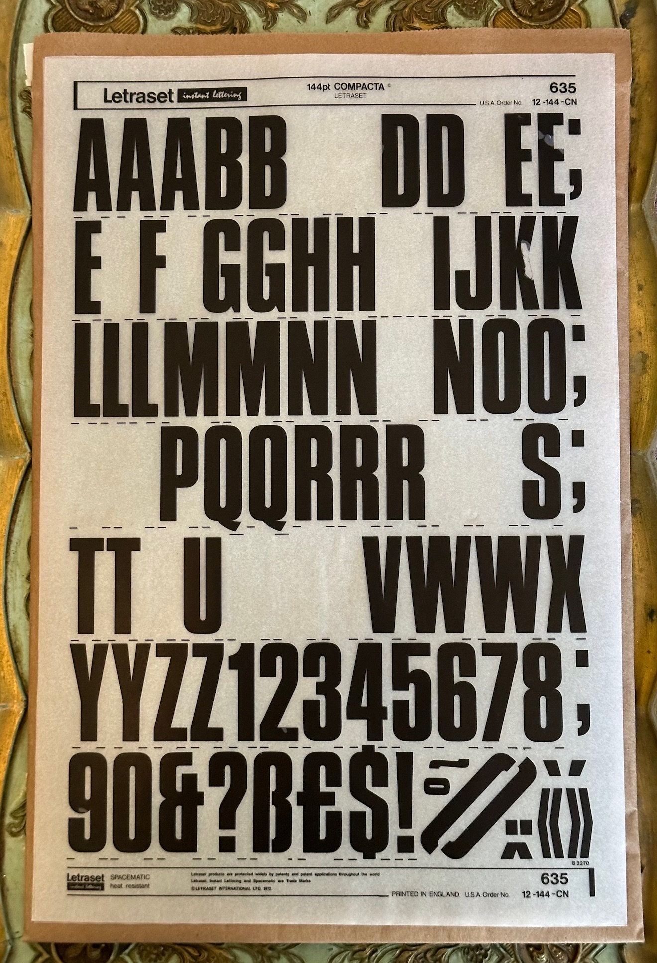
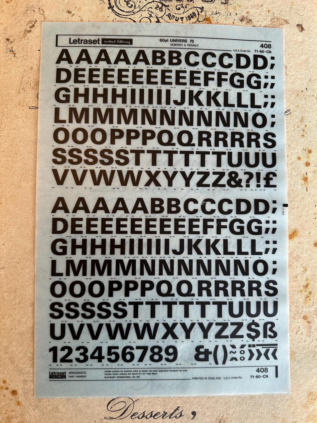
I assumed it would have been Letraset or similar, but yes it could be hand-drawn
From what I can tell, 196pt was the largest you could get. (Website sates 2.7 inches per letter)
Would it be a font like this:
or
or:
Vintage Letraset Incomplete Sheets (1)
Vintage Letraset Sheets.They are all incomplete and see photos.
 vintageonvintage.patternbyetsy.com
or like this:
Vintage Letraset 1 Sheet - Etsy
This Transfer Paper item by VintageonVintage has 44 favorites from Etsy shoppers. Ships from Canada. Listed on Sep 4, 2025
 www.etsy.com
Last edited:
Looks like Eurostile Bold to me. But they have trimmed the “1”. Designed in 1962, so it would have been new and fresh at the time.
https://ar.inspiredpencil.com/pictures-2023/eurostile-bold-font
The “6” in Eurostile has a shorter lower half than the “8”. And yet in “1X31” the lower half looks the same as in the numbers with clear sixes. So I think it is 1631.
https://ar.inspiredpencil.com/pictures-2023/eurostile-bold-font
The “6” in Eurostile has a shorter lower half than the “8”. And yet in “1X31” the lower half looks the same as in the numbers with clear sixes. So I think it is 1631.
Last edited:
Eurostyle was used for the end credits in Season 1, so would certainly have been kicking around.
It became a sci-fi staple, and in modified form, was heavily used in the Star Trek movies.
Could equally be the very similar Microgramma (which also has Trek heritage), which has the same feature of the 6 having a fuller, rounder lower half than the 8. At this resolution, it could be why we're struggling to see the slither of daylight in the upper half of the 6.
I think you are exactly right about that slither of daylight. It is a telltale marker.
I might be misremembering but I think Eurostile was developed by the same artist who developed Microgramma, in order to create something with other widths and weights and a lower case, which I think, Microgramma lacked.
Franz Joseph can be credited with using Microgramma for hull fonts and I think it was Probert who reworked Eurostile bold extended into the hull font used on the refit Enterprise.
As I noted above, I think the “1” has been trimmed.
I don’t think the title is in Eurostile. My guess is that was what was hand drawn, but only because I don’t recognize the font.
I originally saw 1831 as well, but looking at the width of the confirmed "8" in 1685, the various "6"s on the chart are noticeably narrower. I'm very swayed to it being 1631
Agree. Viewed in isolation, one could make a case for '8' but, in situ, with the other numbers on the chart considered, it's '6' for me.
Having reviewed the images, I concur that it certainly looks like 1831 in one of the faded-red images. I did all kinds of zooming on that pic to try to find a discontinuity in the right upper vertical and it was illusory at best.

However, that's also the image which shows a funny black blob emerging from the upper right of the 9 in 1709 just above it.
It's also part of the darker series of digits anyway, which, due to the lighting, look to be of heavier line weight than lower digits, even though I'm sure they're exactly the same in reality.
As such, even though I am perfectly content with registries even up into and beyond the 1900s at this point in the chronology due to later works, meaning I have no philosophical problem with 1831, I'm nonetheless sticking to 1631 as per my previous deskew results that seemed to show that on the remaster, the number width observations, and Jein's view of a less aged film.
Also, I hate to throw shade at the OGs, and I realize typeface availability and the effort to create such things is just easy-peasy now versus then, but I would like to reiterate once again . . . dear sweet heavens there had to be something better available. I whipped up some 8 point stuff in Wordpad, zoomed out 50%, and screenshotted . . . this was the result, and they're all fairly easy to read except Helvetica.

(The custom Iosevka font kinda resembles the ST2 tactical graphics digits, which were pretty dang awesome. Also, I neglected to note that the Routed Gothic is my modified tabular version, hence the monospace digits.)
Wouldn't it have been amazing not to have to zoom and squint and such for almost 60 years?
Last edited:
The slither is more visible in this embossed version of the numbers which another TrekBBS member produced a while back.Eurostyle was used for the end credits in Season 1, so would certainly have been kicking around.
It became a sci-fi staple, and in modified form, was heavily used in the Star Trek movies.
Could equally be the very similar Microgramma (which also has Trek heritage), which has the same feature of the 6 having a fuller, rounder lower half than the 8. At this resolution, it could be why we're struggling to see the slither of daylight in the upper half of the 6.
Of course, the sliver shows up as a shadow now but it's still there!

The rest look like sixes. So I'm going with six for that one.I would very much like that number to be 1631 and not 1831. As I mentioned, I'm not 100% sure, but it looks like an 8 to me
This is the kind of fascinating and extreme attention to detail I love about Trekkies. It's been almost 60 years, and we're debating a 6 or an 8 in a background graphic likely made with little thought. People in this very thread have spent money trying to determine the correct answer.
I have wondered for a long time whether the responsible persons- maybe Mike Minor, maybe Lee Cole - chose 1864 for Reliant specifically because they thought it had been on this chart, as a very “in” reference for obsessed Trekkies such as we are.
I certainly thought it was 1864. And 1831. Until at least ten years ago when I looked into it more closely and yes, the obsessed Trekkie clicked in.
I certainly thought it was 1864. And 1831. Until at least ten years ago when I looked into it more closely and yes, the obsessed Trekkie clicked in.
And the conclusion is that we'll probably never know beyond some reasonable doubt!This is the kind of fascinating and extreme attention to detail I love about Trekkies. It's been almost 60 years, and we're debating a 6 or an 8 in a background graphic likely made with little thought. People in this very thread have spent money trying to determine the correct answer.
On a personal level, I have been a starship guy since around 1986. For me, I also would personally like to know what they are. I have not given up yet one finding out if it is NCC-1631 or NCC-1831. We have ruled out that NCC-1664 is the correct one and it is not the Reliant. I think in order to maintain canon and ensure the future Production Staff won't make mistakes (no offence to Dave Blass) by using Memory Alpha, we have to ensure we get these small details correct.This is the kind of fascinating and extreme attention to detail I love about Trekkies. It's been almost 60 years, and we're debating a 6 or an 8 in a background graphic likely made with little thought. People in this very thread have spent money trying to determine the correct answer.
If we look at things Okuda's done in the past, even they had a hard time with it but they settled on 1631. But getting MA to accept it and others we have to show proof in some way.
For me it's illogical for it to be 1831 when everything else points to 16XX and 17XX. Hopefully time will tell, and we will get an answer, Haha
And the conclusion is that we'll probably never know beyond some reasonable doubt!
I think that between identifying the font, and looking at embossed versions of HD captures, we can get pretty close to nailing what common sense has said all along- that nobody producing graphics was going to infer an “18th type” when the clear message had been - “twelve like her” and all - that the 17th type was the latest and greatest.
That’s also why I think Jein went a bridge too far in saying those 1600 ships were Constitution class. For one thing, it went against Jefferies’ sense of the numbering system. For another, it strains credulity that ten out of those same twelve Constitution class ships are all at that starbase being repaired at the same time.
But that is another discussion for another time. For me, and perhaps only me, those numbers are the Rosetta Stone that can reconcile FJ, Jein, TMoST, and Okuda.
NCC-1709 Defiant
NCC-1631 Intrepid (old- being decommissioned)
NCC-1703 Lexington
NCC-1672 Saratoga
NCC-1664 El Dorado
NCC-1697 Essex
NCC-1701 Enterprise
NCC-1718 Excelsior
NCC-1685 Eagle
NCC-1700 Constitution
Last edited:
That’s also why I think Jein went a bridge too far in saying those 1600 ships were Constitution class. For one thing, it went against Jefferies’ sense of the numbering system. For another, it strains credulity that ten out of those same twelve Constitution class ships are all at that starbase being repaired at the same time.
I have long lamented the absurdity of the Jein supposition . . . the wacky reverse-alphabetical idea, the idea of all of them in one spot, et cetera . . . and Okuda's adoption of it. But, in Jein's defense, my understanding is that the Jefferies numbering schema wasn't necessarily as well publicized as the list of names from TMoST, the FJ lists, et cetera. Is that accurate?
Similar threads
- Replies
- 5
- Views
- 12K
If you are not already a member then please register an account and join in the discussion!